Earlier in the year I reviewed the Esterbrook Estie in the Limited Honeycomb (with a Journaler nib) and the standard Cobalt Blue (with a standard fine) finish. This is another Esterbrook Estie and while I don’t usually review pens with different finishes (although the material here is quite different) this Estie variant also comes with a Scribe nib. The material of the Gold Rush features the trademarked DiamondCast acrylic with the dust of real diamonds.
Thanks to Esterbrook and Desk Bandit for sending this pen in for review.
The Esterbrook Gold Rush pens come in three different colours: The Prospector Black in this review, Dreamer Purple, and Frontier Green. All of them are made with the DiamondCast material which has actual diamond dust, presumably from cutting diamonds. The pen in this review is the regular size but the pen is also available in ‘oversize’ which has metal threads.
This pen has a coincidental (and somewhat loose) connection to me as my part of the world featured a few of its own gold rushes. Mining in general is the most significant aspect of Western Australia economy and gold was a major part early on. We have several locations referred to as Goldfields. These days iron ore dominates
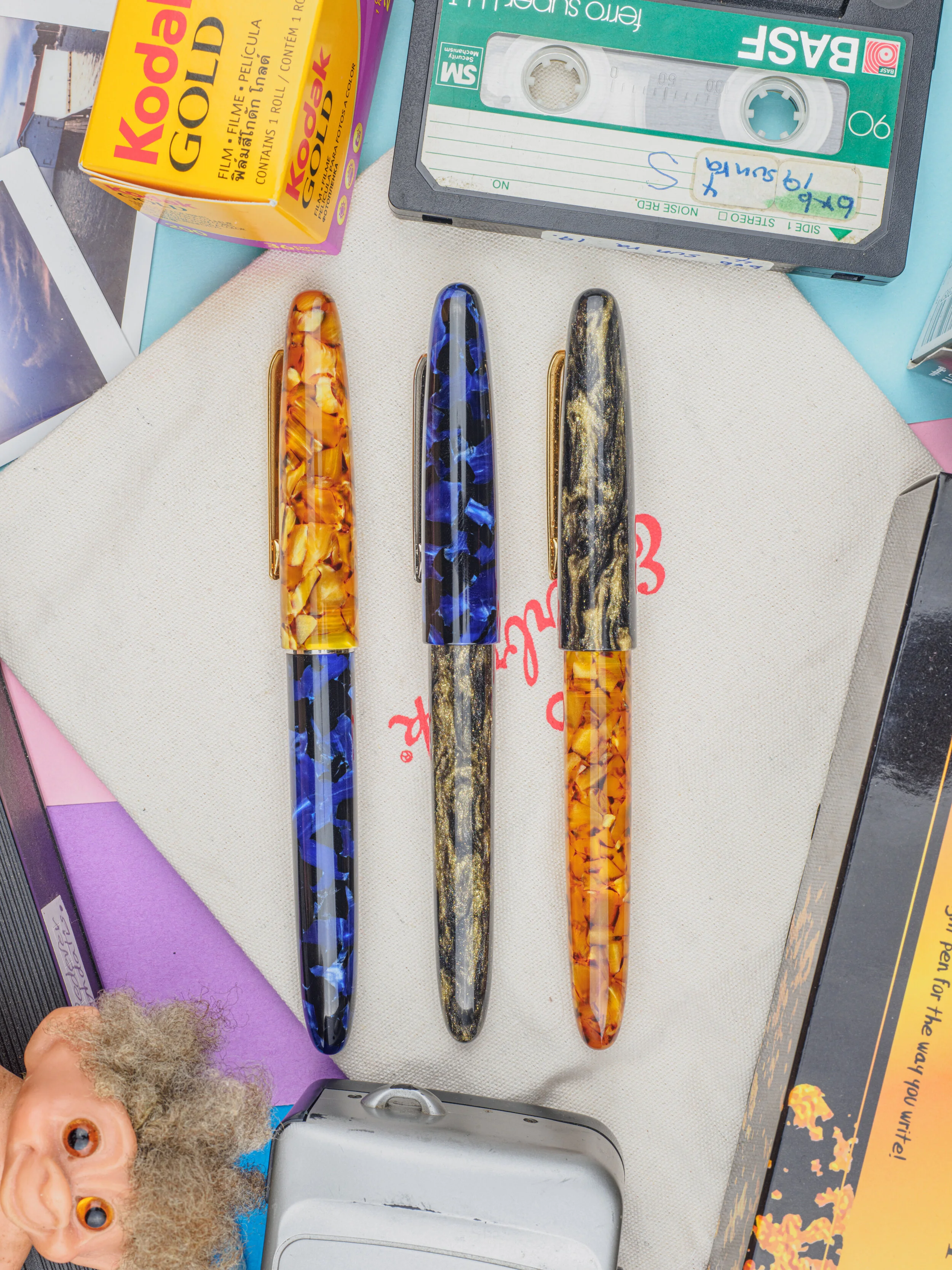
One thing at immediately struck me about the Esterbrook packaging is that it reminded me of 35mm camera film packaging; in particular Kodak’s film. Kodak also have a film called Kodak Gold which purple accent on the yellow box (which would suite the Dreamer Purple perfectly!). Kodak Gold, as it is today, was released (as Kodacolor VR-G) back in 1986 and because of this I descended to go with a 90s themed photoshoot with the pen and I grabbed everything in the house that was even loosely related to that era!
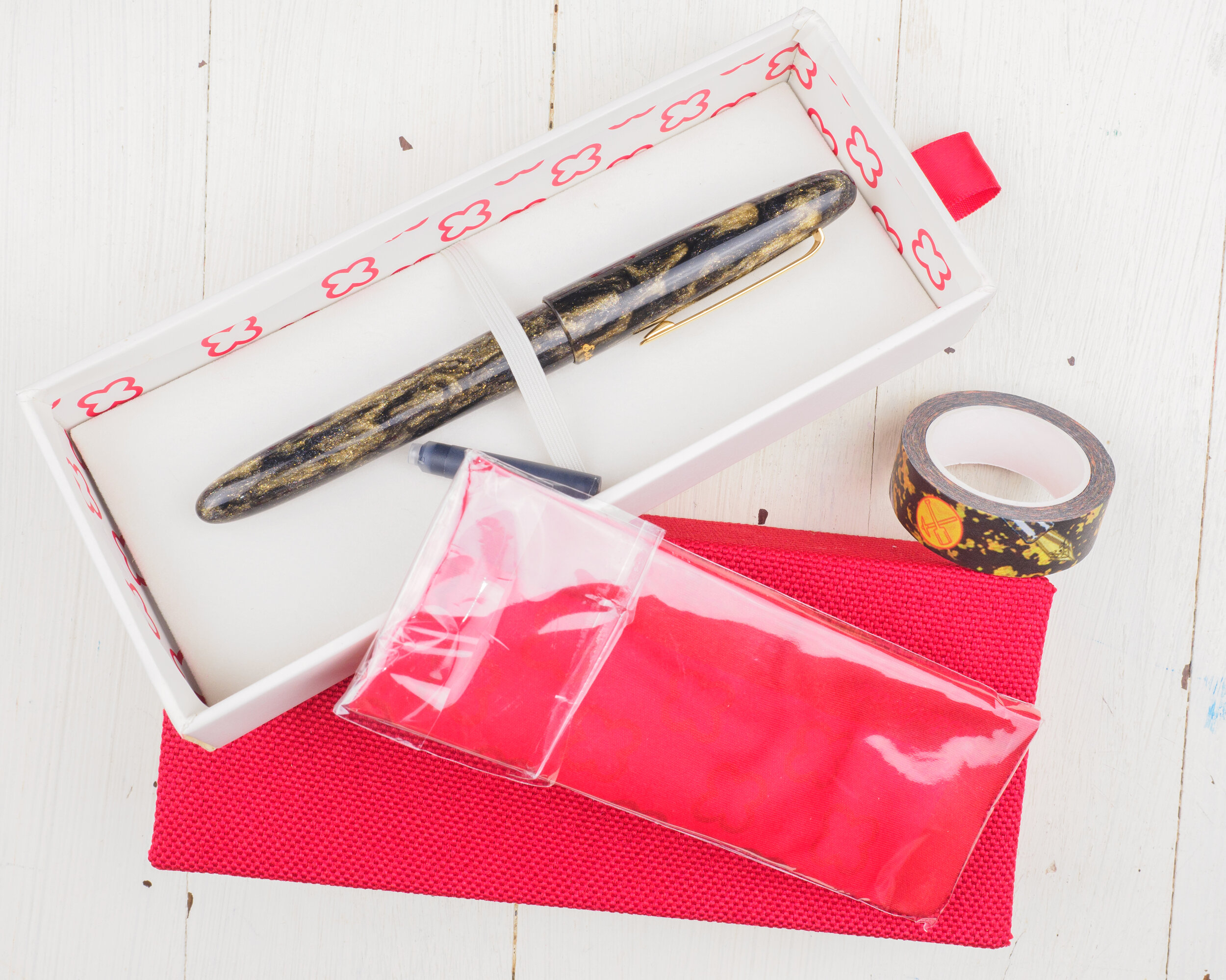
Inside the packaging, which is different from the other espies as it comes in a hard cardboard slide box, is the Esterbrook soft cloth, the converter, a cartridge, and, new the the Gold Rush, a washi tape based on the which type of Gold Rush you got. My washi tape is black and gold to match the Prospector Black finish. It is a little pixelated but still works nicely and has the JoWo nib, a graphic interpretation of the material look and two Esterbrook logos.
This is an Esterbrook Estie. The parts are interchangeable between all the models. It doesn’t matter if you get a Gold Rush, standard or limited edition the caps and parts will fit on each. Not that I’d recommend that as I don’t think any look good! If you look above I did notice that the clip on the cobalt blue site a little lower than the other two.
The threads for the Estie are acrylic on the barrel and metal on the cap. I, personally, quite like the decision to use acrylic on the barrel. The pen is unadorned apart from the cursive ‘Esterbrook’ name debossed into the cap in gold lettering. All of the Gold Rush pens have, naturally, gold trim.
The material really does sparkle! It’s definitely more sparkly than what Sailor do on some of their pens and it catches the light strongly. The flashes are still quite small though with the diamond dust being quite small. When looking under a macro lens and zoomed in you can see the little bright specs and they are quite brilliant and colourful in this close! From the naked eye, however, they look mostly white but if you look closely you can see some of this colour. You can’t see any reflective flakes or particles you just see the light catching and shining.
Nib
Before talking about the Scribe nib that came with this Gold Rush Prospector Black, I think it’s worth mentioning again my previous review of the Esterbrook Estie which looks at the Journaler nib, a regular fine, and a vintage Esterbrook Bookkeeper nib.
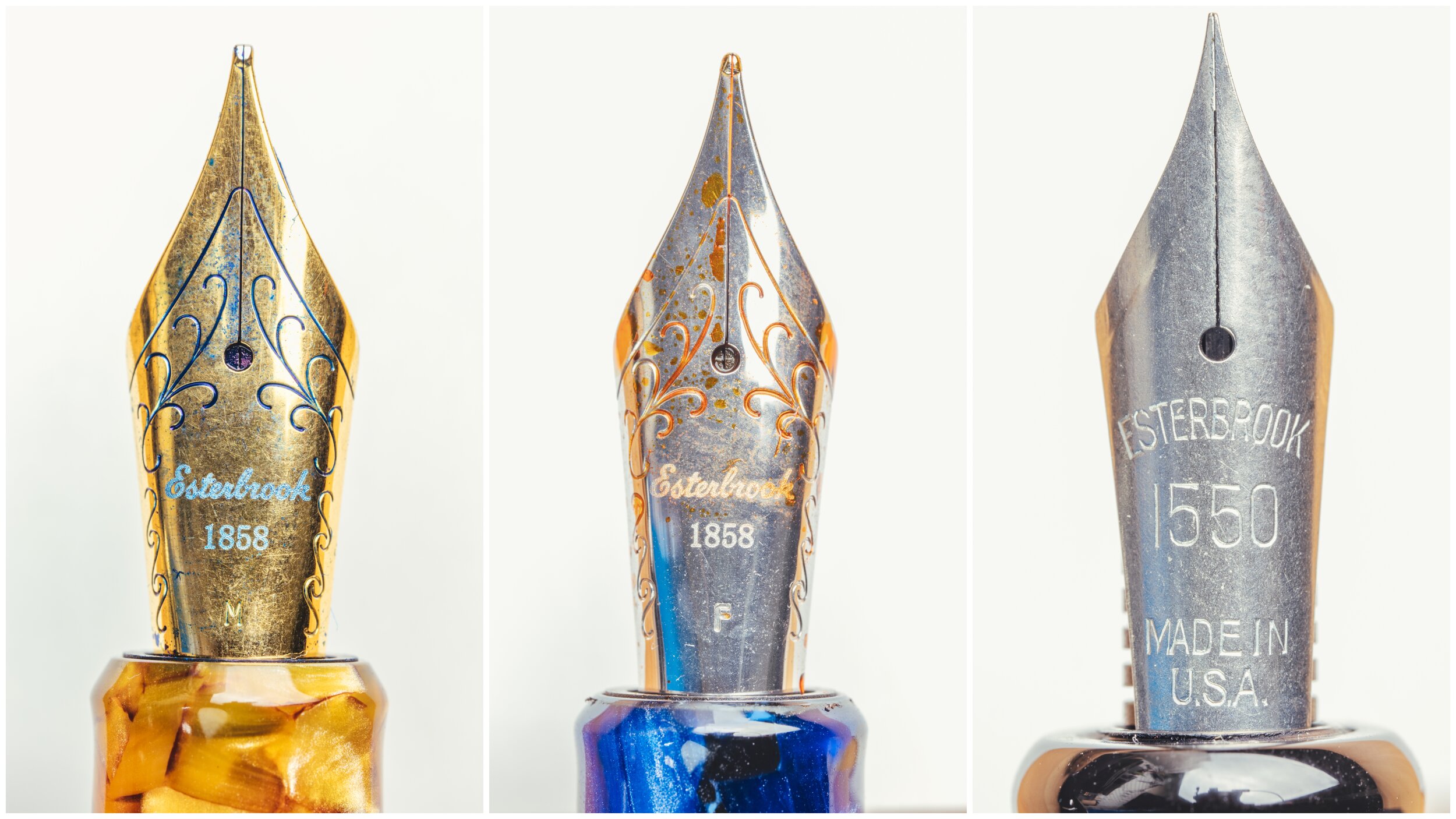
The nib in the Esterbrook Gold Rush is a No. 6 JoWo nib with the Esterbrook cursive name etched into it and the original founding date of the company.
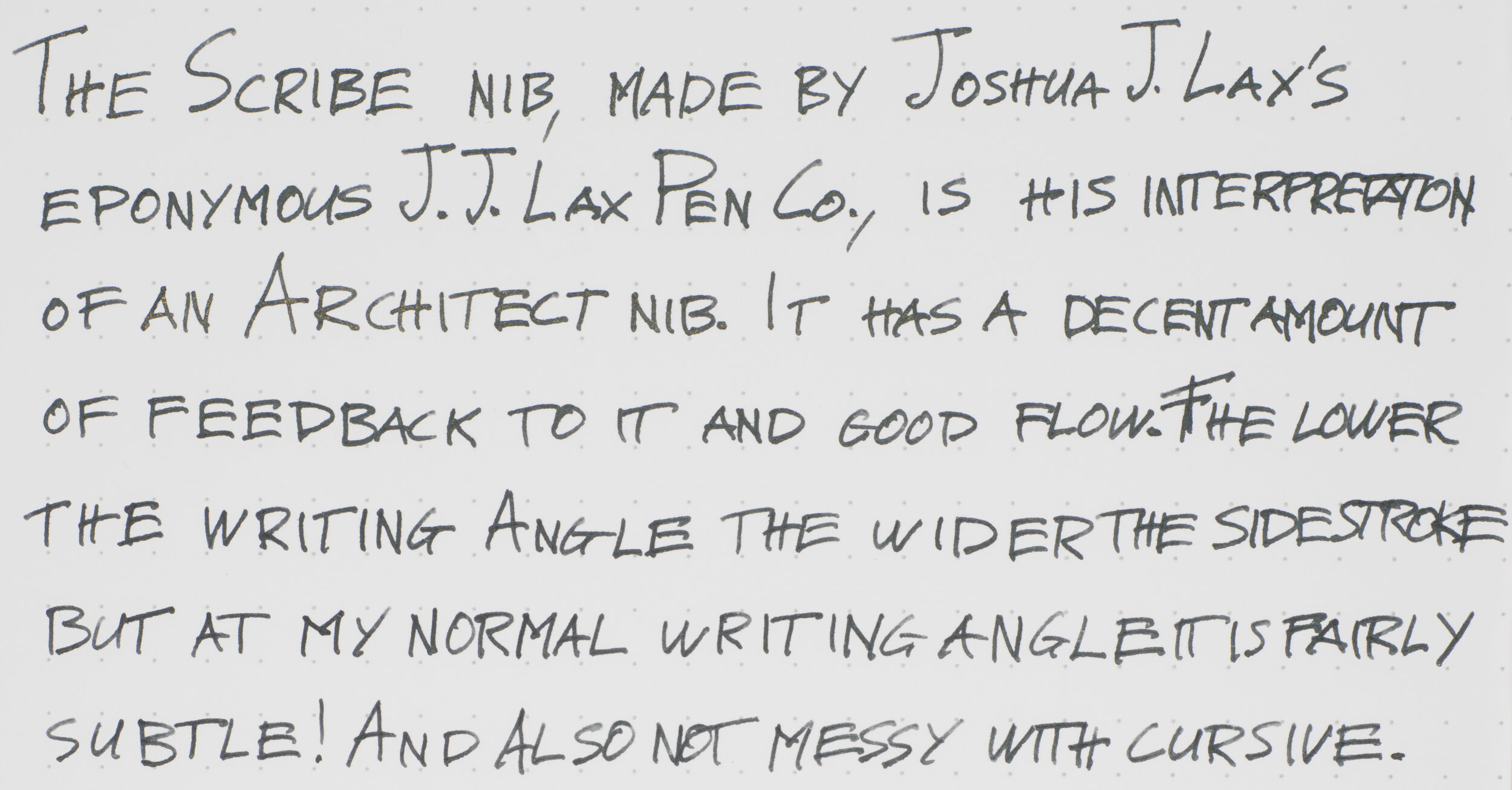
The Scribe nib! This is Esterbrook’s second collaboration with a nib grinder after The Journaler by Gena Salorino from Custom Nib Studio. The Scribe is made by Joshua J. Lax, Esq. of J. J. Lax Pen Co. a New York based nib grinder who has learned from Richard Binder. The Scribe is Joshua’s interpretation of an Architect-style nib grind (sometimes called Arabic or Hebrew as well). This nib grind is the complement to a stub or cursive italic grind with the fatter line being horizontal and the thinner line being on the down stroke (with the opposite happening with stubs and cursive italics). The Architect grind is so named because it works really well the the now somewhat outdated script often associated with Architecture. Because architects often collaborated, having a uniform and, importantly, consistently legible style of script was important and using all caps helped with this. The scrips was quite wide and often had a lot of side-ways strokes. And that is where this nib fits the bill for writing in this style well. It is no-longer necessary for architecture but it’s still a type of script that many people have adopted (outside or architecture). Brad Dowdy of Pen Addict uses a comparable all caps script. Architect nibs excel at print but where architect grinds often look clumsy is cursive.
As you can see from these close ups the nib shape is very different from many nibs and the opposite of the stub-like Journaler nib. While The Journaler is built from a Medium nib The Scribe is made from a Broad. In practice, at my normal writing angle (more on that below) I found that the line from the Scribe actually seems thinner than The Journaler.
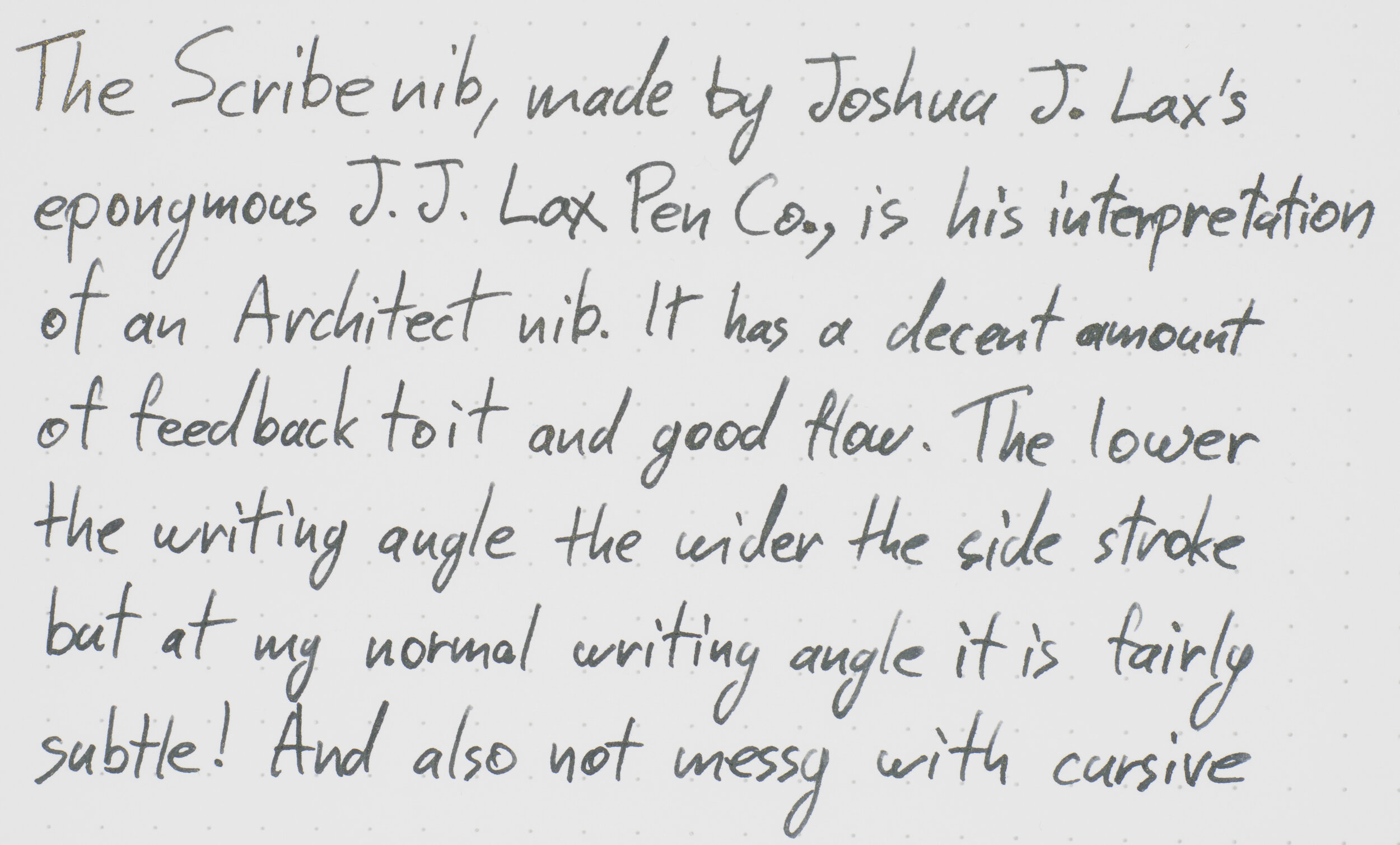
The nib itself is on the wet side of moderately wet. I wouldn’t call it a wet nib though but it does have good flow. It is fairly sharp and so you have a lot of feedback with the paper; more, I’d say, than The Journaler or Sailor nibs but comparable to something from Platinum. It isn’t scratchy but you do easily feel the paper.
As the pen is a black pen with gold accents (including in the material) I went with the OG shimmer ink, the first ink at really kicked up ‘storm’, J. Herbin Stormy Grey. I’ve never actually inked it before (I don’t think) but it was definitely a good match.
Here we can see the Scribe on the right compared with other nibs on the left. I have had an Architect nib custom ground for me in the past. It was a Platinum C (or double broad) that Dan Smith ground down into a brand architect. I wish I still had it for a comparison! From memory that custom grind had a more pronounced difference between horizontal and downward strokes with the down stroke being extra fine and the wide being extra broad.
The three lines for the Gold Rush are at progressively, moving downwards, lower writing angles.
The first is my normal writing angle, roughly 45 degrees from the flat paper. The second is around 35 degrees and the last is at roughly 20 degrees.
At roughly 45 degrees, my normal writing the nib only has subtle line variation. This was a bit of a surprise but I didn’t mind it and I believe this may have been done to make the nib more useable in different writing styles.
At 35 degrees the nib is definitely showing more line variation and the ‘architect’ characteristics are coming out quite noticeably now. The cursive is getting a little messy now. I have to hold the pen a little further back for this but I do know people who hold pens in this manner. This is my personal limit for comfort.
At 20 degrees I had trouble holding the pen. This is definitely more of a technical demonstration than a practical demonstration. The nib is at its fattest (and my writing at its messiest). The cursive looks quite clumsy here. Even the downward line is fatter now as well!
I mentioned above that architect nibs can look a bit clumsy in cursive and also that I believe this nib isn’t as extreme with it’s architecture mannerism at a more common writing angle because it allows for more writing flexibility. I think the cursive here is a good example of that. It isn’t necessarily conducive to the best cursive writing experience but it isn’t detrimental. The cursive looks mostly clean.
With standard print at the 45 degree angle the nib looks pretty standard with some subtle character to it.
When I lean into a loose architect style of all caps with a wide and horizontal emphasis the nib, at the 45 degree angle, is really starting to show its character. It’s still somewhat subtle but the wider horizontal strokes make the writing more stylistic.
At the 35 degree angle it is even more pronounced and stylistic. It really looks like an architecture nib at this angle with this style or writing.
The pen is fairly long when capped at over half a foot in length but this doesn’t translate into an oversized pen uncapped so it is the cap that adds to the length when capped. The section has some ergonomic width changes but they don’t represent much actual change; the section deviates between 1.1cm and 1.15cm. Even the threads are only 1.2cm. At 1.8cm long (2.3cm if you include the threads which aren’t uncomfortable to hold at all) the section is decently long.
The barrel is also fairly consistently 1.3cm wide until it starts to taper near the end. The cap, which is 6.9cm long, feels balanced wit the width of the the barrel at 1.5cm width for the barrel with the clip extending it to 1.7cm thick. The whole pen feels nicely balanced with nothing standing out as too long or thick to me.
| Pen | Capped | Uncapped |
|---|---|---|
| Esterbrook Estie | 15.3cm | 12.9cm |
| Pelikan M805 | 14.1cm | 12.7cm |
| Pilot Custom Heritage 91 | 13.6cm | 12.3cm |
| Sailor Pro Gear | 13cm | 11.6cm |
| TWSBI Eco | 14cm | 13.2cm |
| Lamy Safari | 14cm | 13cm |
| Lamy 2000 | 14cm | 12.5cm |
| Platinum Century #3776 | 14.1cm | 13.2cm |
| Montblanc 146 | 14.3cm | 13cm |
Capped the pen stands out over all the pens. Uncapped the pen becomes a normal full length pen. The Estie does post and that will bring the pen out to 16.9cm (4cm longer than unposed).
| WEIGHT | Capped | Uncapped |
|---|---|---|
| Esterbrook Etsie | 25.9g | 16.6g |
| Pelikan M805 | 29.4g | 20.9g. |
| Pilot Custom Heritage 91 | 18.5g | 11.5g |
| Sailor Pro Gear | 24.9g | 16.1g |
| TWSBI Eco | 20.8g | 12.3g |
| Lamy Safari | 20g | 11g |
| Lamy 2000 | 26g | 17.1g |
| Platinum Century #3776 | 25g | 14g |
| Montblanc 146 | 29.8g | 19.9g |
The pen is pretty average for weight; within a gram of a Sailor Pro Gear, Lamy 2000 and Platinum Century. Noticeably lighter than a Pelikan M805 or Montblanc 146 and noticeably heavier than a Lamy Safari or Pilot CH91. The cap is 9g but it doesn’t feel too back heavy when posted (interestingly, a Safari uncapped is only 11g! Shows how light that pen is that this cap is only 2g heavier).
Sparkly pens aren’t usually my thing. There have been some exceptions of that for me with some Sailor pens (not all!) and I was surprised to like this DiamondCast material as much as I do. I really like that you can’t see the particles that produce the sparkles but even so the sparkles are stronger than what some other pens produce! Very nice. The nib, I think, is an excellent interpretation of an all-rounder architect nib. It can work as an architect or as something more general. I write cursive, primarily, so the nib isn’t ideal for me but it’s different, interesting and fun. If you primarily print (especially if you write in all caps!) this would be a great nib for you I reckon!
The pen is definitely on the pricier side at US$350 from Esterbrook (and US$410 with the Scribe nib). In Australia at Desk Bandit the Gold Rush Pens are AU$455 with a Journaler nib which is an excellent Australian price! This is a step up from the regular Esties but there is the added cost of the material.
Thanks to Esterbrook and Desk Bandit for sending this pen all the way from New Jersey to Fremantle for review!
✒︎ ✑ ✒︎ ✑
Thanks for reading! If you have any questions, comments or suggestions please let me know in a via the comments, Instagram, or contact me directly.
You can find my ink collection here and my pen collection here. Is there something you’d like reviewed? Let me know!
For blog updated you can follow @macchiato_man on Twitter, subscribe via email, or like my Facebook page. Check out the sponsors of this blog as well!
I was not compensated for this review and everything here is my own honest opinion. There are no affiliate links in this review. I bought the Cobalt Blue Estie with my own money without a discount but everything else was sent to me for the purpose of an honest review. Esterbrook and Desk Bandit do sponsor the blog (although during the pandemic I have suspended any payments).










Leave a Reply