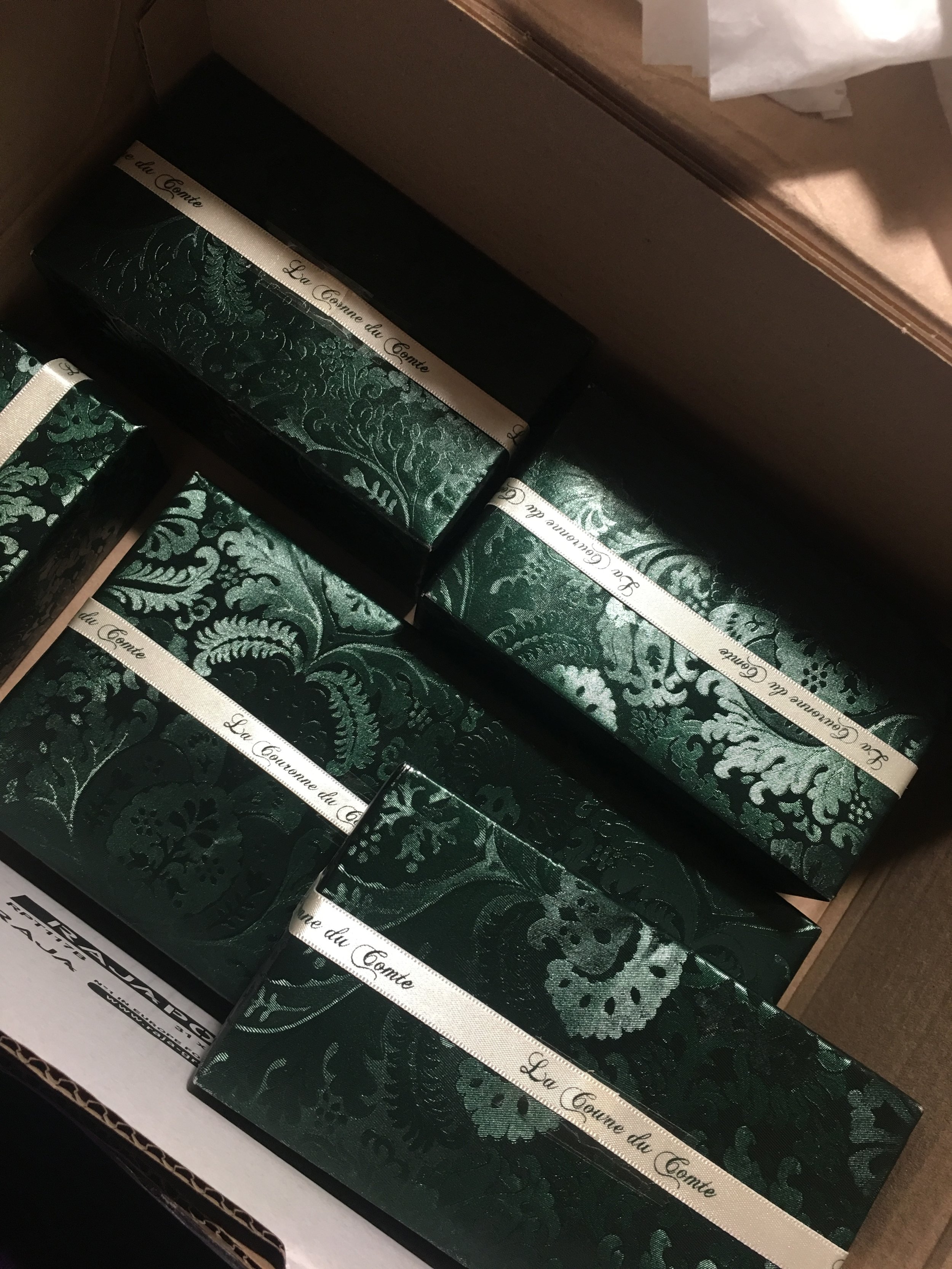
On July 31st last 2017 I reviewed the Nakaya Piccolo Writer Kuro-tamenuri. Twenty-eight days before that review was published I had ordered my own Nakaya. Ten months later it finally arrived; the Nakaya Decapod Writer Aka-tamenuri with a broad bi-colour nib. It’s been a long wait but I think it was worth it and having this one has made we consider another Nakaya purchase down the road. I bought the pen from La Couronne du Comte.
I’m going to be doing more pen reviews moving forward as well so if there are any requests from for a review from all my pens please let me know!
The Nakaya Decapod Writer Aka-tamenuri is a faceted pen with ten faces. It’s made of hard rubber (ebonite) and is covered with urushi or Japanese lacquer. Urushi is the sap of a tree related to the poison oak that that causes skin irritation when touched. Urushi craftsmen build up an immunity to the sap by repeated exposure. One tree produces just half a cup of sap per season and then requires a few years to recover before it can be harvested again. The lacquer is painted onto the ebonite base in various layers with the darker lacquer going over the red-coloured lacquer. Each layer taxes 24 hours do mostly cured (rather than “drying”) but the whole end product can take from months up to a year to fully cure. The red “Aka” urushi visible on the ridges is only visible because it has had the darker urushi that was layered atop the red polished away over months. The resulting pen is a light-weight pen that responds quickly to the warmth of your hand and has a hard and smooth finish with a lovely lustre.
Because of it’s surface it does attract fingerprints so I find myself polishing it with a cloth to get rid of these. The pen is thickest at the barrel and cap seam and tapers slightly in the cap and more so in the barrel with flat ends. the ridges of the facets are smooth and the pen is well balanced for me. The facets and how the pen tapers unique enough to stand out from other pens.
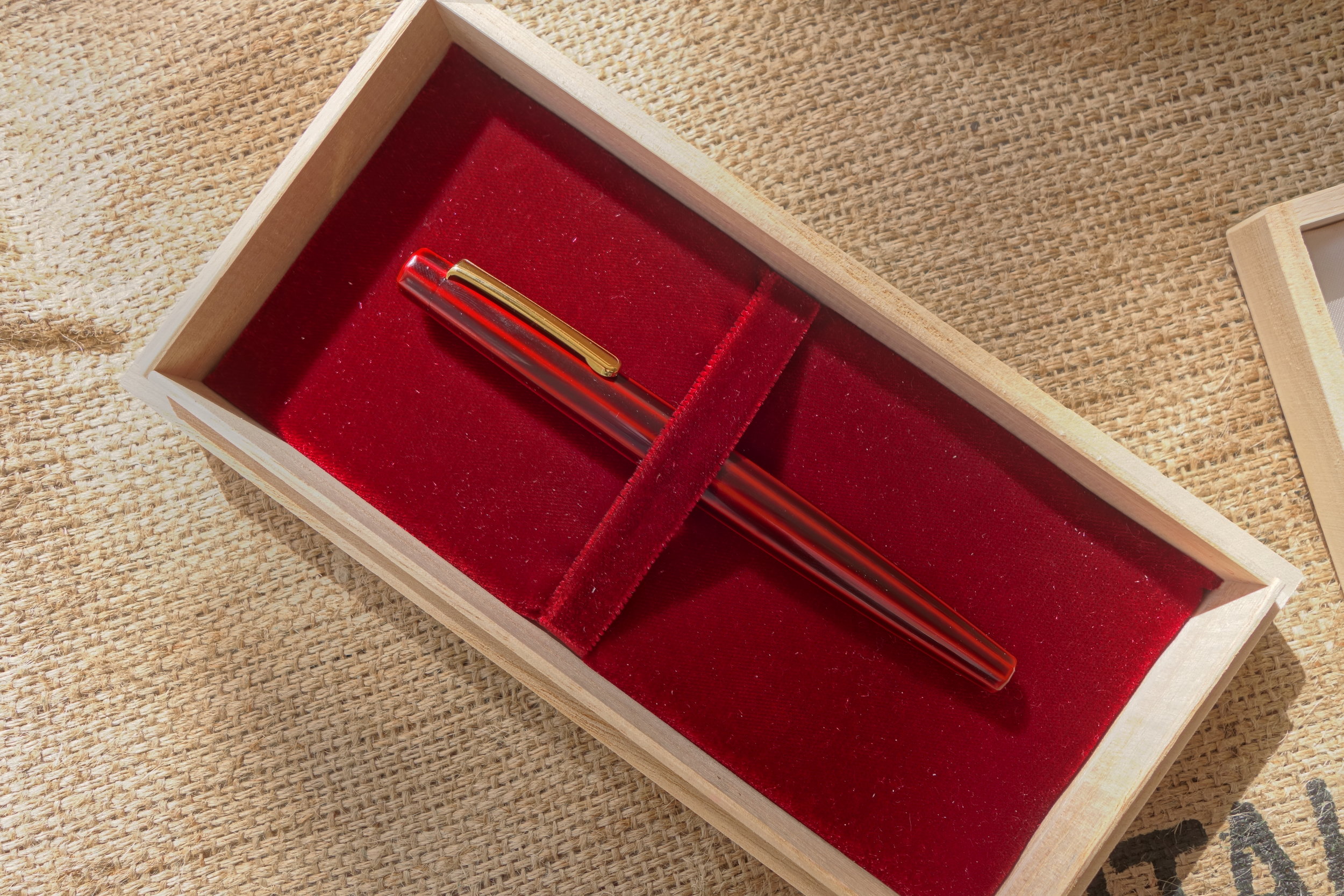
The pen, after unwrapping La Couronne du Comte’s delightful wrapping, is encased in a Paulownia wooden box with a soft fabric inner pillow. The wood box has “custom made fountain pen” and, below the Nakaya label, “made by Nakaya” printed on it along with a seal or inkan stamped onto the box. Outside that is an unadorned rough grain cardboard box.Inside the box is a 10pack of Pilot Blue-Black ink cartridges, the pen itself, and a pen kimono. The whole thing is rather simple and certainly doesn’t call too much attention to itself. Tastefully packaged and unlike most pen cases, especially coffins, this wooden box can easily be reused. Notably missing, however, is a converter! I spent quite a while deliberating over whether I wanted a maki-e converter. I decided against it’s something I’d rarely see but after my decision I didn’t then think whether there would even be a normal one included. I didn’t assume one way or another, I just forgot. Personally, I reckon a cartridge/converter pen at this price should include a converter. I took the converter this is currently using from my platinum.
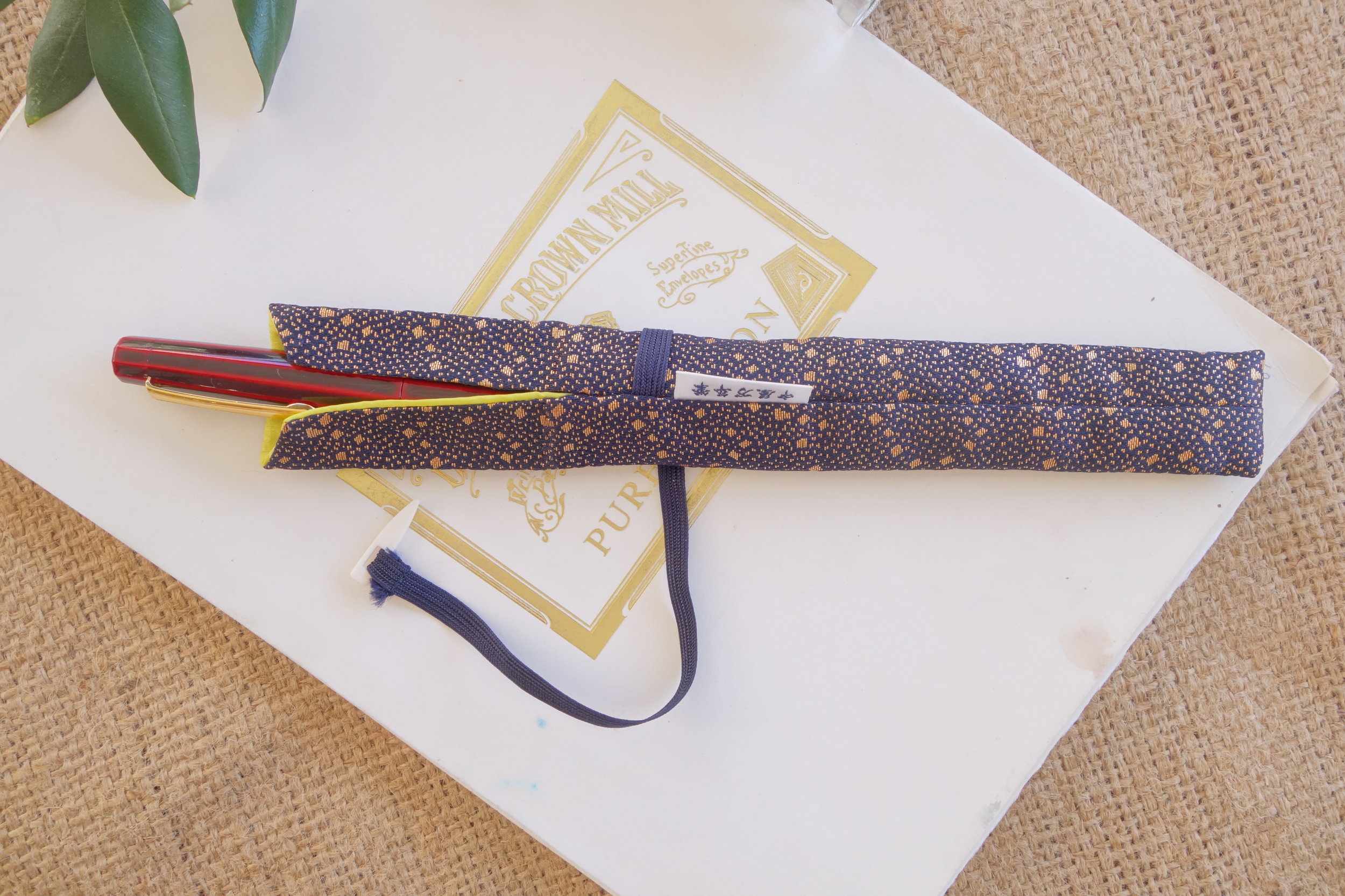
The Kimono is also tastefully done. Not too shiny and the pattern and colour work well. It wraps easily and the pseudo-bone hook secures it well enough. There isn’t any additional padding in it apart from the thick fabric on the outside and the rather thin fabric on the inside.
Some considerations with the pen that some might disagree with is that the facets of the barrel and the clip only align if they are screwed together from one of two points. To align the facets either the top of the nib or the bottom of the feed need to align with the clip. If the nib is side-on to the clip the facets won’t align. Personally, while I do try to align the facets, it doesn’t bother me if they aren’t aligned and it is fairly easy to align them once you know the pattern. Nakaya does address this on their product page in somewhat broken English, however, so this shouldn’t be a surprise to prospective buyers
“As you know, the screw of Nakaya cap has four entrance in order to close a cap promptly. On the other hand, Nakaya designs 10 aspects of a cap and a barrel of theDecapod model are flat when you close a cap. You can make the same aspect by only one enterance of screw. (For sealing the nib, this is no problems by using all of these four entrance of the screw. )”
The seam in the cap is a little distracting. Not because the seem is there (seems don’t bother me) but because striations and facets aren’t aligned on either side of the seam. This is my only gripe with the pen.
The nib cost an extra €66 to get it bi-colour and that is quite a lot for a mere cosmetic different (and factored into why I decided against a maki-e converter). I’m really glad I did though. While a solid coloured nib is still nice, and I certainly considered a rose-gold nib for a time, I love bi-colour or two-tone nibs and this is certainly no exception. Really lovely design and great contrast between the gold and the (I assume) rhodium. The shape of the nib is still the Platinum shape but the bi-colour really sets it apart. I wanted something a little more special and I got it.
The nib itself is a broad nib and very stiff; noticeably stiffer than the Platinums I have. I wanted something fatter than a Japanese medium nib but I also wanted something that I could use in most circumstances as I wanted to use this pen a lot. For me this is the perfect sized nib for that. Some width to show off the ink but not too fat as to be unable to use in a hobonichi. This is of course quite subjective but for my purposes it works well. I have made adjustments to this nib to make it wetter. It wrote perfectly fine off the pens own wait (that is without me pressing at all) so that’s a good test of the nib’s proficiency but it still wasn’t putting down as much ink as I wanted. I used SBRE Brown’s method (using a brass shim to pull the nib outwards; this did misalign the nib but that’s an easy fix) and I’m delighted with the results. It’s juicy now but not crazily so but I should stress that the nib worked well before I made my adjustments and my reasoning was purely subjective.
I was surprised by how smoothly this nib writes. It almost feels like a Pelikan nib; a very glossy buttery feel over the paper. Compared to a Platinum or a Sailor it doesn’t have the trademark feedback that these Platinum or Sailor usually have. I’m a fan of both pens with some feedback and super smooth so I would have been happy either way.
The section of my pen is all ebonite. I much prefer this to some Nakayas that have metal threads on the section. The urushi covered ebonite both looks great but also, I imagine, isn’t as sharp. The section is comfortable to hold either close to the nib (the ridge is rather smooth) or back over the threads which aren’t at all sharp. The threads are very secure, possibly even too secure. The cap is very tight when the facets are are lined up. This means the cap isn’t going to come loose but it’s also a bit of a tug to open it. I wouldn’t find this an issue at all were it not for that it’s so easy to use the clip as a grip to open the cap and I feel if this were done repetitively it could make the clip loose. This is just a suspicion, mind you, but I do make sure I open the cap without putting force on the clip.
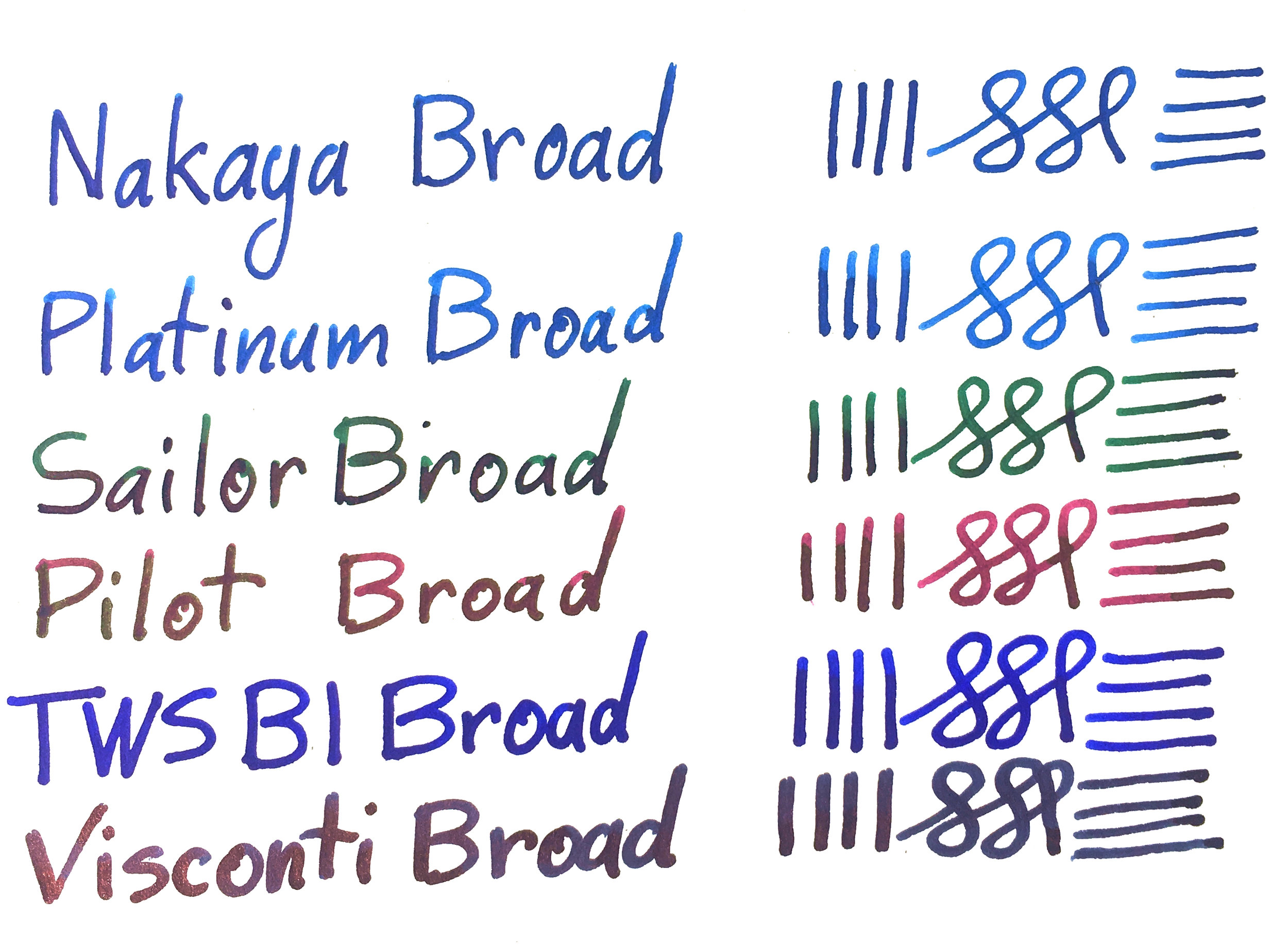
Over Tomoe River paper to avoid any feathering or spread, the Nakaya Broad (inked with Bungubox Sapphire) is the thinnest of the Japanese broads. The Sailor (inked with Ink Institute Cut Jade) is a little wider, the Platinum (Bungubox Sapphire again) is wider still and the Pilot (inked with Pen Land Cafe Red Quill) is even broader. The TWSBI is rather fat (with Noodler’s Baystate Blue) but the Palladium Visconti (inked with Kobe #07 Kaikyo Blue) is almost twice the width of the Nakaya. I measure the Nakaya Broad nib at 0.6mm and the Visconti Broad at 1.1mm. I’ll note that while I made the pen write wetter the line width didn’t vary any that I could tell. For a more detailed comparison between a Platinum medium nib and a Nakaya medium nib there is a decent portion of the Piccolo Writer review that is about this.
I love flat ended pens. I will always pick a Sailor Pro Gear over a Profit/1911. Flat ends are what work for me so they work for me here too. The flat finials on this pen of a slight circular gradient of a darker red in the centre moving to a red on the edges. The pen is quite a long pen but maintains a fine profile. I love roll stops as I never really clip pens but for this pen with all it’s straight lines I think a clip works nicely. There is a lovely curve of the barrel and the cap into the seam between them. The gradients between red and dark red aren’t perfect but are very consistent and the slight imperfections highlight the more hand-made qualities of the pen. The gradients are soft but short and beautiful.
The pen disassembles (at it’s most basic) in a straight-forward fashion. There is metal in the section where there barrel screws in where the converter fits in. The pen takes platinum converters and cartridges but there is also an adapter that allows for standard international converters and cartridges to fit. I don’t have this so can’t comment on it’s efficacy.
I don’t mind the pen being a cartridge/converter pen. I like interesting filling mechanisms but honestly this is easier. It’s quick and easy to clean with a bulb syringe and I often only partially fill my pens (so I can rotate inks quicker) so the extra ml in a piston or other mechanism is often lost on me. Platinum converters can be a little stiff but this one isn’t so no issues there either (with this specifically).
This pen is quite long at 150mm. It’s longer than an full sized OMAS Paragon. It’s quite slender as well, however with a maximum diameter of 14.5mm tapering at the barrel end to only 9.1mm. Uncapped it doesn’t stand out as much but it’s still on the longer side at 130mm. The section isn’t thin nor thick at between 10mm and 11.5mm.
The pen feels light but as you can see is no lighter, in any meaningful way, to comparable pens. I imagine the very middle balance point of the pen (when uncapped) contributes to it feeling lighter than it looks.
| Capped | Uncapped | ||
|---|---|---|---|
| Nakaya Decapod Writer | 25.5g/0.89oz | 16.8g/0.59oz | |
| Lamy Safari | 20g/0.70oz | 11g/0.39oz | |
| Platinum Century #3776 | 25g/0.88oz | 14g/0.49oz | |
| Sailor Pro Gear | 24g/0.84oz | 15g/0.53oz |
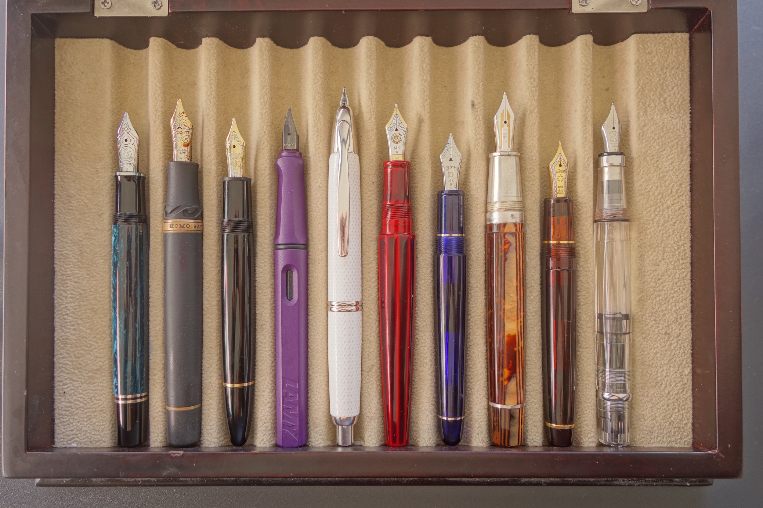
Left to right: Pelikan M805 “Ocean Swirl”, Visconti Homo sapiens “Bronze Age”, Montblanc 146, Lamy Safari “Dark Lilac”, Pilot Vanishing Point “White Carbonesque”, Nakaya Decapod Writer “Aka-tamenuri”, Platinum Century #3776 “Chartres Blue”, OMAS Paragon Arte Italiana “Arco Brown”, Sailor Pro Gear (Wancher exclusive) “Mocha”, and TWSBI Diamond 580.
Left to right: Pelikan M805 “Ocean Swirl”, Visconti Homo sapiens “Bronze Age”, Montblanc 146, Lamy Safari “Dark Lilac”, Pilot Vanishing Point “White Carbonesque”, Nakaya Decapod Writer “Aka-tamenuri”, Platinum Century #3776 “Chartres Blue”, OMAS Paragon Arte Italiana “Arco Brown”, Sailor Pro Gear (Wancher exclusive) “Mocha”, and TWSBI Diamond 580.
Capped it stands out as being comparable to the OMAS but uncapped the pen stands alongside other pens such as the TWSBI Diamond 580 and the Lamy Safari.
Was the 10 month wait worth it? For me, yes. For the impatient hype that builds up when waiting to be met easily makes the wait worth it. Again, this is somewhat subjective but I’m glad I bought the pen and I have no issue with waiting. The whole experience has made me want another (and I have my eyes on the broken-looking Nakaya Negoro – Nuno Kise Hon Kataji). It’s also showed me that waiting is fine so it’s also opened me up to custom built pens that can also take many months to complete.
The pen isn’t perfect; the seam on the clip bothers me very slightly and others might be bothered by the lack of a converter or the facets not always lining up but it reminds me of a quote from the Frasier TV show:
Niles: It was an exquisite meal, marred only by the lack of even one outstanding cognac on their carte de digestif.
Frasier: Yes, but think of it this way,
Niles: what is the one thing better than an exquisite meal? An exquisite meal with one tiny flaw we can pick at all night.
The issue I have with this pen is minor but what I love about this pen is everything else. Great writing experience, beautiful design, and comfortable to hold. It’s everything I want in a pen!
I’ve listed all my inks and all my pens in their respective pages. Please let me know which inks you’d like to review next via the comments, Twitter, Instagram, or contact me directly.
You can follow @macchiato_man on Twitter for blog updates.
I was not compensated for this review and everything here is my own honest opinion. There are no affiliate links.










Leave a Reply