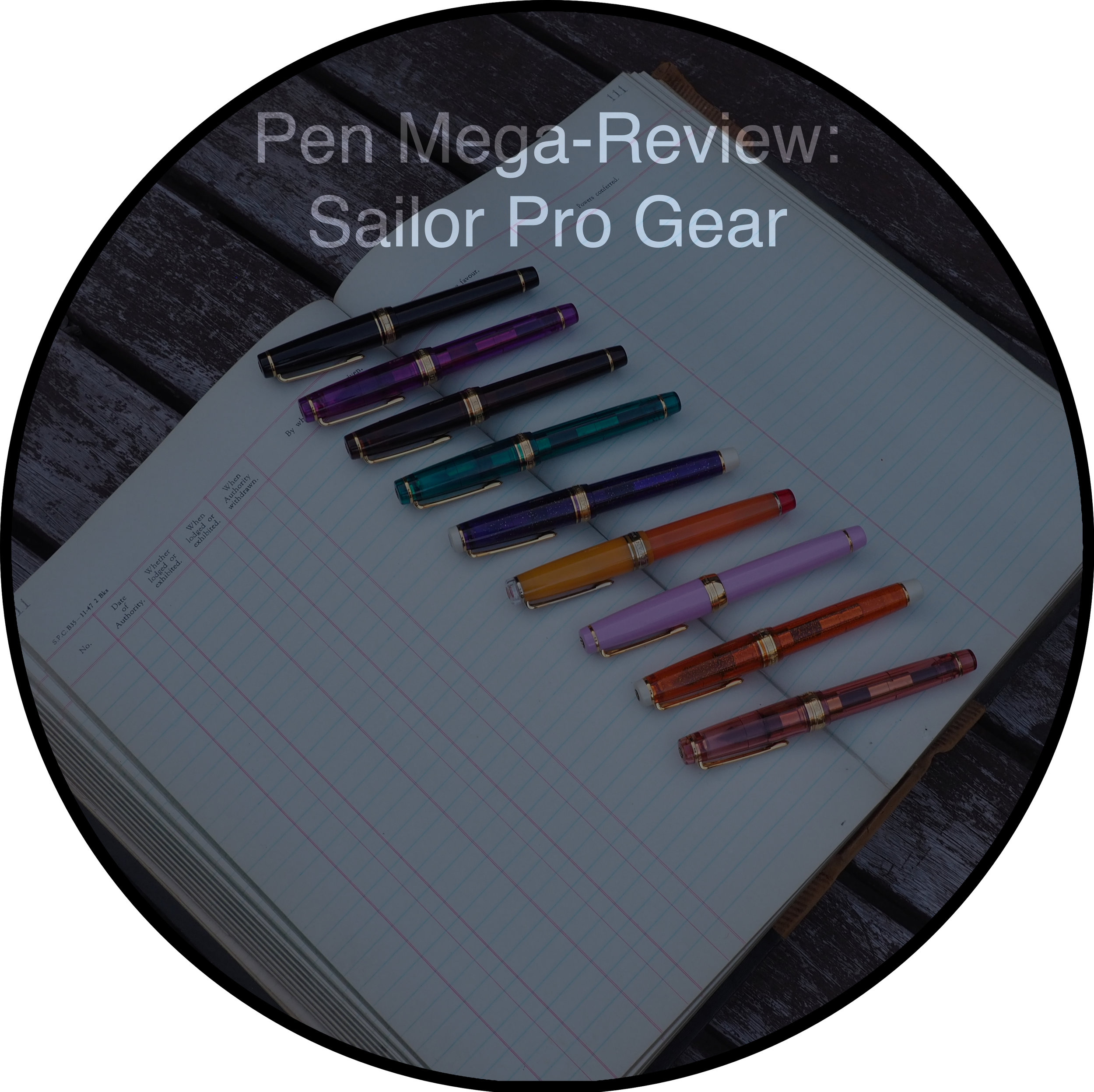
Why is this a mega-review? Because it’s not about a single Sailor Pro Gear; it’s about the model. I’ve got several Pro Gears, myself, and I’ve borrowed some from a friend who also collects Sailor Pro Gears. While this is predominately about the full size Sailor Pro Gear, I’ve got some slims, some interesting nibs, a Realo, and exclusive, limited, and standard line pens. I don’t really see the point of doing a full review of a pen just because it has a different finish or material or colour but I wanted to show off a bunch of Sailor Pro Gears. That is why this is a Sailor Pro Gear Mega-Review!
This is a somewhat personal review for me as these pens are what I love to collect so I think an important opening questions is why do I collect Sailor Fountain Pens? There are a few reasons, some practical and some more aesthetic, and others more for the fun of it.
Two practical reasons are that full sized Sailor Pro Gears are the perfect size and weight for me and that they have good consistent flow out of the box every time. As for size and weight I find them very comfortable to hold and write with for short periods and longer sessions. They are a shorter pen but that’s fine for me but I do like how thicker the section is (not too thin and not too fat but just right… for me). It’s a lighter pen as well which helps for me with longer writing sessions; heavier pens I tend to get a little hand fatigue from when writing for a while.
Why not the Pro Gear Slim? Well while it is a touch too slim and too light for me but the main reason is I made an arbitrary decision to only purchase Pro Gears and not Pro Gear Slims. There are so many pretty Sailors being released that temptations would be higher if I allowed both pens! Plus the Slims are often a lot cheaper so it’s also easy to throw caution to the wind and just add one to the cart. The full size are pricier so you have to really think before making a decision to buy (not that I followed this all the time).
I find Sailor’s nibs to be quite consistent, in terms of feel and in terms of the written line width. They aren’t perfect all the time but I find them more consistent than other brands, even other Japanese brands. I can fix nibs that have minor issues (a foot, misalignment, baby’s bottom, etc.) on the rare occasion that the nib doesn’t write the way I like I’m confident to adjust it myself. I’ve had to do this a lot less than with Sailor than other brands. Where I really give Sailor lead is with flow. I have never had a flow issue from Sailor. I’ve had flow issues from other brands not-infrequently and flow issues can be more annoying to fix than nib issues. I highly rate Sailor’s flow consistency.
As for aesthetics, I love the bi-colour nibs (both silver on gold or gold on silver), I love the colours of the pens, I especially love the various colour schemes some of the pens have (with different colours for different sections of the pen). Not all of them work for me but I do like a lot of them. The sparkles in the materials are well chosen. Sometimes they are subtle sometimes more overt.
As for the fun of it, it’s fun to chase down these Japanese exclusive pens. Which is also partly the reason that the easier to get Sailors don’t interest me as much. It’s fun tracking them down, and working out how to buy them. It’s not always easy (or practical or possible) but I find it fun. Sailor also make so many new pens every year that one thing I’ve told myself is that I don’t need to worry about FOMO. I’m not missing out because there will always be another pretty Sailor that I will covet around the corner even if I don’t get this one!
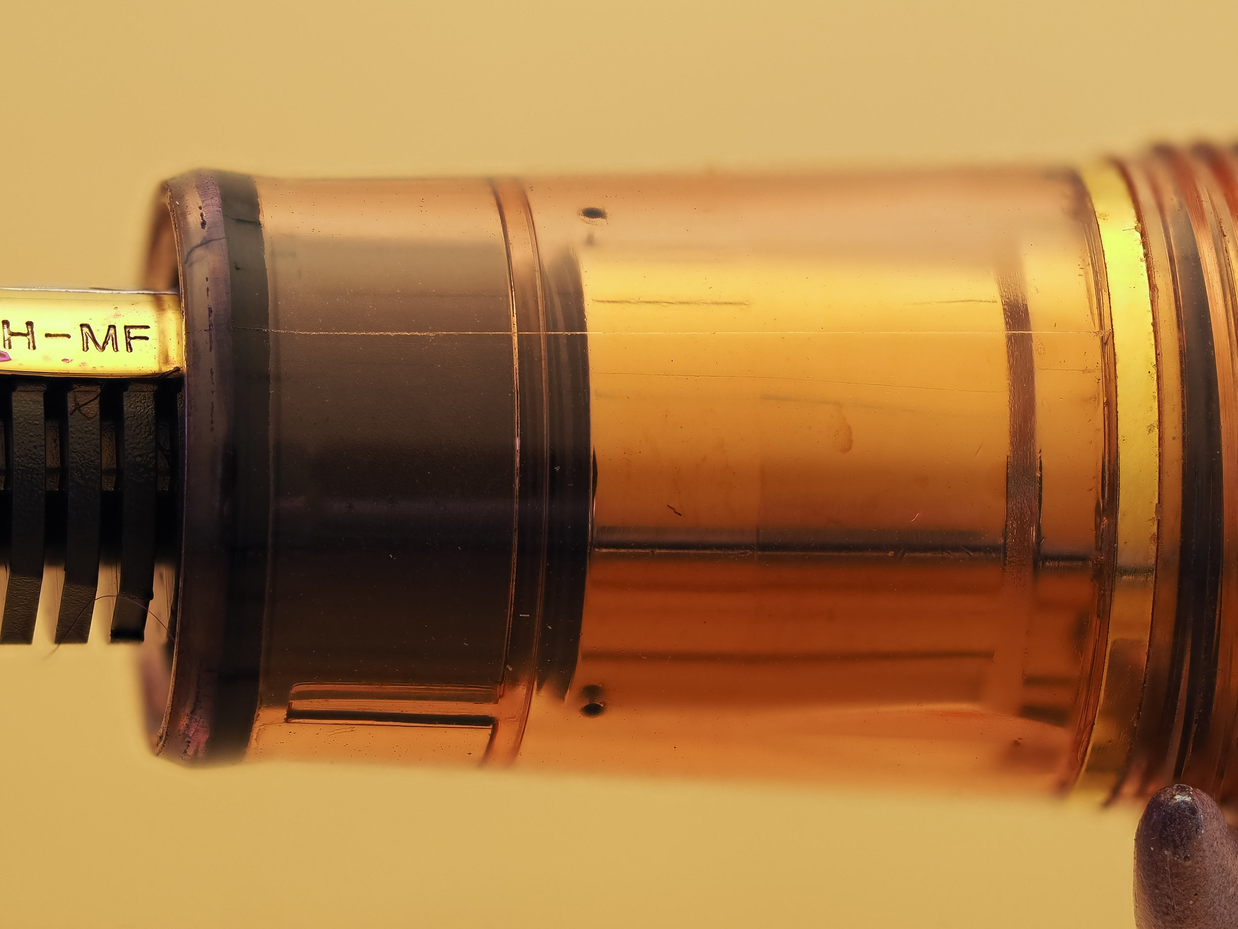
Because of the above reasons I am willing to look past the fact that the pen’s value based on components isn’t that high. It’s a converter/cartridge pen with injection moulded plastic (where you can see and sometimes feel the seams) that sometimes doesn’t even come with a converter! The nib is 21k gold (which is very high) but the nib are always quite firm so the high karat gold isn’t really as much of a benefit. That said, I find C/C pens easier to clean and suit how I like filling pens with only a quarter to half a fill before moving onto the next ink. Some of these pens cost AU$550 or around US$400 which is quite high but give everything I love about the pens and collecting them, they do have a high value to me even if the component cost (21k nib notwithstanding) might not be that high.
Wordy time over, let’s look at some photos and some different pens.
This is my collection. It was pretty small at the start of the 2018 but it… has grown by 333% last year. Yikes. The whole collection has gold trim which makes sense because I generally prefer gold but I do also prefer the rhodium-based bicolour nib over the gold-based. I really need some rhodium trimmed Pro Gears! This year!
My first Pro Gear (not my first Sailor) was a broad nib black with gold trim. Pretty much the most generic pro gear you could buy. Nothing much to say about this as it’s fairly boring. I am planning to have this sent off to get a Cursive Italic ground into the nib. Should make the pen more interesting.
My first interesting purchase for a Pro Gear was the Wancher exclusive ‘Wisteria’ model. I do quite like this colour but the actual colour depends a lot on the colour of the light hitting it. In the sun’s yellow light the pen is quite magenta but in an indoor bluer light the pen leans more purple. I much prefer the purpler colour but I still like the magenta. This one is a medium nib, one of three.
After that I went purchased, second hand, the ‘Mocha’ Wancher Pro Gear in a fine nib (not my first choice but I’m now glad it is a fine because I do want one of every sailor nib). It was at this point I realised that the whole Wancher collection was looking interesting. The Mocha is a translucent dark brown that looks somewhat black unless the lighting is good.
Another second hand purchase and the first for last year, this time ‘as new’ and unused, is the Wancher Maldives in Medium Fine. This pen is quite difficult to photograph as every camera I have had (iPhone, Sony, Olympus) makes the teal colour decidedly more blue than green. It has a decent amount of green in it and more than the Aqua Blue Wancher which a friend has.
Moving forward, and this was actually bought when I traveled to Japan. From a tiny pen shop called PenPoint at the start of the hills at the edge of Tokyo I purchased this stunning brand nibbed purple pen called Ayame. For me it’s the perfect purple. Not too red and not too blue. Nice gold sparkles and a custom designed nib. Still one of my favourites. The cream finials balance the body and cap colour very well.
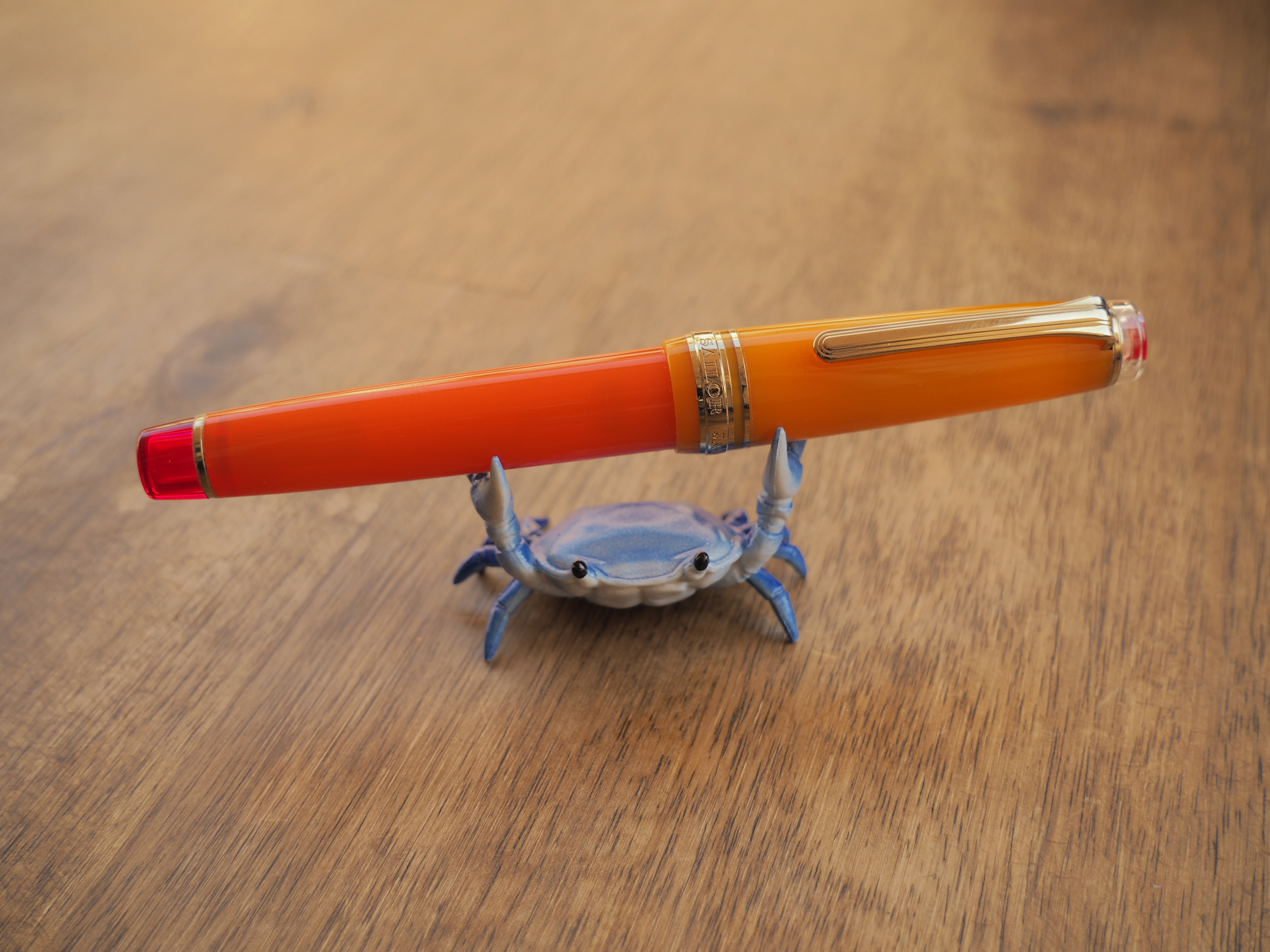
Shortly after I got back the Tequila Sunrise was announced. I loved this pen from first sight and needed it! With some friends we bought our models and it was well worth it. I love that every part – the section, body, cap, and both finials are all all a different colour but each colour still makes sense (it seems to also match photos of the cocktail but I don’t drink so I have no idea in reality!). This pen also has a green-gold trim as opposed to the normal yellow-gold. My speculation is that yellow-gold would be too much with the red orange and yellow colours of the pen. This was my second Medium nib.
Two days later after receiving the Tequila Sunrise I received the Nagasawa Hydrangia Pro Gear from Desk Bandit which was quite a coup from them to get. I chose the Hydrangia over the Rokko Shichidank because I already had two purple pens and the Hydrangia was an interesting pink in that it had a slight tint of blue in it. This is my only pen with a single-band on the cap; I have to say I prefer the more common double band pens. The pen, another Medium, also has the very pretty Nagasawa designed custom nib of a cock (rooster) etched into it.
None of the pens I had were numbered limited editions. That changed with the Mita Club Tataranuma no yuyake | ‘Sunset of Tataranuma’ orange pro gear. I managed to get 11/50 (etched right shoulder of the nib) and when I purchased mine there was only three left. This is another Medium Fine. This pen look great next to the PenPoint Ayame with both having the cream finials.
The second last pen for the year was the Wancher (again) Hawaiian Ripe. I love this pen from the get go but I didn’t pull the trigger. It a good match for me though, I love coffee and this is inspired by a ripe coffee bean (presumably one from Hawaii). It’s a love rose gold pen. For a third time, this was second hand and also a medium fine nib.
Finally, the last pen for 2018 was the new Nagasawa Kounan Maroon. My second Nagasawa pen, this one with a cool maroon cap, a translucent richer maroon body and off-white ends. Again the same broad single cap band that the Hydrangea has. Differently from the Mita Club Tataranuma no yuyake which had the limited edition number etched into the nib as “11/50” this has it on the cap band and it reads “No.96” out of 100 made. Where this is unusual for me, is that it is my first Extra-Fine! I don’t plan on getting any more extra fines as they generally aren’t for me. This will get lots of good use on my Hobonichis, however. This is a very nice wet EF with quality feedback.
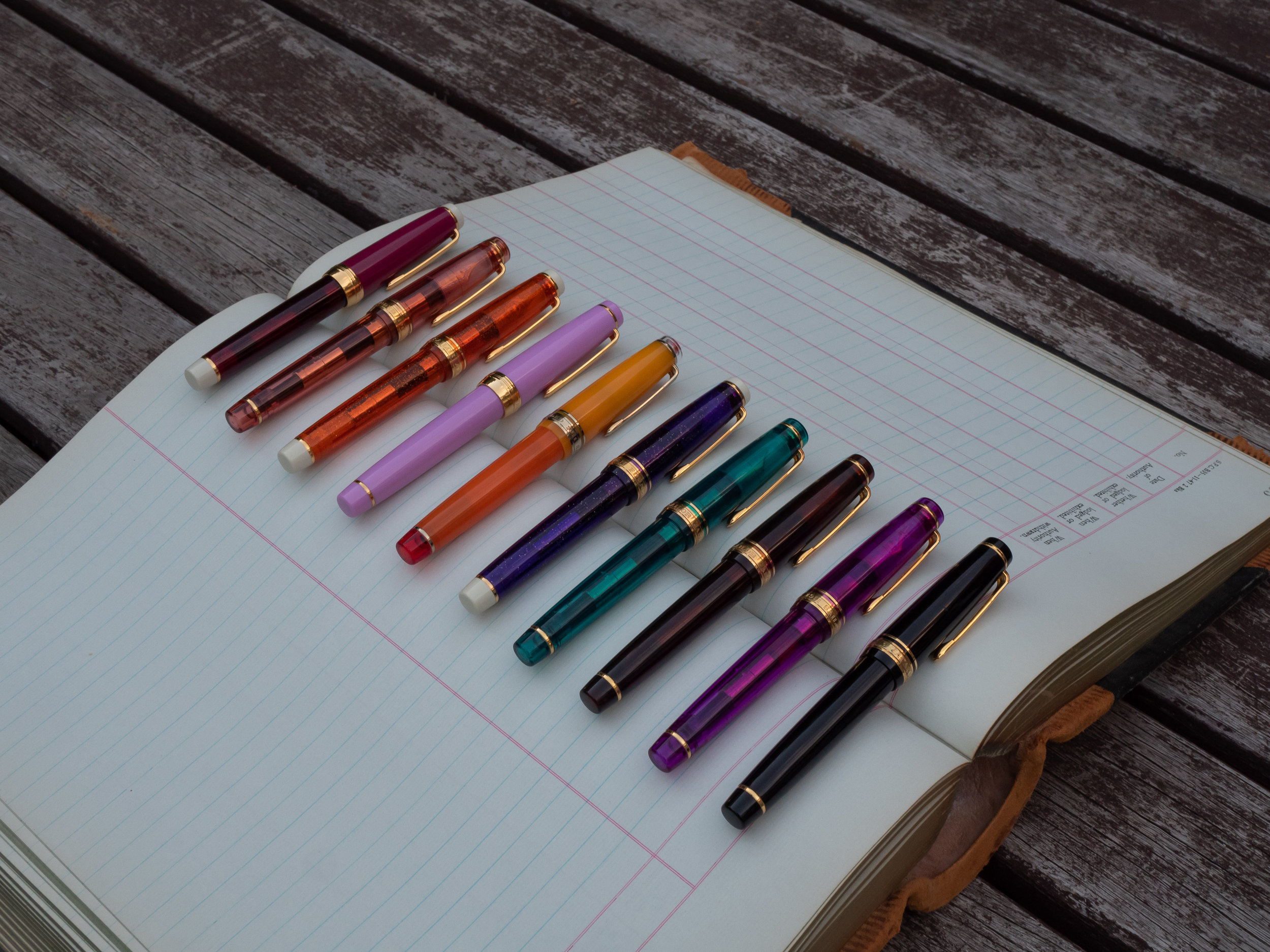
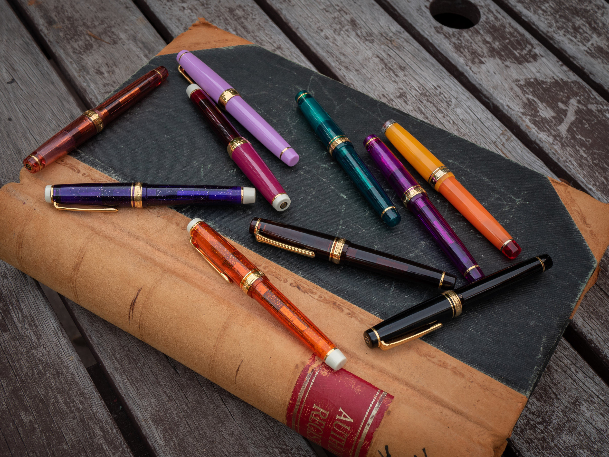
Moving onto some other pens, these are pens I have borrowed from some friends. There are three of us that collect Pro Gears (and nearly exclusively full sized these days). This is the latest of our full sailor collections combined. It’s pretty impressive if I do say so myself!
This Joyful-2 Aria was bought by me second hand from Kingdom Note in Tokyo but the pen wasn’t for me, it was for my good friend Justine. I don’t know much about this pen but I borrowed it from Justine because I wanted a rhodium-trim pen and also an extra-fine nib. It also has the single-band on the cap in rhodium as opposed to yellow-gold.
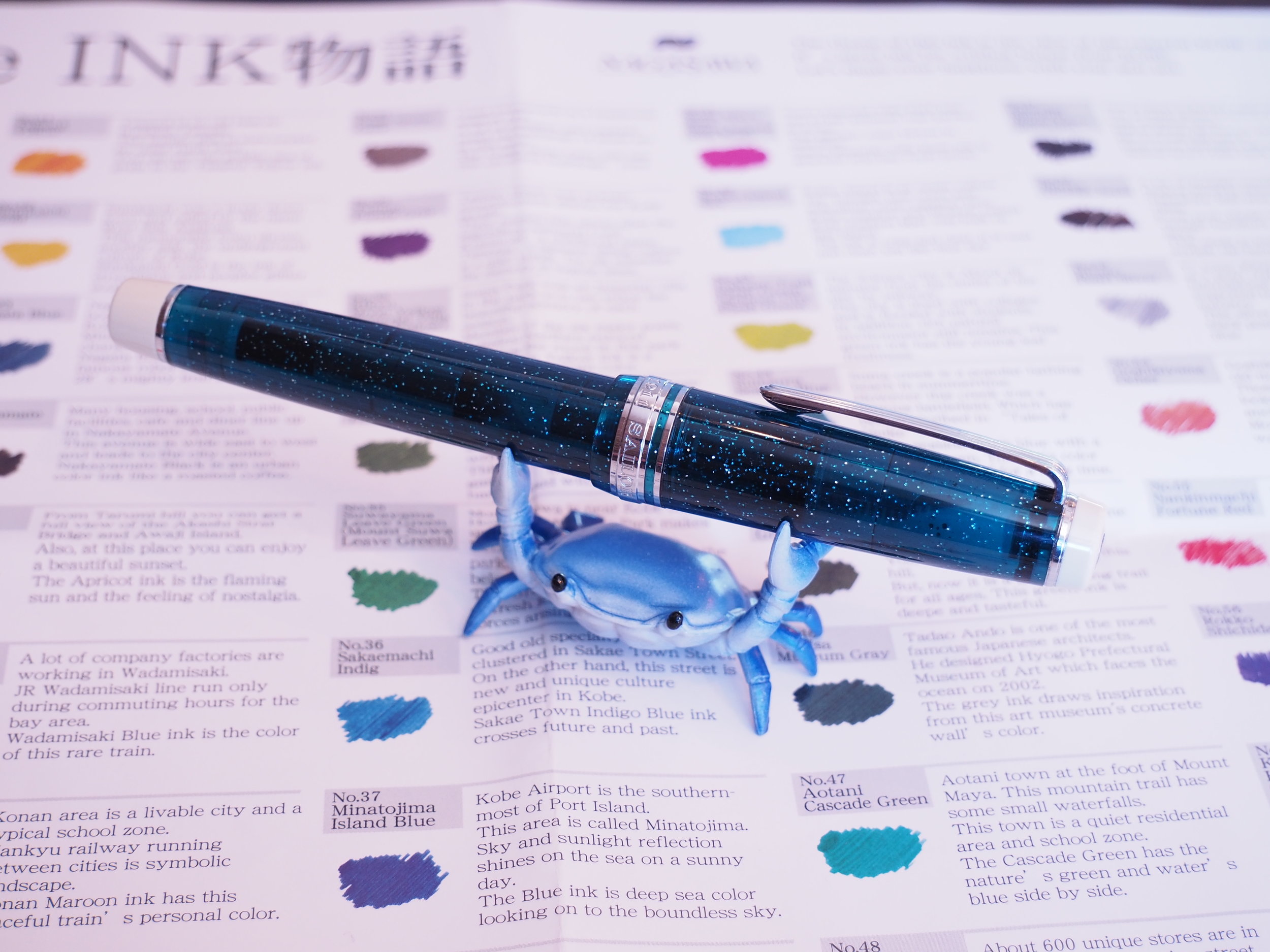
This Mita Club Shooting Star of Jonuma was borrowed from another friend. It’s less transparent than my own Mita Club (which his orange) and I believe the green Mita Club is even less transparent! A beautiful teal colour but it shows how the transparency level is different between similar pens.
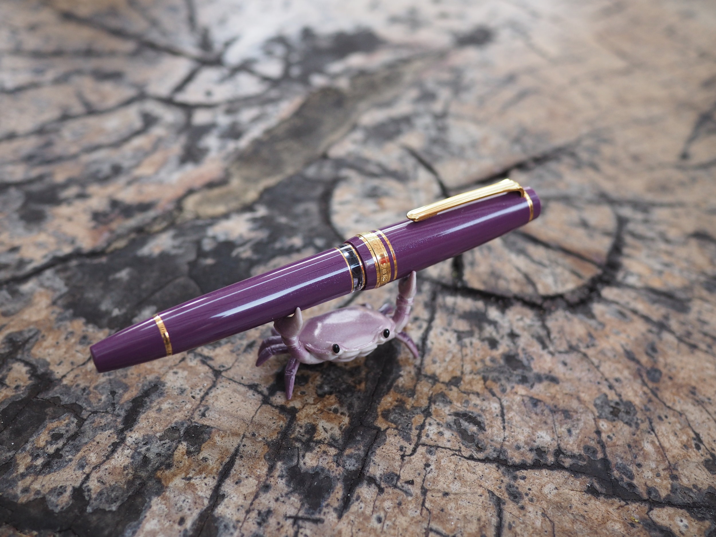
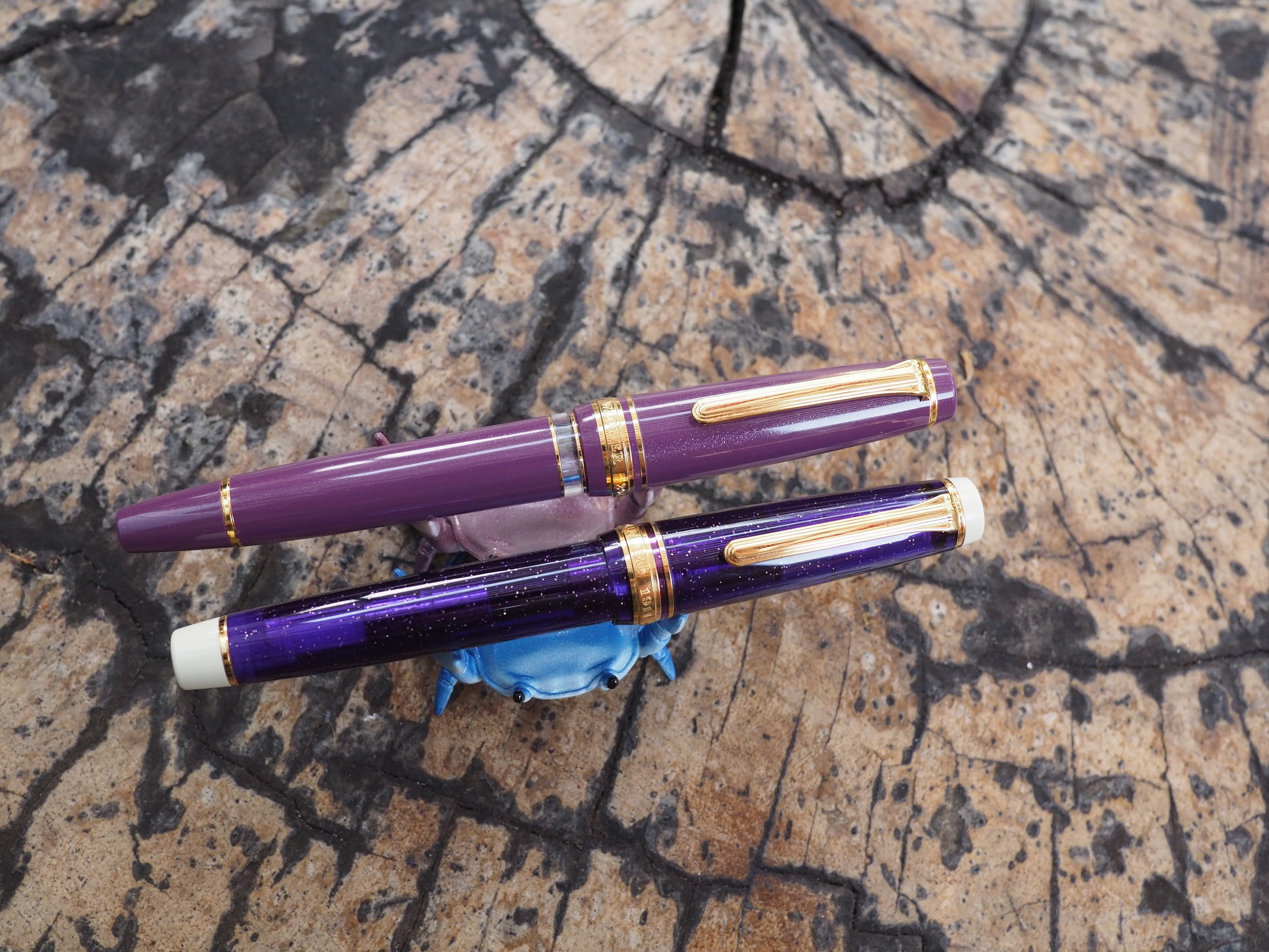
Justine also found this second hand Sailor Pro Gear Realo commissioned by the Wagner pen club. I know essentially nothing about this club (but I’d love to know how to commission a pen from Sailor for the benefit of my own Sailor “club”). The pen is purple with gold trim and I borrowed this pen for two reasons: firstly due to it being a Realo and secondly because it has a Music Nib. I have my own but it is on a slim 1911. Because the pen is a Realo it is a piston filler, has an ink window, and different dimensions.
The last of the borrowed pens from Justine is this pink and green Pro Gear Slim is called Senbonzakura from Nara KA-KU. Lovely colours! This pen, like my orange Mita Club Tataranuma no yuyake is the 11th numbered pen, this time out of 88. The main reason for this pen was simply to have a Pro Gear Slim to compare to as I don’t have one myself.
The Nibs
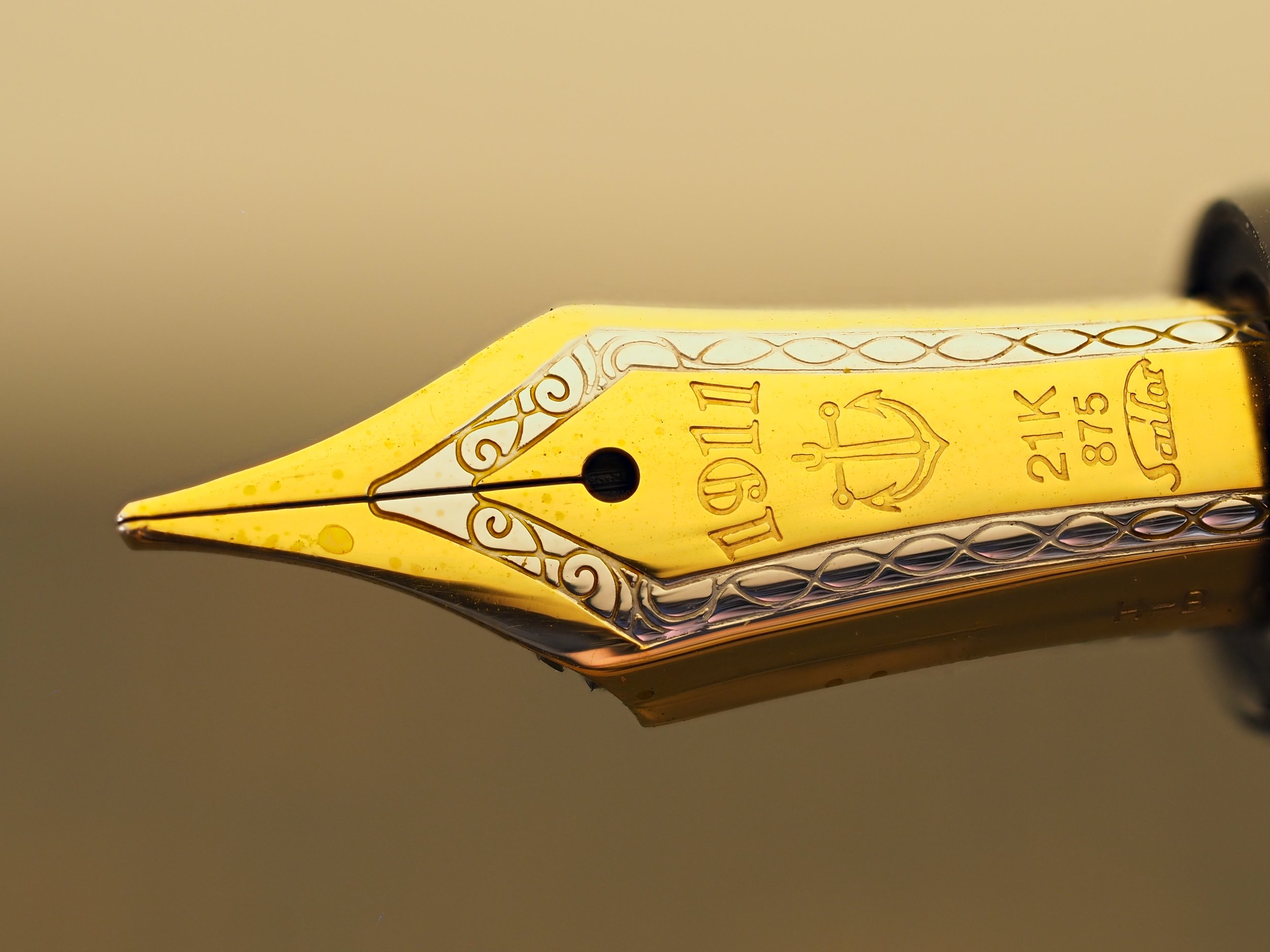
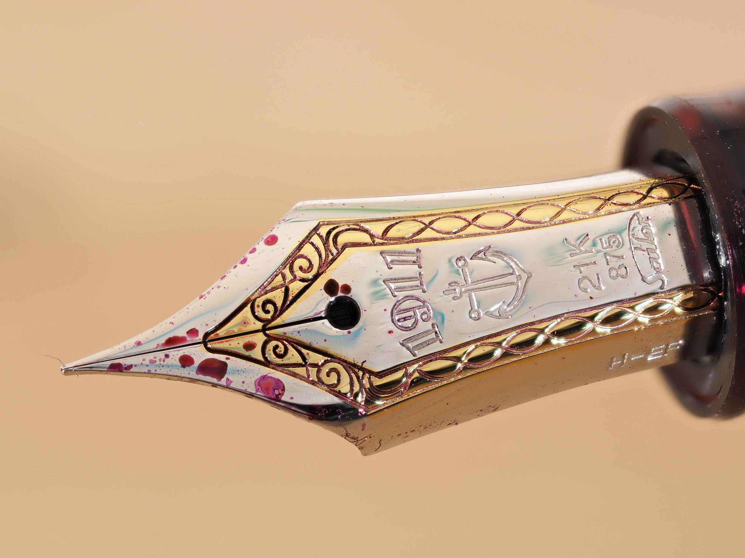
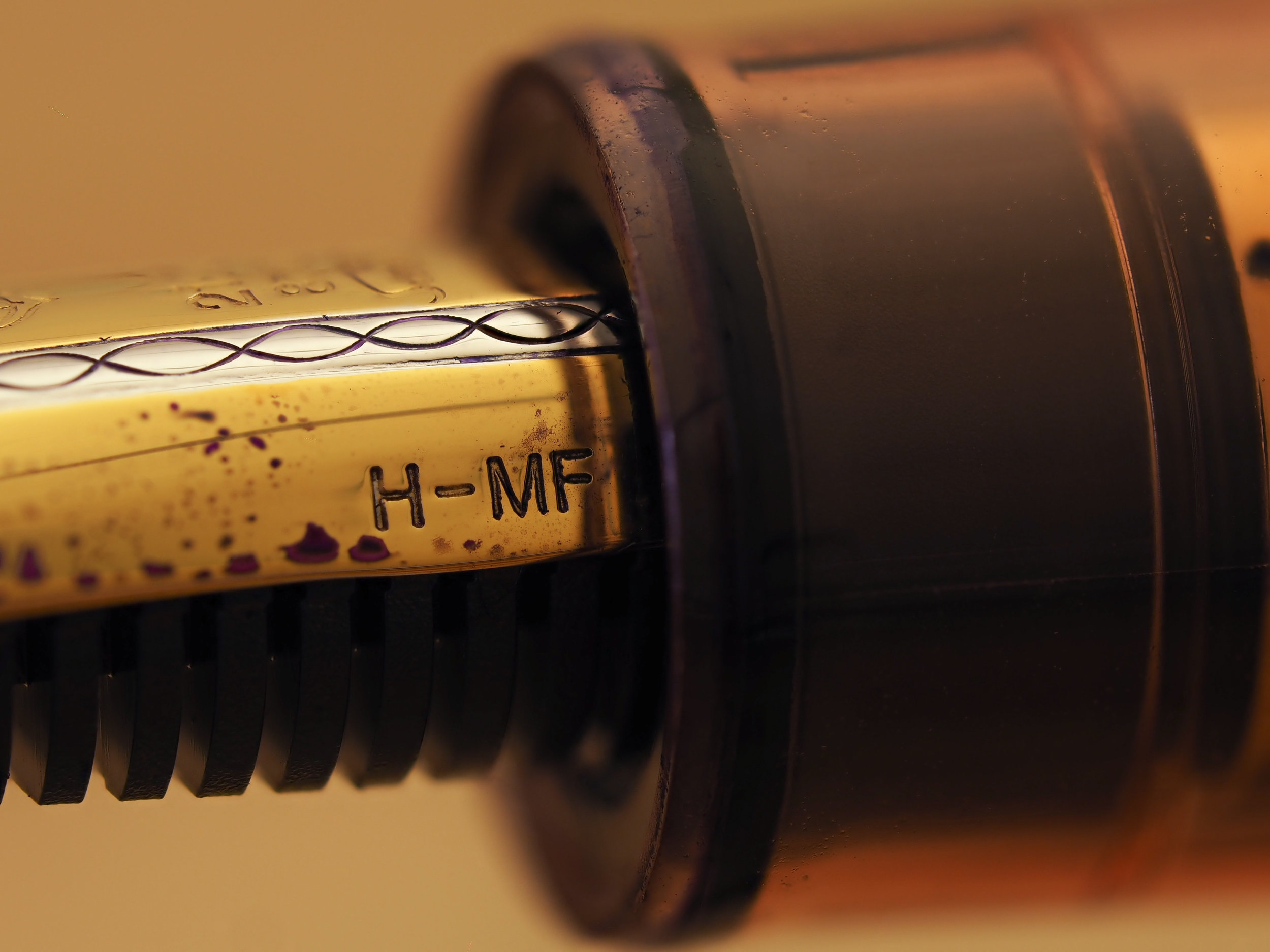
The basic Sailor Pro Gear comes primarily in two nibs designs – either a bicolour gold nib or a bicolour rhodium nib. Some Pro Gears do come with the single colour nib (both in gold and rhodium) but I’ve never run into them so I feel they are less common (or perhaps more common outside Japan). From top to bottom the nib reads: 1911, the Sailor Anchor(⚓️), 21km, 875 (the gold content), and then the Sailor Logo. The counter colour to the predominant colour of the bicolour nib is a border around the inner engraved parts and has itself some engraved filigree inside it. They have a simple circle breather hold and the nib size is engraved on the left shoulder of the nib.
The Pro Gear Slims are not bicolour but are either the gold or rhodium finish to match the trimmings of the pen. The design is otherwise the same. I’d like to note that the gold slim photographed above is from a 1911/Profit and indeed a 1911 with a 21k nib which is unusual as slims usually have the 14k nib; the size of this nib is still the smaller ‘slim’ size that both the Pro Gear Slim and the 1911/Profit Slim have.
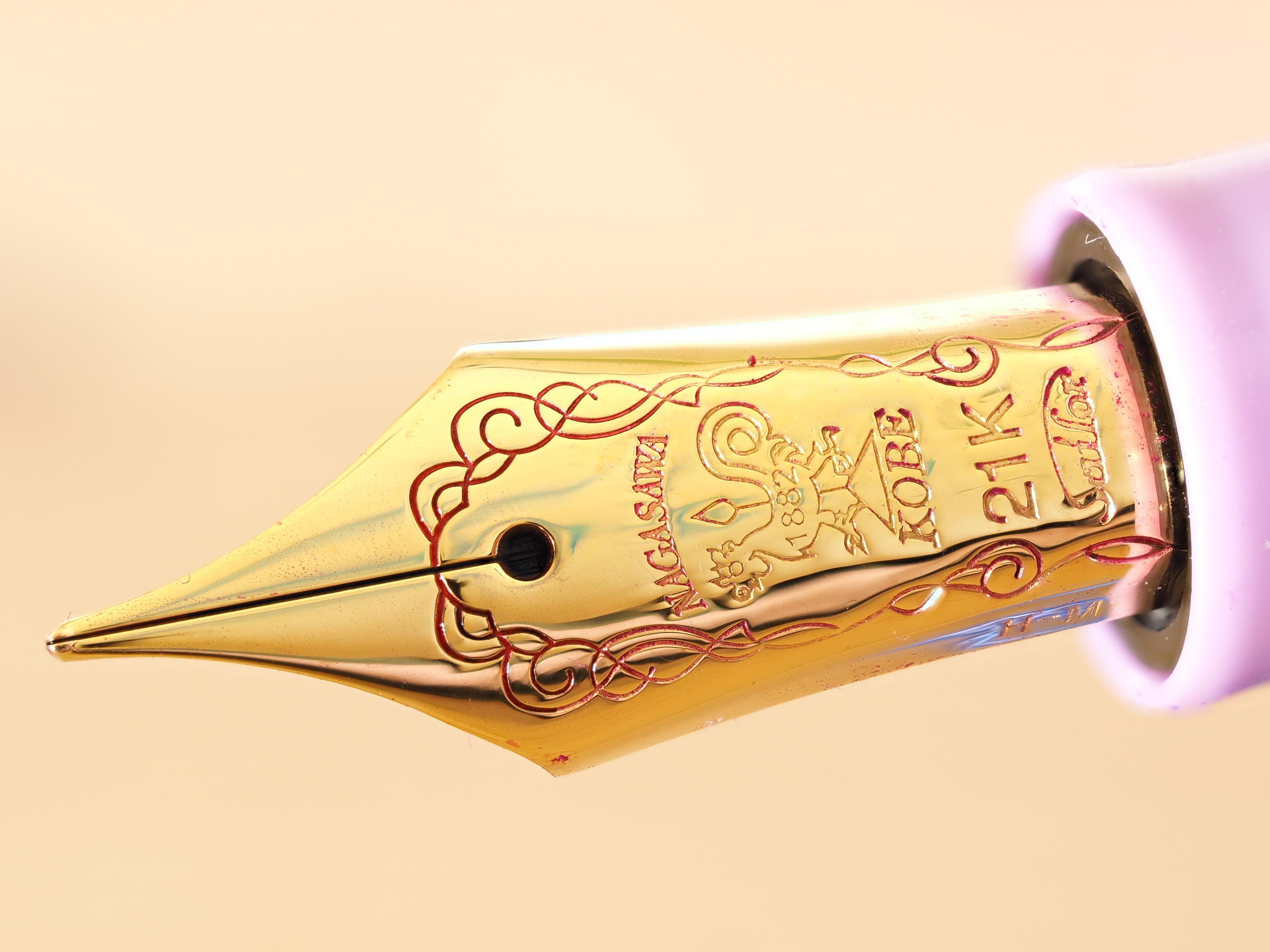
There are also a variety of pen shops that that have a custom nib engraved for them. Some, like the Nagasawa, are more deeply engraved like the standard nib design. The Nagasawa also follows design cues from the standard nib design. The Wagner and the PenPoint on the other hand have a shallow etching and don’t adhere to the design of the standard nib design in any way. There are plenty more custom nibs as well.
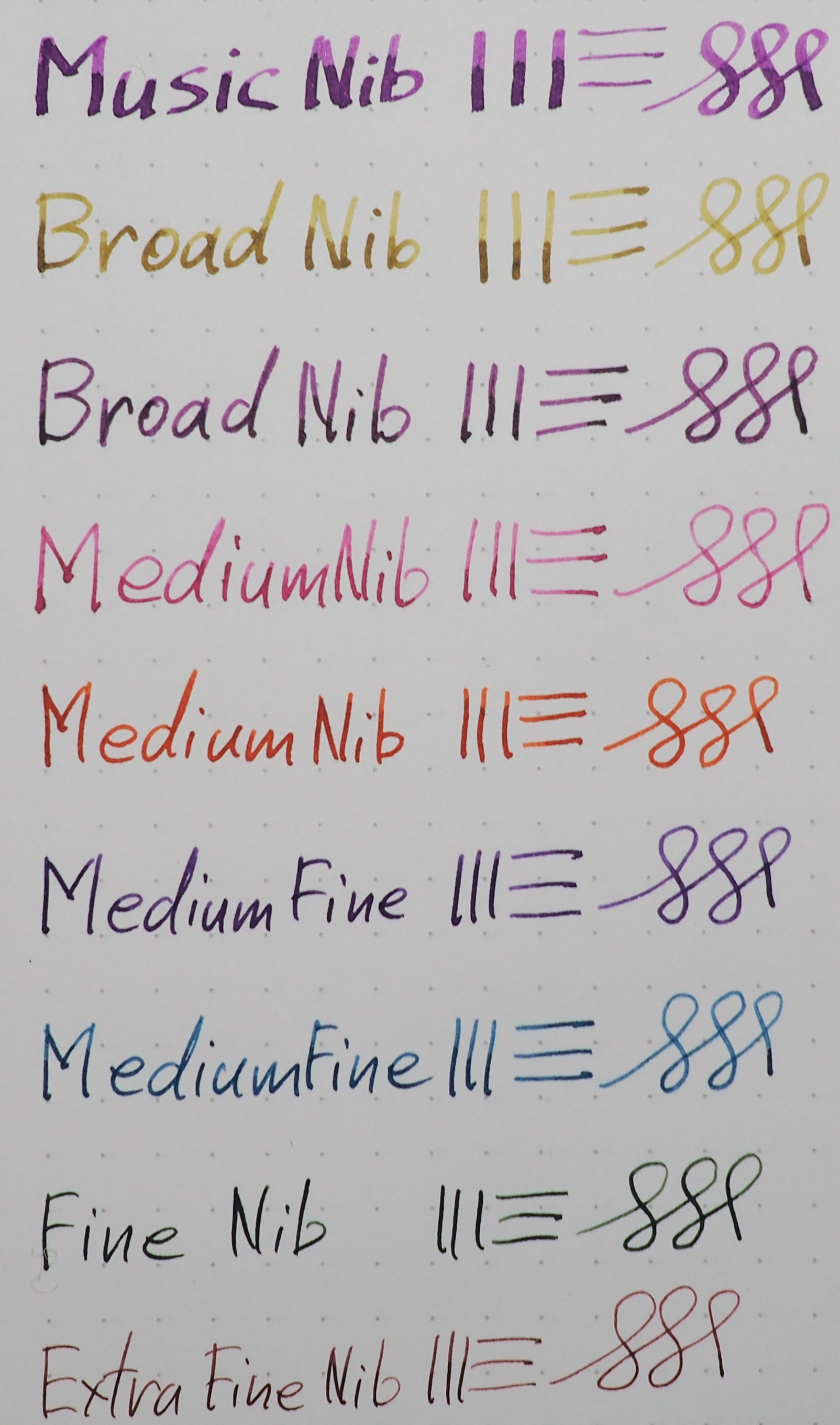
Various nibs on Rhodia 5mm dot grid
Unlike many other pen brands, I find Sailor’s written line to be fairly consistent. That doesn’t mean that some mediums might look like a medium-fine but you won’t find a fine that looks like a medium. The gradient from Extra Fine to Broad above is pretty steady and the Music Nib (which is not two tines and is more realistically just a fat stub) takes a step further. There are other nibs available but only the Zoom can generally be purchased on a Pro Gear (apart from these).
The nib tipping material is unsurprisingly very minimal on an extra fine nib but what I found interesting is the difference in the tipping between two broad nibs. The nib on the right has a pretty huge amount of tipping compared to the one on the left. They write fairly similarly, however. It might be worth noting that the nib on the right is the PenPoint Ayame which comes with the store branded custom nib design and the one on the left is the stock sailor nib.
As for how the nibs feel, in general they do feel as they are famous for feeling; they have feedback of a pencil-like quality. In General. There is some variation here as some pens have more and some have less feedback. And it doesn’t just build down to broad being smoother than Extra Fine. Some Extra Fines are surprisingly smoother than some broads! Rarely have I used a Sailor nib that I’ve felt is scratchy but it has happened. Usually it’s just a slight misalignment.
The Material & Trimmings
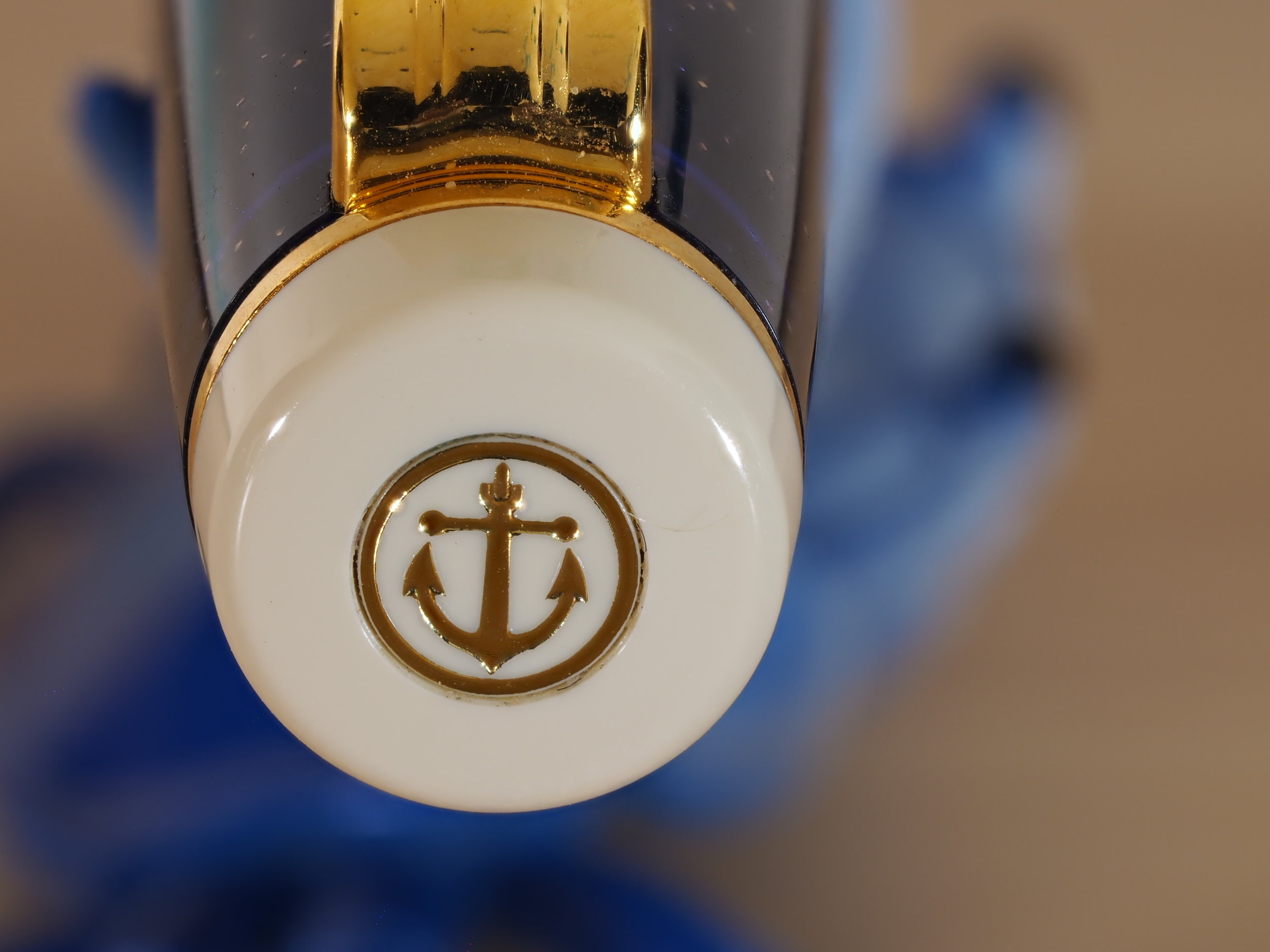
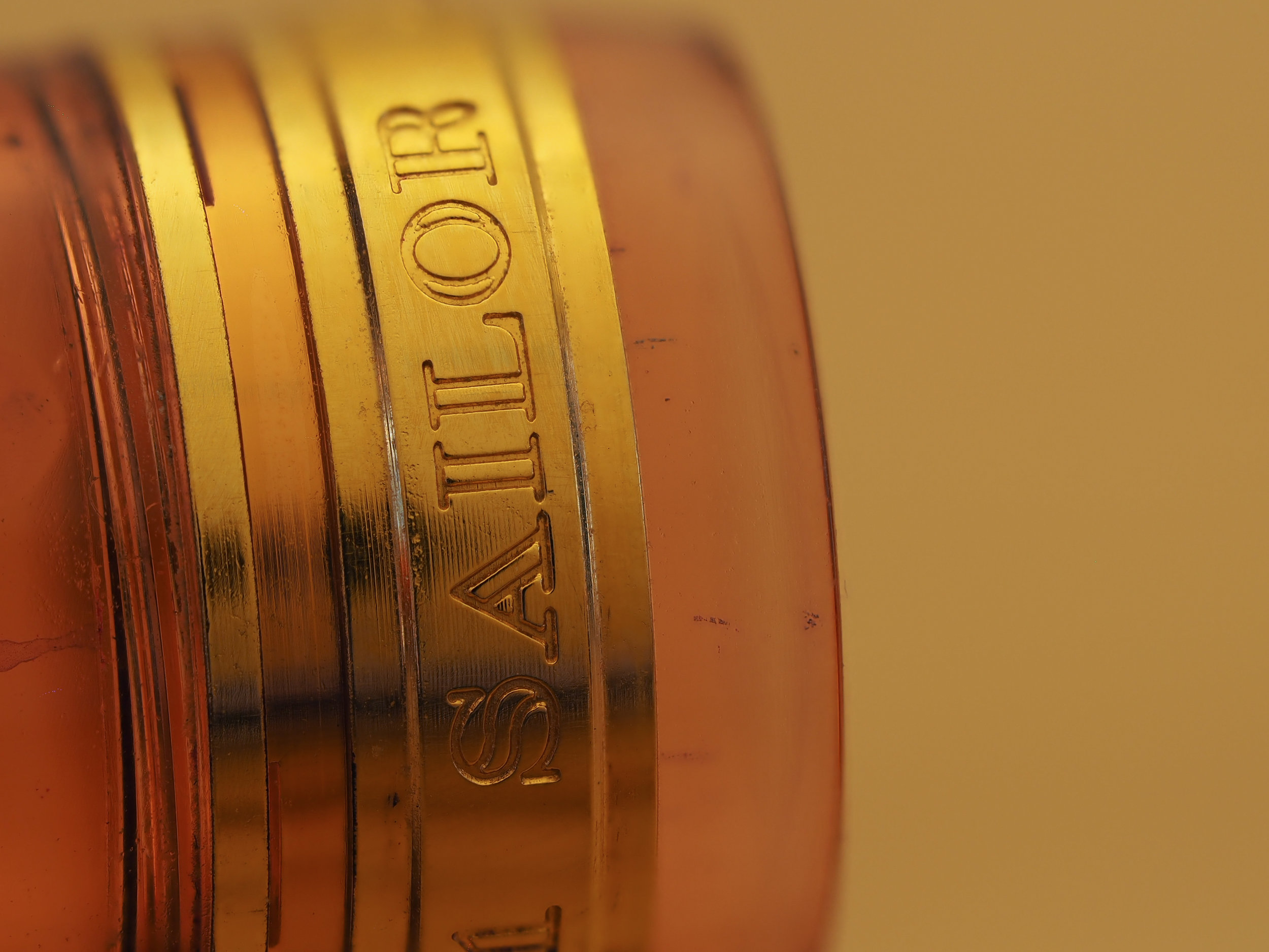
The cap finial of the Sailor Pro Gear generally features a the Sailor Anchor on it impeded in a disk made of either the same material as the cap, a a different material, or a painted veneer. Sometimes, like with the Nagasawa, they have a custom designed symbol on the cap. Bungubox frequently have raden shell inlayed into the finial design. The finial on the body is just the material of the body a secondary material colour.
As mentioned above there are two types of cap bands. One with two bands, with one band thicker than the other, and another version with a single large band.
You can see here the three different colours of the trimmings, the green gold of the Tequila Sunrise, the rhodium and the yellow gold.



















Leave a Reply