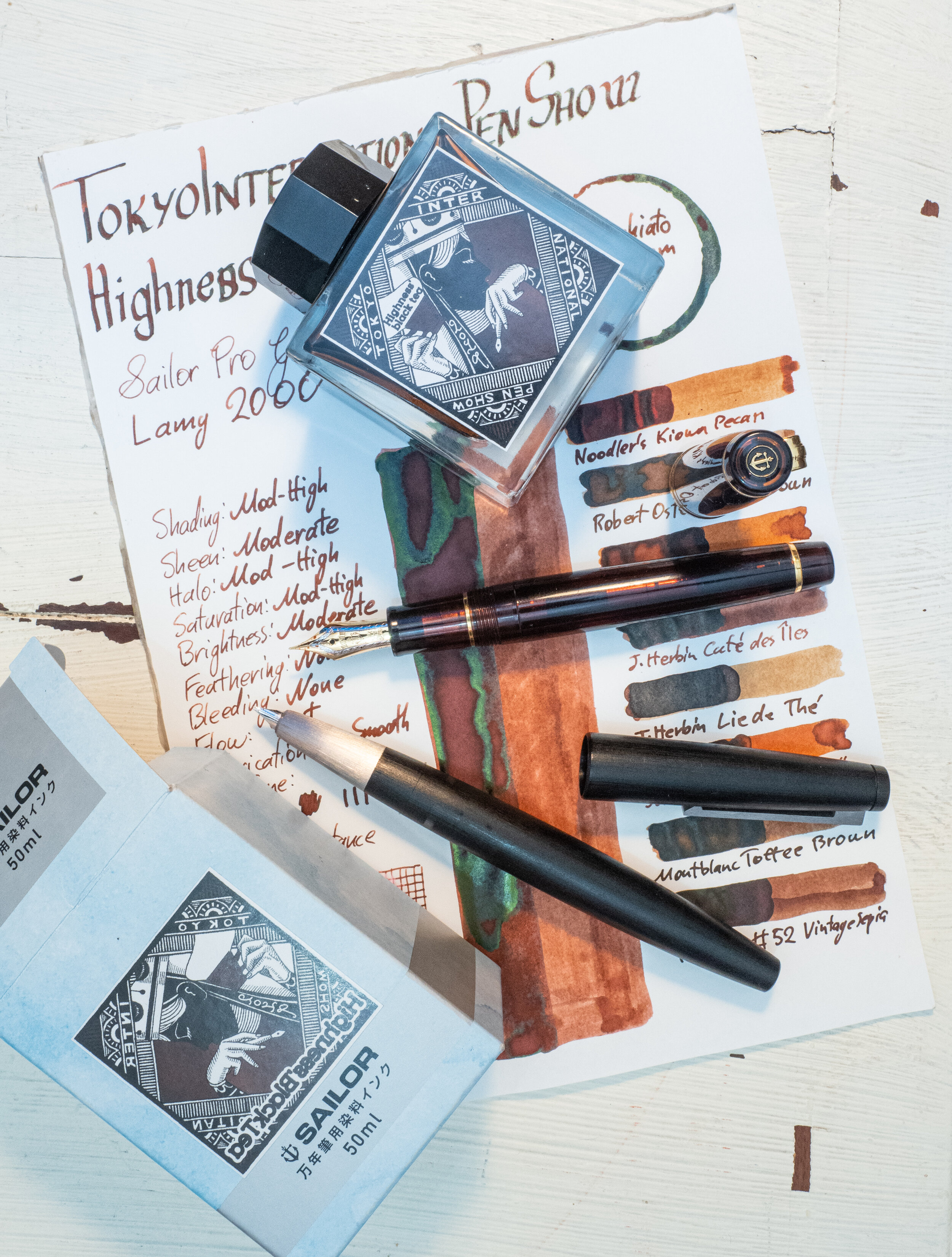
Tokyo International Pen Show Highness Black Tea is a Sailor made ink that was, unsurprisingly, made for the Tokyo International Pen Show back in 2019. This ink is no longer available, as far as I know, and I was only able to get it via a friend last year. Two inks were released exclusively for the 2019 show, the other being Noble Green Tea which I didn’t get (disappointingly!). Some photos of this green ink can be seen here, here, and here.
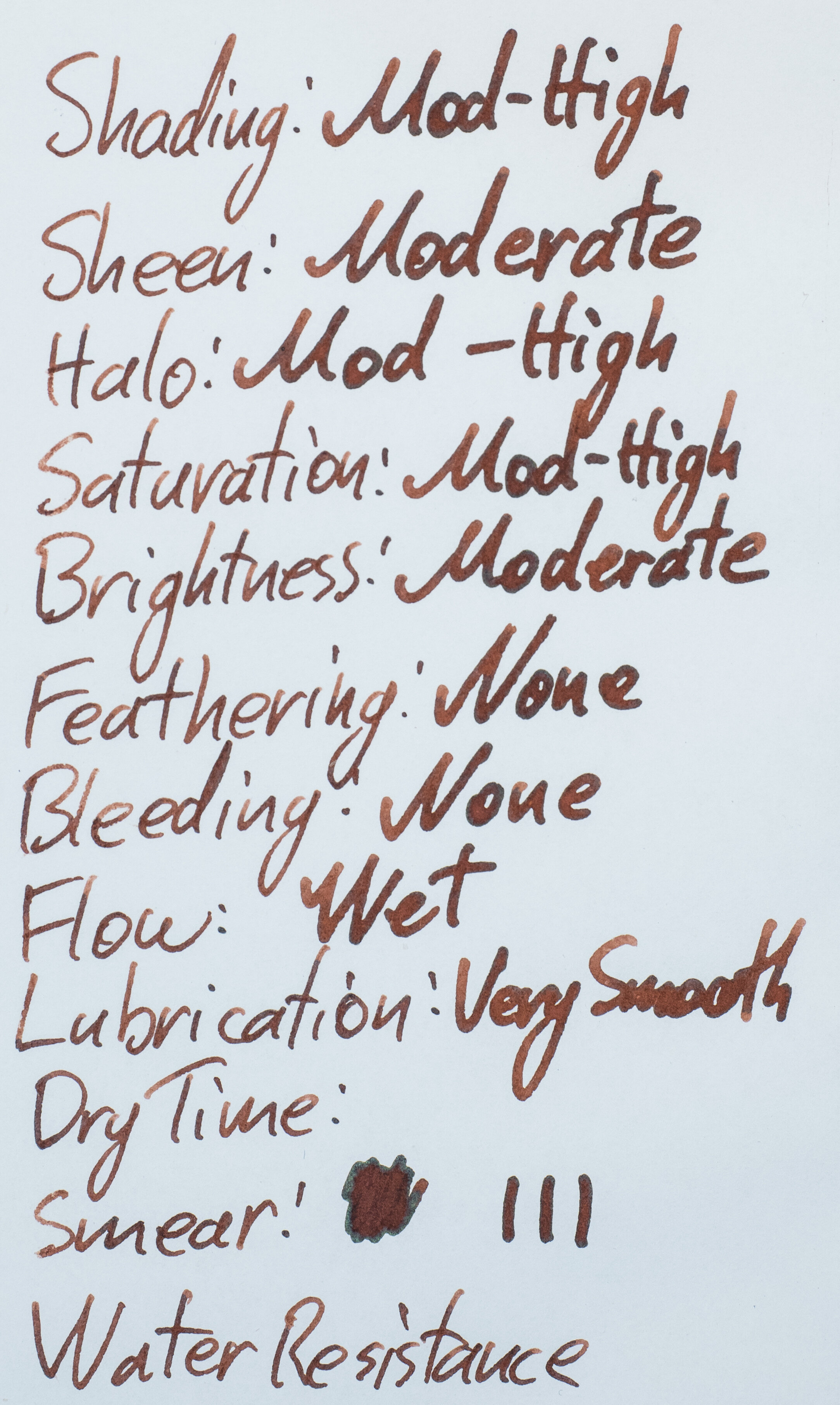
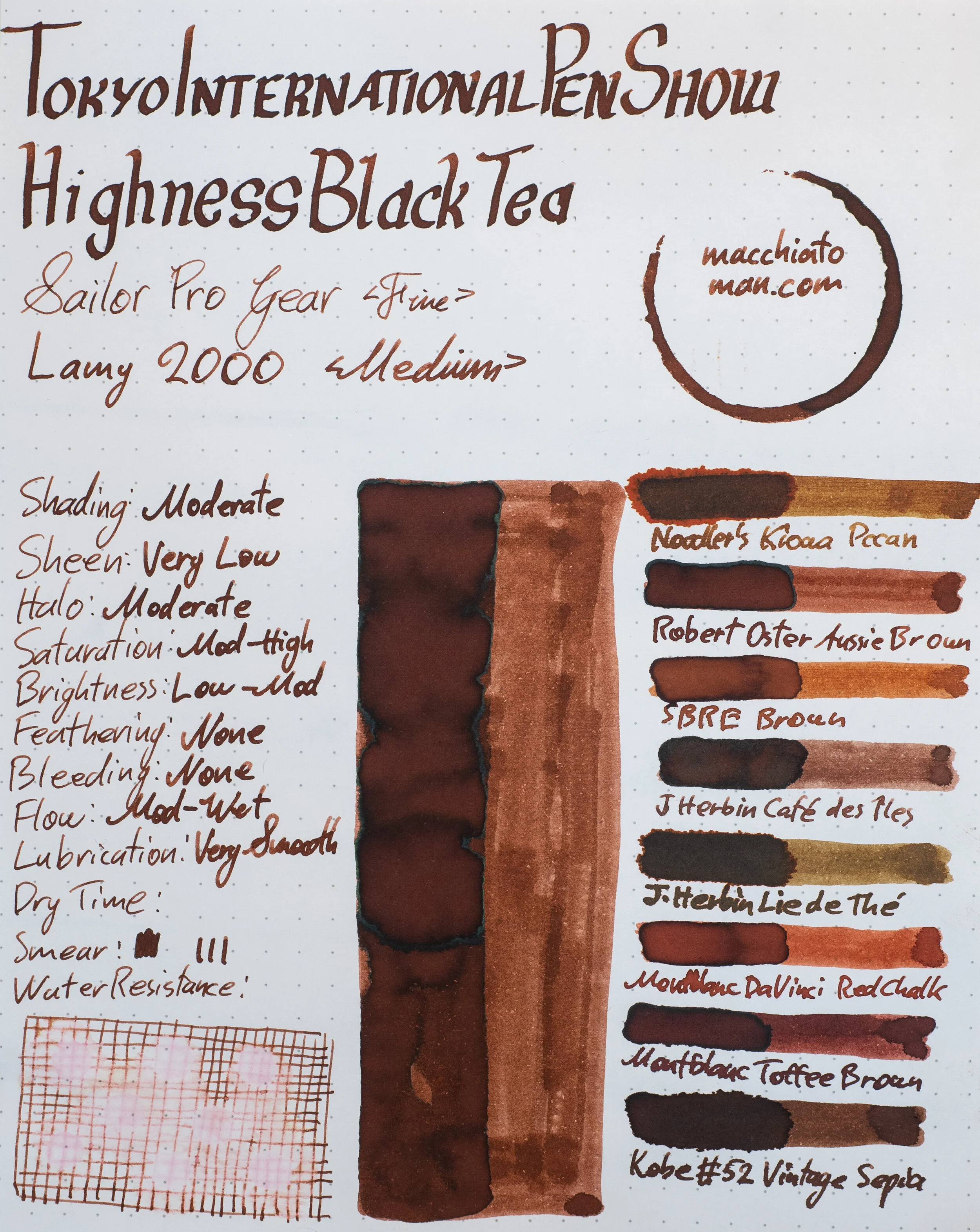
TIPS Highness Black Tea is a somewhat richly saturated brown that can move from pretty dark to slightly light depending on how wet the pen is; often it’s fairly moderately dark. The ink is mostly an orange brown but it leans slightly more red than yellow within that orange spectrum. This colour remains fairly consistent on most papers.
The ink is quite wet and lubricated, like all saturated Sailor inks and is pleasant to write with. On less fountain pen friendly paper the ink still performs OK. Nothing amazing but a little better than the usual. Examples of this ink on 16 different paper types is at the end of the review.
The ink bottle is the standard now-modern square ink bottle from Sailor with an almost playing-card like brown graphic on the front.
This ink has some beautiful chromatography! Starting with a vibrant pink it breaks into a tan-yellow before a green gradient that gets darker. Very complicated! Dry time is similar for both Tomoe River and Rhodia which is a surprise. This makes it slightly slower for Rhodia and slightly quicker for Tomoe River.
There is a very light pink line left behind from the water rest but this is essentially not resistant to water.
52gsm Ivory (White) Tomoe River
On Tomoe River the ink is a little lighter than on Rhodia, as we will see, but the colour is still the same hue.
-
Noodler’s Kiowa Pecan: is too yellow;
-
Robert Oster Aussie Brown: is less saturated and not red enough;
-
SBRE Brown (Diamine): Is a little too saturated and nor quite red enough;
-
J.Herbin Café des Îles: Is a similar hue but less saturated and a little darker;
-
J.Herbin Lie de Thé: is way too yellow (and with a hint of green);
-
Montblanc Da Vinci Red Chalk: is a similar hue but too saturated;
-
Montblanc Toffee Brown: is darker and less saturated; and
-
Kobe #52 Vintage Sepia (Sailor): is darker, less saturated and a little bit redder.
I consider Montblanc Red Chalk to be a decently close ink though definitely still different.
Sheen
On Rhodia the shading is on the low side with not much contrast and a very slow gradient with low frequency as well. The lighter and slightly dryer fine nib shows some better contrast and frequency. There isn’t any haloing.
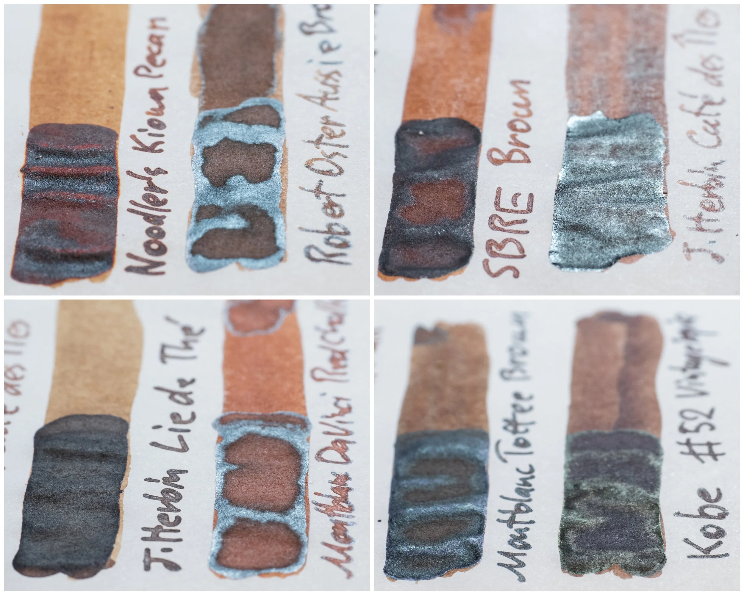
The sheen is decently strong with a green tinted silver sheen. on the swatch the green is more prominent than the writing. Additionally, seeing the sheen from the side emphasises the silver reflection but from top down the green shows a little more.
None of these inks have a similar green-tinted sheen apart from J.Herbin Café des Îles but it is fairly muted on that ink. Robert Oster Aussie Brown has a silver sheen but it is a little muted and not as strong. Montblanc Red Chalk has a similar sheen to Aussie Brown but less of it and Kobe has a strong muted yellow-green sheen that is fairly subtle.
80gsm White Rhodia
As mentioned Highness Black Tea is lighter on Tomoe River and thus it is darker on Rhodia. This is a subtle difference, however.
-
Noodler’s Kiowa Pecan: isn’t as yellow as on Tomoe River but is still too orange this time but is otherwise a lot closer on Rhodia;
-
Robert Oster Aussie Brown: is very strangely too red this time!
-
SBRE Brown (Diamine): is still too orange;
-
J.Herbin Café des Îles: Is a little redder but much less saturated and a little darker;
-
J.Herbin Lie de Thé: is still way too yellow and too green;
-
Montblanc Da Vinci Red Chalk: ligher and way too saturated;
-
Montblanc Toffee Brown: is too dark and too red;
-
Kobe #52 Vintage Sepia (Sailor): is darker, less saturated and a little bit yellower this time.
Robert Oster Aussie Brown is the clear standout for me here.
Sheen
There is some sheen but it’s very subtle and you really need to look for it on the written line (and only on wetter lines). The green has disappeared too.
Shading is a little improved with higher frequency, some more sudden gradients, and very slightly higher contrast than on Tomoe River. This still isn’t a high shading ink.
Only Robert Oster Aussie Brown and J.Herbin Café des Îles present with any sheen, still silver, and still none on the writing!
This is a lovely rich brown that isn’t too dark or too light for my taste with a nice amount of sheen on Tomoe River. I wish it shaded a bit more but this is a fun ink to write with. I’m glad to have it but disappointed I don’t have it’s green tea sibling!
This ink obviously isn’t available any more and even when it was it was difficult to acquire. I’ve generally avoided these Japanese exclusive inks since they have been difficult for many people to purchase but I asked on Instagram (a while ago now) whether people wanted to see these and the overwhelming response was yes. That said they still won’t be the majority; they will just be filtered in every now and then. Sailor Japanese exclusive certainly make up a large chunk of my collection!
✒︎ ✑ ✒︎ ✑
Thanks for reading! If you have any questions, comments or suggestions please let me know in a via the comments, Instagram, or contact me directly.
You can find my ink collection here and my pen collection here. Is there something you’d like reviewed? Let me know!
For blog updated you can follow @macchiato_man on Twitter, subscribe via email, or like my Facebook page. Check out the sponsors of this blog as well!
I was not compensated for this review and everything here is my own honest opinion. There are no affiliate links in this review.


Leave a Reply