Ferris Wheel Press have been drastically expanding their ink line which started with a few standard inks. Lately the colours have been getting more interesting and unique. Generally most of them are rather light and vibrant or dim and dusty like this Lady Rose.
I purchased this ink from Desk Bandit.
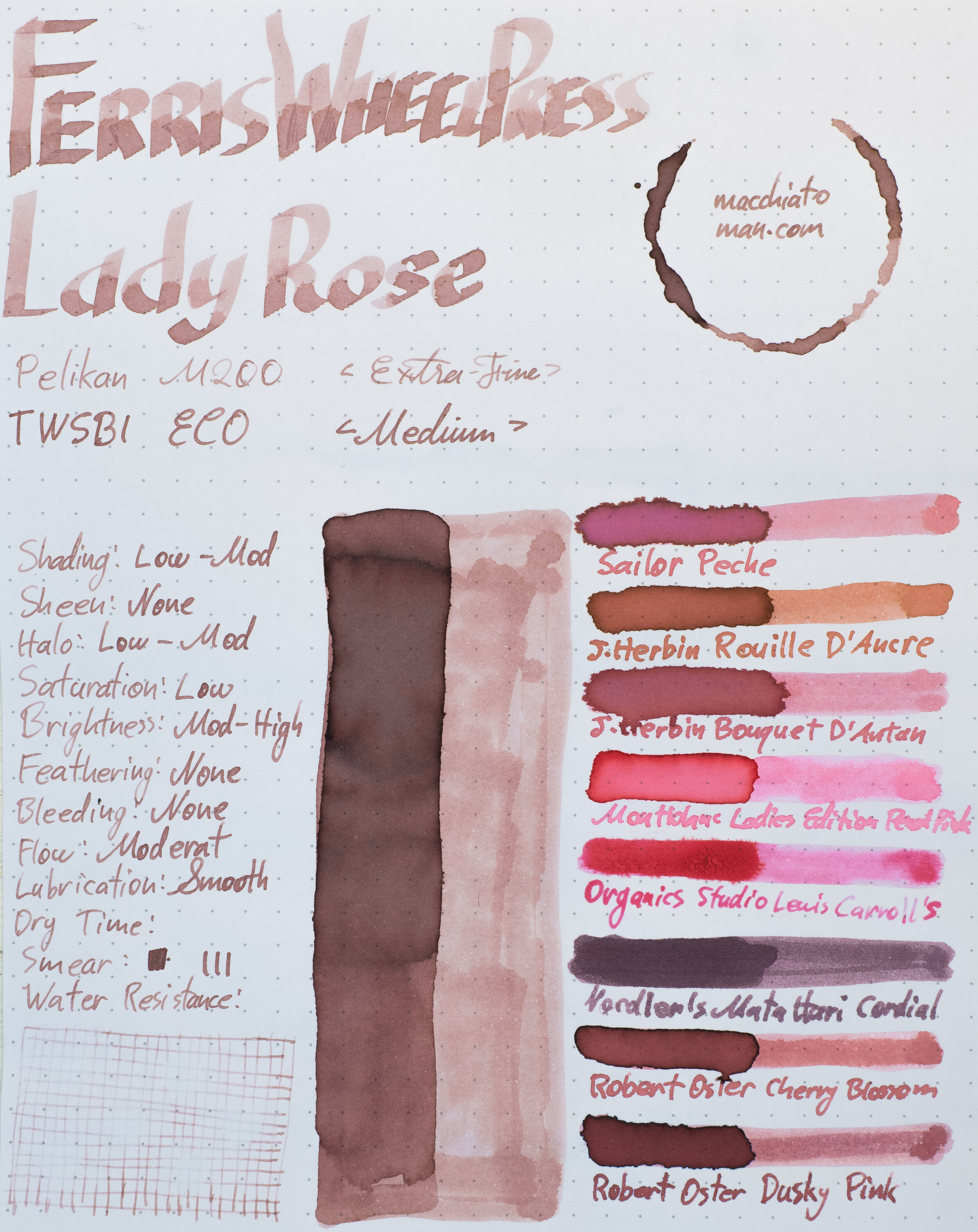
Ferris Wheel Press Lady Rose is a dusty low saturation pale pink ink; a light puce-like colour. There’s a bit or yellow to the pink giving it a hint of brown or taupe. There is some colour shift on different papers with the yellow becoming more or less prominent.
The ink is moderately lubricated and moderately smooth to write with. It isn’t a dry ink but it certainly isn’t a wet ink either. On poorer behaving paper the ink suffers a little; less saturation, more blue, and some feathering but it performs well on all fountain pen paper. Examples of the ink on 22 different paper types is at the end of the review.
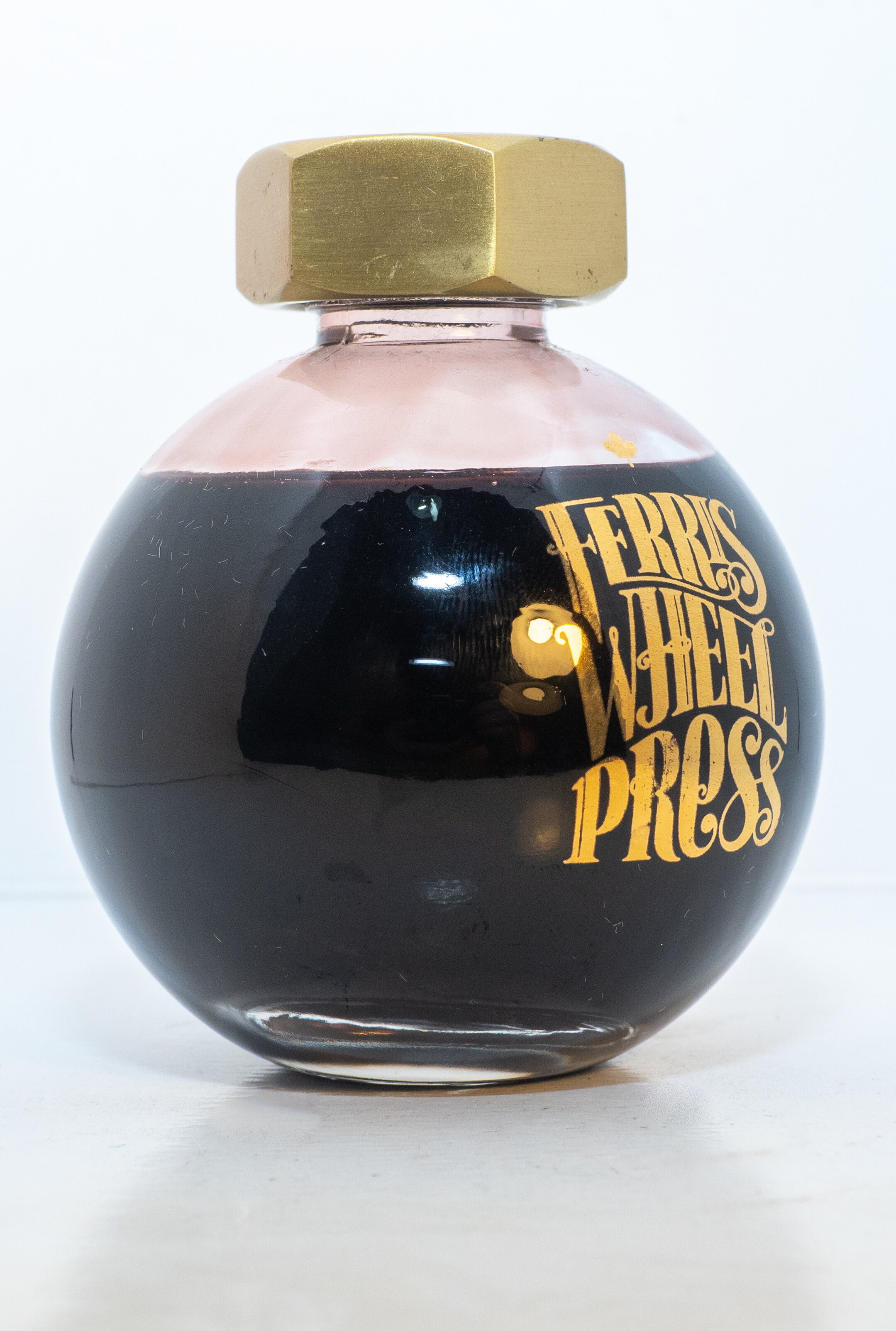
The ink comes in a lovely spherical bottle with a heavy brass (or brass like) lid. Bottle feels very high quality.
Lady Rose has decent shading though not as much as I would have expected! The frequency of the shading is high but the contrast is low and the gradient is smooth making the shading less obvious. There is some haloing but you have to look close to see it.
There is no sheen-whatsoever to see anywhere!
Regardless of the paper. On no paper does Lady Rose develop sheen.
Ferris wheel Press Lady Rose is almost completely washed away by droplets of water; this ink doesn’t resist water at all. The dry time is fast on Rhodia but about average for ink on Tomoe River.
The chromatograph is a colourful one! It starts with a darker and low saturation purple before a pale salmon pink becomes more saturated. After the pink it becomes more orange before breaking out in a light pale baby blue.
Review Rhodia 80gsm White
Ink Comparison Rhodia 80gsm
Compared with Tomoe River the ink is a little pinker on Rhodia and a touch more saturated. The ink performs well with no feathering or bleeding and no smearing either.
-
Sailor Peche: this is too red and pink and too saturated;
-
J. Herbin Rouille d’Ancre: is too orange and saturated;
-
J. Herbin Bouquet d’Antan: is slightly too saturated but also too pink with not enough brown;
-
Montblanc Ladies Edition Pearl Pink: way too pink. Even if it’s a soft pink its to saturated and has no brown to it;
-
Organics Studio Lewis Carroll: way too pink and saturated with no brown to it;
-
Noodler’s Mata Hard Cordial: It has some brown but is more purple and way too dark;’
-
Robert Oster Cherry Blossom: Getting much closer in hue (probably the closest) but too dark and saturated; and
-
Robert Oster Dusky Pink: again not too far off but it’s too pink and too dark.
The too Robert Osters would be the closest for me, especially Cherry Blosom. Maybe if it was watered down?
Sheen Comparison Rhodia 80gsm
None of these inks show sheen on Rhoda, just like how Lady Rose didn’t!
Review 52gsm Ivory (White) Tomoe River
Ink Comparison Tomoe River 52gsm
On Tomoe River the pink is paler and less saturated and also a little more toupe coloured and less pink than when the ink is on Rhodia. Still no feathering or bleeding, as expected and no smearing.
-
Sailor Peche: is a little paler and less saturated than on Rhoda and is showing more yellow but no where near enough and is too pink and saturated;
-
J. Herbin Rouille d’Ancre: too yellow and started still;
-
J. Herbin Bouquet d’Antan: Much closer with more yellow but still too saturated and pink;
-
Montblanc Ladies Edition Pearl Pink: Paler than on Rhodia but still way too pink and saturated;
-
Organics Studio Lewis Carroll: Also too pink and saturated;
-
Noodler’s Mata Hard Cordial: Much closer this time and more pink than purple. It’s still too dark but the saturation and hue are similar;
-
Robert Oster Cherry Blossom: A little too saturated and a touch too pink this time; and
-
Robert Oster Dusky Pink: Very close but a touch darker and a touch more saturated.
Noodler’s Mata Hard Cordial actually comes a lot closer than I would have thought on Tomoe River but is quite dark. Robert Oster Dusky Pink is clearly the closest this time with Cherry Blossom not that far behind.
Sheen Comparison Tomoe River 52gsm
Cherry Blossom has a hint of a matte sheen and the Noodler’s has some surprise silver sheen but only on the swatch.
More realistic product photo
Image from Ferris Wheel Press website.
One of my complaints about Ferris Wheel Press is their product photos. The images portray the bottle, supposedly with the ink in it, very inaccurately. I understand, in one sense, that they are trying to show the ink colour (in which case it isn’t far off) but in reality the ink ink the bottle is quite dark; like how most inks look in a bottle! The official product photo makes the ink look it would be incredibly pale when it isn’t that pale. You’d barely see that colour on the paper! They do the same with all of their inks. I’m not a fan as I find it misleading even if the intention is good.
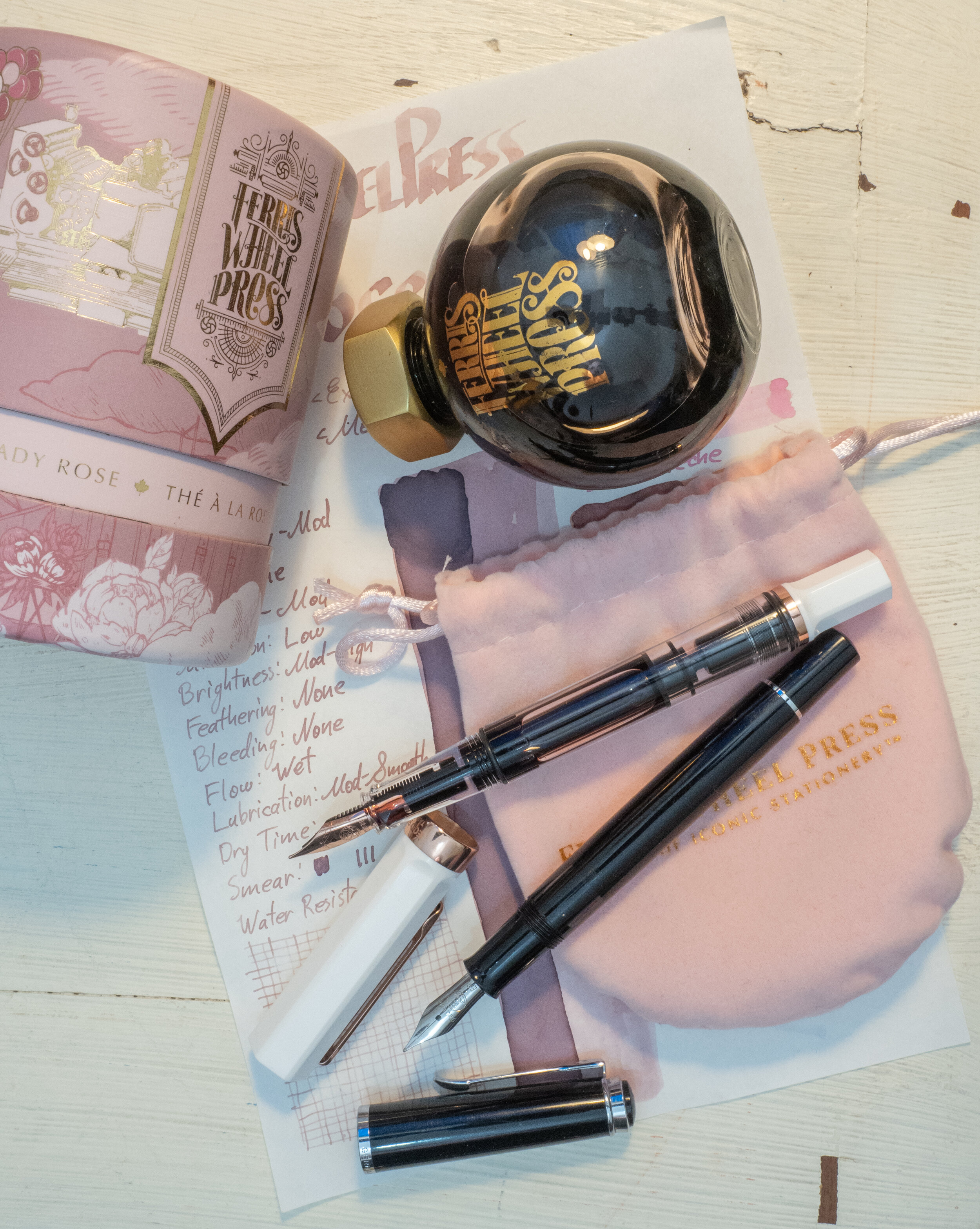
Hot pinks have never been for me. I have them and I’ve used them and I have enjoyed them but I’ll always prefer softer and more complex pinks. This is a decently complex pale pink and I quite like it. It’s dark enough to not be difficult to read on yellow or white paper. The ink isn’t too dry either for a pale ink. I wish it had more shading but it’s decent enough. I quite like the colour and the ink overall and I love the bottle which also comes with a cloth pouch and a nice cylindrical box! I need to pick up more Ferris Wheel Press inks as they have a few other pale pink inks and pale inks which I’m liking more and more!
I purchased this ink from Desk Bandit and at $56 the ink isn’t the cheapest but I feel like I got my money’s worth.
As usual, images of the ink on other paper types is below.
✒︎ ✑ ✒︎ ✑
I’ve listed all my inks and all my pens in their respective pages. Please let me know which inks you’d like to review next via the comments, Twitter, Instagram, or contact me directly.
For blog updated you can follow @macchiato_man on Twitter, subscribe via email, or like my Facebook page.
I was not compensated for this review and everything here is my own honest opinion. There are no affiliate links in this review.


Leave a Reply