There are a few super sheeners out there now. The first was Organics Studio Nitrogen Royal Blue and Organics Studio have come out with a teal and a darker blue super sheener, Krishna has come out with a blue super sheener similar to Nitrogen and now Ink Institute in Taiwan has come out with two more. One is again similar to Nitrogen; rich moderately bright blue ink that’s practically all sheen. But excitingly they also came out with a true green ink that’s a super sheener. All the rest have been either blue or a blue-green (such as Walden Pond Blue) and this is a lovely rich true green.
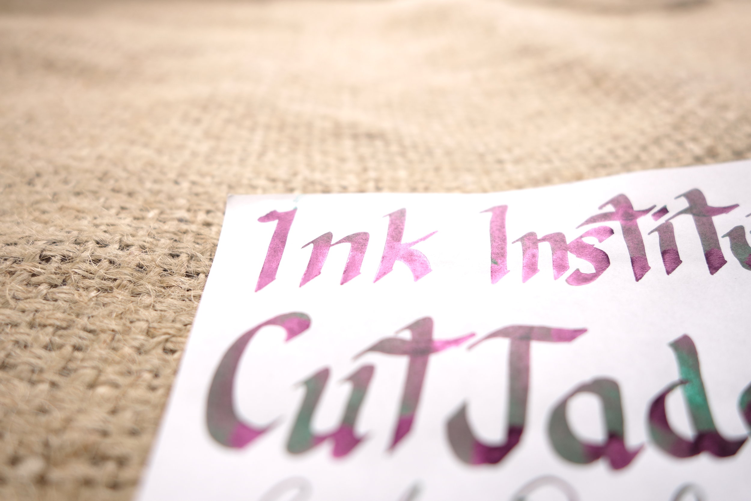
Ink Institute Cut Jade is a 20ml bottle and cost AU$35 (US$26.30) for me via a friend. That does include shipping and maybe a forwarders fees (I’m not sure how my friend got this!) But I have found that if you make enquiries to this shop in Taiwan that they might be able to work something out! 20ml is pretty small and for me it’s too close to sample territory but the bottle and box are quite tastefully designed. The green colour is meant to represent the first shine of jade when it’s cut into a jade stone. This is a rich true green that doesn’t lean too blue or too yellow. It’s very neutral. It’s rich and dark and very saturated so it isn’t a green-black just a dark rich green. The ink is quite wet and very well lubricated but unlike with the Organics Studio sheeners, inks the ink doesn’t dry as easily in the feed. Two weeks after inking the pens and they still write perfectly and leaving the cap off for a reasonable amount of time doesn’t dry it out either; this is a notable improvement. The ink has some decent shading not not a high amount. There’s isn’t a heap of contrast to the shading but almost every line, even in cursive has some nice shading. The ink performs decently on poor quality paper; not too much feathering or spread.
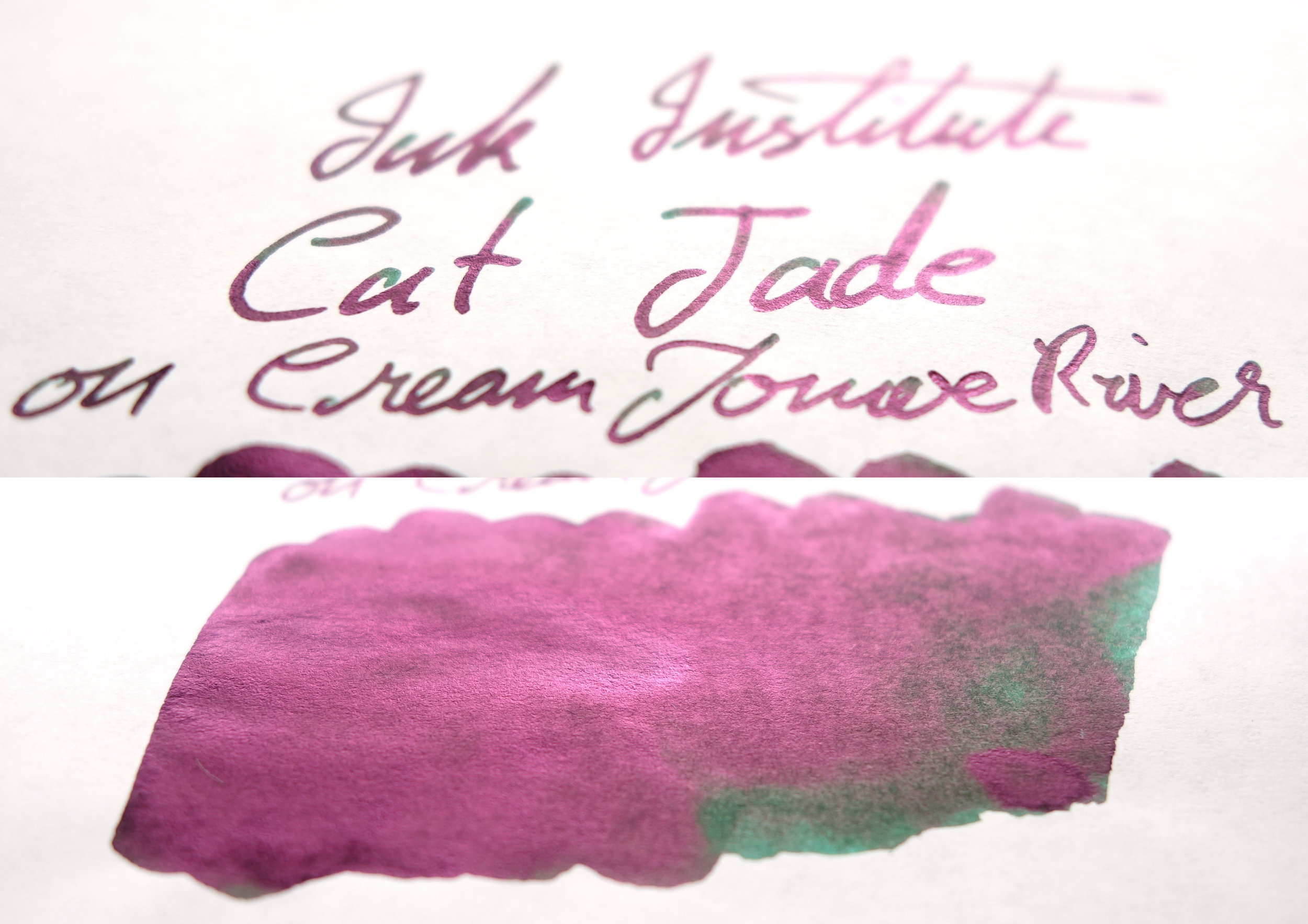
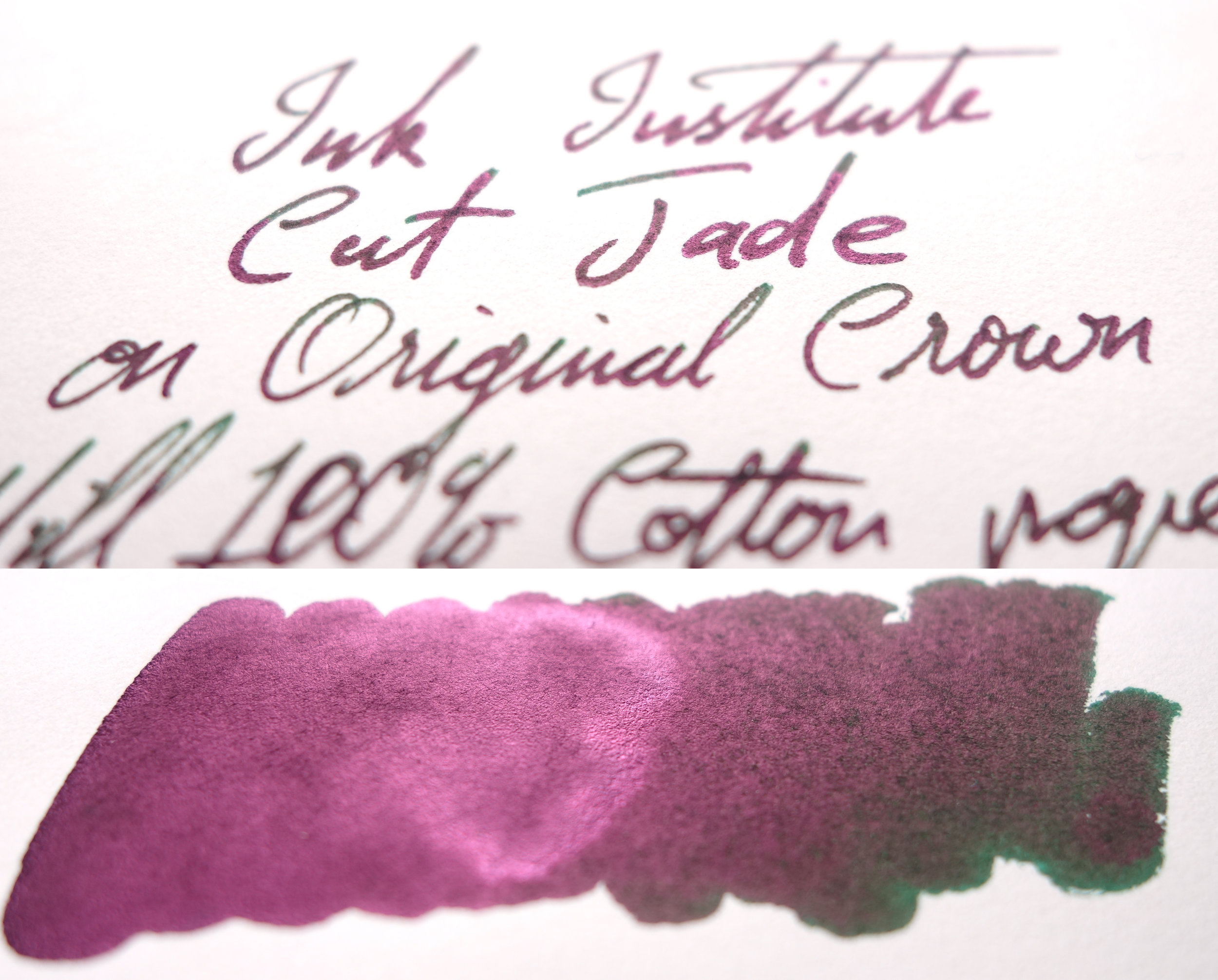
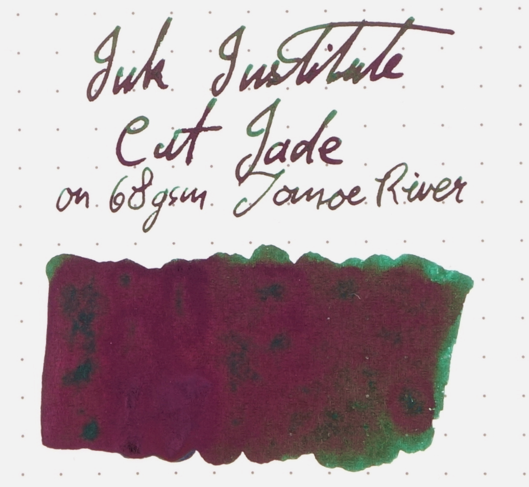
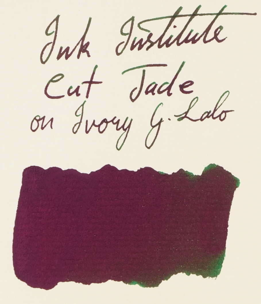
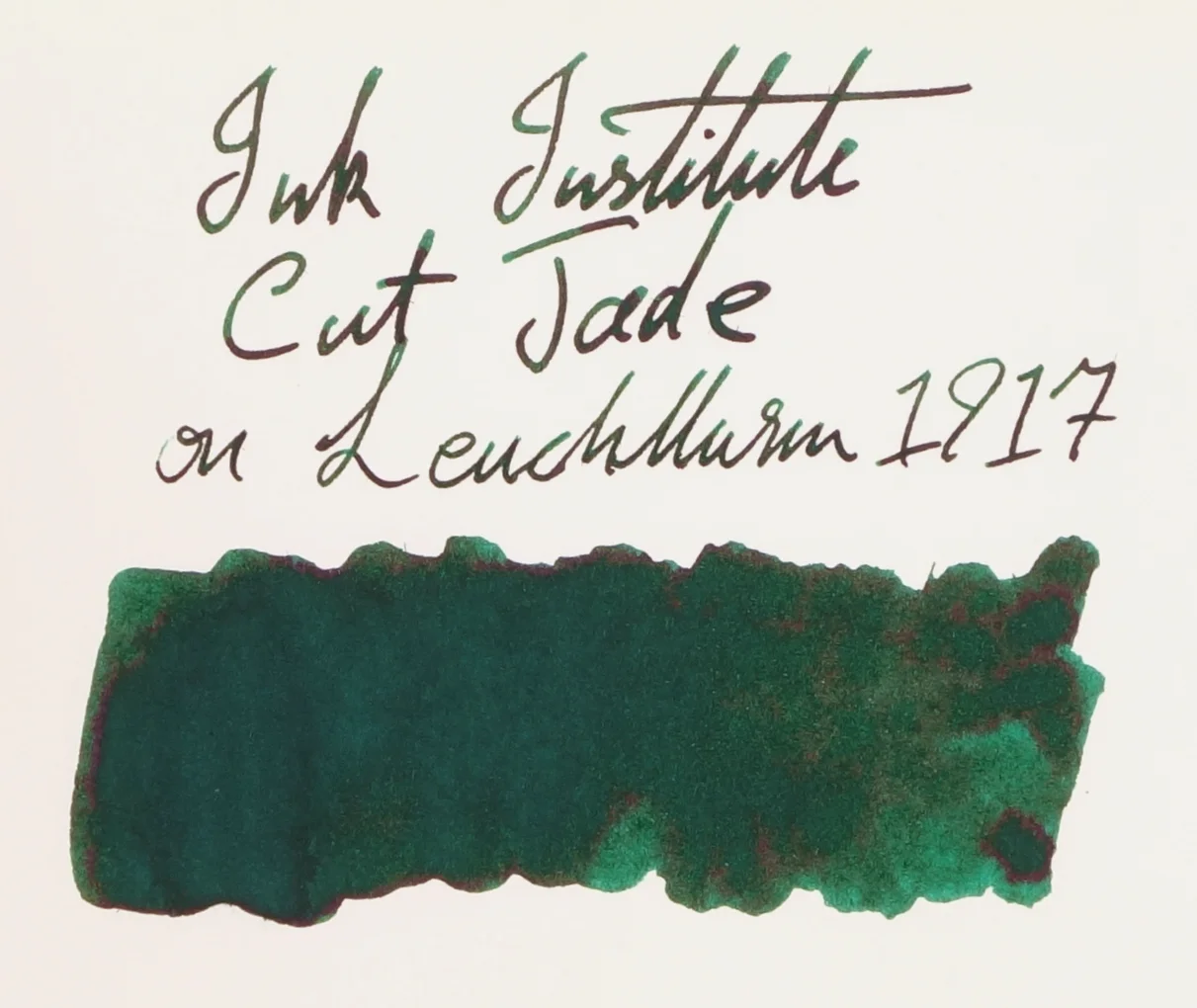
The sheen isn’t as brilliant as the sheen from Nitrogen; it’s a tad dull. This isn’t to say the sheen is dull such as the sheen in Shumibun Writing Time Jasper Green, just that compared to Nitrogen it is. The colour of the sheen is a little more magenta in colour than the pink/red of Nitrogen. The sheen almost completely covers the entire line on Tomoe River and is quite prominent, easily as prominent as the Organics Studio inks if not more, on Rhodia. There’s some sheen on all Fountain Pen Friendly paper, even some that flatten inks like Clairefontaine and Leuchtturm1917.
The Chromatography shows how neutral the ink is; it starts with a yellow green, moving through a neutral green and finished with thin dark blue line right at the end. Dry times are very slow, unfortunately. One minute on Rhodia and two on Tomoe River. This could definitely be an issue for some people but this is part and parcel for high sheening inks. There is no water resistance with this ink.
On 80gsm White Rhodia
There is some smearing on Rhodia. This is common for sheening inks, however.
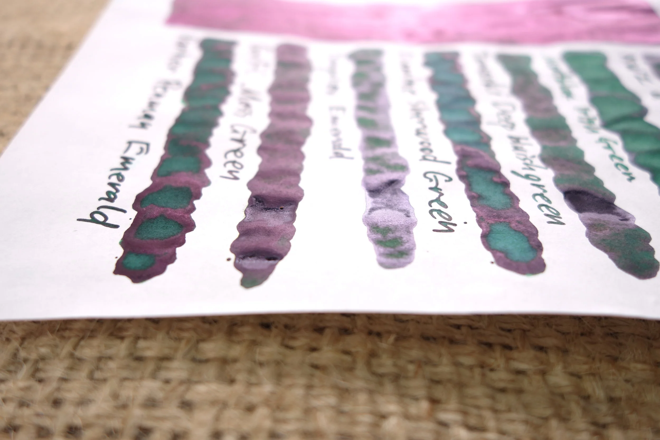
The inks I’ve compared here are fairly similar to the inks I compared in my Parker Penman Emerald comparison because Penman Emerald itself is somewhat neutral and dark. KWZ Green #3 is a similar hue but darker and not as rich and saturated. Montblanc Irish Green is also a similar hue but is slightly bluer and is less saturated. Tamaoki Deep bluish green, a Sailor store exclusive ink, is much bluer and too unsaturated as well. Diamine Sherwood Green isn’t too different here but still isn’t quite as saturated. Bungubox Emerald (or Norwegian Wood) is darker and flatter and is even still lacking in saturation. Graf von Faber-Castell (GvFC) Moss Green is surprisingly sheeny on Rhodia paper the green ink itself is much too dark, too lacking in saturation and too flat. Parker Penman Emerald is the closest in terms of saturation but is a tad too light; a similar hue otherwise.
Difficult to pick but for me Diamine Sherwood or Parker Penman Emerald come the closest. Both are obviously lacking in sheen compared to Ink Institute Cut Jade, however.
52gsm Ivory(white) Tomoe River
Days later there is still smearing on Tomoe River. With a dry hand brushing the page it isn’t an issue but if there is any pressure when brushing over a written line with a finger than it will certainly smear.
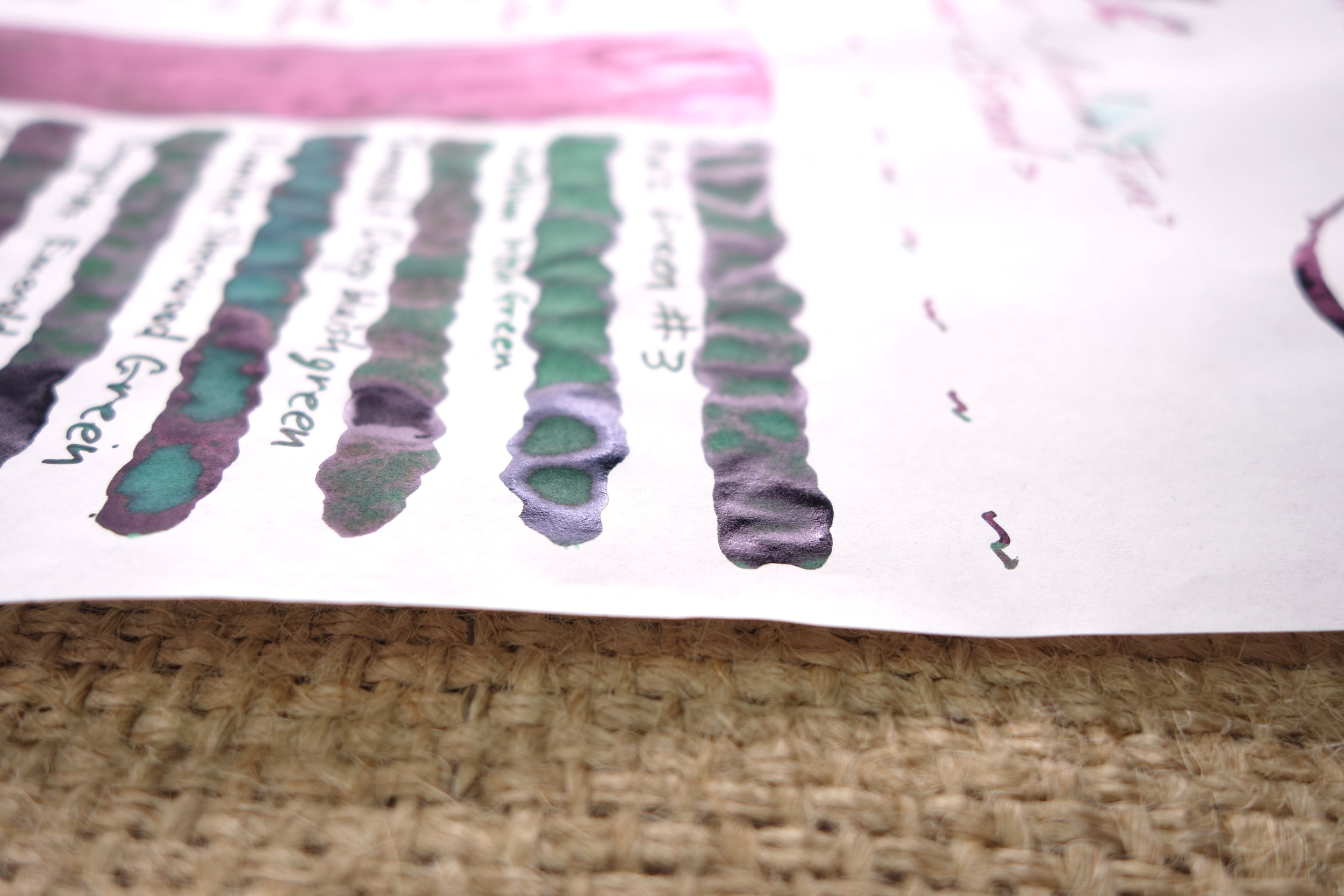
On Tomoe River there is a few changes compared to on Rhodia KWZ Green #3 has become bluer, as has Montblanc Irish Green but to a lesser degree. Tamaoki Deep bluish green, however has now become yellower! Diamine Sherwood Green is quite a it bluer now. Bungubox Emerald hasn’t changed much but it is tad duller. Graf von Faber-Castell Moss Green is still dark and unsaturated and Parker Penman Emerald has become a tad bluer but hasn’t changed much.
KWZ Green #3 or Parker Penman Emerald would be my closest picks on Tomoe River.
Surprisingly, Graf von Faber-Castell moss green has the most sheen. It is, however, a very dull sheen. The sheen on Parker Penman Emerald and Diamine Sherwood Green is redder but still quite dull. The sheen on Bungubox Emerald is quite extensive but is a silver with a slight hint of pink much like the sheen from KWZ Green #3. Montblanc is showing some sheen in the swatch and is a straight silver sheen. There isn’t any real decent comparison here. I don’t know of a green ink with as much sheen as Ink Institute Cut Jade, nor one even close.
Sailor “Maldives” Pro Gear (Wancher Exclusive); Sailor Pro Gear Black/Gold
These super sheeny inks aren’t for everyone and they are definitely trendy off late. I have also seen some some push back in the community regarding super sheeny inks; I’ve read some people saying that its silly or that ink makers have gone too far or that ink manufacturers have just jumped on the latest band wagon. But it’s important to remember that not every ink is meant to be liked by everyone. I can’t stand washed-out teal inks such as Diamine Soft Mint but there’s a place for those inks and there are people that like them. There is a trend here with these extreme sheening inks this but I wouldn’t say there’s a bandwagon; I know of 7 “super sheener” inks in the same category as Nitrogen Royal Blue (that is that the sheen almost covers the entire swatch or the entire line, especially on Tomoe River). That’s not a huge number so I don’t think the market is oversaturated (pun only retrospectively intended). I do think there is now enough sopmewhat-light-blue sheeny inks (simply because a lot of them do look almost identical; I feel this way with many Turquoises inks as well) but I’m always happy to see new super sheeners if they have a unique base colour, or sheen colour. A super sheening purple ink with gold sheen would be welcome to me but another rich somewhat-light-blue? Maybe not. A dark blue maybe. A Magenta, maybe… So I am quite happy that there is a rich neutral green that has extreme sheen. It is another red sheen, but the base colour is interesting enough (and I really do love the rich green colour!).
I like super sheeners for the same reason I like opals: shiny colours (it’s as simple as that). These aren’t everyday note taking inks because they take longer to dry and are prone to smearing so they aren’t super practical. These inks are also not that suitable as professional inks as they are probably too flamboyant. Journal writing or letter writing might work well. They are beautiful inks, however, so any excuse for me!
As said, this ink is made in Taiwan and I don’t believe there is currently an international distributor apart from, maybe, this shop in Taiwan. The company that makes Cut Jade, Ink Institute, has some other interesting colours as well but I can’t say I’m familiar with any of them except the other blue super sheen (which I haven’t inked). Hopefully, like with Krishna inks recently, Ink Institute can open up international orders more easily because I’d definitely grab more of them if they were easier to pick up!
✒︎ ✑ ✒︎ ✑
As usual, below as the ink on various papers.
I’ve listed all my inks and all my pens in their respective pages. Please let me know which inks you’d like to review nextvia the comments, Twitter, Instagram, or contact me directly.
For blog updated you can follow @macchiato_man on Twitter, subscribe via email, or like my Facebook page.
I was not compensated for this review and everything here is my own honest opinion. There are no affiliate links.













Leave a Reply