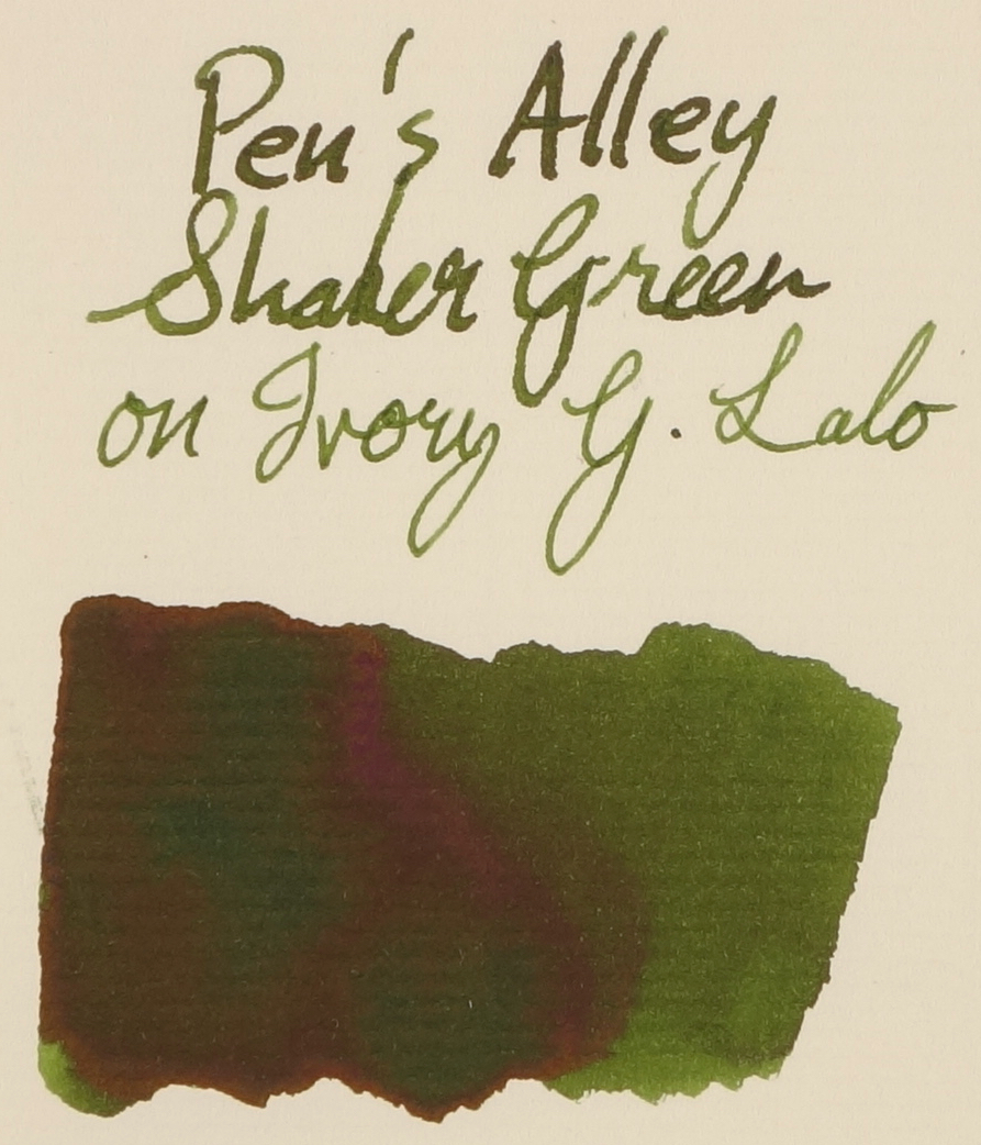
Pen’s Alley Shaker Green is a pretty unique and special ink; a green ink with gold sheen. I’ve never seen anything like it before! Pen’s Alley is a stationary and pen store in Okazaki, Japan. They have a series of Sailor Store Exclusive inks in the tall “vase” Sailor bottles of which this is one. It’s a beautiful olive green ink but where this ink stands out is its sheen!
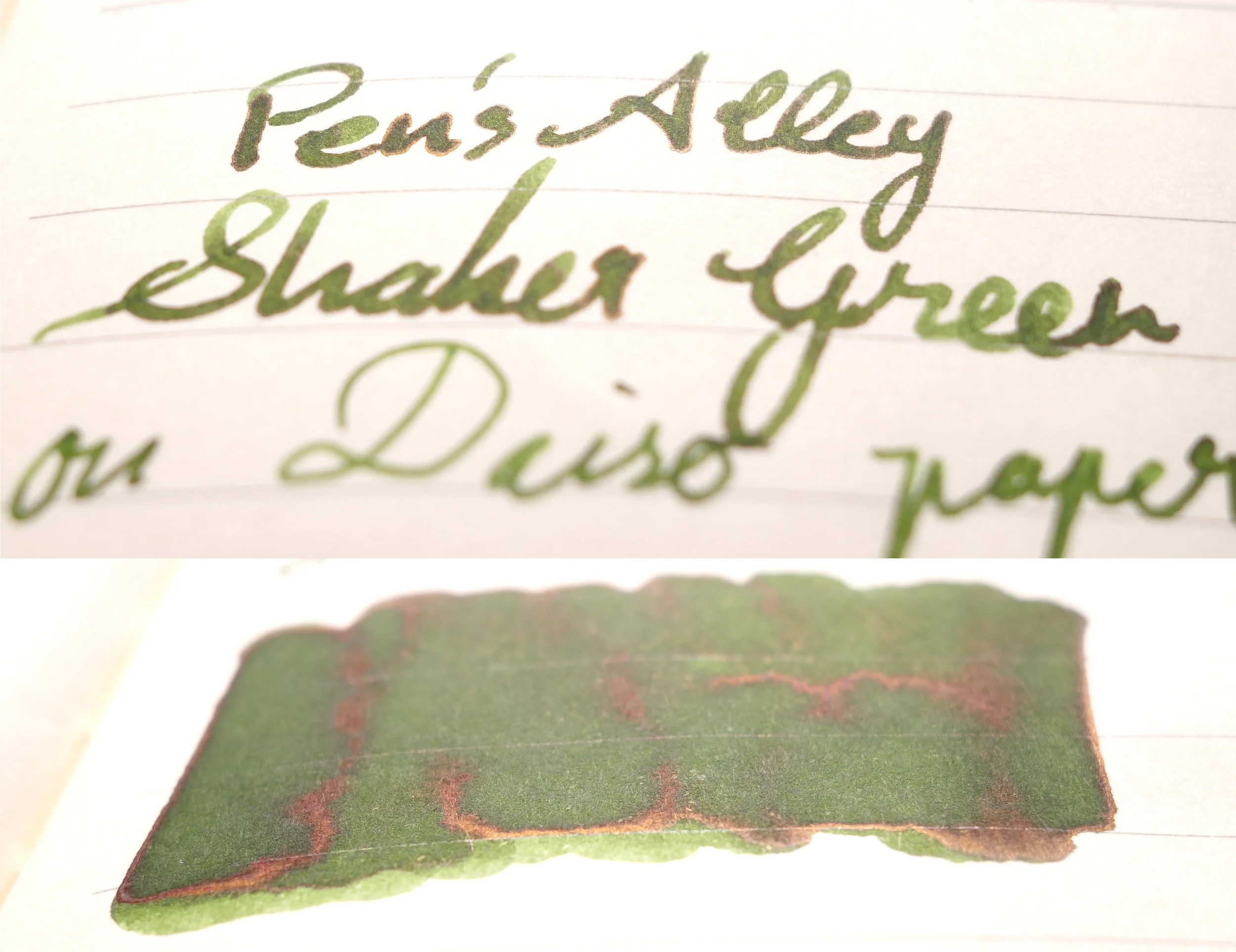
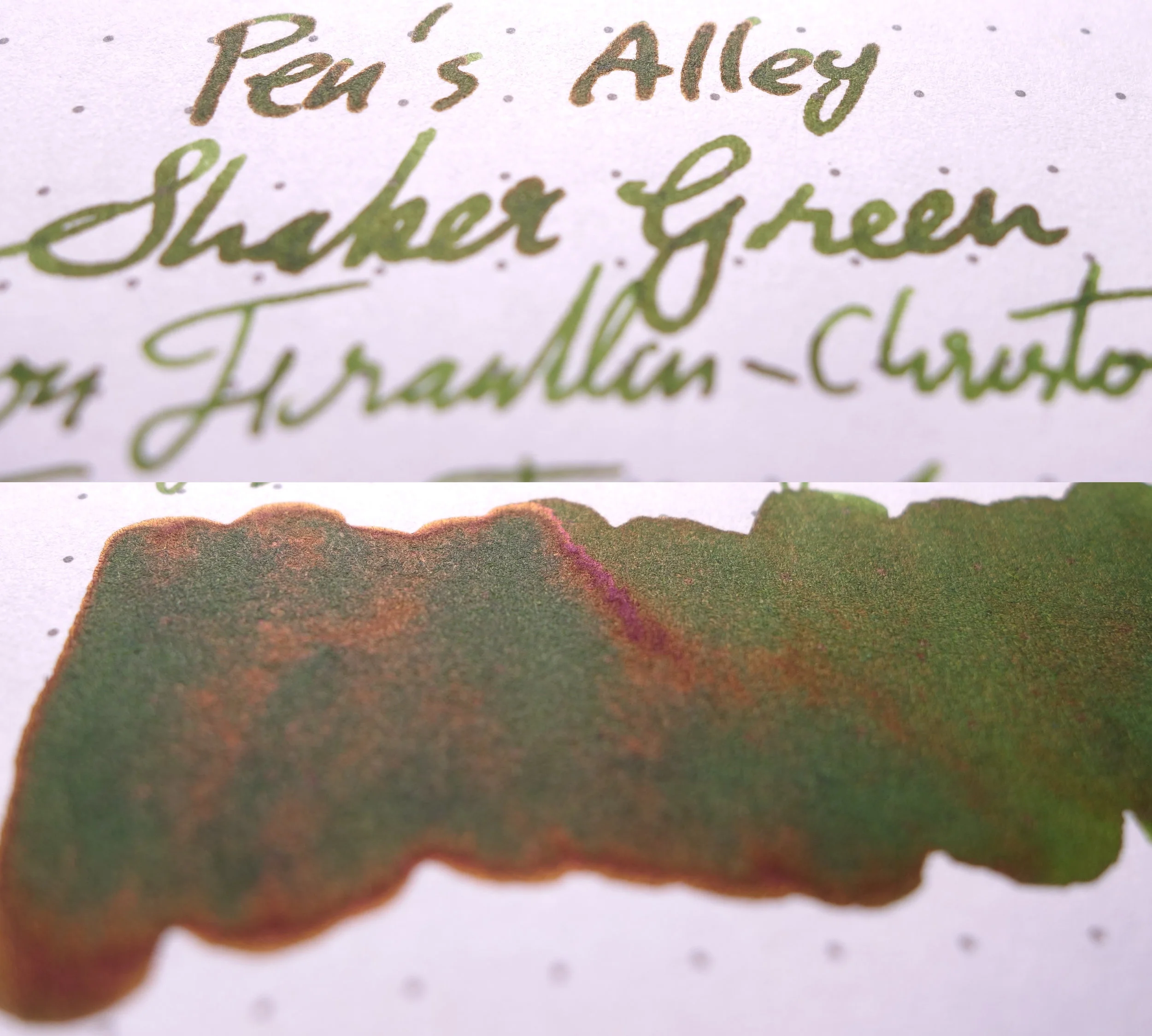
Pen’s Alley Shaker Green is a comforting olive green ink. As usual for a Sailor ink it performs great in the pen; wet and smooth with no issues. On paper it’s the similarly high quality with no bleeding or feathering but with nice shading and in this instance unique sheen. The ink isn’t a very rich ink, colour-wise, but it’s not weak or insipid at all. Saturation is, likewise, a little down but it still presents itself as a beautiful green colour. This ink is a decent shader.
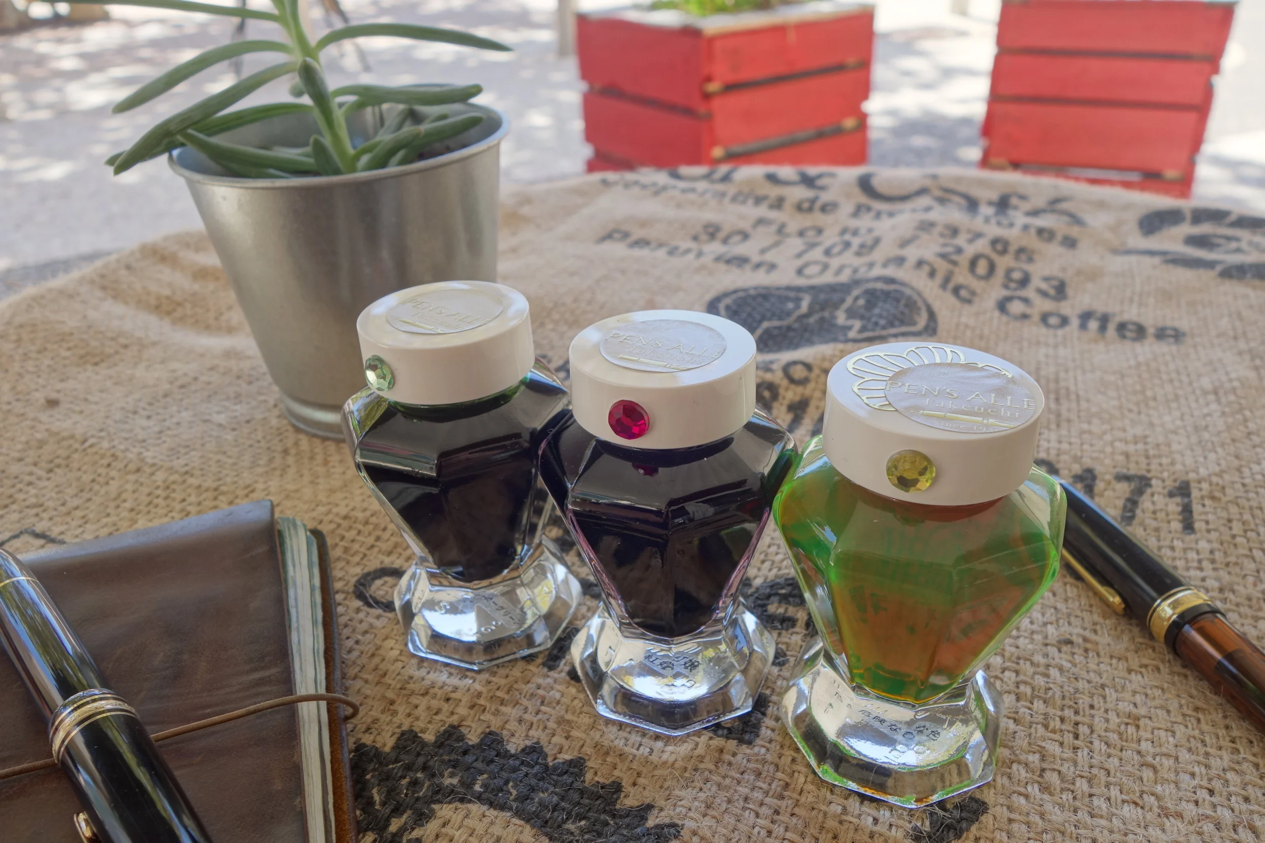
The ink comes in the beautiful vase bottle or tall bottle that Sailor use for some of the Store Exclusive inks. This bottle is by far my favourite ink bottle (even more so than Akkerman!). What’s unique about this is that they come with a little plastic jewel glue to the side of the lid (and some bottles also come with a flower picture on the top of the lid under the Pen’s Alley sticker). This isn’t a big deal but it is pretty and I certainly appreciate it.
Bottles of Shaker Green, Lady Red, and Dangerous Colour from Pen’s Alley
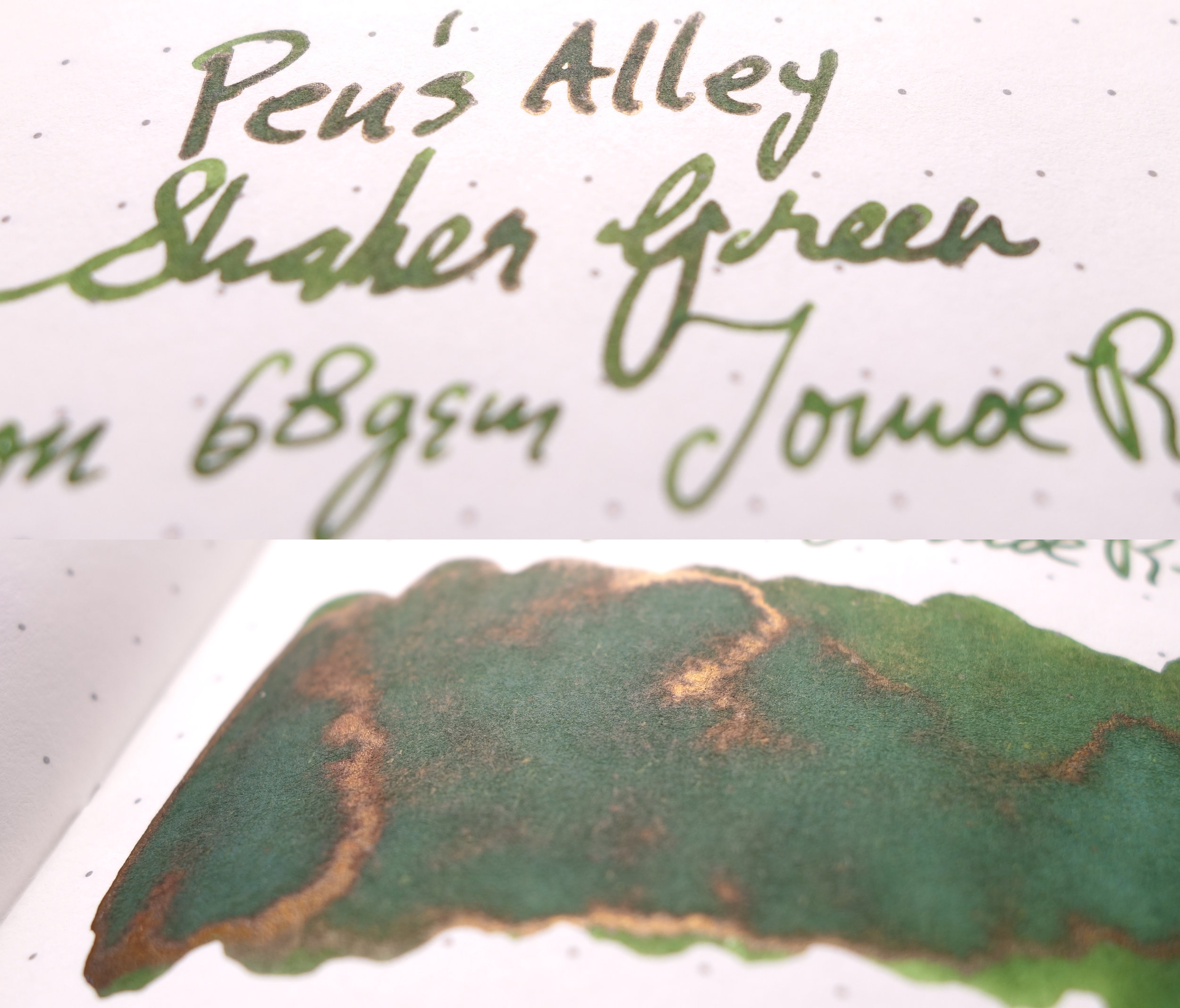
The sheen on this ink is what makes it so unique. I don’t know of another green ink that sheens gold! There are red sheeners and silver shiners but gold is unique. Get it in a wet enough pen and it’s a brilliant gold colour on the right paper. Layer it on thick in a swatch it goes from yellow to rose gold. I should stress that this isn’t a sheen monster. The sheen is somewhat subtle. It’s noticeably visible (on Tomoe River at least) but it doesn’t cover the line like some of these do. What’s unique is not even gold sheen (which is somewhat common on red-based inks); it’s the fact that there is a beautiful gold sheen over a yellow-green based ink colour. This is something I’ve never seen before (without faking it). It isn’t quite the right green to be adopted as an Australian ink, however.
Chromatogaphy is interesting. It starts with a hazy light blue, moves to a khaki colour, then to a lemon yellow and finally to a light green colour. A bit going on! Dry times aren’t bad on both Rhodia and Tomoe River. Nothing to write home about but around average.
On Rhodia (80gsm White), shading is good but there is little sheen. The ink doesn’t smear when wiped the next day. Water resistance is not that bad if you mop up the spill quickly (the test on the right) and leaves behind a light blue-grey when left to soak. Still visible so not too bad though I wouldn’t say this has water resistance.
The inks compared are: Montblanc Defoe Palm Green which is a similar brightness but is a little browner with a little less saturation. Kingdom Note Tanna Japonensis, which is also similarly too dark and not as saturated but is also a little yellower. Rohrer & Klingner Alt-Goldgrün is noticeably lighter and yellower than Pen’s Alley Shaker Green as is Organics Studio Willow Green (but even more so). Robert Oster Jade is a little too light but is, this time, more green and a little more saturated. Voice Maccha (that’s how it’s spelled on the box) Yokan is like Kingdom Note Tanna Japonensis but even darker. Finally, Robert Oster Verde de Río is even lighter and greener than Robert Oster Jade. The closest to my eyes would either be Montblanc Defoe Palm Green or Robert Oster Jade but neither are that similar.
The lovely olive green colour of the ink remains very similar on Tomoe River as it does on Rhodia which, while not unsual, isn’t exceedingly common. Shading also remains pretty good as well even though Tomoe River often homogenises shading a little. No smearing, which is very good on Tomoe River, and Water Resistance is as on Rhodia. Sheen is very pretty on Tomoe River.
As with many Montblanc inks, Defoe Palm Green loses a lot of saturation and brightness and so isn’t as dark or nearly as saturated as Shaker Green. Kingdom Note Tanna Japonensis is a little lighter and yellower now. R&K Alt Goldgrün has gone very light and has also lost some saturation but Organics Studio Willow Green hasn’t changed. Both Robert Oster Jade and Verde de Río have got a little lighter and a little less saturated and Voice Maccha Yokan seems even darker now. These inks are all less similar on Tomoe River. Kingdom Note Tanna Japonensis is, to my eyes, the closest but it’s a bit of a stretch.
There’s no comparison to be made of the sheen here. Voice Maccha Yokan and Kingdom Note Tanna Japonensis have a silver sheen (and Organics Studio Willow Green almost has one) none have something coming close to a gold sheen. Of the inks I’ve used that have a red sheen those inks are also more blue leaning than yellow leaning (like these inks are).
This ink is one of my favourite inks and it’s in a beautiful bottle. The problem with this ink is that it’s difficult to acquire. Not only are they frequently out of stock but you need to have a friend in Japan or use a proxy service (forwarders won’t work without a Japanese credit card, I believe). This is too much for many people to bother and the ink will also end up costing US$35+. This isn’t too bad when you factor in all the fees involved but it is still not a cheap purchase and with all the steps involved the hassle might not be for everyone. It’s worth it for me, though. Sailor inks are the perfect inks for me and their Store Exclusives are often unique and interesting and are very collectable.
The inks is a somewhat unique olive green and the sheen is beautiful and very unique and they work very well together. It comes with in the lovely Sailor vase bottle (with a cute little plastic jewel!). I love this ink and I think it’s worth the cost and effort!
If you are interested in a sample of the ink a good friend of mine runs the ink sampling facebook page Ink Sampler in their spare time where you can buy a whole bunch of samples of Sailor Exclusive inks (including Pen’s Alley Shaker Green). I don’t know of another service that offers the variety of difficult to find inks as this. There are also a bunch of more standard inks available as well. Highly recommend checking it out!
As usual, below as the ink on various papers.
I’ve listed all my inks and all my pens in their respective pages. Please let me know which inks you’d like to review next via the comments, Twitter, Instagram, or contact me directly.
For blog updated you can follow @macchiato_man on Twitter, subscribe via email, or like my Facebook page.
I was not compensated for this review and everything here is my own honest opinion. There are no affiliate links.









Leave a Reply