Kobe’s ever increasing list of inks were for a while only available from Japan. These were more easily available than some other Japanese exclusive inks because they shipped internationally from Nagasawa’s – the store that sells Kobe inks – Global Rakuten store. More recently they began being sold by some US stores such as Vanness and Pen Chalet and this year they came to Australia which I’m, personally, pretty happy about. Kobe #07 “Kaikyo Blue” is named after the water under the Akashi Kaikyō Bridge, a suspension bridge, and the longest in the world, in Kobe, Japan.
A new store called Desk Bandit has opened in my city (that does international and national deliveries with free-shipping thresholds and a 15% discount code if you subscribe to their Newsletter) and I emailed them asking whether I could write something small about them. After ordering a few Kobe inks, some Colorverse inks, and an Opus 88 Koloro from them they added an extra bottle of Kobe Kaikyo Blue to my order. This isn’t a sponsored review in a traditional way, but it is in another sense in that I think the people behind the store are doing a great job getting new and interesting stock and at good prices plus these are local to me so I have my own self-interesed reasons for their success! I’ll talk a little about them later in the review but there will be no affiliate links and I’d like stress that I was the one who reached out to them.
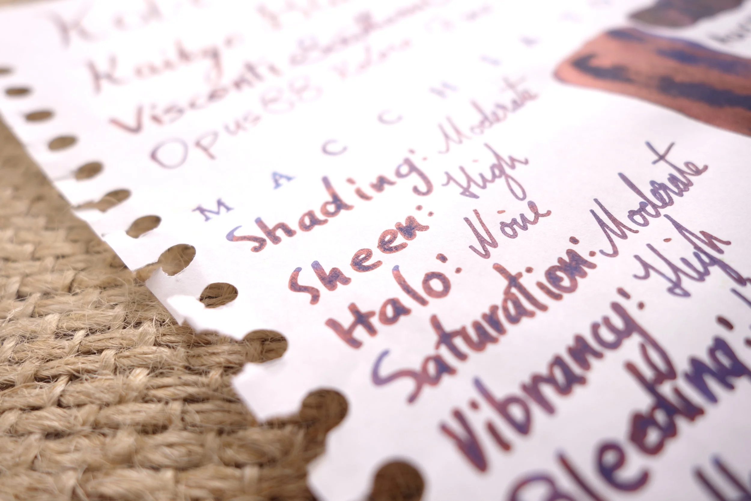
Kobe #07 Kaikyo Blue is a more traditional “blue-black” in that it isn’t just a dark blue (which is how I see Kobe #38 Kitanozaka Night Blue) . Kobe #07 isn’t super saturated because the “black” in “blue-black” removes some saturation (otherwise it wouldn’t be black!). It’s still a rich ink with a good amount of dye content. As it’s a Sailor ink, it performs very well with no feathering or bleeding on fountain pen friendly paper (shoutout Fountain Pen Friendly – a blog from a fellow Australian who is reviewing notebooks!) as well as limited feathering and bleeding on cheap paper. The ink is also nice and wet and smooth as usual for a Sailor ink. The ink has some shading, and isn’t bad for a rich and wet blue-black ink but it isn’t a large amount.
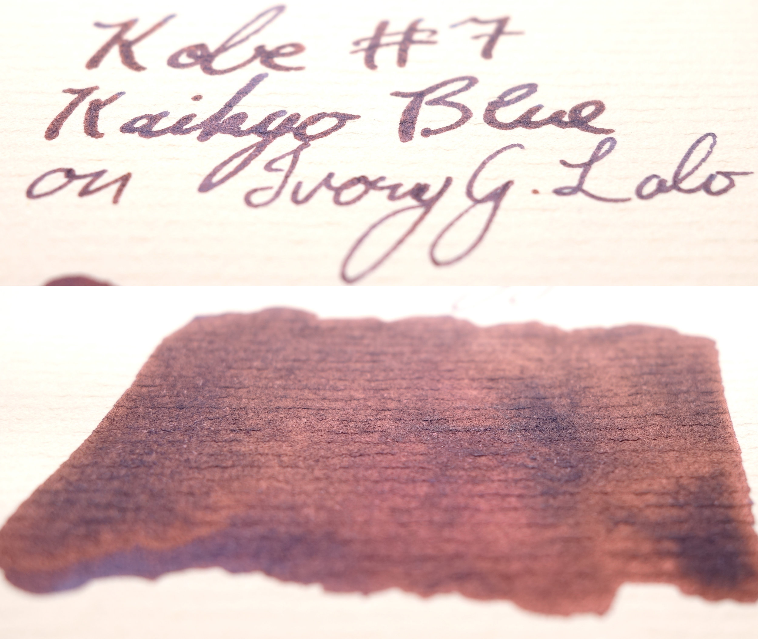
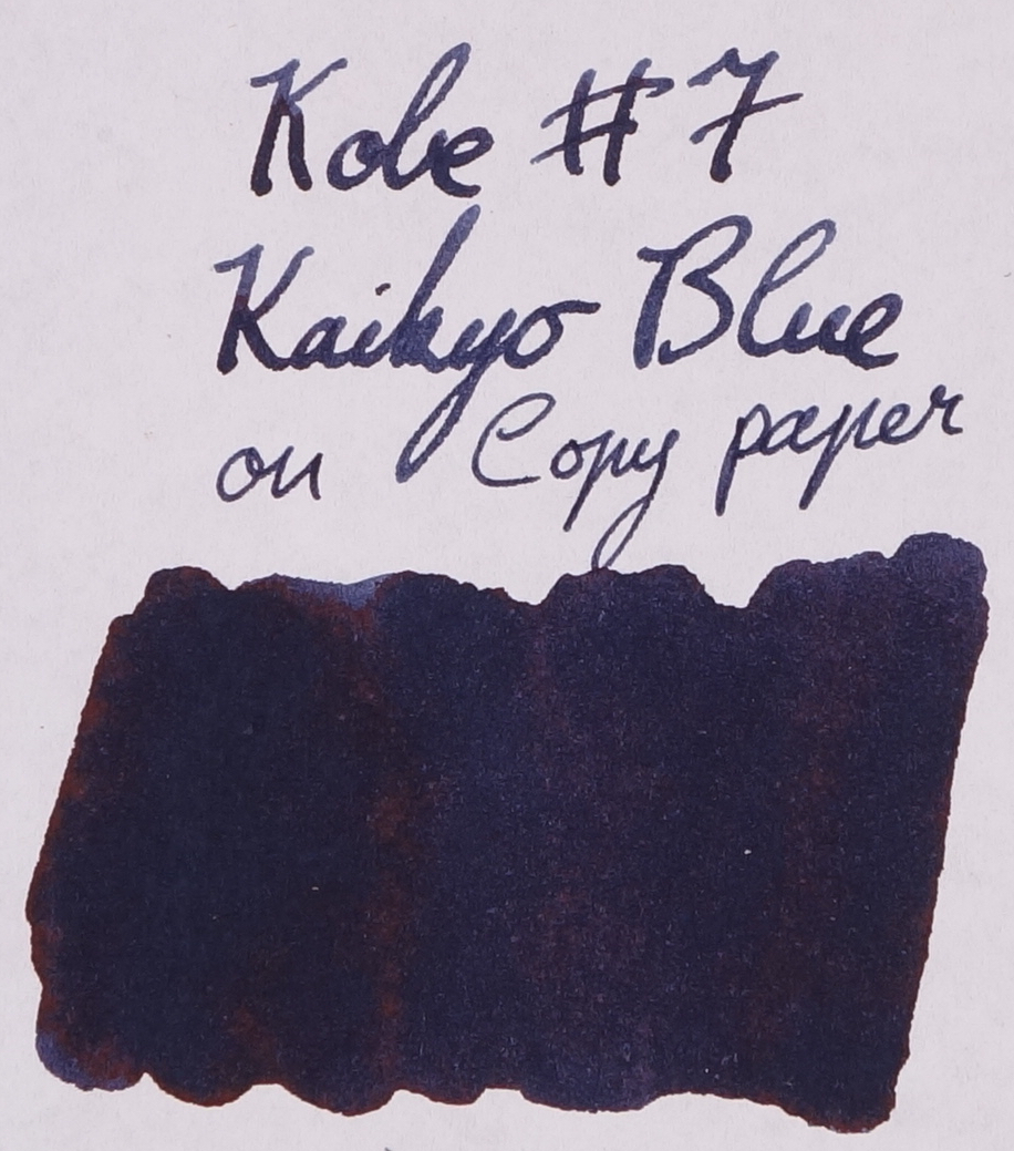
On the right paper, sheen on this ink is pretty impressive. A very prominent coppery-red sheen covers much of the ink on 52gsm Tomoe River and is noticeably prominent on many other papers. Very little on Rhodia, but there is some very subtle amounts on copy paper (though I’m starting to think the copy paper I have on hand is actually not that bad for copy paper).
Chromotography is pretty plain; mostly just the colour of the ink with some darker tinges up the top. Daytime isn’t bad on Rhodia but is a little slow on Tomoe River. Water resistance (see reviews below) isn’t bad as you should still be able to read what was accidentally washed.
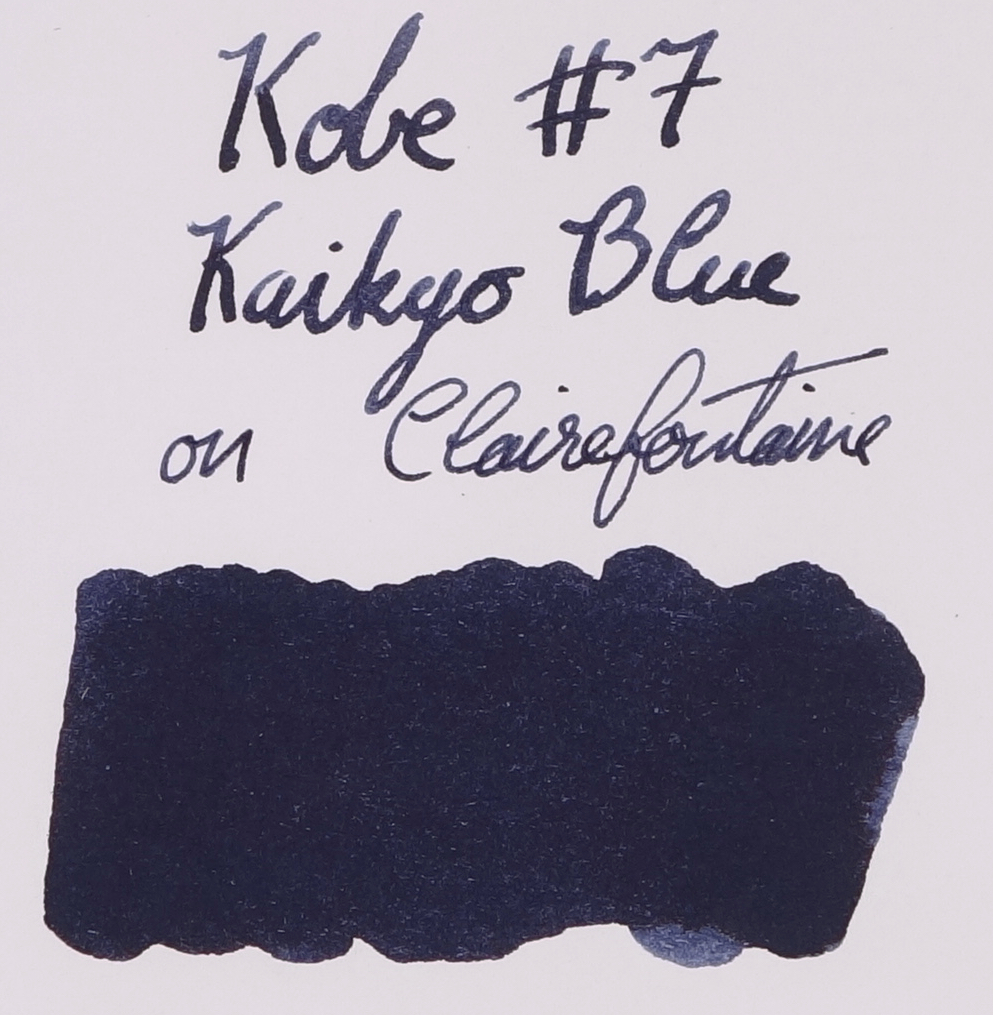
On Rhodia, Aurora Blue Black is actually not a bad substitute. A little greyer, maybe. Kobe #51 Kano Cho Midnight is too dark but actually somewhat similar. Iroshizuku Shin-Kai is way too light. Sailor Blue Black, Pelikan Edelstein Tanzanite, and Bungubox 4B are all too green leaning. Finally Kobe #38 Kitanozaka Night Blue is too saturated and a little too dark.
Rhodia White 80gsm
On Tomoe River, Aurora Blue Black becomes too green and while Kobe #51 Kano Cho Midnight still seems decently similar in colour, the sheen, which is green, looks very different. Iroshizuku Shin-kai is still way too light but is also too saturated now. Pelikan Edelstein Tanzanite, Sailor Blue Black, and Bungubox 4B are still too green but Sailor Blue Black and Bungubox 4B don’t seem as distinct as they are on Rhodia. As above, Kobe #38 is still too saturated but is otherwise now a comparable brightness.
Ivory/White 52gsm Tomoe River
Kobe #07 is one of the sheeniest of the bunch. Only Bungubox 4B really compares well it strength and is also a similar coloured sheen. Iroshizuku Shin-kai, Pelikan Edelstein Tanzanite, and Sailor Blue Black have similarly, to each other, less sheen but a similar coloured sheen to Kobe #07. Neither Kobe #51’s green sheen and Kobe #38’s hybrid green-red sheen do not compare well.
Kobe #07 Kaikyo Blue is a solid blue-black. It isn’t as unique as something like Kobe #38 but it does “blue black” well and with all the bells and whistles that are common with Sailor inks (good performance in a pen and on paper, it’s wet, it has some nice sheen) but unlike something like Sailor Blue-Black, Kaikyo Blue it isn’t that green leaning and I, personally, much prefer my blues to not lean too far green.
As mentioned, I got this ink from The Desk Bandit (which I will talk about a little bellow – and below that is still the customary paper comparisons) which I strongly suggest checking out, especially if you are from Australia. They have a unique range of inks (for Australia, anyway) and are eager to grow their stock where practical and possible.
I’ve listed all my inks and all my pens in their respective pages. Please let me know which inks you’d like to review next via the comments, Twitter, Instagram, or contact me directly.
For blog updated you can follow @macchiato_man on Twitter, subscribe via email, or like my Facebook page.
I received this ink free of charge for the purpose of giving an honest review. I was not otherwise compensated and everything here is my own honest opinion. There are no affiliate links.
The Desk Bandit
The three friendly people behind the The Desk Bandit started the store on Etsy in 2017 and late last year they expanded to a standalone web store. I only recently stumbled upon the store (I can’t remember how) and was excited to find out that the store is based in Perth, Western Australia where I live. Perth is a somewhat small and isolated city so having a new store is welcome news, especially one offering more exotic inks than just Waterman and Pelikan (not that they are bad!), so I wanted to try and give them a bit of a shoutout.
The team behind The Desk Bandit are wanting to focus on customer service. They want to go further than how a usual customer retailer relationship would be by, for example, helping you research an idea for a product that you have to find a product that fits, help you get an ink, or help you with a pen. In my experience they have been very open to community suggestions. One of the products that I and others in the Perth and Australian community suggested was Colorverse inks and not too long after they started stocking Colorverse (and at very decent prices). They are quick to respond to emails, and are happy to talk (and are patient too).
Like many web shops they are powered by Shopify so the experience is familiar and easy as many pen shops around the place use this as well. Their packages are packed extremely carefully (Kobe bottles come wrapped in bubble wrap and then enclosed in a sealed bag to prevent damage from potential, though unlikely, leaks. My Koloro was presented very well with a black paper wrapping with a The Desk Bandit sticker affixed to it. The presentation of the packaging is great and feels very secure. Even better, though, is how each order comes with a Tim Tam!
They have a 15% off code if you sign up to their newsletter as well!


Leave a Reply