Shumibun Writing Time Jasper Green is a Sailor store exclusive ink from Shumibun in Japan. The store itself is makes a Fountain Pen magazine for the Fountain Pen market. The store describes the colour as a “deep green mixed with jasper”. There are two other inks in the series (from which I only have a bottle of Jasper Green): Coral Blue (a dusty turquoise colour) and Lapis Blue (a rich blue).
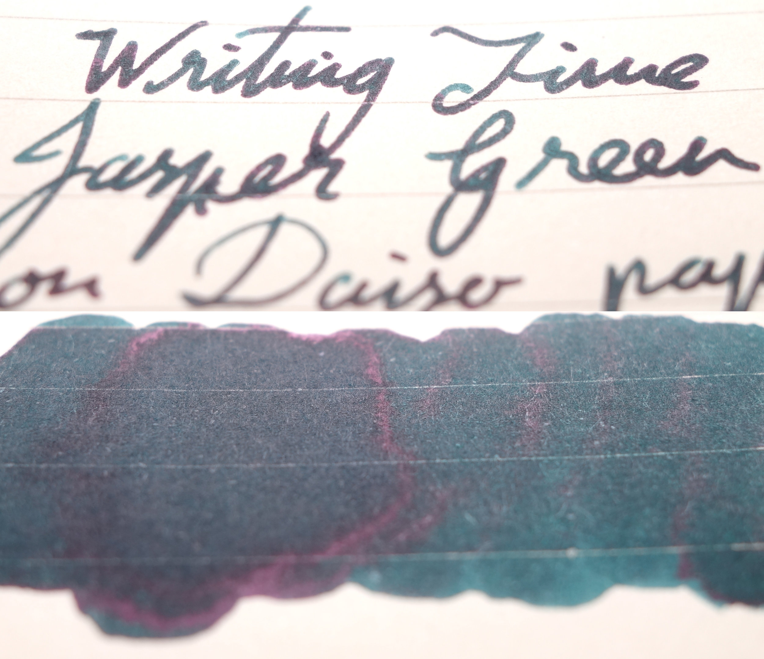
The ink itself is a little too blue and too dark for my idea of Jasper. It’s a rather dark teal ink and it isa very rich colour with high saturation. It comes in the now-outdated squat and round Sailor bottle with the label on the lid. I found no issues with the ink and it’s very smooth and wet and generally performs well in a pen and on paper, as usual for a Sailor ink with no bleeding and no feathering. The ink isn’t bad for shading especially for a dark wet ink. It’s not huge but it’s there.
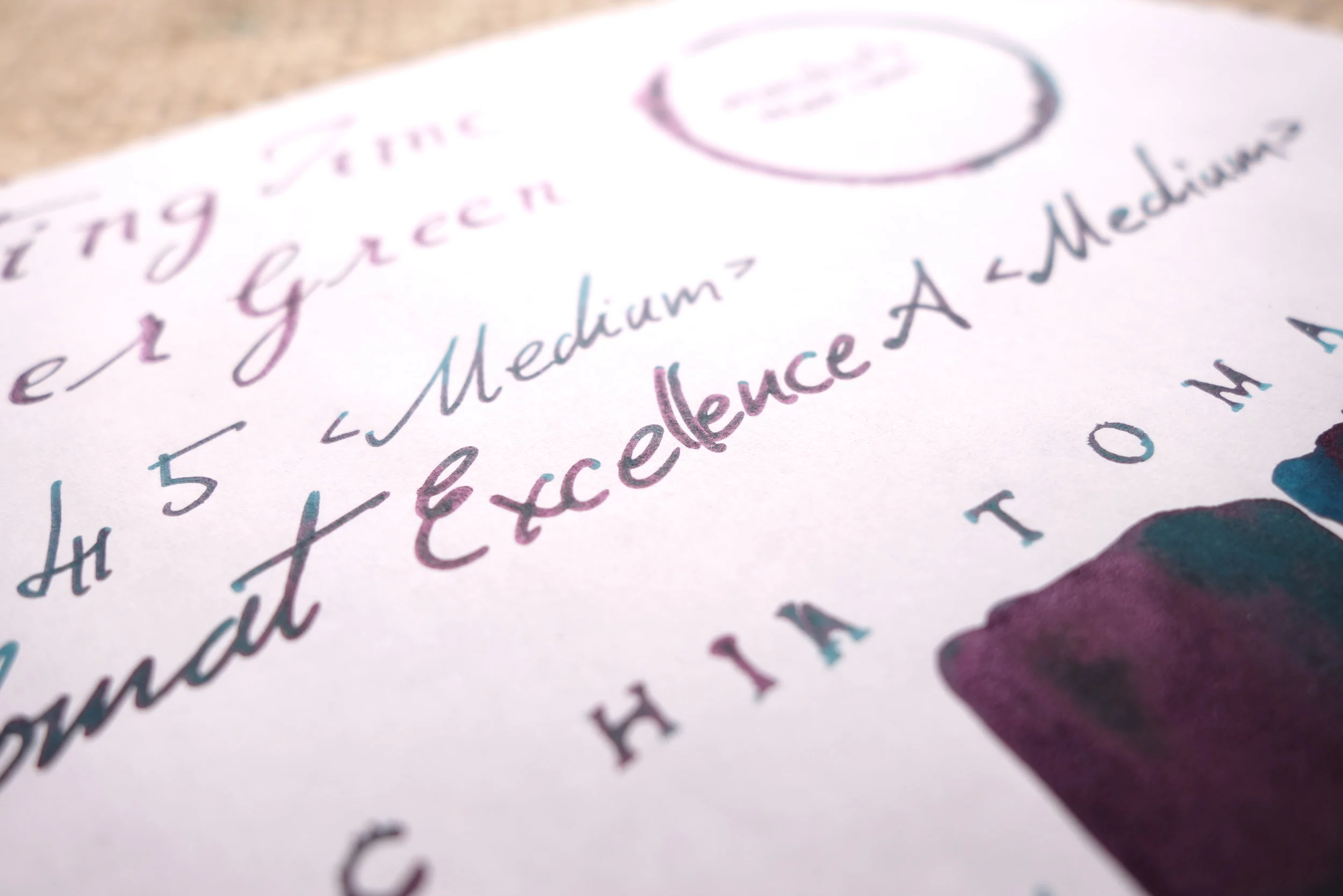
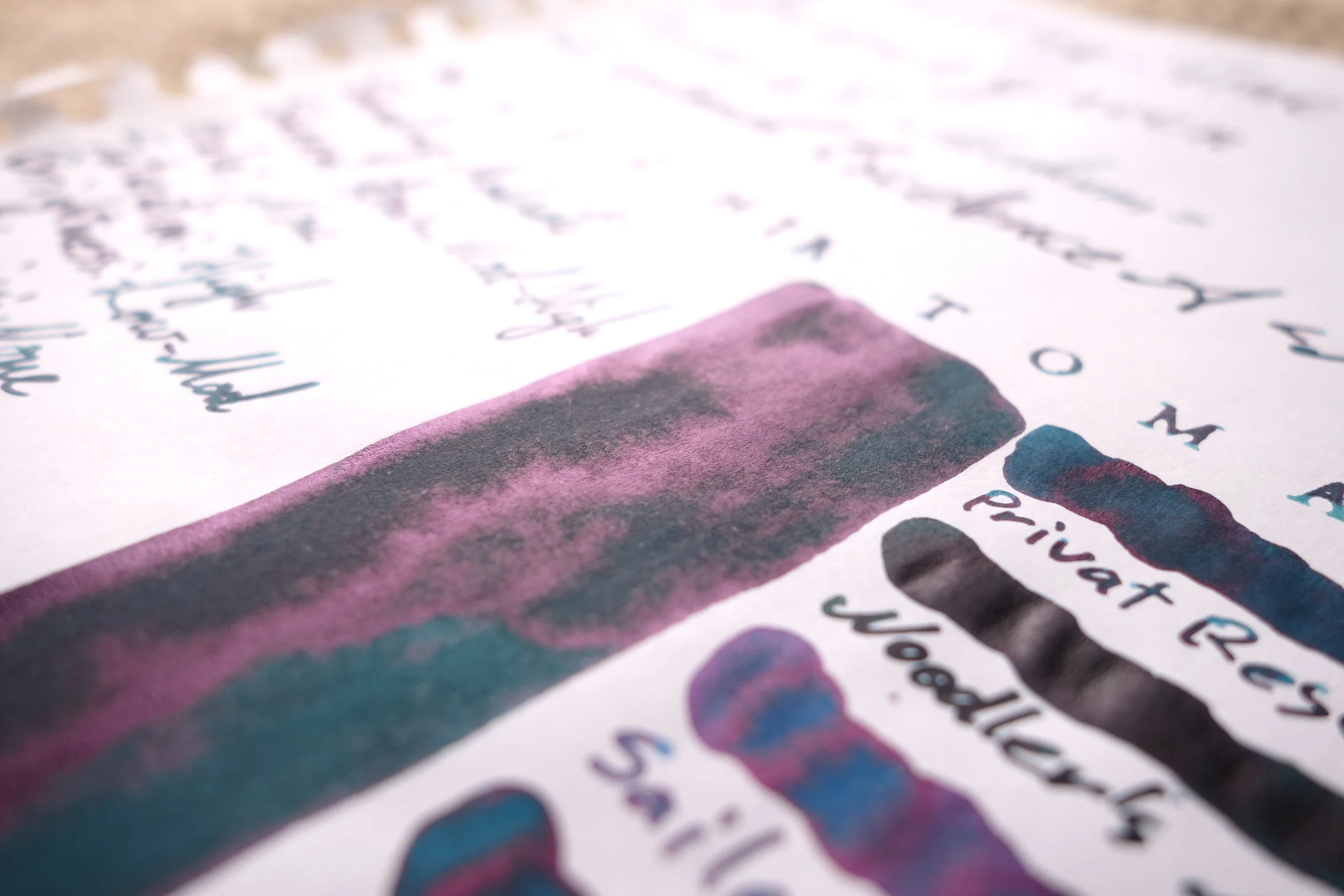
The ink does have a nice sheen to it. It’s a somewhat subdued sheen that, like Robert Oster Velvet Storm and unlike something like Organics Studio Ralph Waldo Emerson Twilight Blue is somewhat soft rather than shiny and bright. The Sheen is a pink mauve similar to Opera mauve and is’t a strong sheen though it will be present, when on Tomoe River, most of the time. There is no practical sheen on Rhodia, however.
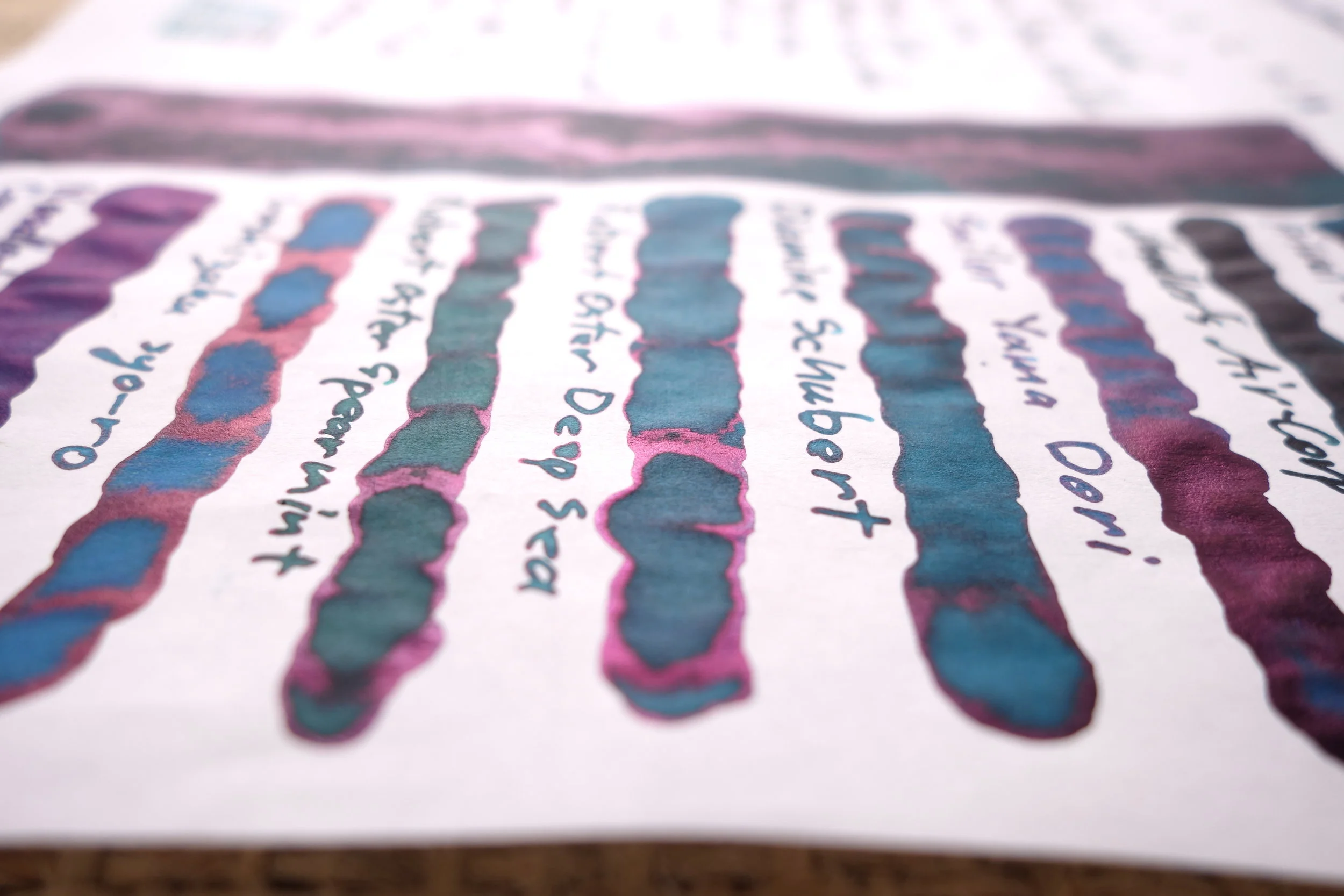
The Chromatography isn’t bland but it is all in a similar tone. It starts wit ha grey-blue moves through a real that gets darker before going into a blue-green and finally a turquoise. Dry time isn’t bad on Rhodia but is a little on the slow side on Tomoe River but still not that bad.
On 80gsm white Rhodia paper the ink as some nice shading on the tips of the letter but most of the line is pretty dark. Water resistance isn’t bad! Can definitely see the line after water has soaked (right hand test) and after quickly dabbing.
The compared inks are Private Reserve Ebony Blue which is a similar brightness and shading but a little more blue. Noodler’s Air-Corp Blue-Black is too green. Sailor Yama-Dori is way too light and blue as is Diamine Schubert. Robert Oster Deep Sea is way too light as well. Robert Oster Spearmint is way too green and too light. Iroshizuku Syo-ro is a good hue but too light. Private Reserve Blue Suede is too blue and light.
On 52gsm Ivory (white) Tomoe River the shading drops a little but not too bad. The ink looks a little greener here as well. Water resistance is the same as on Rhodia.
Private Reserve Ebony Blue is, on Tomoe River, too blue but an decently compareably hue. Noodler’s Air-Corp Blue-Black is much closer on Tomoe River than it was on Rhodia but is still a touch too green. Sailor Yama-Dori is way too blue and light. Diamine Schubert, Robert Oster Deep Sea and Robert Oster Spearmint are all way too light. Iroshizuku Syo-yo is now too blue and light. Noodler’s Prime of the Commons while a curious ink that has some changes of colour on the page is too blue.
When comparing sheen, surprisingly a Noodler’s ink is possibly the closest! The sheen of Writing Time Jasper Green is slightly dull and also covers the whole line and that’s what happens with Noodler’s Prime of the Commons Blue-Black. Sailor Yama-Dori covers the whole line but is too bright. The rest of the inks sheen on the edge of the line and are too bright or are not sheeny enough.
Since doing this review I’ve subsequently purchased and received Anata Brand/Mita Club Shooting Star of Junuma, another Sailor Store Exclusive, and it’s a similar ink to this; a dark teal. It’s probably a little more blue than this but overall not too different.
Shumibun Writing Time Jasper Green is an interesting and is a pretty uniqe colour and sheen. The muted sheen on a Sailor ink isn’t too common and I feel this is an ink that might be OK in a work setting. The slight water resistance might be a boon to some as well. Unfortunately, as with the vast majority of Sailor’s Store Exclusive inks, they are difficult to buy. You’ll need either a proxy service (or possibly a forwarding service) which means extra fees and shipping costs on top of the base ¥2160 (including tax) price. This might be an issue to some but I think sailor inks are worth the higher costs.
As usual, below as the ink on various papers.
I’ve listed all my inks and all my pens in their respective pages. Please let me know which inks you’d like to review nextvia the comments, Twitter, Instagram, or contact me directly.
For blog updated you can follow @macchiato_man on Twitter, subscribe via email, or like my Facebook page.
I was not compensated for this review and everything here is my own honest opinion. There are no affiliate links.


Leave a Reply