While Robert Oster Signature Ink’s Fire & Ice isn’t going to go anywhere, River of Fire hopes to be the successor to Fire & Ice’s crown. Like Fire & Ice, River of Fire has a great name and a border of sheen. The ink colour itself was created based on the colour of Rob’s boyhood local river green (though I assume that river wasn’t made of fire!)
I’ve been warming to blue-greens, green-blues etc. lately. Normally they aren’t the colours that I go for. I put Iroshizuku Syo-ro in a pen and enjoyed it so this comes at a good time for my taste! The ink is green ink that leans blue rather than a blue ink that leans green. It’s a nice wet ink, like Fire & Ice, with smooth lubrication.
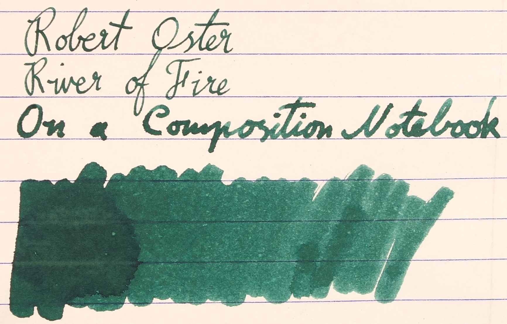
On fountain pen unfriendly paper there is some feathering (not unexpected!) but otherwise the ink performs well with no feathering or bleeding on semi-decent paper or better.
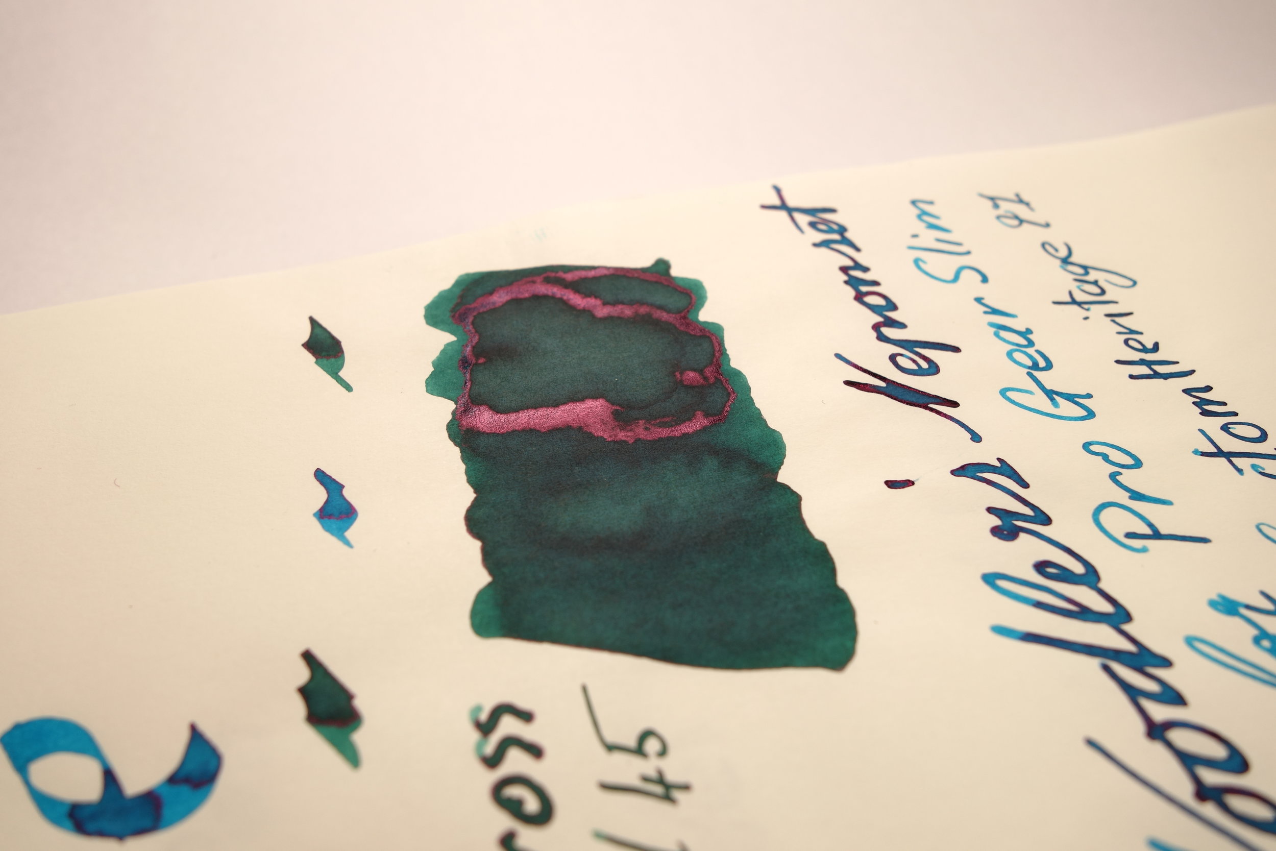
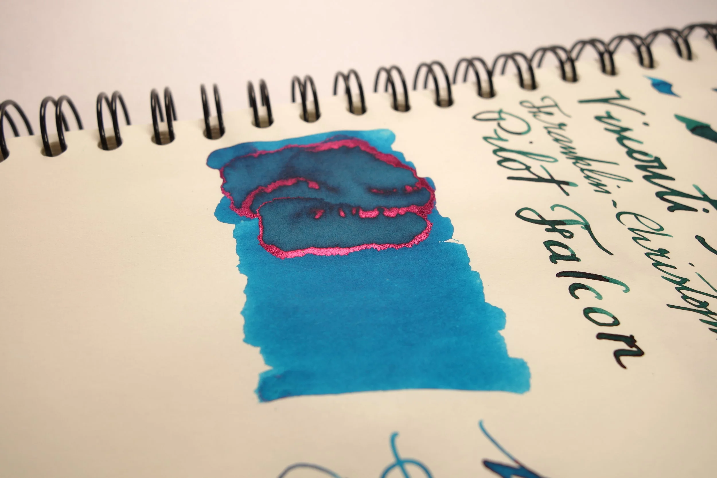
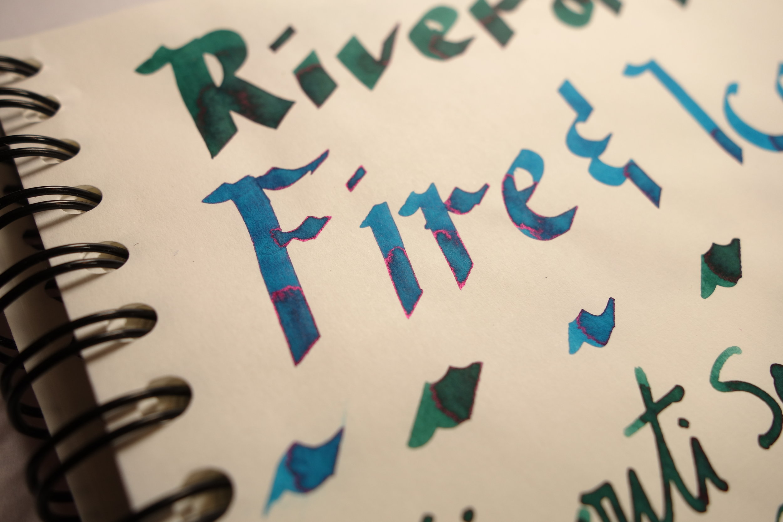
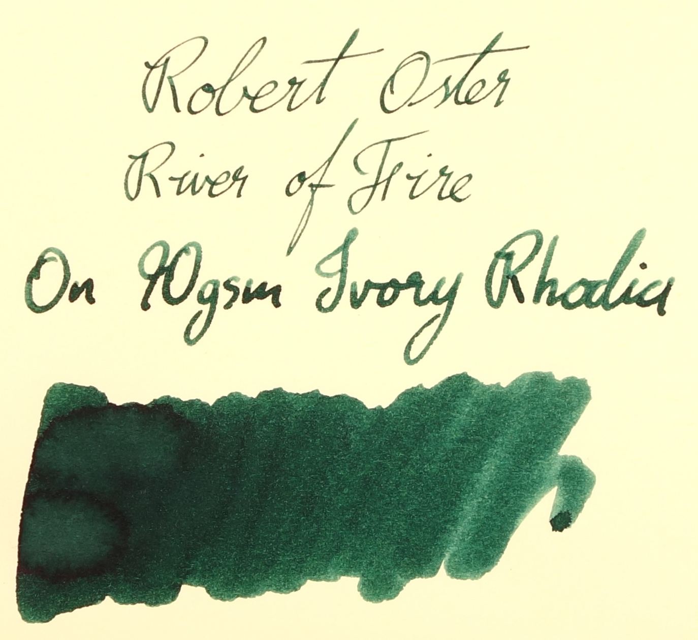
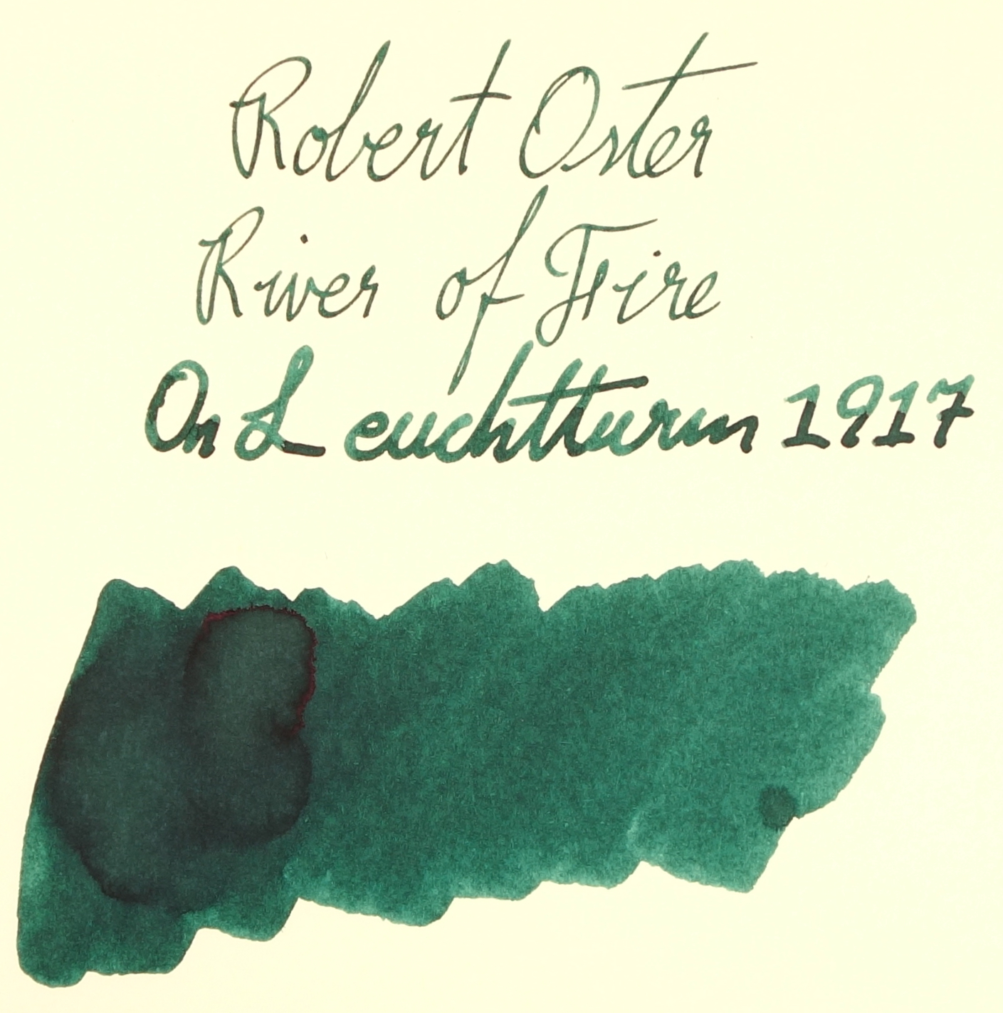
The fire part of the ink is not quite is bright as Fire & Ice and is a little more muted in colour. It’s still a shiny red sheen, like Fire & Ice, but not as shiny. The ink sheens fairly well in a wet pen on Tomoe River paper, but Fire & Ice is still slightly ahead in the quantity department. The two perform fairly similarly on Tomoe River (notwithstanding that Fire & Ice’s sheen is shinier) but where the differences lie is on more absorbent paper. Fire & Ice still is a bit of sheen on Rhodia but with River of Fire you need to look a little closer.
It’s worth noting that the sheen from the Noodler’s Neponset is so strong on Fire & Ice because my Neponset is an extremely wet pen. It puts down a line that stays raised up from the paper it pools so much for a good while.
The ink has absolutely no water resistance, which is expected. The dry-time is fairly quick for a sheening ink. Maybe I’m used to Sailor ink dry times but for me 30 seconds to dry on Rhodia is fast dry for me.
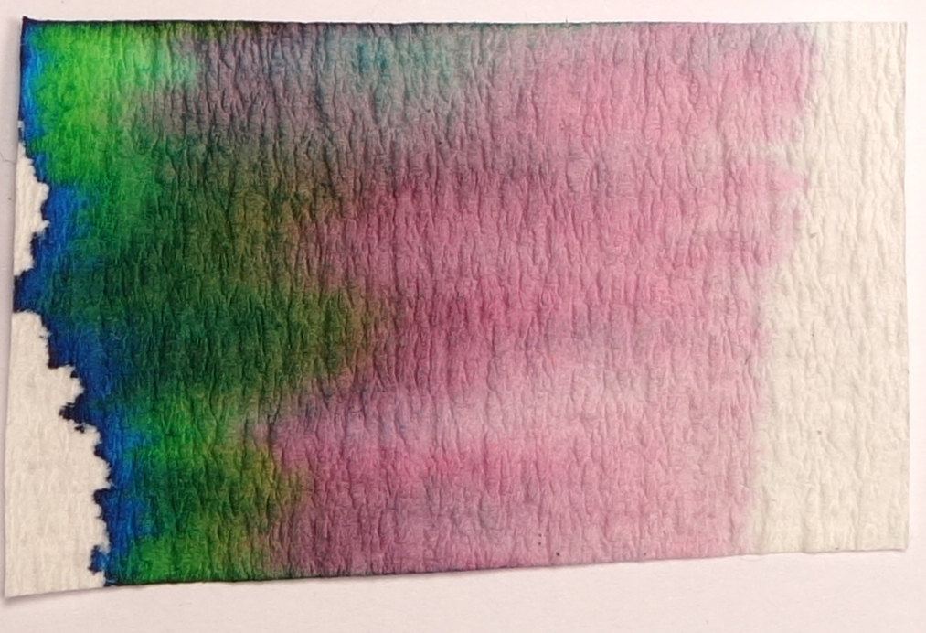
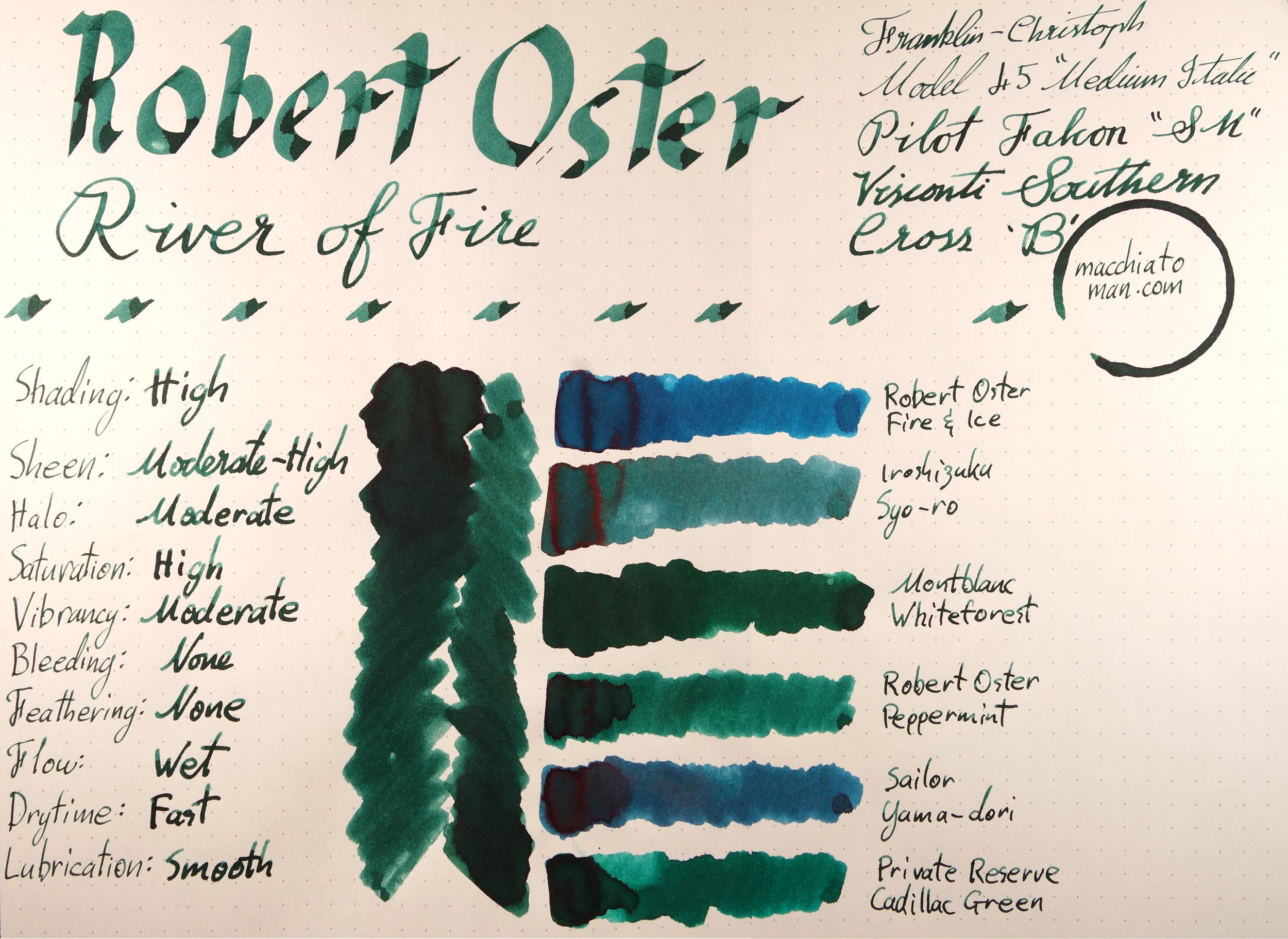
The Chromatography is pretty interesting. There’s the blue that finishes the chromatography breaking out of a yellowy-green but below that is a decent amount of grey-pink. A similar grey-pink is on Robert Oster Graphite. There seems to be a slight hint of an orange-yellow in between the pink and the green as well.
Top to bottom (River of Fire on the left): Robert Oster Fire and Ice, Iroshizuku Syo-ro, Montblanc Whiteforest, Robert Oster Peppermint, Sailor Yama-Dori, Private Reserve Cadillac Green
When I first saw the ink I thought of a sheening Montblanc Whiteforest but it turns out the Whiteforest has less blue in it, is a little flatter and of course has no sheen. Iroshizuku Syo-ro has a decent amount of sheen and is a comparable colour but is lighter and a little more blue (of note is that Syo-ro goes on the paper quite blue and dries a lot greener). In included Sailor Yama-dori because whenever a blue-green (or green-blue) ink comes around people often wonder how it compares to Yama-dori. Well Yama-dori is closer to Fire & Ice than it is to River of Fire! Much less green. Private Reserve Cadillac Green is muncher brighter and more vibrant than River of Fire (my bottle of Cadillac Green unfortunately doesn’t sheen though I know that there are those that do).
On 80gsm Rhodia
On Ivory Tomoe River
I have expanded the lineup of different papers below to include Spirax and Graphilo paper.
This type of colour has never been the top of my list of ink colours. I have been warming to them lately and this is a very nice one. Very nice shading, decent amount of sheen and performs well and wet. But will it take the crown from Ice & Fire? For me, no. I love blues so I’m predisposed to prefer Fire & Ice. The sheen is also just a bit less than Fire & Ice. As for whether it overtakes Fire & Ice for others depends on whether you prefer your inks to be blue-green colours or green-blue colours!
I’ve listed all my inks and all my pens in their respective pages. Please let me know which inks you’d like to review next via the comments, Twitter, Instagram, or contact me directly.
I received this ink free of charge for the purpose of giving an honest review. I was not otherwise compensated and everything here is my own honest opinion. There are no affiliate links. I do sell Robert Oster inks at my café but I am not allowed to sell the inks online, only in shop.













Leave a Reply