Robert Ostster’s Kada Kada FPA Light & Dark are two ink made for the Fountain Pens Australia Facebook group. After two rounds of choosing colours that Robert would base the ink off, the group chose “Kada Kada” with the colour hash code of #270567 and after that I worked with Rob to come up with this ink. The name Kada Kada means “Story” in the local (to me in Fremantle, Western Australia) Noongar language. And the hash code was chosen because it is the date (27/05/1967) that Indigenous Australians were afforded constitutional rights.
The ink can be bought exclusively from Pensive Pens in Australia.
Kada Kada Light and Dark have high saturation but are not inks with high vibrancy. Their colour is a somewhat soft and dusty dark grey purple. The main difference between Dark and Light apart from the obvious is that Dark has a less red visible. The colours to separate a little on the page meaning that you can sometimes see parts where the line is redder or bluer.
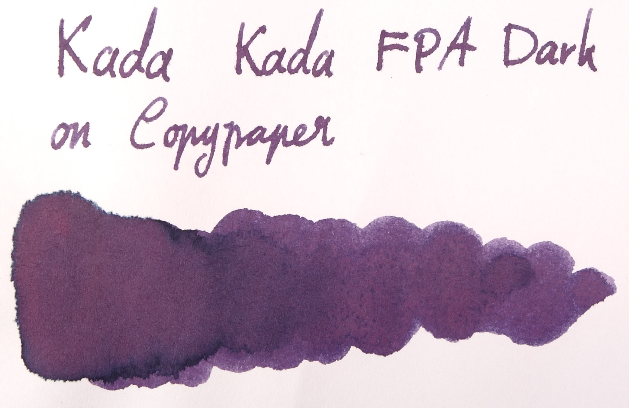
Kada Kada Light and Dark both have moderate lubrication and flow. They definitely aren’t dry by any means but they aren’t Sailor-level wetness either; the glide across the page nicely. The ink has good shading but it isn’t extremely noticeable in wetter pens. There is some shading though to give it some character. Drytimes are on the slower end of the spectrum and the ink performs very well on Rhodia, Clairefontaine and Tomoe River but feathers pretty badly on cheap 80gsm copy paper. The colour also adopts more of a red look on copy paper and loses a lot of character. The dark characteristics of the ink wash away leaving a light pink glow behind so this ink is not very water resistant, as expected.
Somewhat astonishingly, there is absolutely no sheen on Tomoe River (though there is quite a decent halo effect on good paper). Kada Kada FPA Dark has a deep dark green sheen on Rhodia, but not on Tomoe River. This sheen doesn’t appear when in a pen, however, only in wet swatch form.
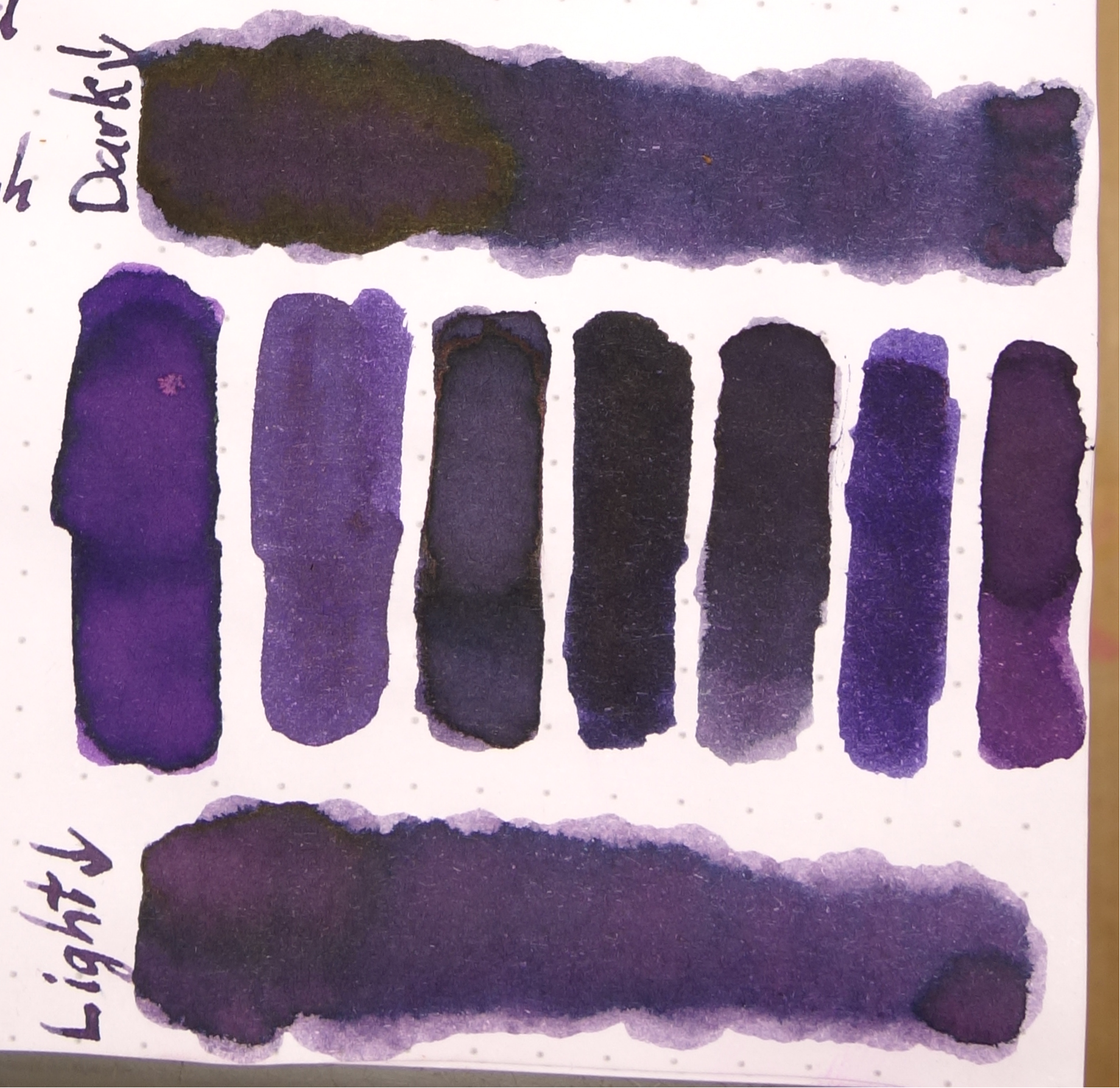
Left to right: 1) Diamine Amazing Amethyst; 2) Noodler’s La Reine Mauve; 3) Robert Oster Purple Rock; 4) Private Reserve Ebony Purple; 5) Bungubox Sakanamachi Horoyoi/Tipsy Purple; 6) Sailor Shigure; and 7) Papier Plume Mardi Gras Purple
Bungubox Sakanamachi Horoyoi/Tipsy Purple is the closest of the inks I have to Kada Kada FPA Light while Private Reserve Ebony Purple is the closest to Kada Kada FPA Dark. Amazing Amethyst and Papier Plume Mardi Gras Purple are both too vibrant and red while Shigure has too much vibrant blue. Noodler’s La Reine Maybe is fairly similar to Light, it lacks a lot of the shading and halo. Robert Oster Purple Rock is again similar but darker and with less shading.
Review on Rhodia
I do like this ink. It’s a good professional colour with some character. The two versions are fairly similar so if you’re on a budget my preference goes to the Light; I feel that the redder tone gives it an edge but I still recommend both if you can. I’m unsure as to whether this ink will be in Rob’s rotation forever so I suggest buying it while you can! I’d like to thank Rob for taking the time to make an ink for our growing Australian community!
I’ve listed all my inks and all my pens in their respective pages. Please let me know which inks you’d like to review next via the comments, Twitter, Instagram, or contact me directly.
I received this ink free of charge for the purpose of giving an honest review. I was not otherwise compensated and everything here is my own honest opinion. There are no affiliate links. I do sell Robert Oster inks at my café but I am not allowed to sell the inks online, only in shop.


Leave a Reply