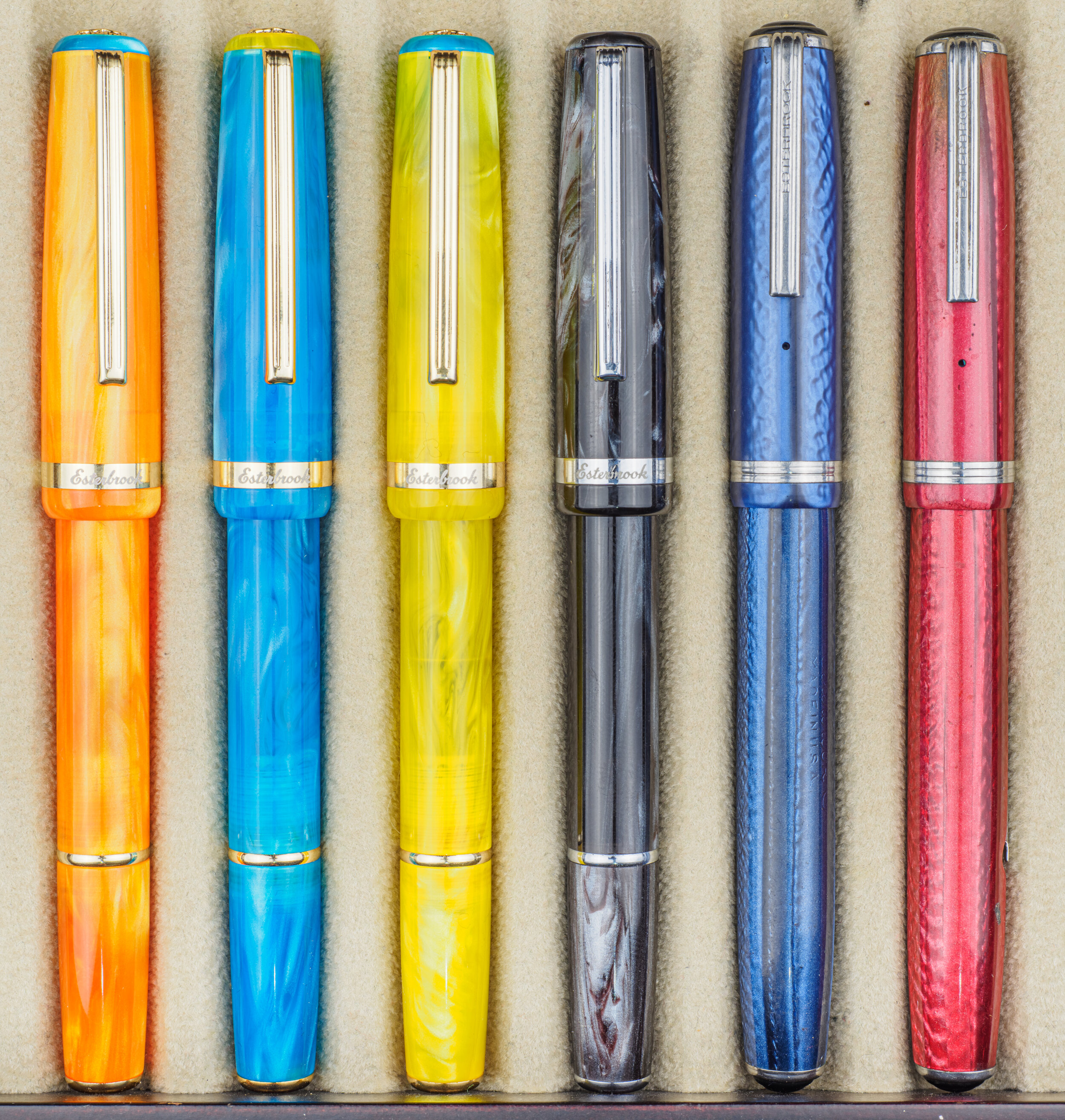
The Esterbrook JR Pocket Pen is part of the modern Esterbrook’s revival of the brand with the pen being a call back to one of vintage Esterbrook’s most popular pens, the Esterbrook J. The modern Esterbrook JR has come in a few colours, Red (‘Carmine’), Black, (‘Tuxedo’), and Blue (‘Capri’) but Esterbrook recently released the Paradise Set of three brightly coloured pens. These new colours have some slight design changes and come in Yellow (‘Lemon Twist’), Blue (‘Blue Breeze’) and Orange (‘Orange Sunset’). This review features the full Paradise Set, and the standard Tuxedo wit comparisons with two vintage Esterbrook J pens.
Thanks to Esterbrook for sending in the Paradise Set and to Desk Bandit for sending in the Tuxedo for review!
The now-vintage Esterbrook J was a very popular pen and because of how many were made it can still be easily found for affordable prices. These vintage J pens were small pocketable pens and one of the major selling point was the interchangeable nibs available to them. With at last 32 different nibs of various size and character and four different degrees of flexibility of those nibs. The nibs would easily unscrew and you could walk into any Esterbrook pen counter and buy a replacement nib. The tag line was some variation of having a nib for every writer or way of writing:
Put Personality in Your Handwriting with the Right Point for the Way You Write
Esterbrook Pens … with a choice of points for every writer – The gift for comfortable writing
Give the pen with the right point for every writer – The gift for more comfortable writing
Times have changed since then! You can’t casually walk into a department store or a mall or CBD, find the Esterbrook booth and buy a different nib right then and there. We are currently in a golden revival of fountain pens but we don’t quite have the universal appeal as they did in the 1930s. We have so much variety and opportunities with new pen makers and pen designs but the we never quite made it to the same complexity of nib choices of the fountain pen’s heyday. I do feel pretty confident in saying that we have more variety with inks than ever before, however!
At the start I called the modern Esterbrook JR a call back to the vintage J. You could also call it homage or ‘inspired by’. The JR has similar dimensions and profile to the J and you can see the reference point but it is certainly a modern pen and a distinct pen rather than a new version or a revival.
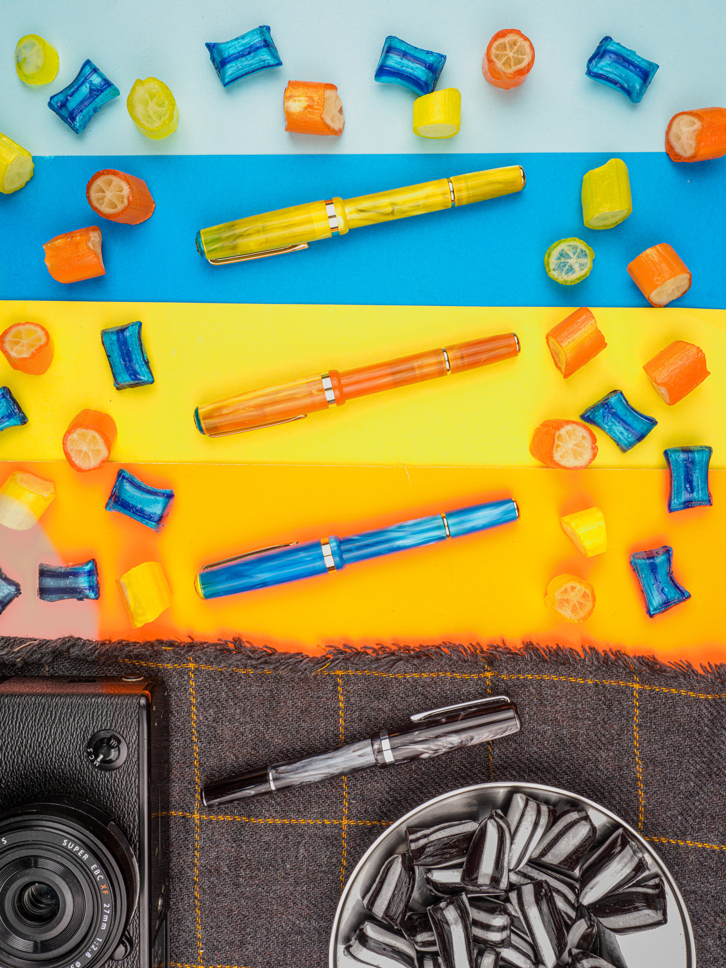
The Paradise set pens are very vibrant and eye catching. They remind me a lot of what we in Australia would call lollies (sweets or candy elswhere). I went to my local lolly shop and found some hard lollies with a similar colour (and the flavours pretty much matches as well). These colours are light, partially translucent and highly saturated, just like the lollies! They aren’t a flat colour but have some depth and colour-texture to them with a swirl-like pattern.
The Paradise set has gold finishings and a newly designed finial, compared with the ‘standard’ JR pen models.
The packaging is the nice standard flexible coffin-style case made with fabric inside the red and off-white cardboard sleeve.
The Tuxedo is from the stand line and is one of the two JR pens that has a silver trim (the other being the red ‘Carmine’ model). The Tuxedo is a mostly black pen but with some noticeable silver swirls and even some maroon deep in the martial. It has some nice character for a ‘simple’ black pen.
Both the Paradise set and the standard models obviously all have interchangeable sections with each other which works quite well with the Lemon Twist and Blue given with they share alternate colours on the plastic ring around the finials
The materials of all of these JRs (and also the Carmine and Capri which I don’t have) have a swirly texture to them. The swirls are mostly silvery but there is also elements to the swirl that is more transparent. The Tuxedo has some red-brown in it.
These pens are also cartridge converter pens (as distinct from the vintage J which is are Lever fillers with a sac) and come with a converter.
I believe that one of the characteristics of pocket pens like the vintage Esterbrook J was that it had a very low profile when clipped into a shirt pocket. I can’t find information on this so I might be wrong. Either way the vintage Esterbrook J does have a slim profile and the modern Esterbrook JR has a very slightly more prominent hump as well as a longer clip but is slightly better than the Pelikan M200.
Modern Esterbrook JR compared with vintage Esterbrook J
The Esterbrook JR and the vintage J have a very similar profile. They are almost exactly the same length, the cap is the same length and girth, both have (mostly) flat ends, they have the cap band in the same spot (and it is a similar thickness) and the clip on both is square with vertical lines down its front. The main differences are in the section, finals, back-body band, the length of the clip and the filling mechanism.
It’s worth noting that there are different vintage models of this pen. The full-sized ‘J’, which I have here, but there is also a slender ‘LJ’ model which is thinner, a demi ‘SJ’ model which is thinner and shorter and finally a ‘Purse Pen’ (‘CH’ or ‘H’) model that is smaller still. There are also different generations with some mostly visual differenced. The two I have here for comparison are the very common Double Jewel versions that started being made in 1948 in the colours Dubonnet Red and Cobalt Blue.
With the section the vintage J there is a very short black material before a very large thread. The same is also a simple straight taper rather than a curve on the modern JR. The modern JR also had a band on the body; this band is set a fair bit away from the end which in my experience gives the impression of the the end being either a blend cap or a turning nob. That you can see the threads that attach the two sections of the body to the band in the translucent Paradise Set of JR pens doesn’t help this possible misinterpretation! The band itself, I can confirm, is just aesthetic and I think it does look nice but we are also trained to see such lowly set bands as meaning something else.
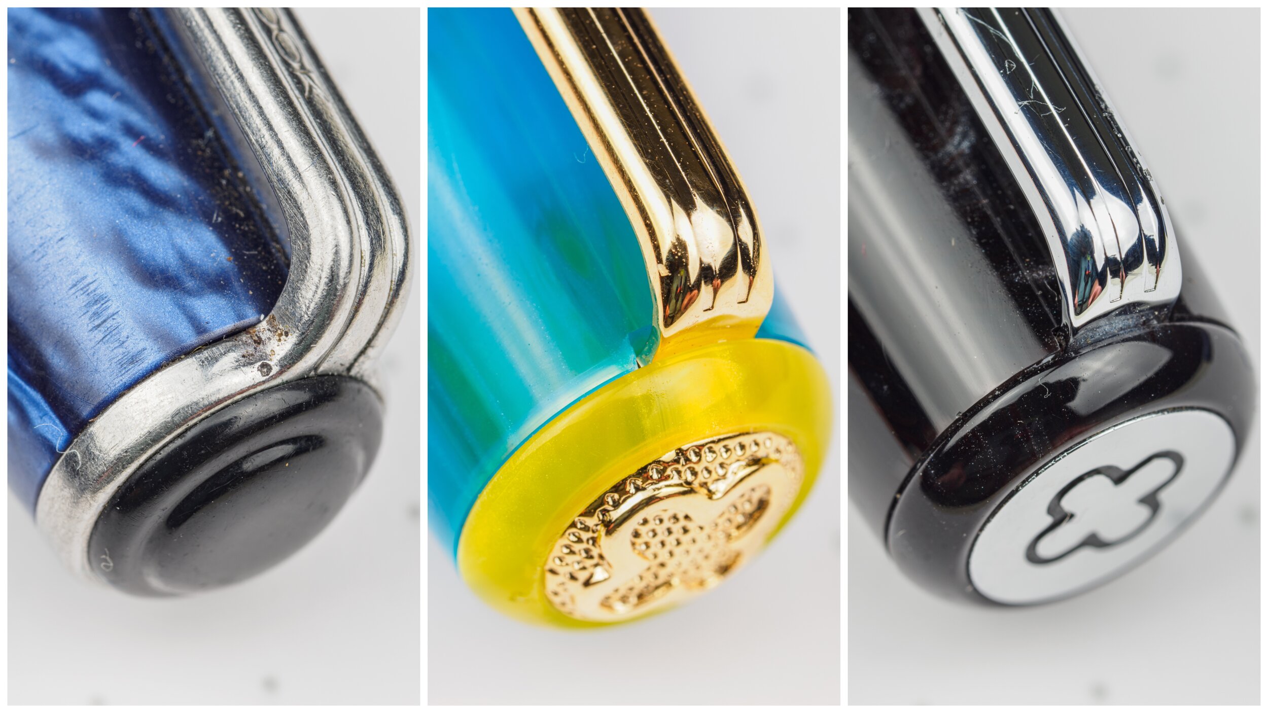
The finials on the vintage J have a black plastic jewel with a embossed circle on top. This somewhat rounded jewel was used to distinguish between the pencil and the ball point (which had a concave and pointy jewel, respectively) when in your pocket. The Jewel of the standard modern JR models is a almost completely flat silver plate on the body finial and the same on the cap finial but this time Esterbrook Logo (called an ‘Eternity’ symbol) stamped onto it. The cap finial is different on the Paradise set with what I believe to be a plastic moulded and textured finial with a some roundness to it.
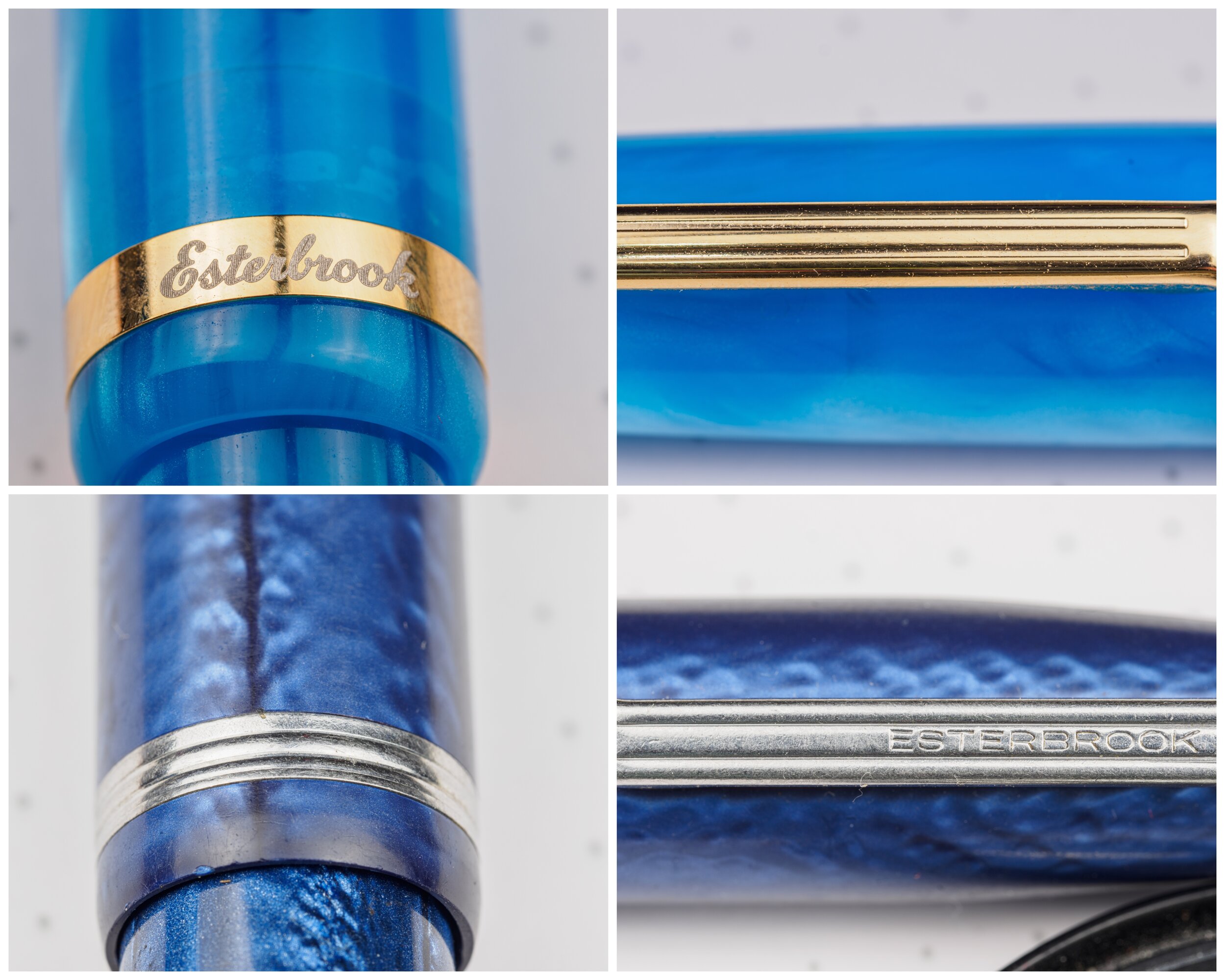
The cap band on the modern JR is where the company name is places in cursive writing but the band on the vintage however the J has the Esterbrook name on the clip. While both clips are generally square and flat (with both having vertical lines running down the front) the J is noticeably shorter.
The way the clip is fastened to the cap is slightly different. With the J the clip also has a metal ring that attaches underneath and around the jewel and forms part of the finial. On the modern JR the clip slips underneath the jewel and the ring of plastic that forms the finial.
My vintage Esterbrook J also has ‘Esterbrook®’ in cursive over ‘MADE IN U.S.A.’ stamped onto the barrel. This is same Esterbrook cursive logo that is used today and is etched onto the band of the modern Esterbrook JR.
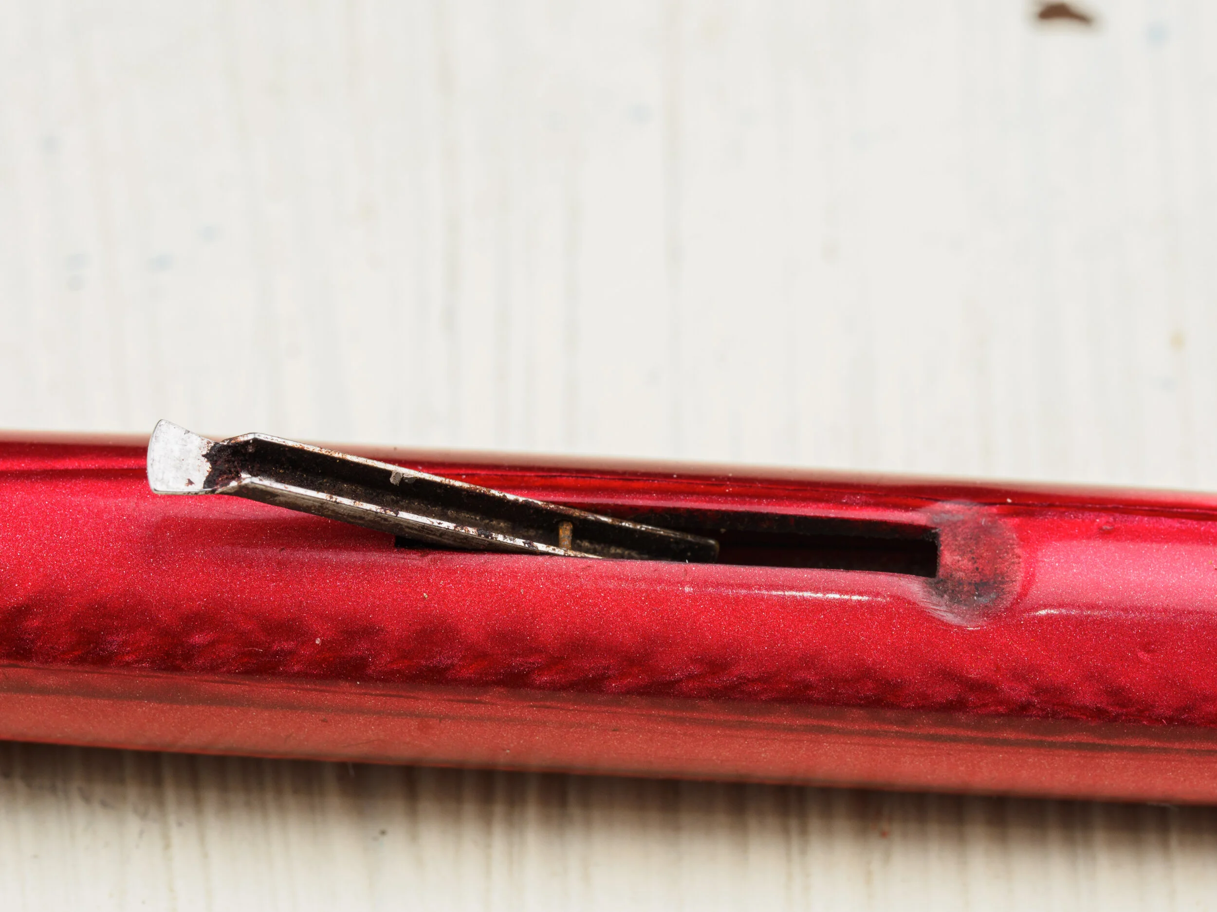
While the modern JR is a cartridge converter pen the vintage J pens are lever-filler pens with sacs. This means that some will likely now need sac replacements. I tend to treat pens like this quite carefully. I avoid Japanese inks (which are often alkaline) and I avoid Noodler’s inks. I generally stick to old European brands as those inks often work with vintage European brand pens with require a similar cautious approach. I probably need to clean the lever a bit!
Nib
The nib on the modern Esterbrook JR Pocket fountain pen comes with a JoWo No.5 nib in in EF, F, M, B, 1.1 Stub, Journaler & Scribe. The JR No.5 nibs have the Esterbrook Eternity symbol etched onto the front/top. These are pretty standard and common nibs that are available in many pens these days. JoWo, along with Bock are major third-party nib makers. In general I find JoWo nibs to ve quite consistent, especially with Medium and thinner nibs. There is some common Western-nib inconsistencies with the finer nibs (being that an Extra Fine is often not that fine). They are mostly smooth and wet. The Stubs I find have some variety in their wetness and if the tines aren’t perfect you can really feel it. The broad nib in JoWo and Bock nibs, in my experience, tends to be the one that is most likely to cause an issue with baby’s bottoms. Because of the polishing required for a smooth nib sometimes they get over-polished which can result in a baby’s bottom and hard starts at times. I did not find that with the broad nib on this Orange Sunset JR! All of these were wet and good writers out of the box. I only mention my personal experience with these nibs as it might be helpful when choosing a nib.
I reviewed the Journaler nib on an Estie here and the Scribe on another Estie here. I really like the Journaler and the Scribe is an excellent nib (although the type of nib doesn’t suite my handwriting as much).
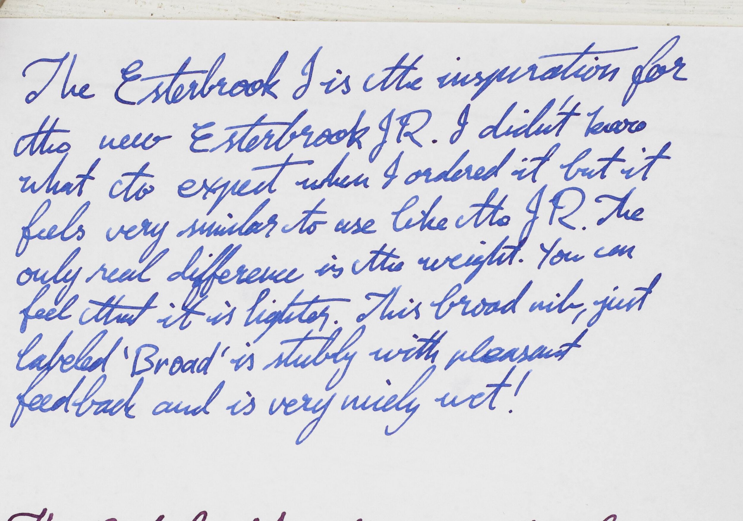
The vintage nibs I received (as an aside) were very nice and wet with the Broad (no number) being a little stubby. Both seemed to have tipping material (which isn’t on all vintage Esterbrook nibs) and the Medium 2668 nib is surprisingly wide but it seems this nib was bent and re-shaped which might contribute to that. Regardless both write very nice.
Like the vintage J pens having nib units that you can easily unscrew, the modern JRs do as well. I have some Franklin-Chiristoph No.5 nibs in my collection and the nib units are easily removed from both pens and placed in each other. Franklin-Chirstoph only have silver-trim nibs so this one doesn’t really match the gold-trim Orange Sunset JR!
The Tuexedo’s Medium nib is surprisingly fine! It’s a delight to write with as well with good flow and smoothness. The Lemon Twist’s Medium is a little broader and also nicely wet (overview of Esterbrook’s newly released inks coming soon). The Orange Sunset’s broad is not quite as wet as the mediums but has a very smooth writing experience. The 1.1 Stub on the Blue Breeze is a little dry but with a wet ink writes very nicely. Both the vintage J nibs are very wet and quite smooth with the Broad being stubby and the Medium being a little fatter than I expected. More writing samples below.
Dimensions and Comparison
The pen is moderately small and decently pocketable, as should be expected. The pen is also fairly thin, especially the section which is less than 1cm at its thinnest and just 1cm at its thickest. It is still comfortable to write with but worth noting for people with bigger hands or who prefer larger sections. The section is also fairly straight across from where the threads finish to before the nib starts but there is a concave dip just before the nib (a dip of 1mm).
The body is fairly straight and only slightly tapers once you get past the body’s metal band. The p[en does post which extents the pen by 3.7cm.
| Pen | Capped | Uncapped | Posted |
|---|---|---|---|
| Esterbrook JR | 12.5cm | 11.8cm | 15.5cm |
| Esterbrook J (vintage) | 12.8cm | 11.7cm | 15.4cm |
| Sailor Pro Gear | 13cm | 11.6cm | 14.9cm |
| TWSBI Eco | 14cm | 13.2cm | – |
| Lamy 2000 | 14cm | 12.5cm | 15.3cm |
| Platinum Century #3776 | 14.1cm | 13.2cm | 15.4cm |
| Pelikan M205 | 12.5cm | 12.1cm | 14.9cm |
| Parker Vacumatic | 12.7cm | 11.8cm | – |
| TWSBI Vac Mini | 12.4cm | 11.4cm | 14.8cm |
| Kaweco Sport (w/ clip) | 10.5cm | 10cm | 13.3cm |
| Kaweco Liliput (w/ clip) | 9.6cm | 8.7cm | 12.4cm |
| Franklin-Christoph Model 45L | 12.7cm | 12cm | 15.8cm |
| Franklin-Christoph Model 45 | 11.2cm | 10.4cm | 14.1cm |
| Pilot Elite | 11.5cm | 10.2cm | 14.2cm |
| Mabie Todd Swan Selffiller | 12.2cm | 11.1cm | 15.2cm |
Capped the pen is similarly sized to a TWSBI Vac Mini, a Pelikan M205, and even a Sailor Pro Gear isn’t that much taller. The Platinum #3776, Lamy 2000, and TWSBI ECO are still much taller.
Uncapped most pens become fairly similar except the TWSBI ECO. The Lamy 2000 is just a little taller and the Platinum #3776 is fairly close. Uncapped this isn’t that short of a pen.
Where it gets a lot of its pocket ability from is its somewhat short status when capped, its thin girth, and its low profile when clipped somewhere. The size is almost indistinguishable from the vintage Esterbrook J.
| WEIGHT | Capped | Uncapped |
|---|---|---|
| Esterbrook JR | 18.8 | 12.8g |
| Esterbrook J (vintage) | 15.7g | 9.7g |
| Sailor Pro Gear | 24.9g | 16.1g |
| TWSBI Eco | 20.8g | 12.3g |
| Lamy 2000 | 26g | 17.1g |
| Platinum Century #3776 | 25g | 14g |
| Pelikan M205 | 14.4g | 9.6g |
| Parker Vacumatic | 16.6g | 11.8g |
| TWSBI Vac Mini | 24.6g | 15.9g |
| Kaweco Sport (w/ clip) | 12.8g | 5.7g |
| Kaweco Liliput (w/ clip) | 24.9g | 14.6g |
| Franklin-Christoph Model 45L | 14.9g | 11.7g |
| Franklin-Christoph Model 45 | 13.7g | 10.6g |
| Pilot Elite | 12.2g | 7.1g |
| Mabie Todd Swan Selffiller | 13.9g | 8.9g |
The pen is moderately weighted. It isn’t as light as the vintage J nor the Pelikan M205, but is surprisingly similar in weight to a TWSBI ECO.
The Orange Crush, when compared to my other orange pens is a yellower orange. There are some darker orange bits in the material but overall, compared to the other pens, this seems almost yellow!
The Lemon Twist is very much a lemony colour with almost some green in there. It is closest to the Narwal fountain pen’s yellow.
The Blue Breeze is pretty close to a perfect standard fountain pen turquoise ink colour (like these here)!
The texture and depth in the material of the Tuxedo set it apart from pure black pens and make it seem almost a dark grey.
Compared in size to other ‘pocket’ pens the JR is on the taller side, just a little shorter than the Franklin-Christoph Mode. 45L and noticeably larger than the Kawecos and the Franklin-Chirstoph Model 45. It is also larger than the Pilot Elite! This is definitely still pocketable but it’s on the larger end of that category. Depending on your purpose and use case that could be a benefit or a downside.
Conclusion
These are a good sized pen for me (and this review made me also realise I like the vintage Esterbrook J pens). I find them comfortable to write with and they have some lovely colours. The nibs write well and I like that I can put some other nibs that I have (some with custom grinds on them) into the pen easily (though this isn’t unique to these pens, I should note). Surprisingly to me I think I like the Tuxedo the most! The material gives a subtle pen some good character and the nib on that really suites how I write. This is a nice pen to carry around with me in a pocket or just have all three of them sharing a shirt pocket!
These pens are possibly on the pricier side depending on where you are coming from. I feel this price for new-wave fountain pen makers is fairly normal, however. From Esterbrook the JR is US$175 (Paradise set or standard) with extra for the custom nib grinds. At Desk Bandit the JR is AU$230. Personally I find these prices to be fine. I was about to buy one of these before they were sent to me for review (don’t tell them!) so for me I think I’m getting value.
Thanks to Esterbrook and Desk Bandit for sending this pen all the way from New Jersey to Fremantle for review!
✒︎ ✑ ✒︎ ✑
Thanks for reading! If you have any questions, comments or suggestions please let me know in a via the comments, Instagram, or contact me directly.
You can find my ink collection here and my pen collection here. Is there something you’d like reviewed? Let me know!
For blog updated you can follow @macchiato_man on Twitter, subscribe via email, or like my Facebook page. Check out the sponsors of this blog as well!
I was not compensated for this review and everything here is my own honest opinion. There are no affiliate links in this review. Esterbrook and Desk Bandit do sponsor the blog (although during the pandemic I have suspended any payments). I purchased the vintage Esterbrook J pens myself.











Leave a Reply