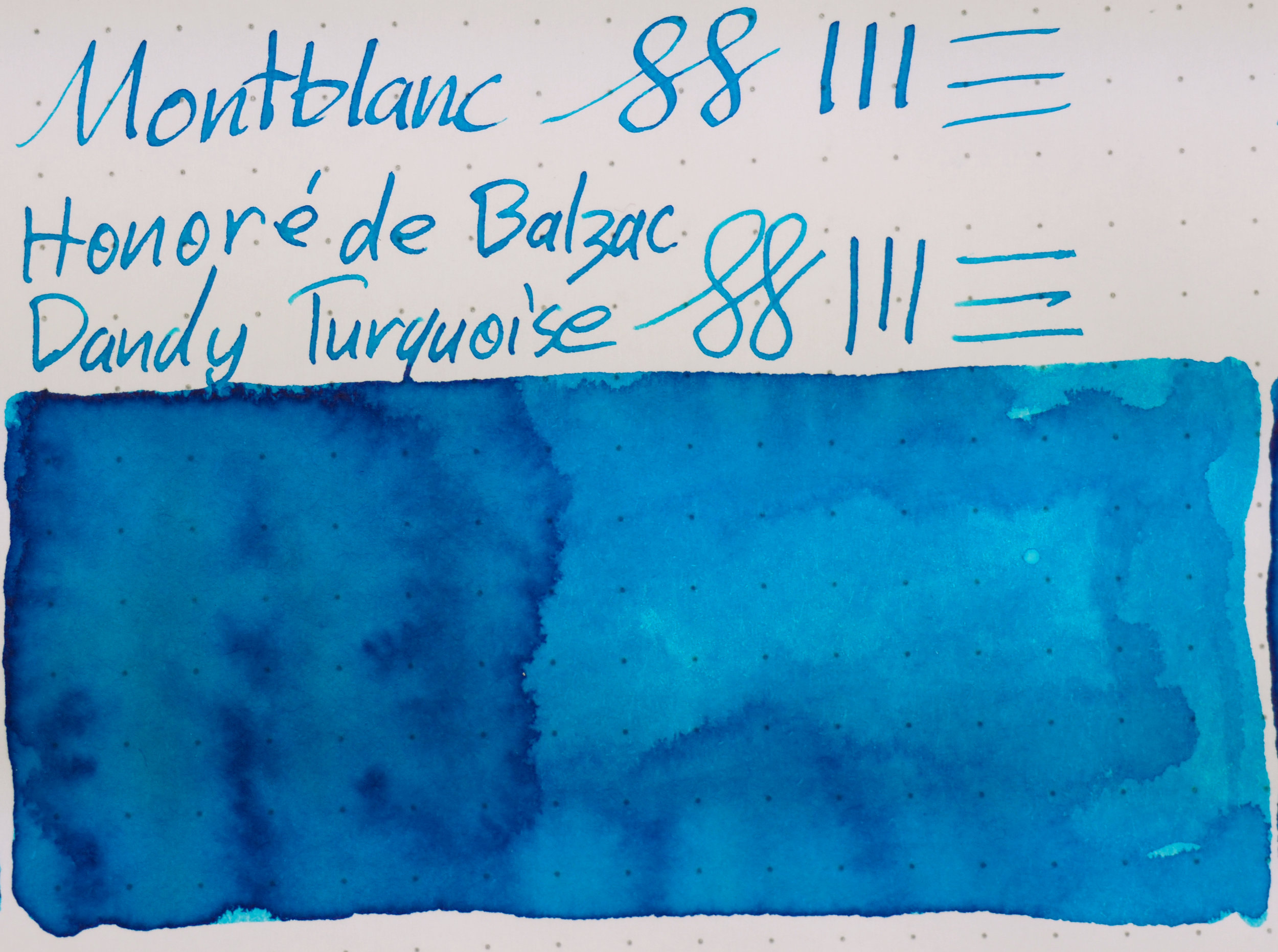
Montblanc Honoré de Balzac Dandy Turquoise is a well regarded discontinued Montblanc ink. Because it’s discontinued it commands a premium price on the second hand market. However, while it is a well behaved and pretty ink I always felt it was quite similar to other turquoise coloured inks out there.
I’ve always considered Turquoise inks to be often very similar. There are many turquoise inks out there but for some reason the category for “Turquoise” seems somewhat narrowly defined. Turquoise inks seem to all be a light very vibrant and highly saturated blue. Where they differ is the amount of green present but I don’t think there’s that much wiggle room here. Without the green or if too dark or too grey and they will start being called something else; too much green and it becomes a teal. Pinks, for example, have a much wider gamut of colours that would be considered pink though that is probably a more general ink category. It’s a somewhat uniquely specific colour range for an ink colour, when taking into account it’s prevalence and popularity. However, it does seem to mimic the range of colours of the actual mineral. One thing I have heard is that many of these turquoise inks might be similar due to using similar and common known-to-be-safe ingredients; this seems plausible to me as these inks are very safe to use even in vintage pens (though I do, personally, avoid Noodler’s in vintage and the more alkaline inks from Japan in original sacs). The inks I’ve picked here on the less-green spectrum of what would be considered a turquoise. Something like OMAS Turquoise, or Robert Oster Turquoise contain noticeably more green and are omitted here. Especially since the purpose of this comparison is to compare Montblanc Honoré de Balzac Dandy Turquoise which doesn’t contain that much green.
With regards to the vibrancy and saturation of the ink I was disheartened to find that the screen on my computers and my mobile devices were not able to produce a colour as vibrant or as saturated as the inks appear in real life. They look noticeably duller on screen when compared to the paper in hand. I wondered whether this was my fault when taking the photos so I used a colour wheel to make the most saturated turquoise colour I could and that colour was still not as saturated as the ink in real life. A bit disappointing but it can’t be helped. Please keep this in mind however. The inks should be relatively accurate compared to each other but all inks are more saturated than they appear here. What is interesting, however, is that without the sheet of swatches in hand the inks as they appear on a screen still look very saturated. Your eyes definitely acclimatise to the screen!
Montblanc Honoré de Balzac Dandy Turquoise came out in 2013 as part of the Writers Edition series. The inks I’ve chosen to compare to this is Toucan Bright Blue which is an Australian ink made by Tintex, Sailor Kobe #26 Wadamisaki Blue, Waterman Inspired Blue, Noodler’s Navajo Turquoise, Montblanc UNICEF Turquoise which was released in 2017, Robert Oster Australian Sky, Lamy Turquoise (so also Lamy Pacific Blue) and Rohrer & Klingner Blu Mare. I’ve done this comparison on 80gsm white Rhodia paper and 52gsm Ivory (white) Tomoe River paper. The reviews are also done with a wetter swatch to the left of the swatch and a drier to the right.
This isn’t a review so I’m not going to go into performance too much but in general I wouldn’t call these inks wet. Even Kobe, which is made by Sailor who make generally quite wet inks, is one of their dryer inks. I wouldn’t call any of them dry, either, but not wet. Kobe #26 Wadamisaki Blue, Waterman Inspired Blue and Toucan Bright Blue are the the wetter of the bunch. None of them feather or bleed.
Comparison 80gsm White Rhodia
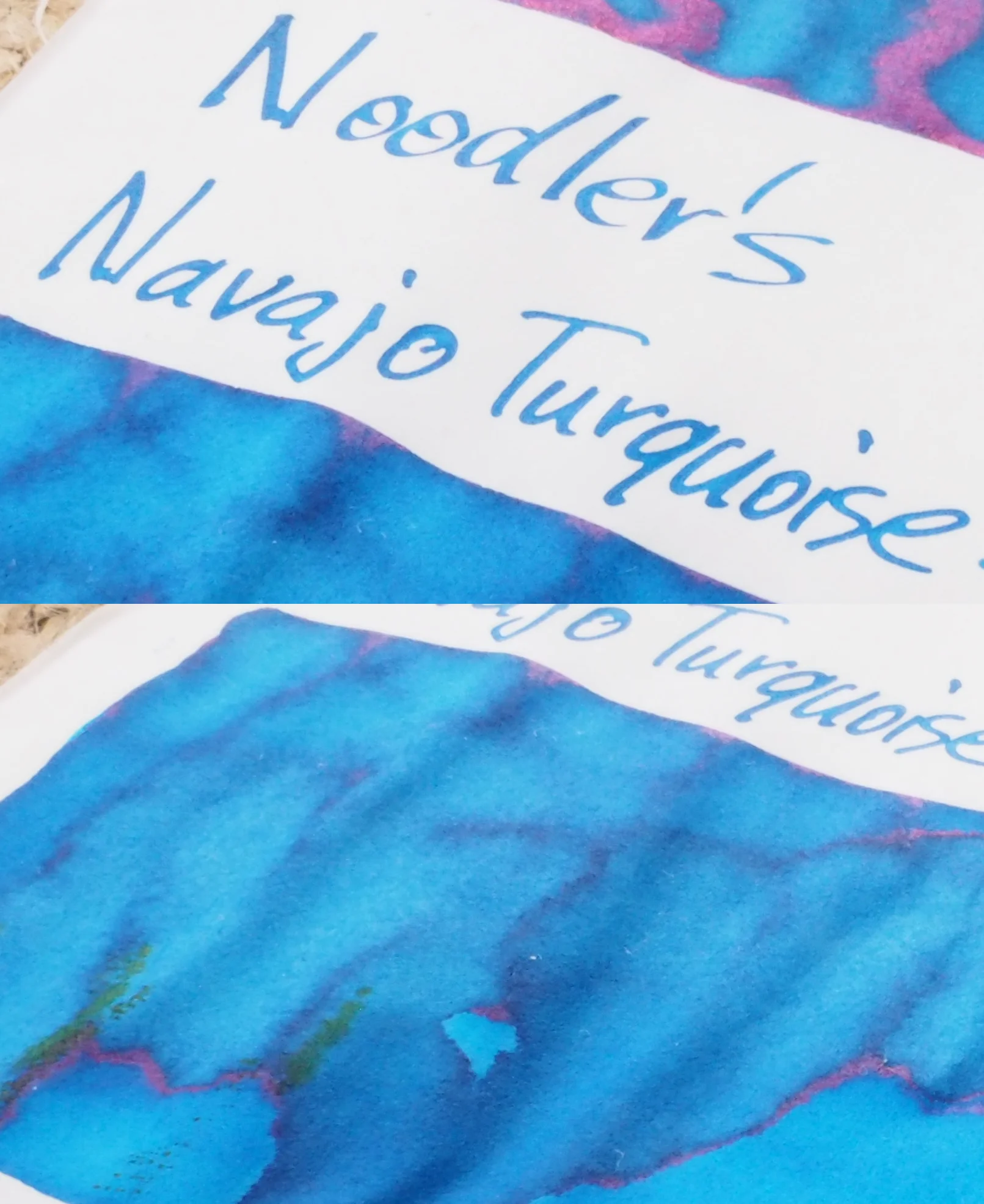
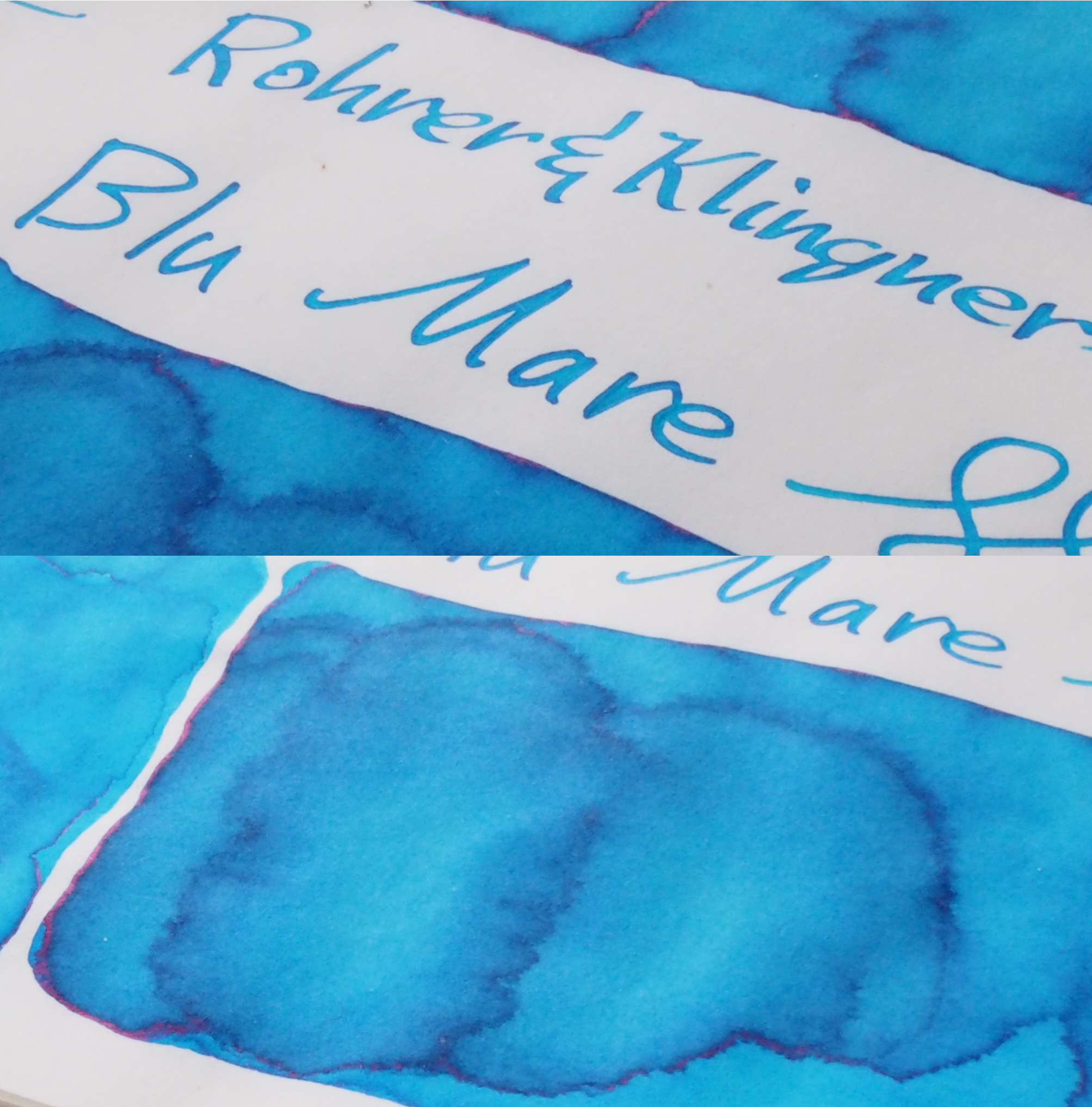
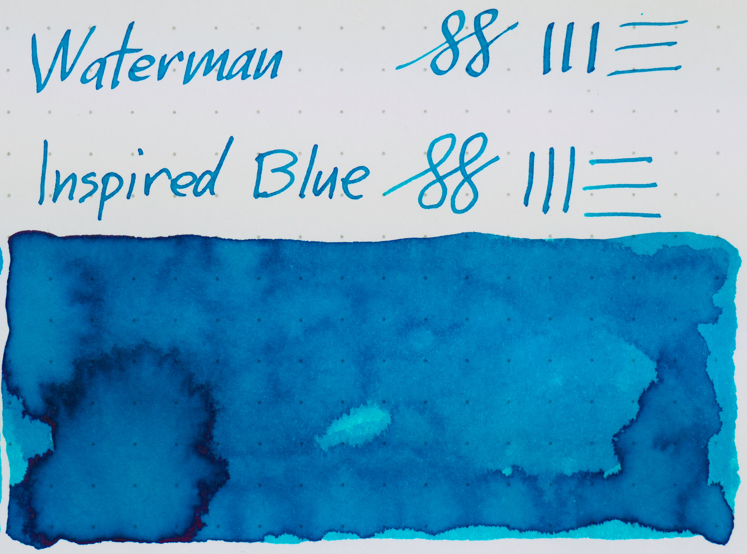
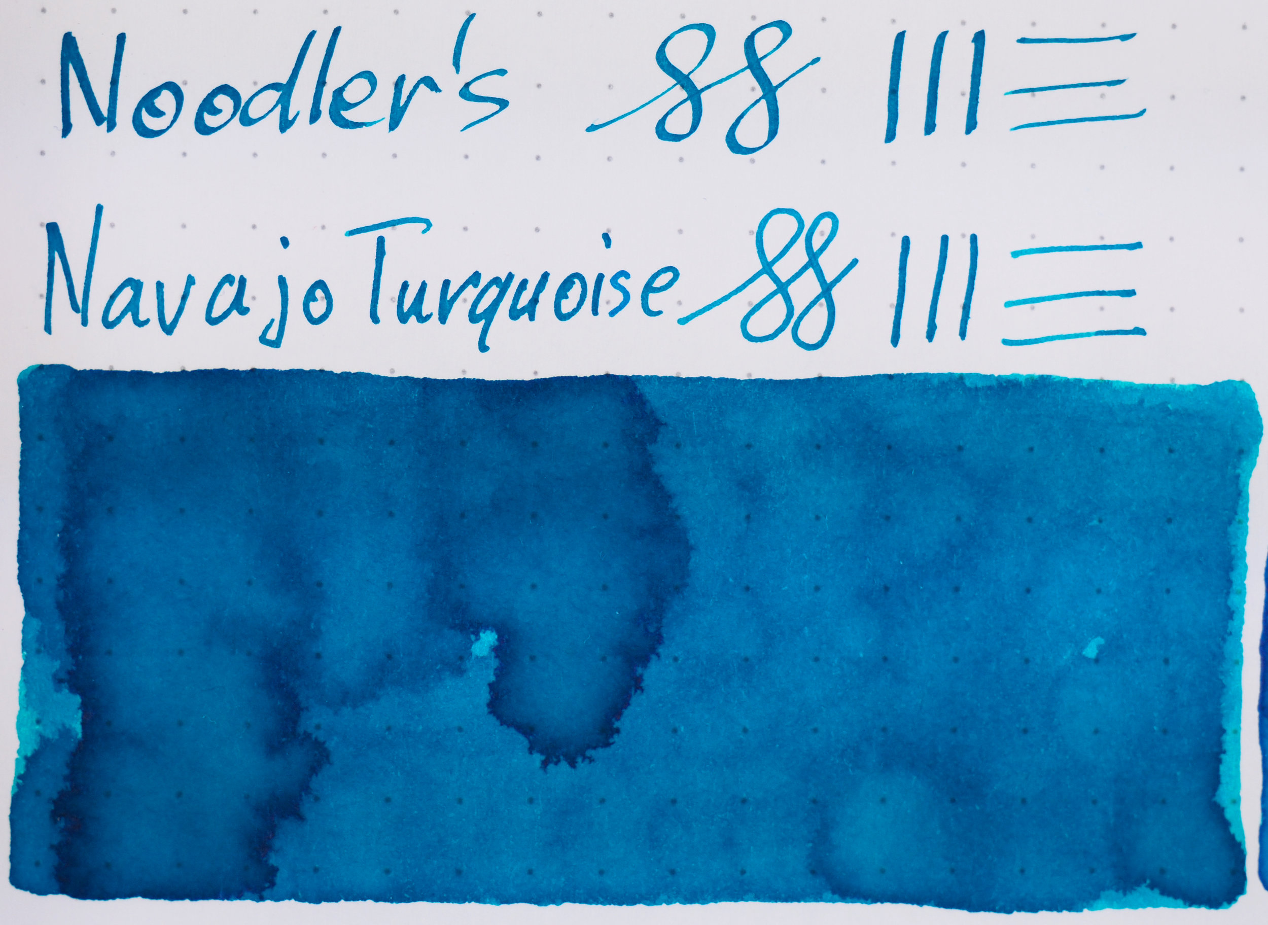
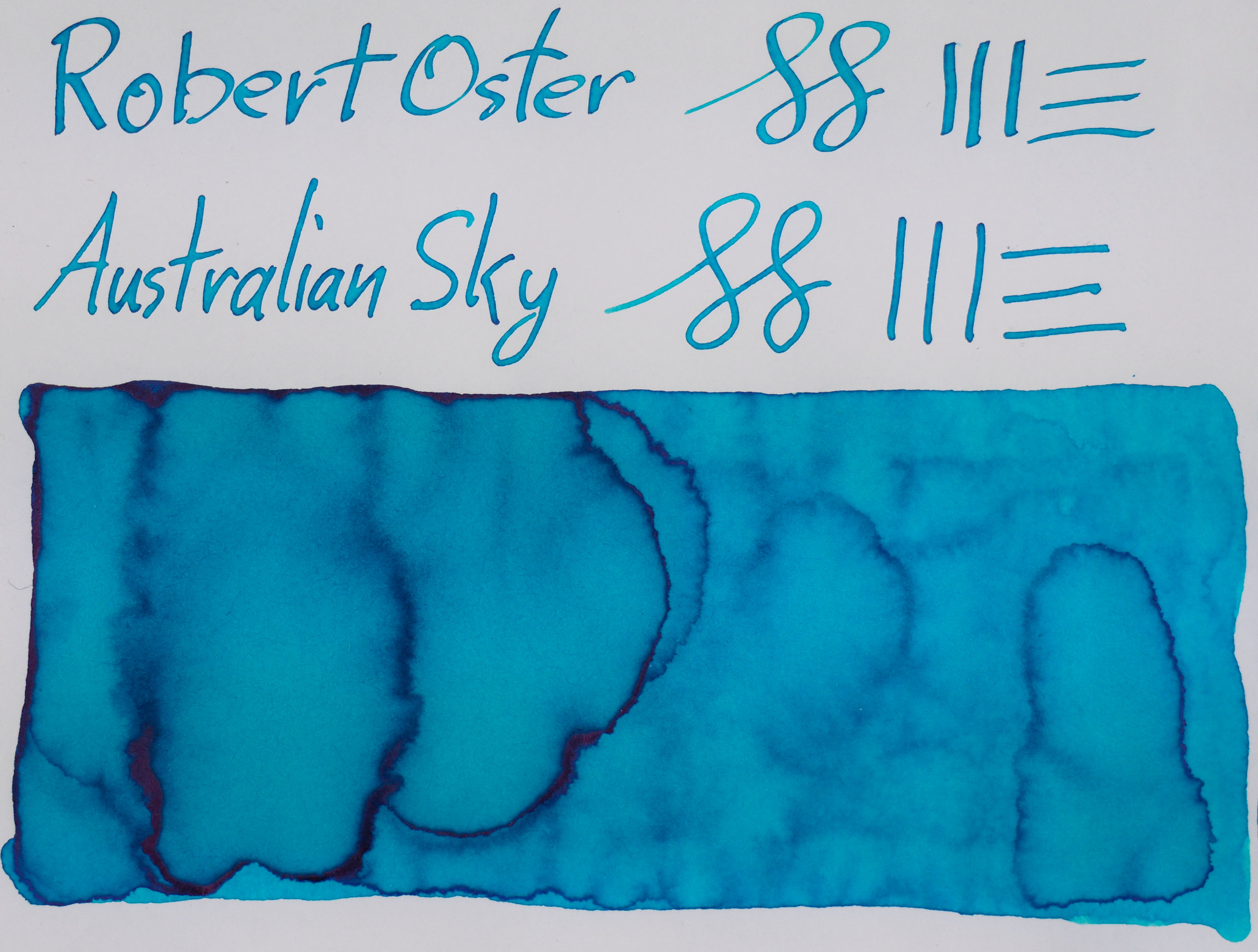
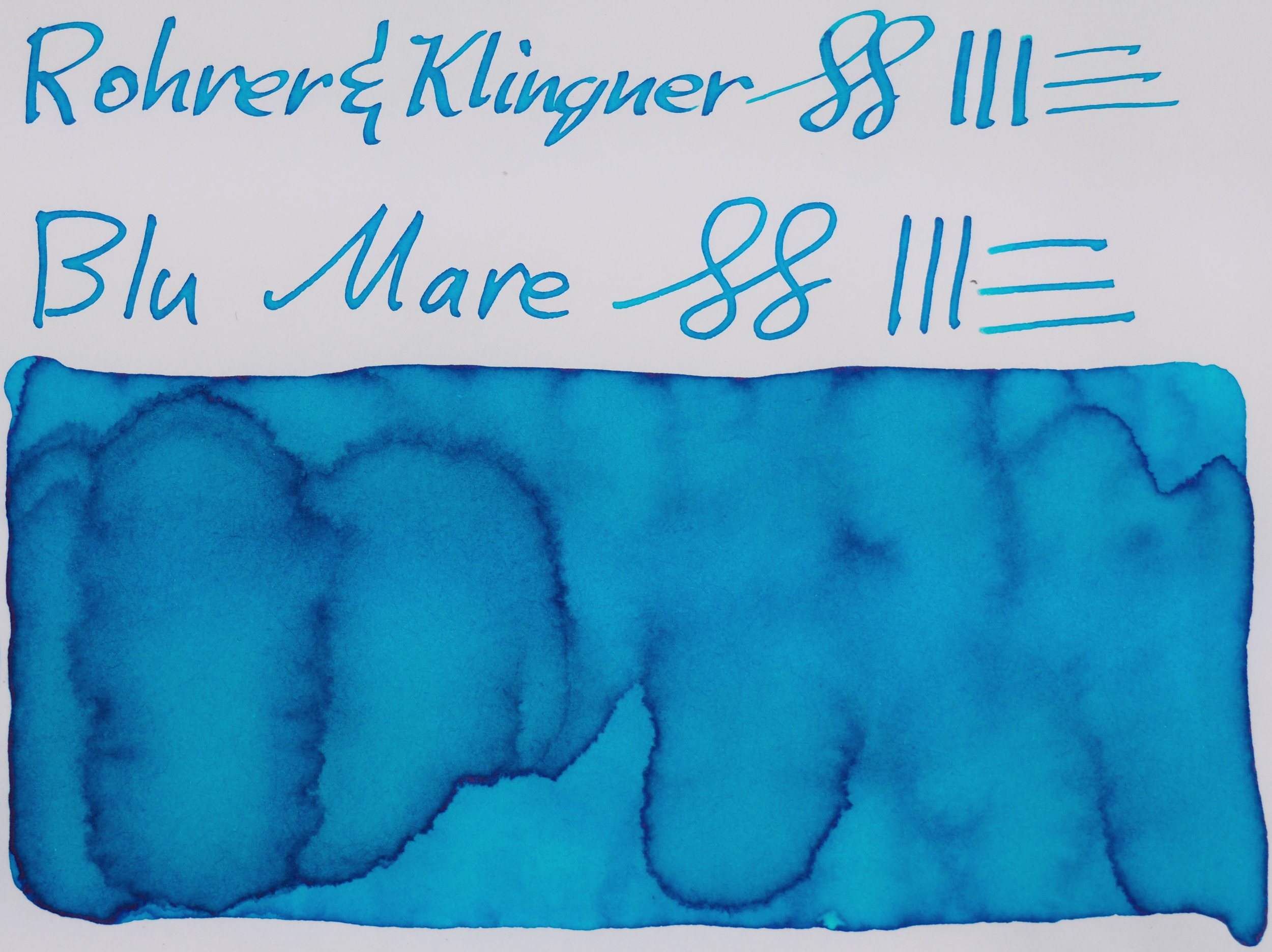
On Rhodia you can definitely see differences between the inks. Toucan Bight Blue and Waterman Inspired blue have slightly more green present and are slightly darker than Montblanc Dandy Turquoise. Noodler’s Navajo Turquoise is noticeably darker. Montblanc UNICEF Turquoise, Robert Oster Australian Ski, Lamy Turquoise and Rohrer & Klingner Blu Mare are all very, very similar. UNICEF Turquoise, Australian Sky, and Blu Mare are slightly lighter (but not that much!). Lamy Turquoise is extremely similar. Saturation from a visible perspective; that is, how strong the colour looks is one thing but then there’s how opaque the inks is in terms of how much the ink obscures what is underneath it. All the inks have a similar saturation, especially Dandy Turquoise, UNICEF Turquoise, Australian Sky, Lamy Turquoise and Blu Mare, but some inks obscure the dots of the Rhodia a little more than others. The dots are most visible on Montblanc Honoré de Balzac and Robert Oster Australian Sky with Waterman Inspired Blue and Noodler’s Navajo Turquoise being the most obscured.
Comparison 52gsm Ivory (white) Tomoe River
On Tomoe River all the inks come out lighter and less saturated. Especially Noodler’s which was quite a bit darker on Rhodia is now the same darkness as Toucan Bright Blue. Kobe #26 and Robert Oster Australian Sky are also now a decent amount lighter, especially in the written line, than the rest. Toucan Bright Blue is decently dark in the writing here and the strongest shading ink with all the others taking a decent hit to how much shading they put out. This isn’t unexpected for on Tomoe River, however, which generally flattens the ink a bit.
Sheen is few and far between for the most part. Toucan Bright Blue has the most by far and it is noticeable in the written line without close attention but it is a rather muted sheen. Robert Oster Australian Sky has some edge sheen where the ink pools but there’s very little on the written line and the same goes for for Waterman Inspired Blue. Some sheen might be visible on some of the rest in the swatch but it just doesn’t translate to any practical sheen on the written line so I classify this sheen is none.
There are definitely more turquoise inks out there that are a very similar hue to these so this absolutely isn’t an exhaustive list, however I think I have have chosen some of the more popular ones or at least more common inks out there to compare with Montblanc Honoré de Balzac. It’s difficult to pick an alternative here as they are all just so similar. The biggest differentiating factor is price. Lamy, Waterman and Rohrer & Klinger are all US$12 for 50ml, UNICEF, if still available, is US$42 for 50ml, Kobe is around US$30, Noodler’s is US$12.5, Robert Oster is US$17, and Toucan is around US$4.5 for 30ml. Montblanc Honoré de Balzac Dandy Turquoise, by comparison, goes for at least over US$75 (and possibly over US$100) for a full bottle (that is only 30ml) on the second hand market. Discontinued Montblanc inks definitely command a premium but due to how similar they all are I have to recommend taking the economical route: Lamy is possibly the closest alternative and is one of the cheaper inks. Waterman is a touch darker and Rohrer & Klinger a touch lighter are also cheap. Toucan Bright Blue is more different in colour but is even cheaper! If you want to stay within the Montblanc family then jump on UNICEF before that runs out. The premium price that discontinued Montblanc inks command is not something I believe is worth spending with this ink unless you are a collector. Fortunately there are plenty of alternatives at good prices!
Toucan inks can be bought from La Couronne du Comte in the Netherlands and Tintex in Australia. Montblanc inks can be purchased from many stores that have a physical brick-and-mortar presence. Noodler’s can be bought from Pen Savings and many other stores around the world. Robert Oster is also available worldwide. Kobe inks can be purchased from Pen Chalet* and Vanness Pens in the US and Desk Bandit in Australia. Rohrer & Klingner is available worldwide.
Below are individual photos of the inks rather than a single page of all the inks.
✒︎ ✑ ✒︎ ✑
I’ve listed all my inks and all my pens in their respective pages. Please let me know which inks you’d like to review next via the comments, Twitter, Instagram, or contact me directly.
For blog updated you can follow @macchiato_man on Twitter, subscribe via email, or like my Facebook page.
I was not compensated for this review and everything here is my own honest opinion. Affiliate links a have an asterisk (*) next to them.







Leave a Reply