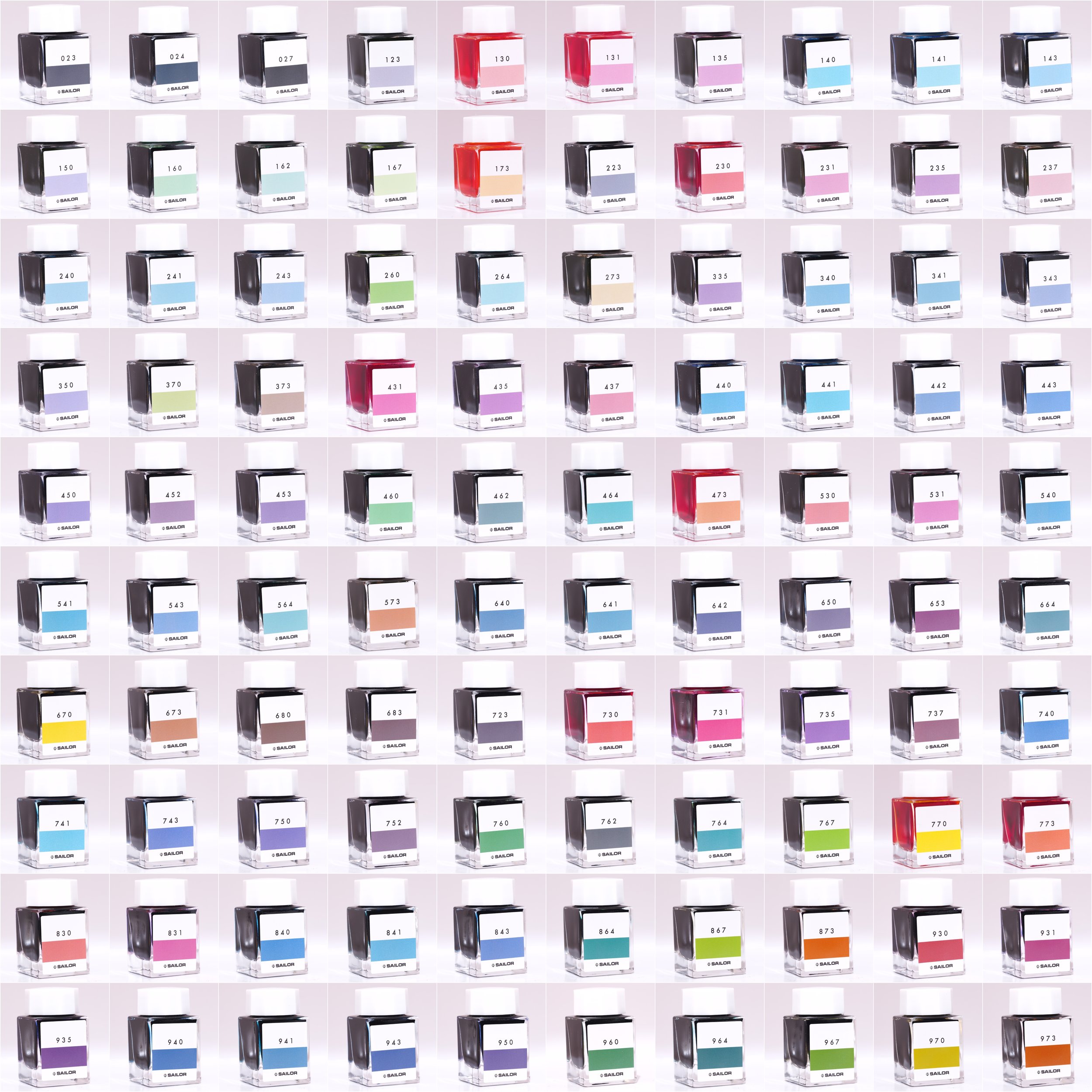
I purchased my set of Sailor Ink Studio inks (all 100) from Pen Classics in New Zealand. These Ink Studio 100 are based on the Ink Studio custom inks blended by Ishimaru that are held at events around Japan throughout the year. These 100 are chosen, somehow, from the the the thousands of custom blends that people have asked the inkmeister at these events to make for them. As for the numbering, there is certainly patterns about them and they aren’t randomly numbered.
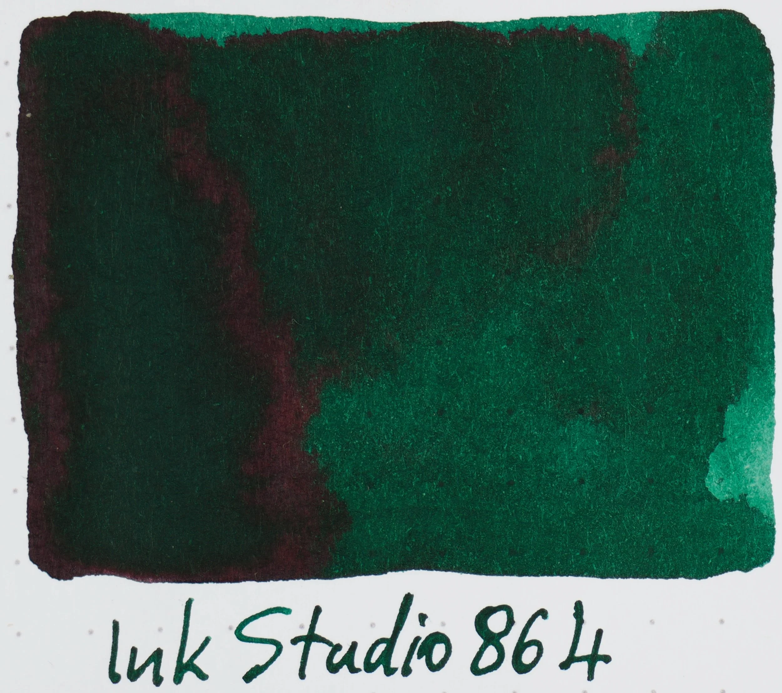
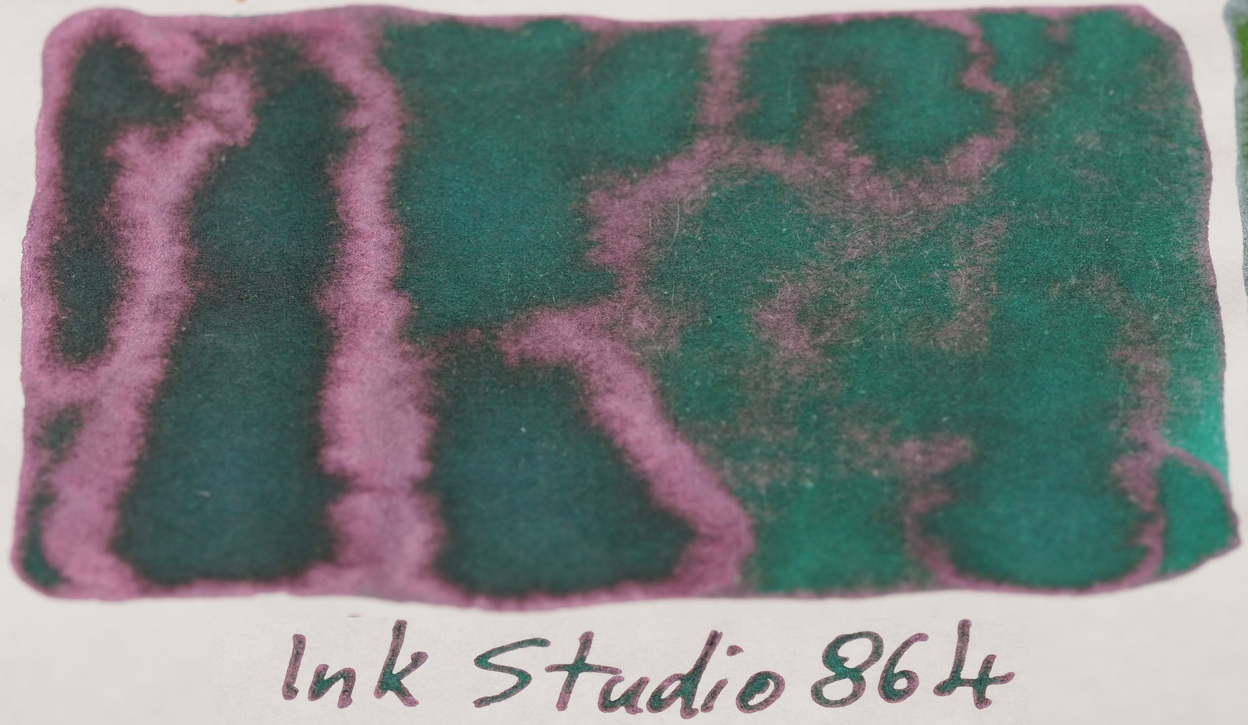
UPDATE: Sailor has retired Ink Studio Nos. 543, 531, and 864. They have replaced these three with new Nos. 224, 252, and 280 (now included)
023-973
402 photos were taken for this overview and I had to adjust nearly every ink swatch and writing sample so this overview has probably taken the most hours to produce of anything on here. I would like to state the the full-page photos (like the one immediately bellow) are not quite as accurate nor are they as high a quality photo as that of the individual photos of each ink. While I will be using the full page photos for commentary I recommend looking at the individual photos of inks you are interested in. Also, photos of sheen have not been edited for ink colour accuracy (so only use the individual swatch photos for that). Swatched have been done for each ink on 52gsm Ivory (white) Tomoe River paper and 80gsm White Rhodia paper.
In 2020 Sailor retired Ink Studio Nos. 543, 531, and 864 and replaced them three with new Nos. 224, 252, and 280 (included below).
Curiously each ink comes with a sticker, the purpose of which is to stick on and wrap around a converter (which you can see in the third picture on Sailor’s landing page for the inks). Obviously this means I need 100 Sailor Pens, right? 88 to go I guess…
Number patterns and colours
Each ink is represented by a 3 digit number ranging from 023 to 973. There are of course 899 numbers missing from a linear range of numbers and this is presumably due to that the 100 were subjectively chosen (of the 999 presumably available numbers) and that there is certainly a pattern involved in the numbering.
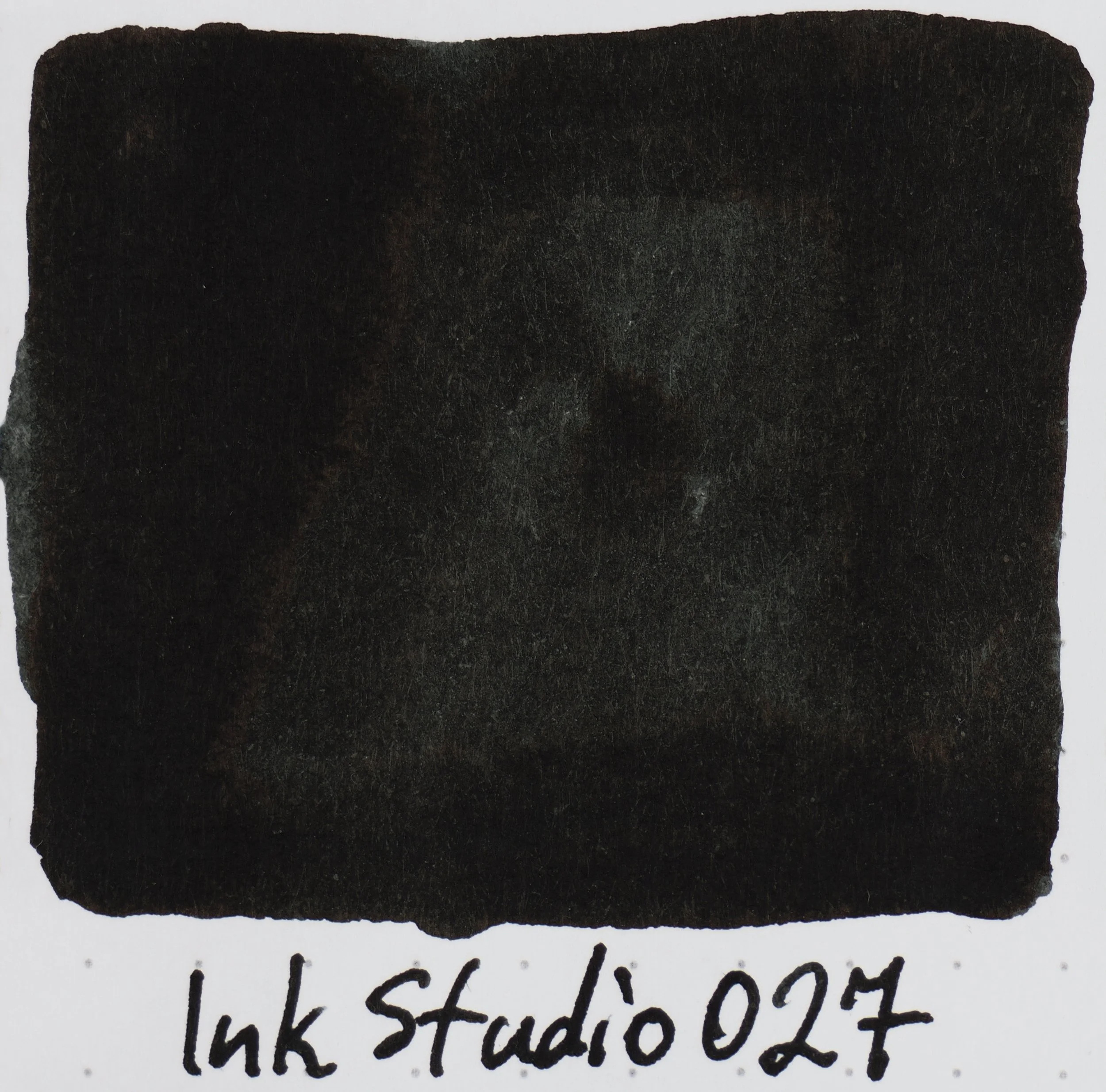
While I’m not completely sure what the first number actually represents (or any with complete specificity) in effect it generally represents saturation and dye content. I do not believe it represents sheen or darkness but depending on the colour being represented, a higher saturation of dye content in the ink will often translate to a darker ink with higher sheen. An exception for this seems to be the “0” number range which only accounts for three inks all of which are somewhat black (so are naturally have to be highly saturated with dye).
As for the first digit there are:
-
Three “0”s
-
Twelve “1”s (these are easily the palest)
-
Eleve “2”s
-
Seven “3”s
-
Fourteen “4”s
-
Seven “5”s
-
Ten “6”s
-
Sixteen “7”s
-
Eight “8”s (I can’t help but imagine the eight “8”s was deliberate!)
-
Twelve “9”s (each iteration from “1”s have consistently become less pale and more saturated in colour
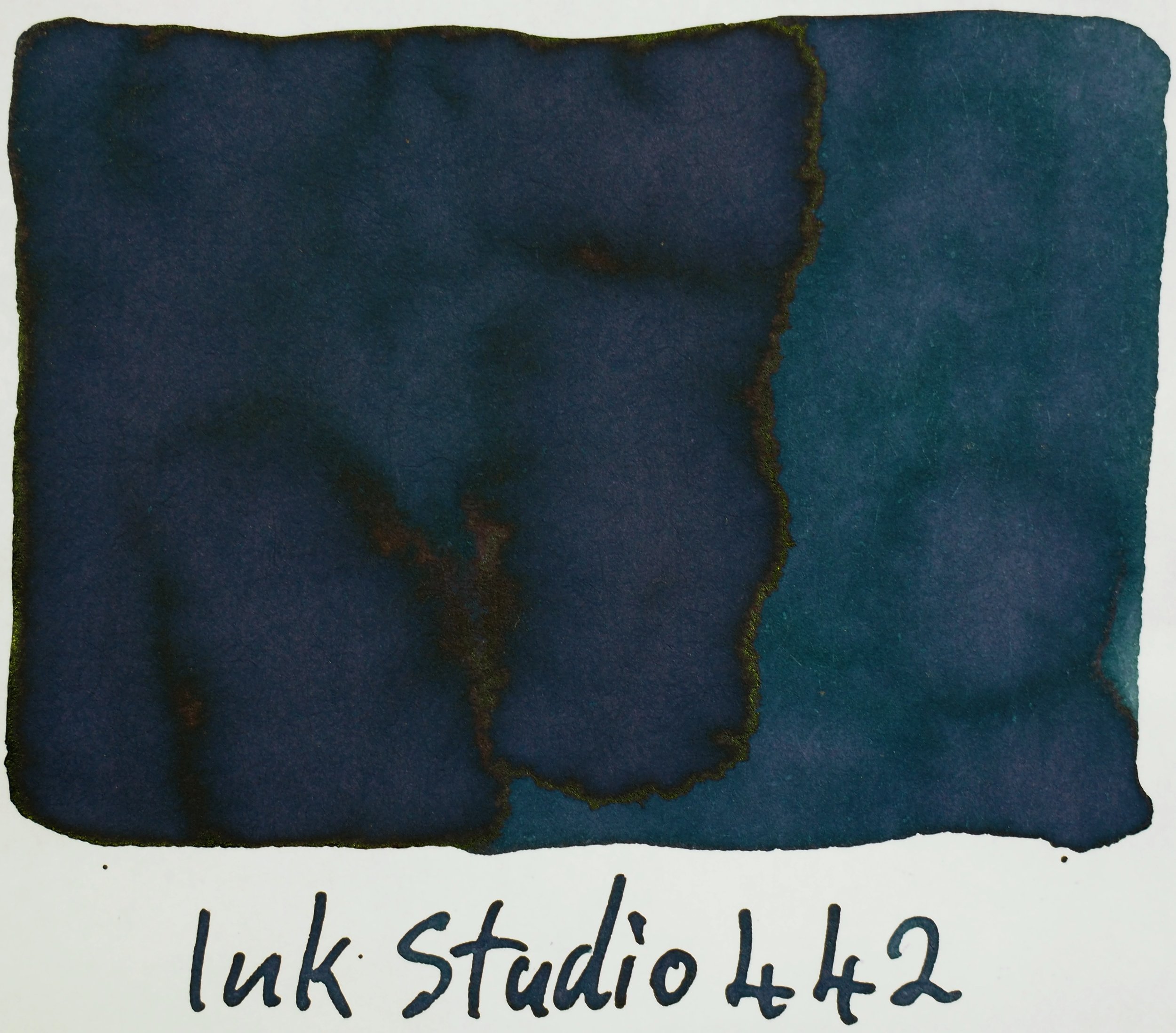
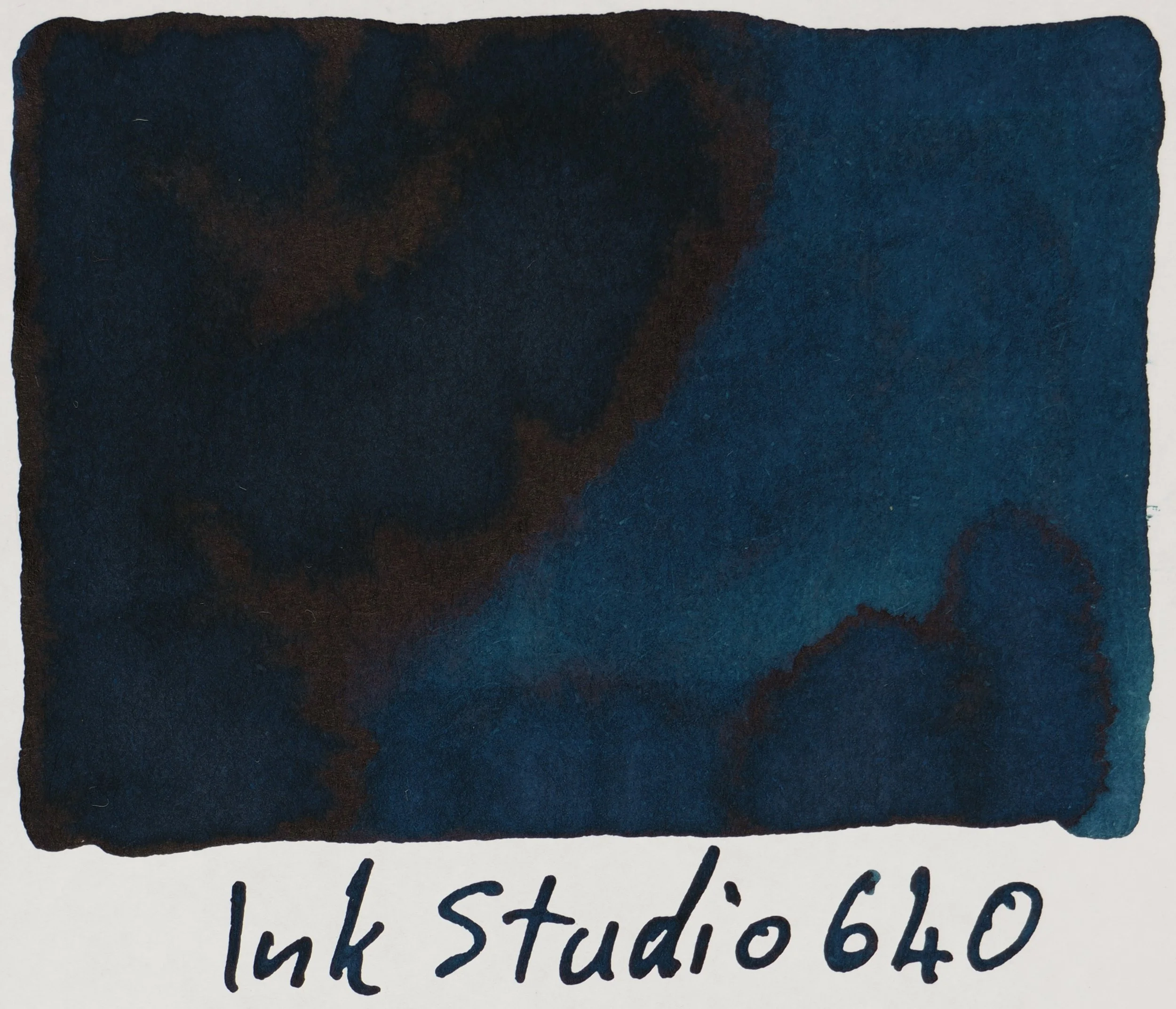
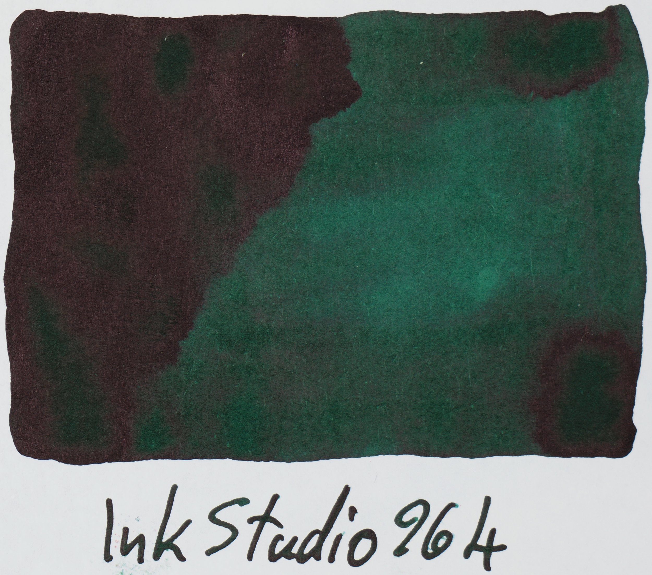
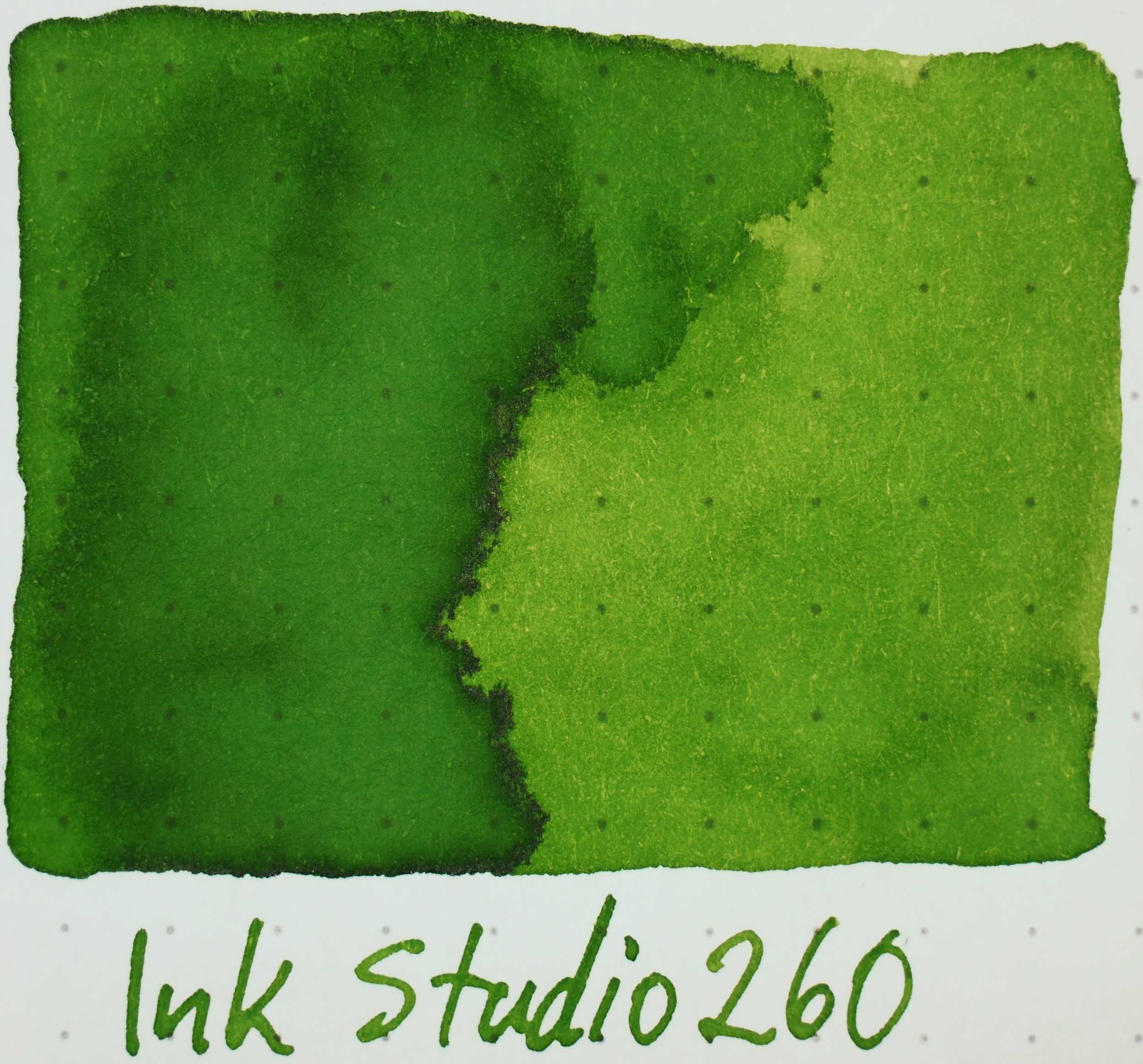
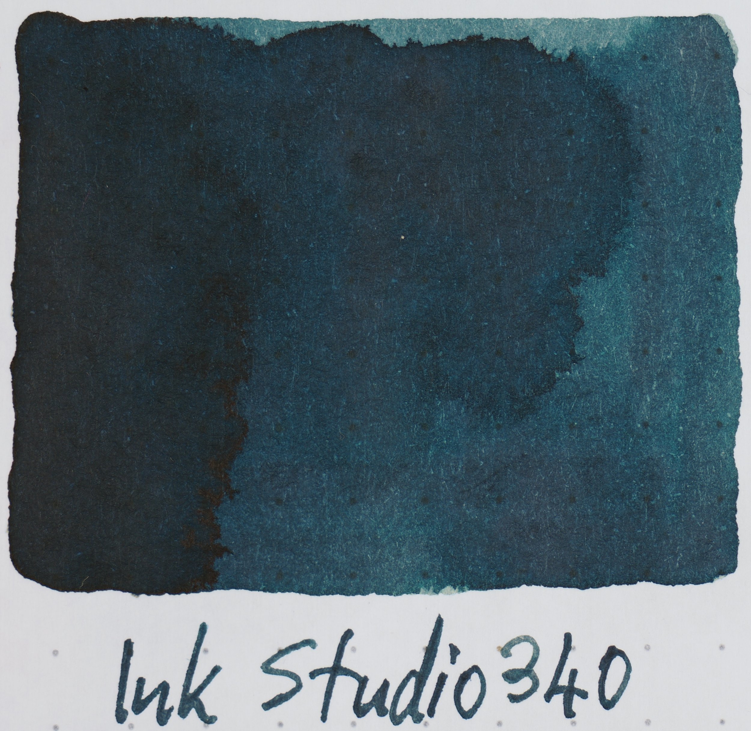
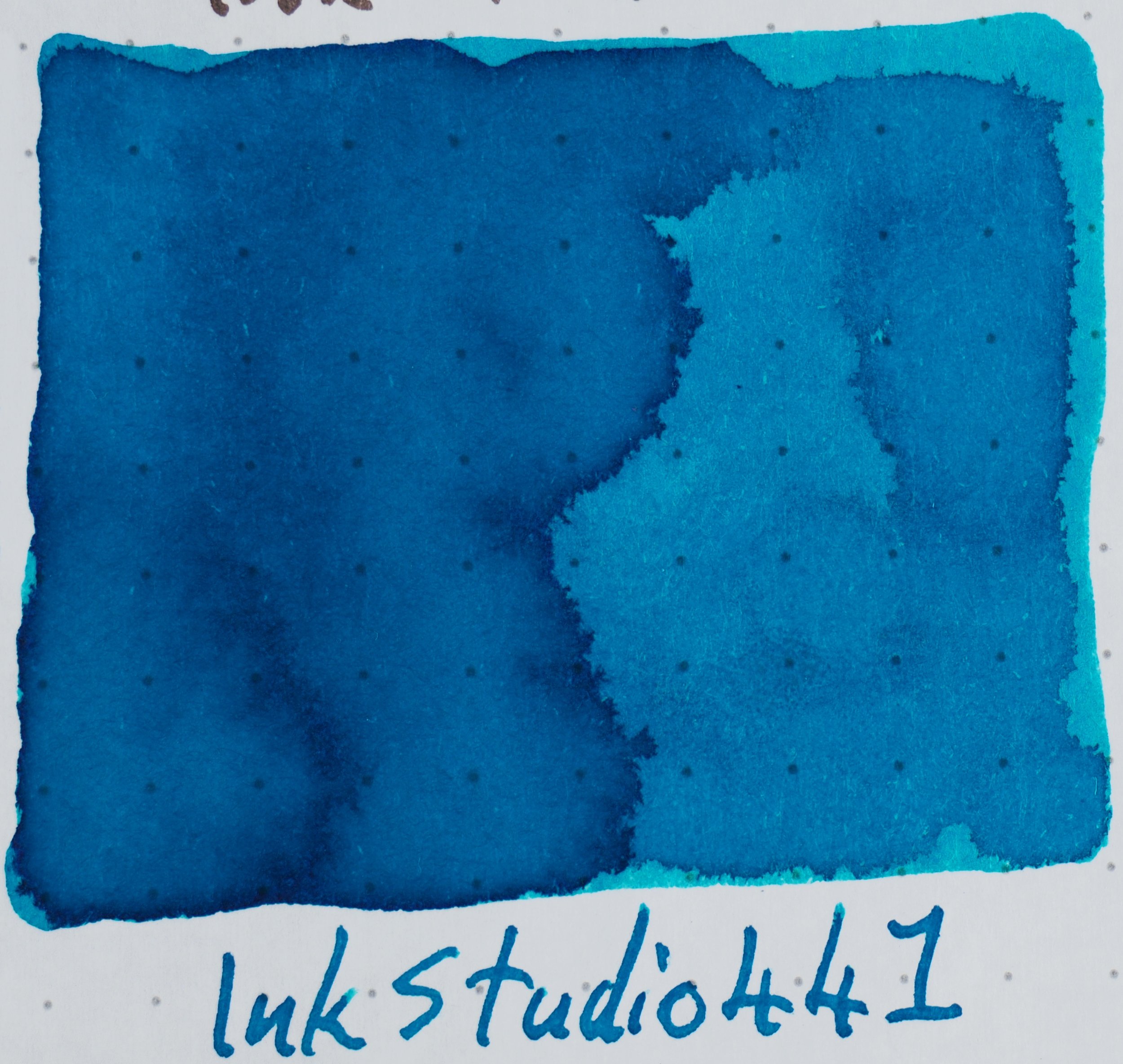
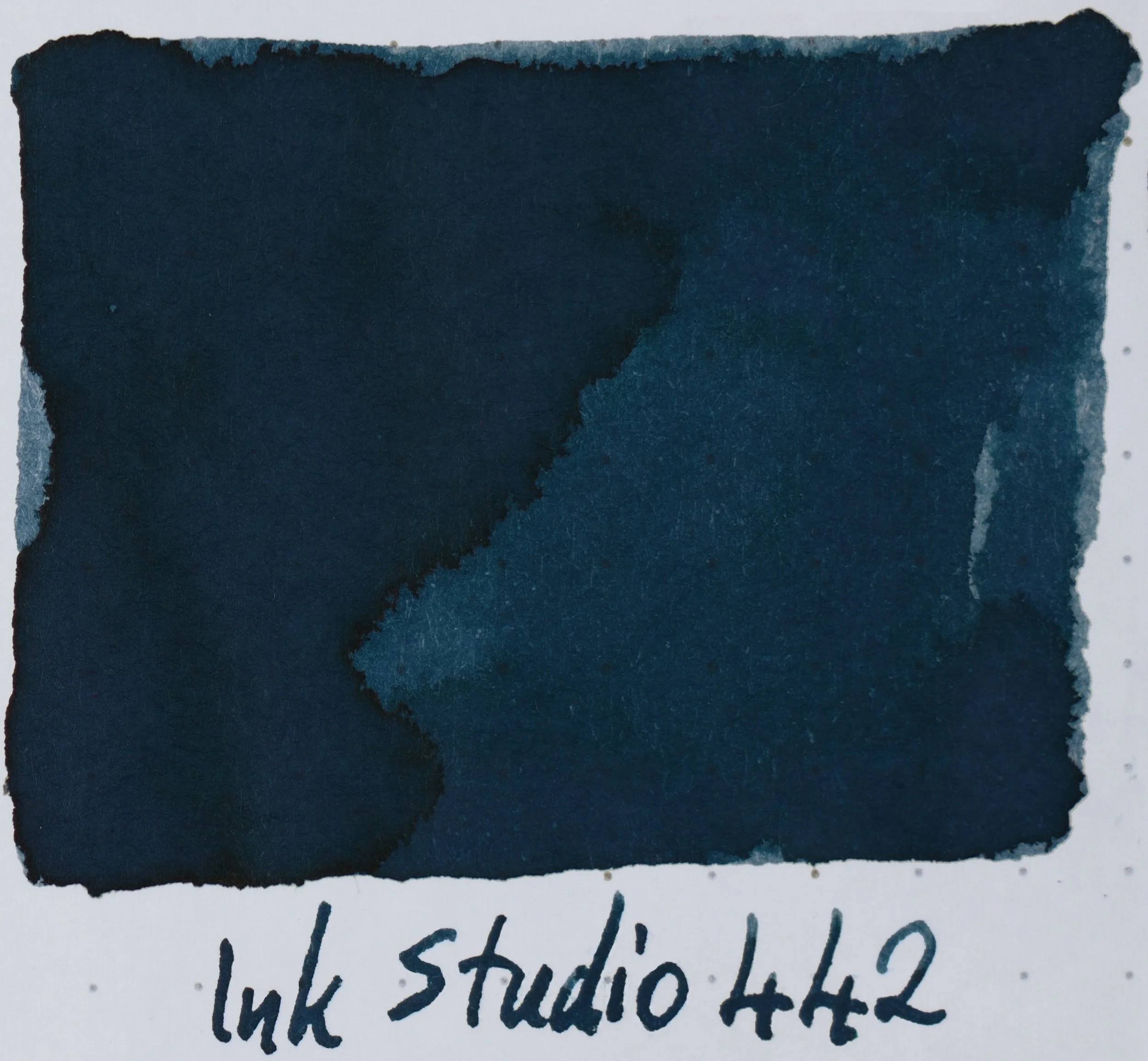
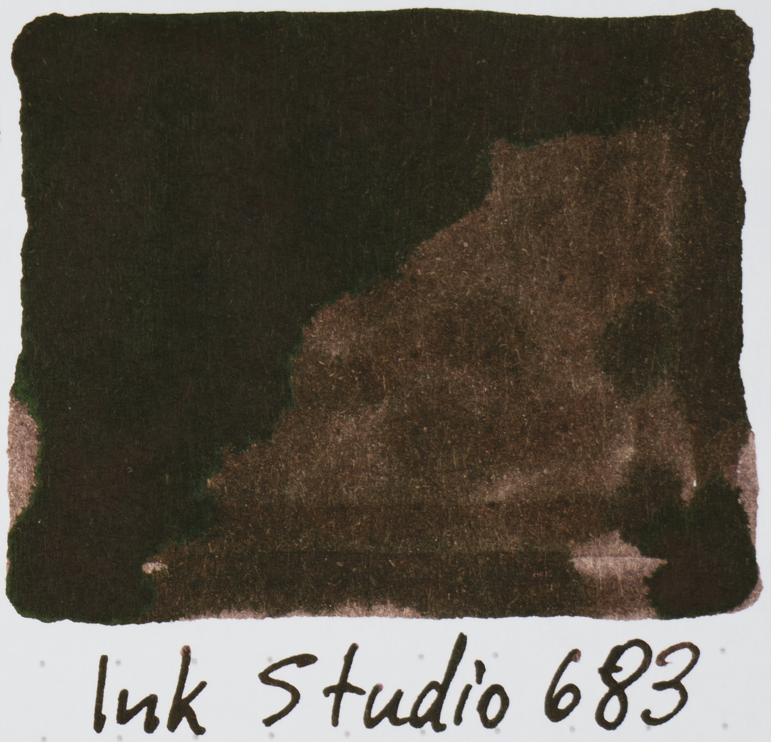
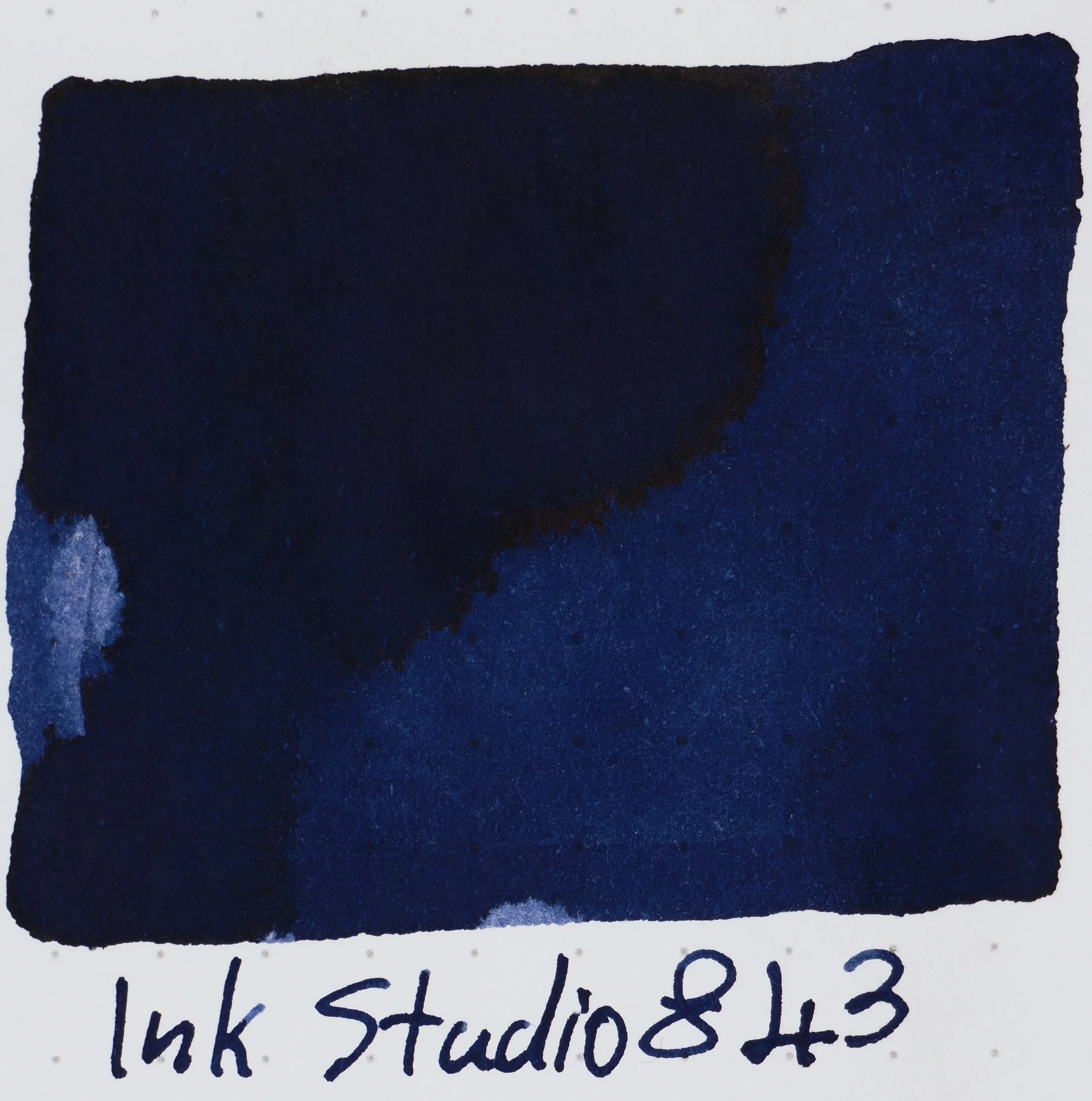
As for the second digit, “0” and “1” aren’t used at all and neither is “9”. The following is my own interpretation of the patterns (which do seem to become a little arbitrary towards the latter pages): “2” seems to represent blacks and grey-is colours (of various base colours); “3” seems to be reds, pinks and magentas as well as magenta leaning purples; “4” is consistently blues; “6” is greens and teals; “7” is oranges, yellow or orange browns, and yellows; and 8 is only used for 680 and 683 which are dark browns that approach brown from a redder base.
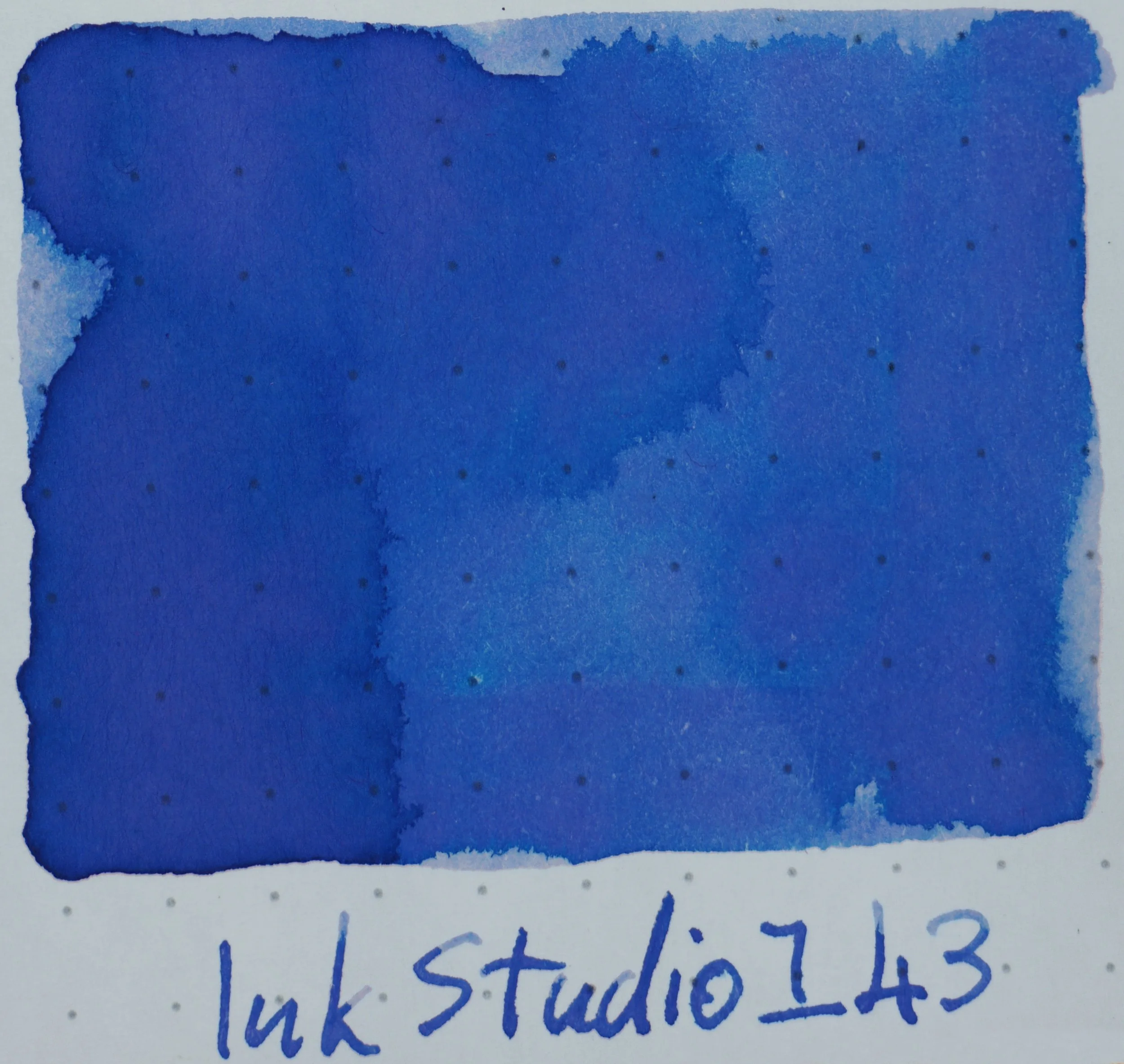
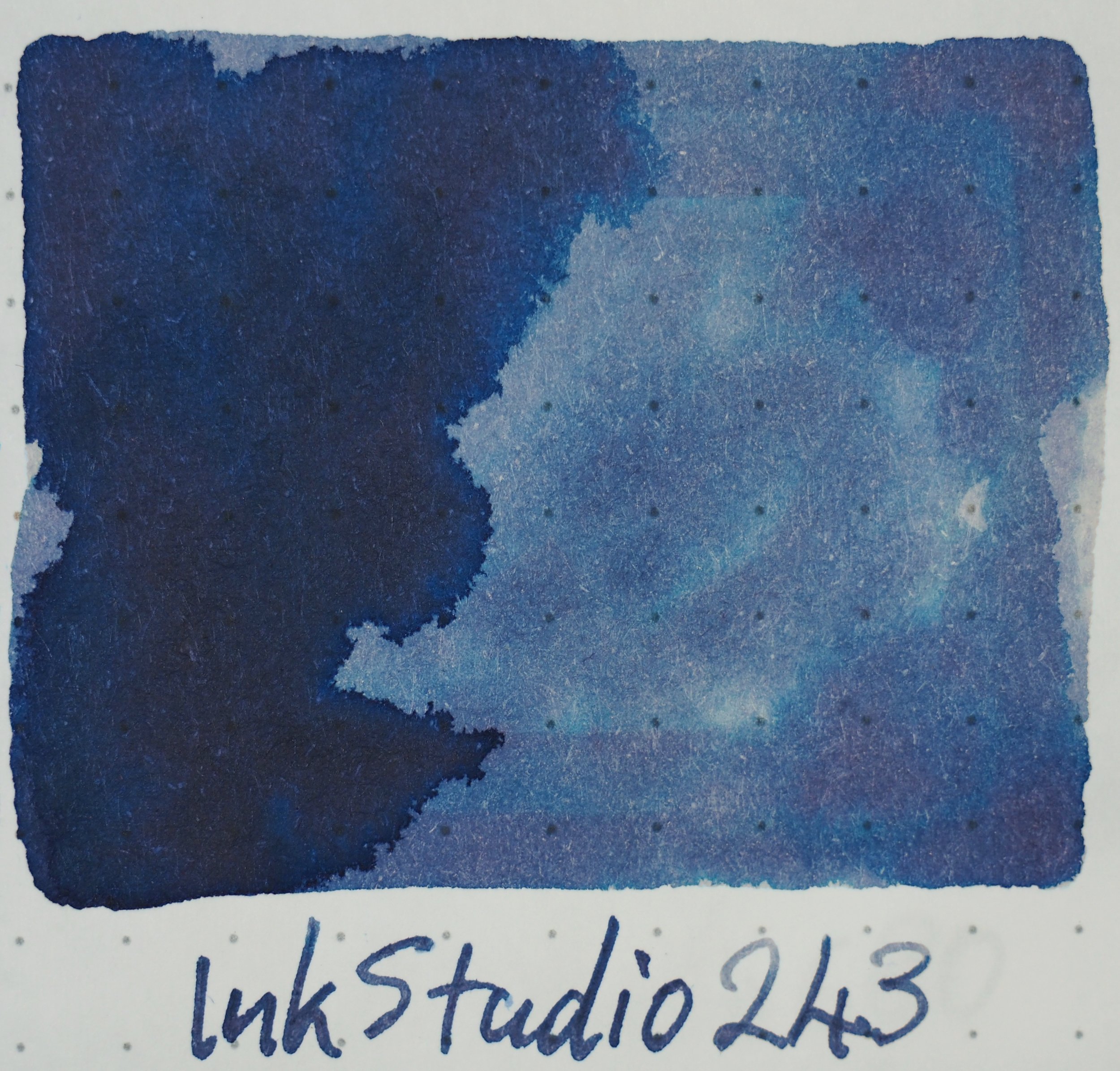
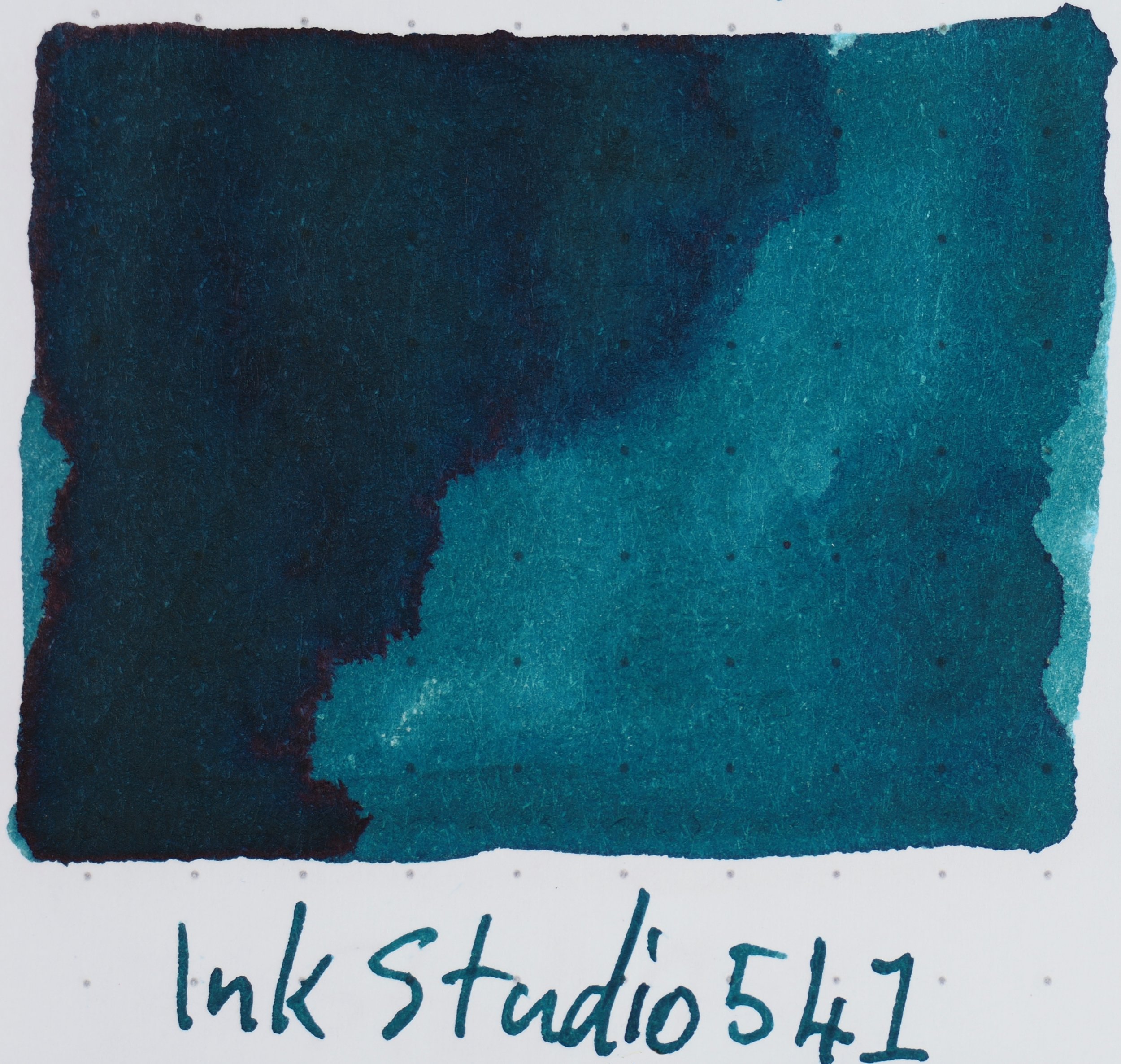
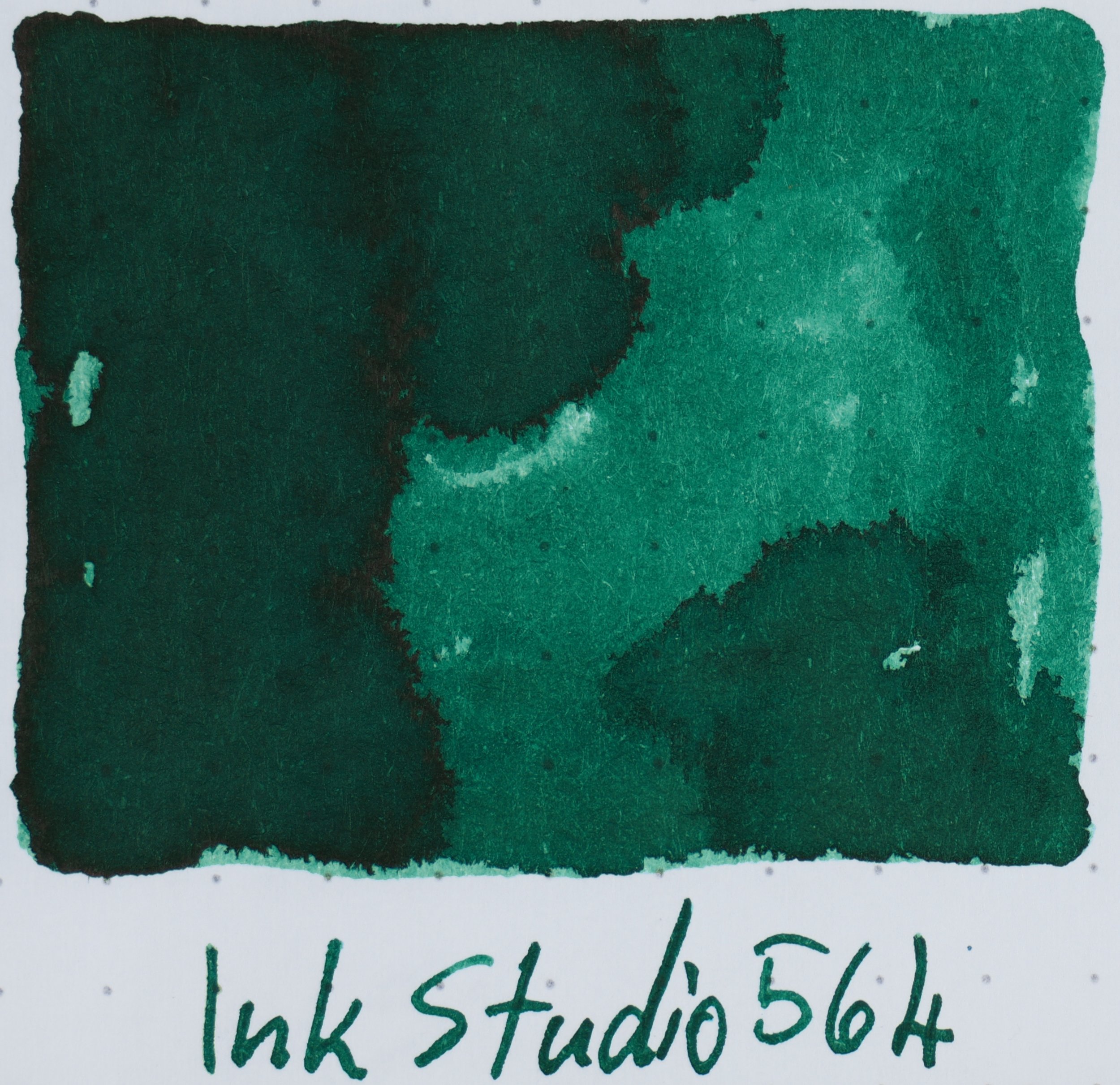
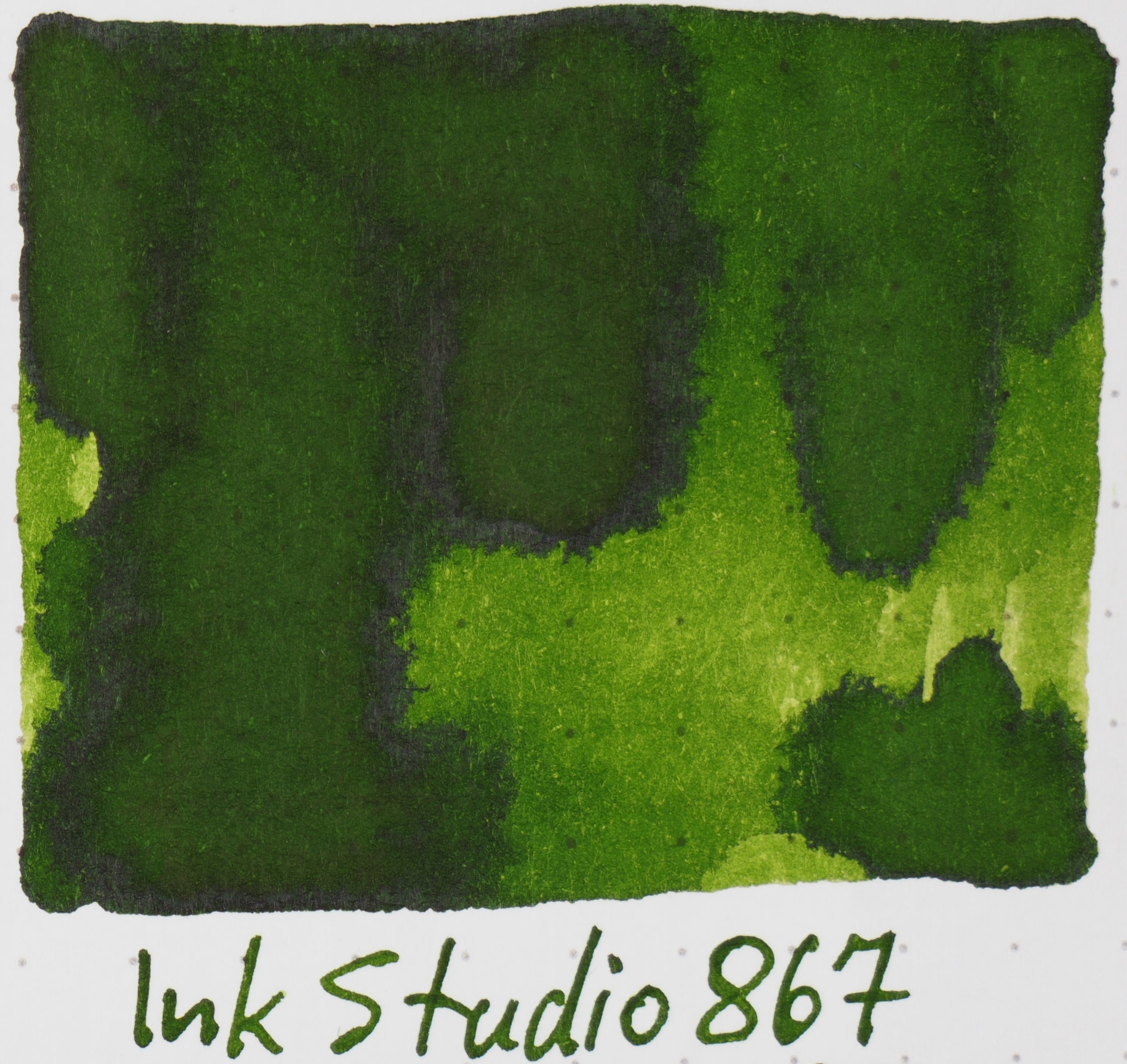
Some of these numbers are more consistent than others for example #40, #41, and #43 (where # represents different first digits) are consistently a more neutral blue, a slightly teal leaning blue and a slightly purple leaning blue, respectively. #64 is consistently a teal to some degree, #60 is a neutral green, and #67 is a yellow green of some sort. #30 is consistently redder in colour than #31 but each instance of each of these two colours has some variation in it; they aren’t just more saturated; for example 531 has noticeably more blue in it than other iterations of the #31 colour and 530 is noticeably more orange than other iterations of the #30 colour.
As for the third digit, I’m not entirely sure what this is. I’m not sure what the pattern is here but as mentioned above with #40, #41, and #43 there are consistencies and there is certainly a vague pattern. ##0 might represent a neutral version of that general colour as #30 seems to mostly represent a more neutral red like colour, #40 seems to mostly represent a more neutral blue like colour and #60 does represent a mostly neutral green colour. But while ##3 represents a purple leaning blue in #43 in #73 they seem to vary quite a lot. I’d definitely be interested in hearing if anyone has any theories for the third digit.
So how many of each colour? This obviously is a little subjective where you put what but this is what I came up with:
-
Black/Grey – 6
-
Blue – 14 (-1 2020 update)
-
Light Blue – 6
-
Dark Blue – 3
-
Teal – 8 (-1 2020 update)
-
Green – 11
-
Light Green – 3
-
Dark Green – 1
-
Yellow – 3
-
Brown – 7
-
Orange – 3
-
Red – 4
-
Deep red – 3
-
Pink – 7
-
Magenta – 2 (-1 2020 update)
-
Purple – 7
-
Light Purple – 3
-
Dark Purple – 5
-
Dual-colour – 4 (+3 2020 update)
That’s 23 “blue” inks out of 100 and that’s not counting teals or purples that lean blue. There are a few greens but overall this is heavily dominated by blues (which is fine by me as I love blue!) and they are all different at least.
Tomoe River 52gsm Ivory (white) paper
Tomoe River Ivory(white) 52gsm 023-237
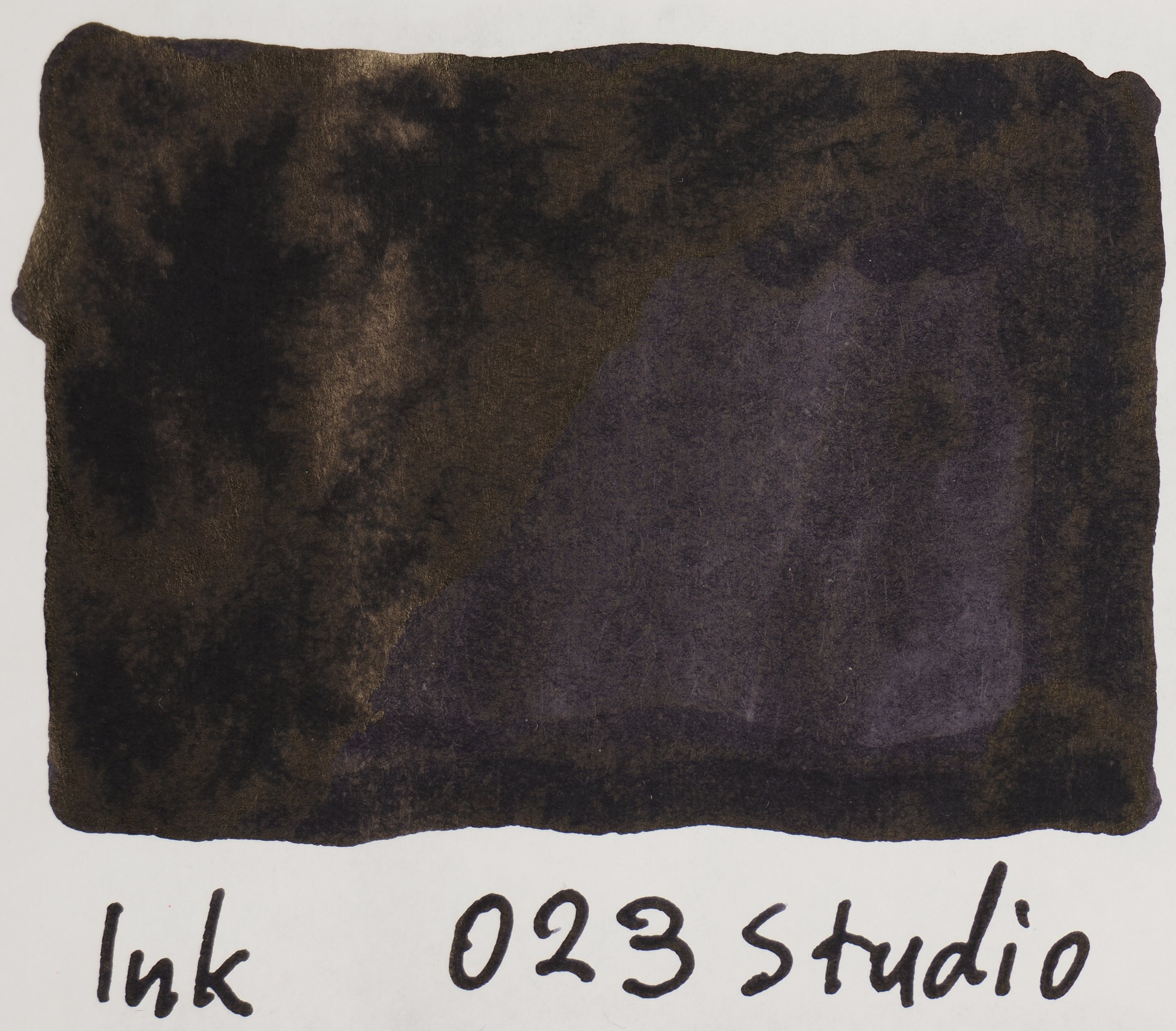
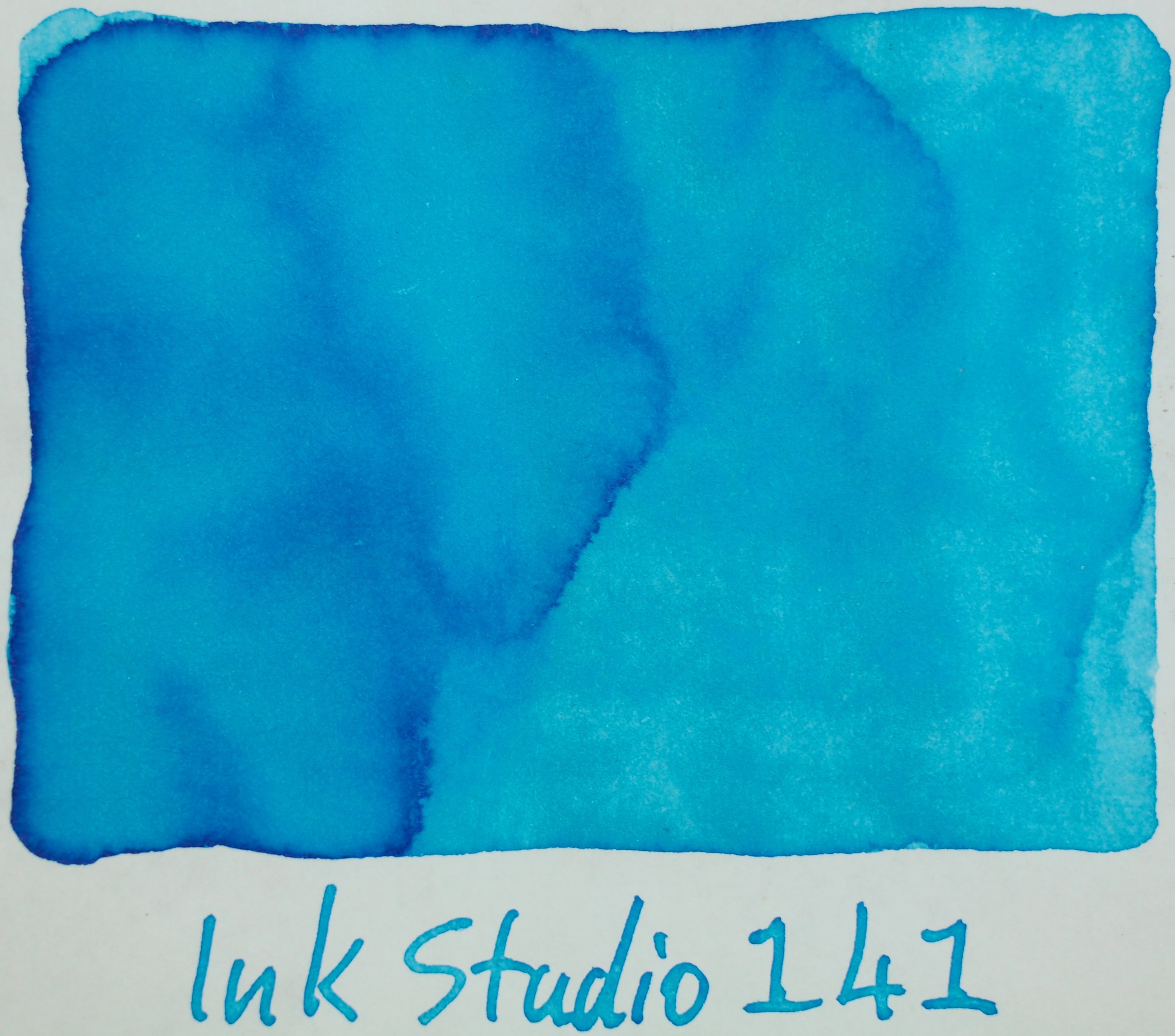
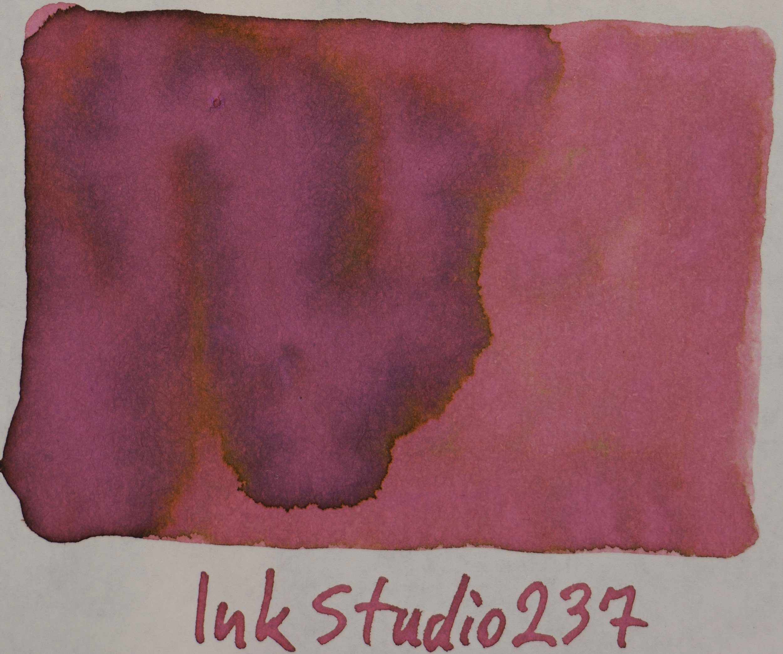
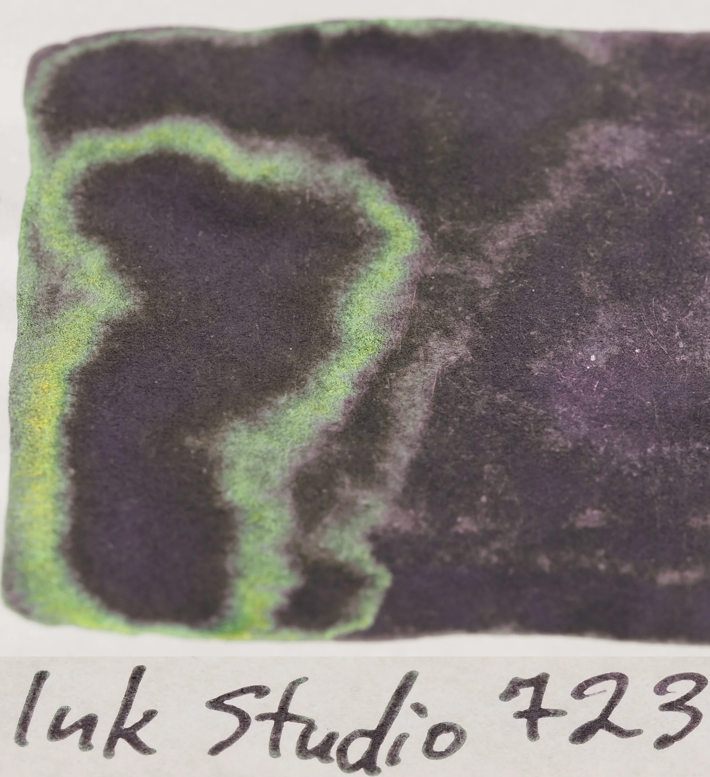
On the first page you get the only three “0” inks. Three “black” inks that approach black from a purple, blue and green base colour. Within this first page we get most of the inks that have the now famous dual-colour affect to them. 123 is a pinkish grey ink with green highlights and 162 is a greenish grey ink with pink highlights. 223 is a dark grey greenish ink with pink highlights. 237 is a pink with brown parts to it and 173 is a pink ink with orange highlights. 150 is a lavender with some blue highlights and 143 (and to a lesser extent 140) are blues with a subtle pink undertone. There is only a hint of gold sheen on 130 as well as some silvery sheens on the “0” inks but otherwise this is a pastel-like page with limited saturation and sheen.
The 2020 additions
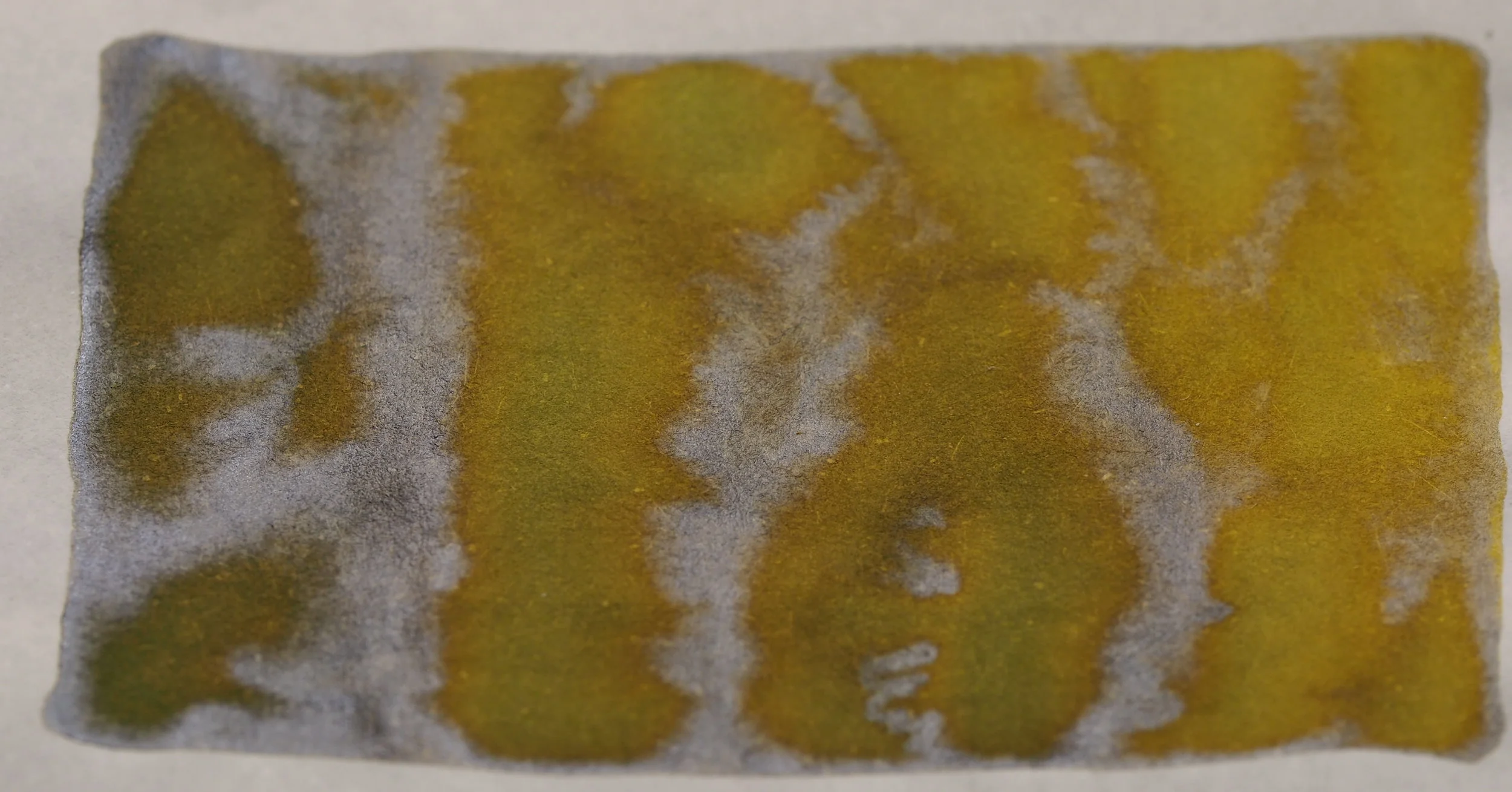
UPDATED: The 2020 additions to the set are all dual-colour inks. 224 is a pink ink with green edges, 252 is a more saturated pink ink with a teal edge. 280 is a brown-orange-yellow ink with lovely green edges! The dual-colour characteristics is much more prominent on Tomoe River and the inks change colour a little on Rhodia. There is no sheen on Tomoe River
Tomoe River Ivory(white) 52gsm 240-443
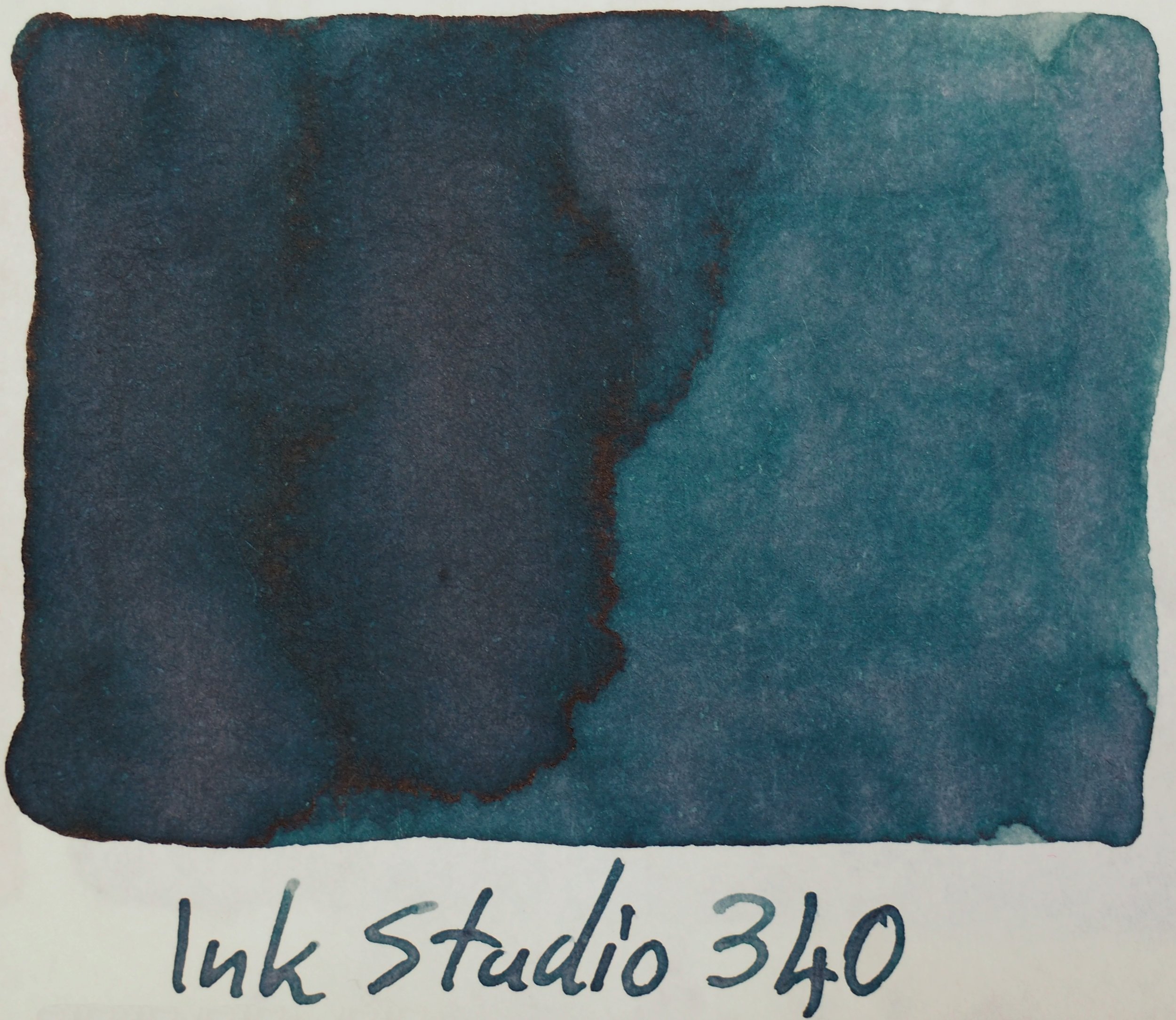
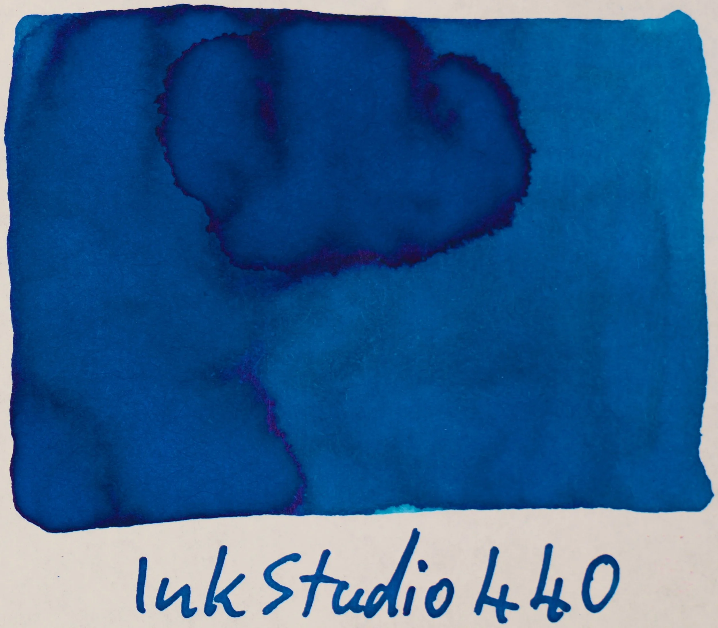
The inks on page two are darker and clearly have a higher dye content but aren’t very vibrant and are on the greyer duller side. 264-373 are all somewhat dull inks whereas the first page were pastel-like inks. 431 onwards are certainly starting to quickly get ore vibrant!
273 is an interesting tan coloured ink more yellowy-brown in some areas but with pink hints in others. 373 is similar but with some green in there. 425 is a lovely rich magenta leaning purple.
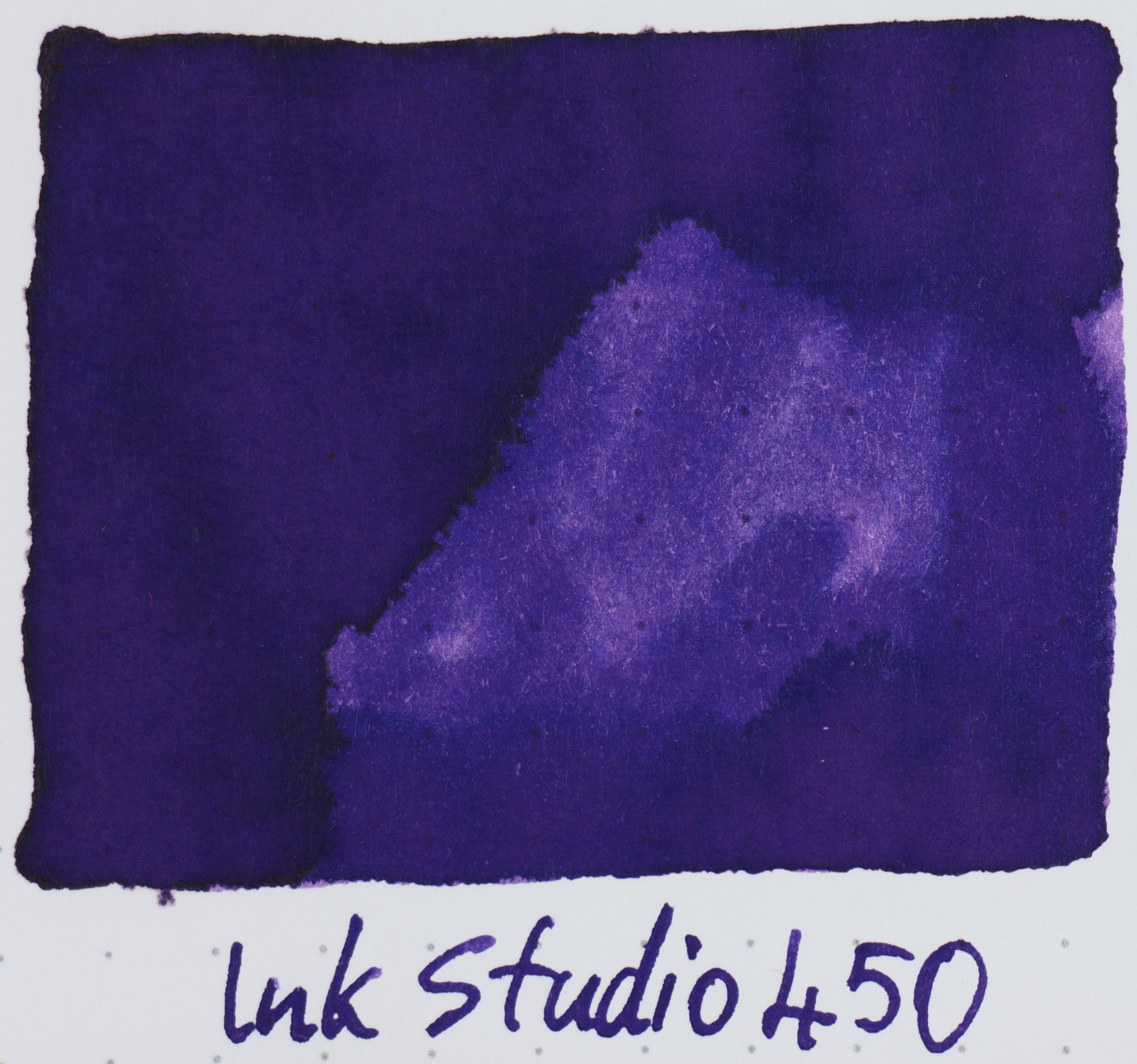
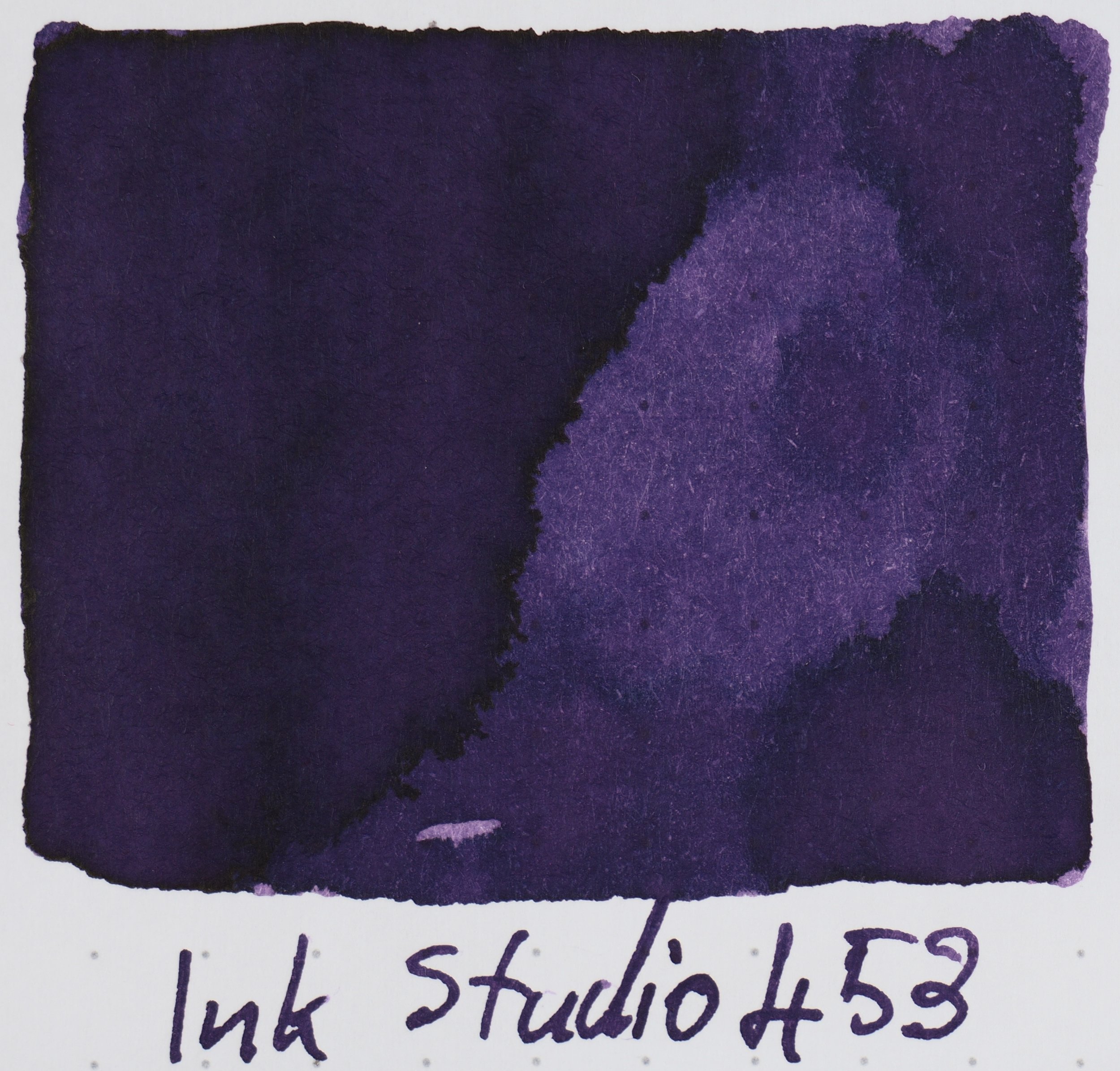
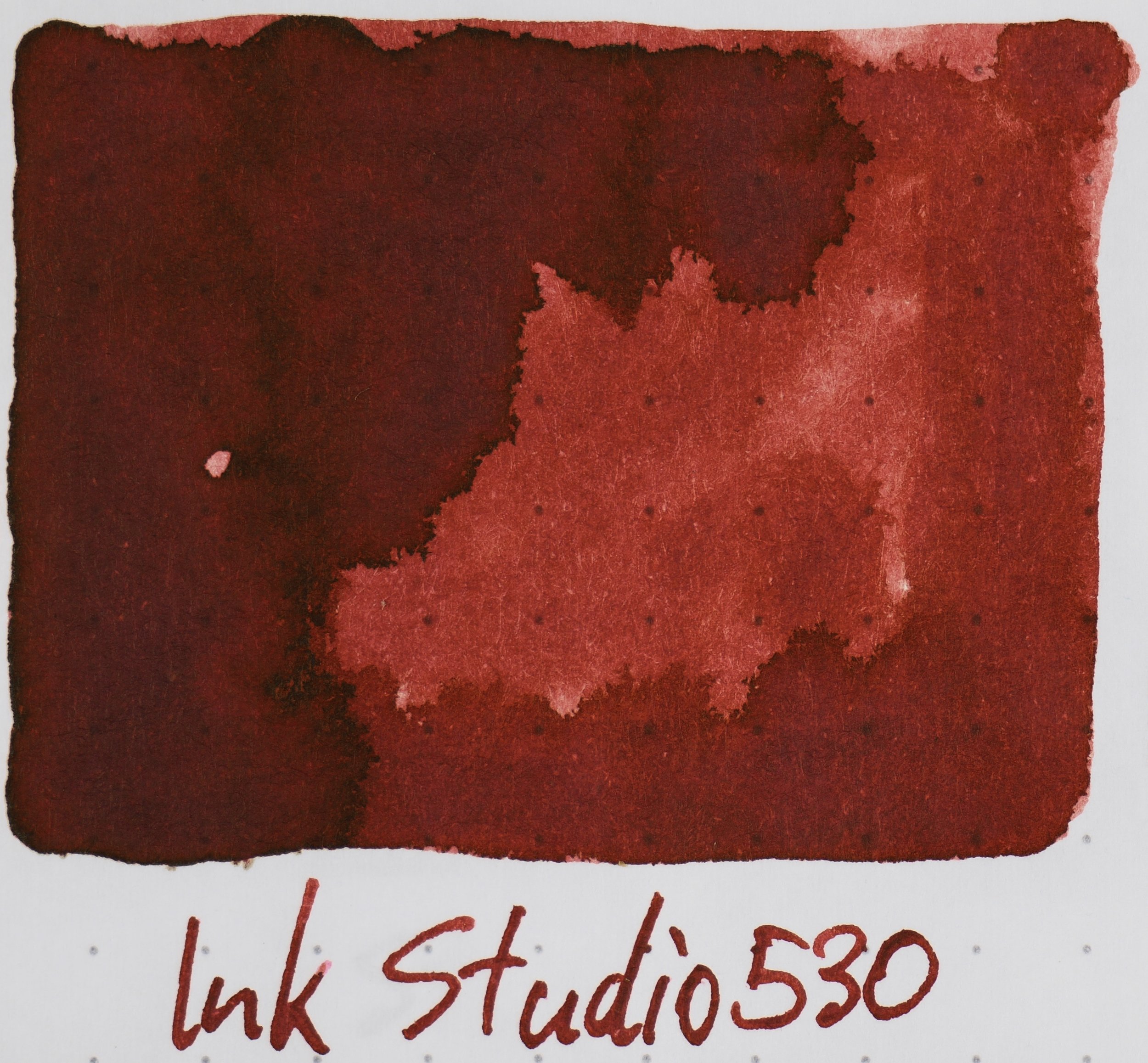
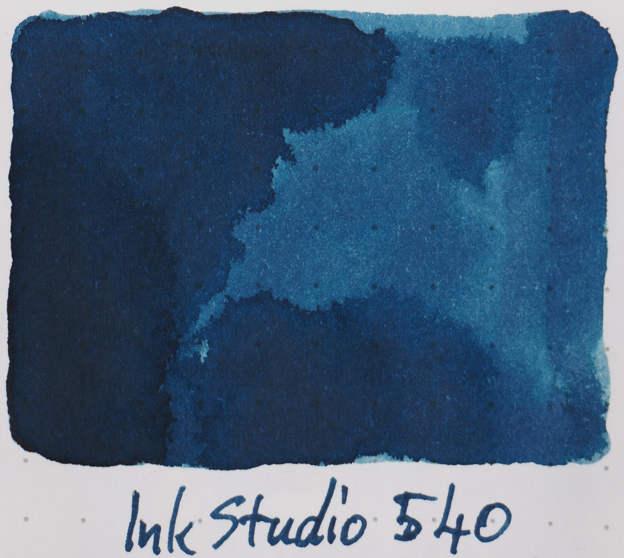
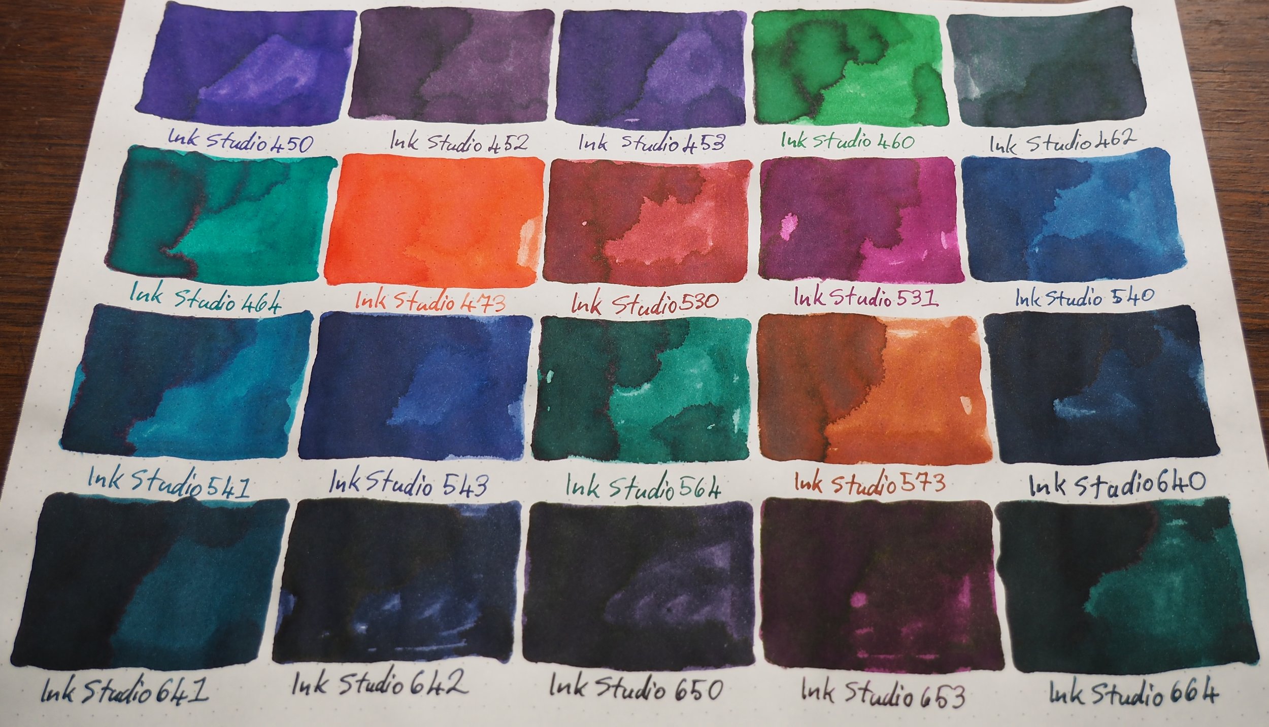
Tomoe River Ivory(white) 52gsm 450-664
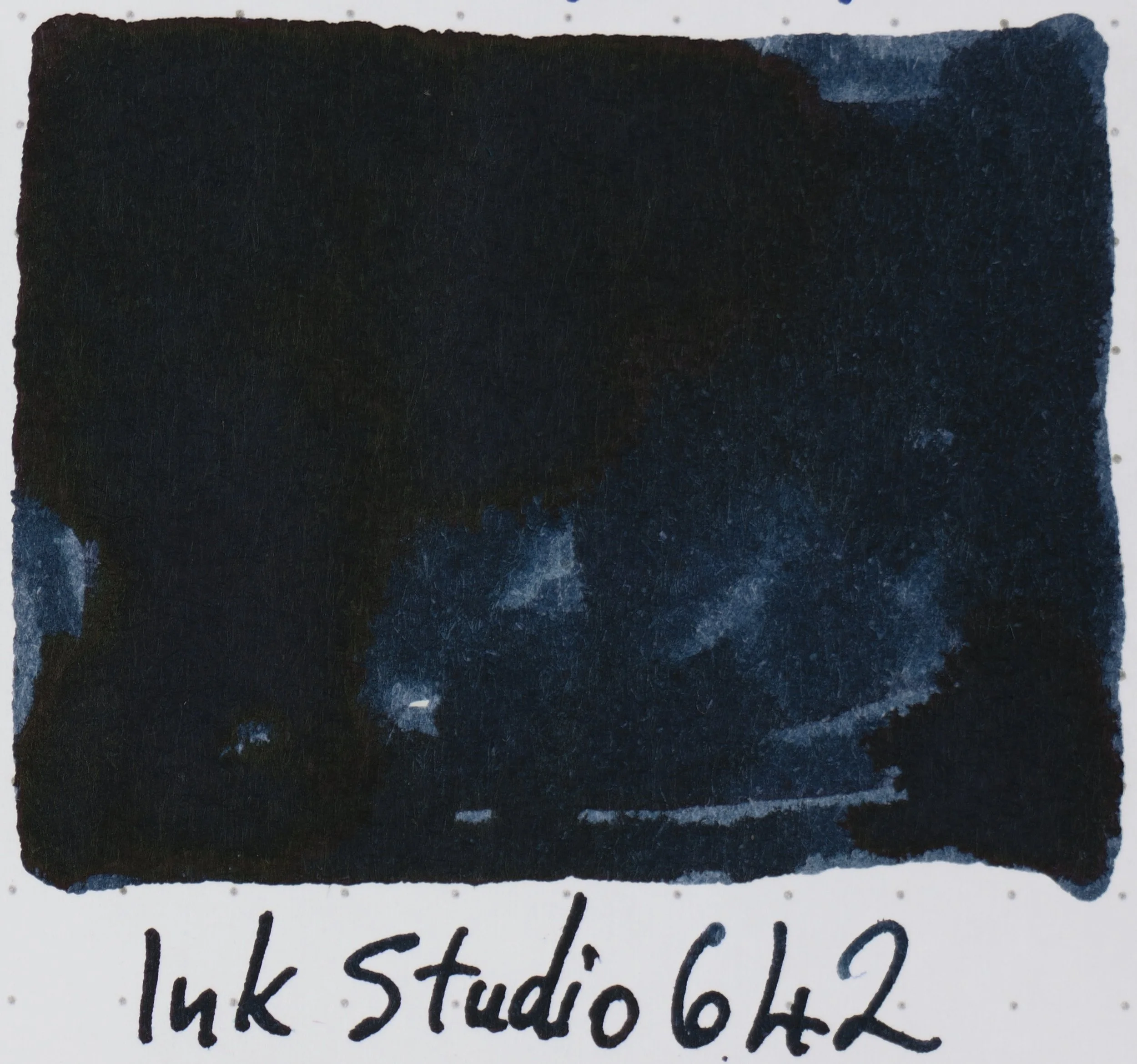
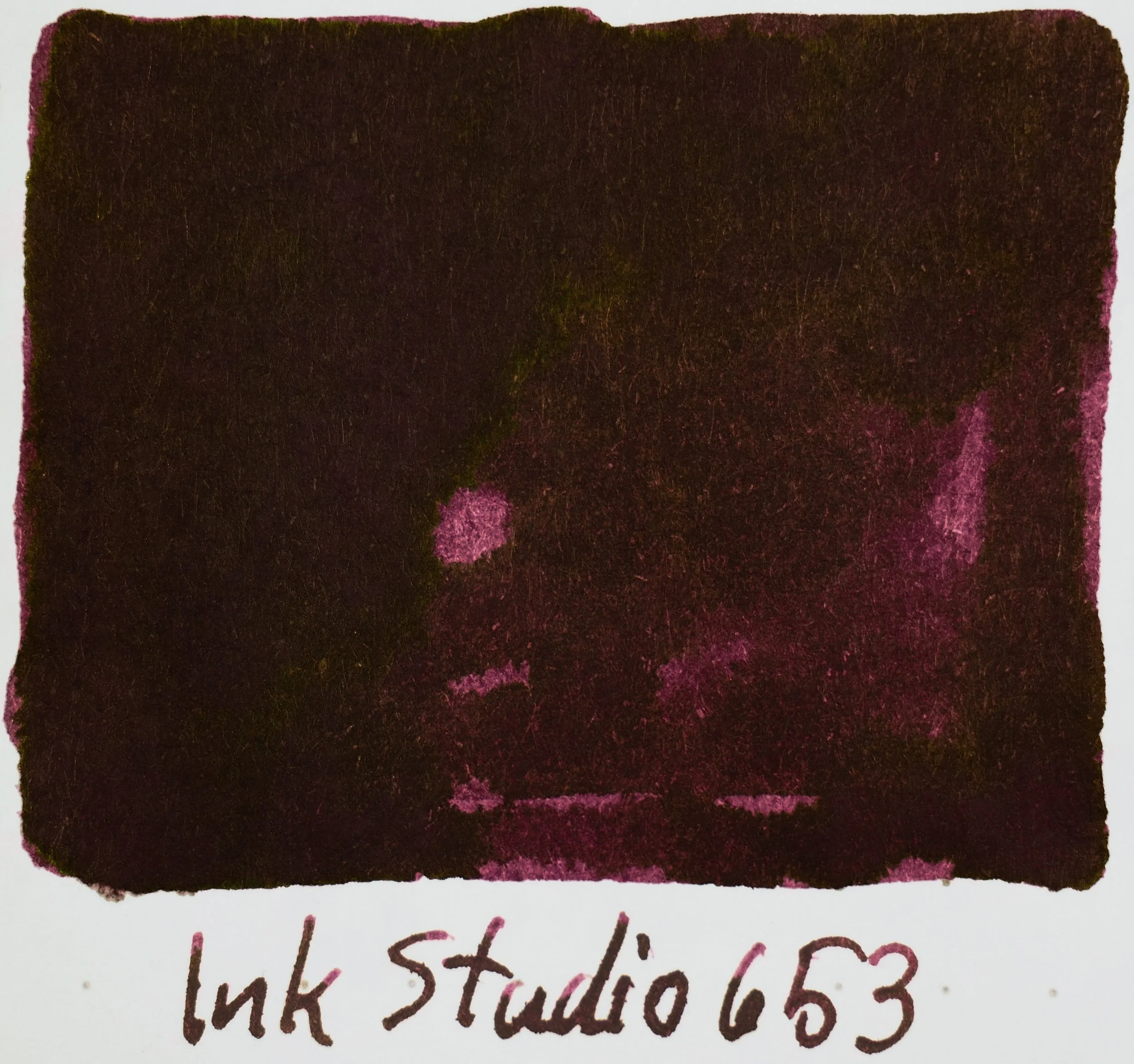
Definitely getting a lot more vibrant and richly coloured page three (and it stays like this for the rest of the pages). 462 is another multi-coloured ink, this one with a green base and some subtle pink hints. I’m a big fan of the rich ness of 642 and 653. 530 and 573 remind me of slightly more vibrant versions of Montblanc Red Chalk and Cards Collodi.
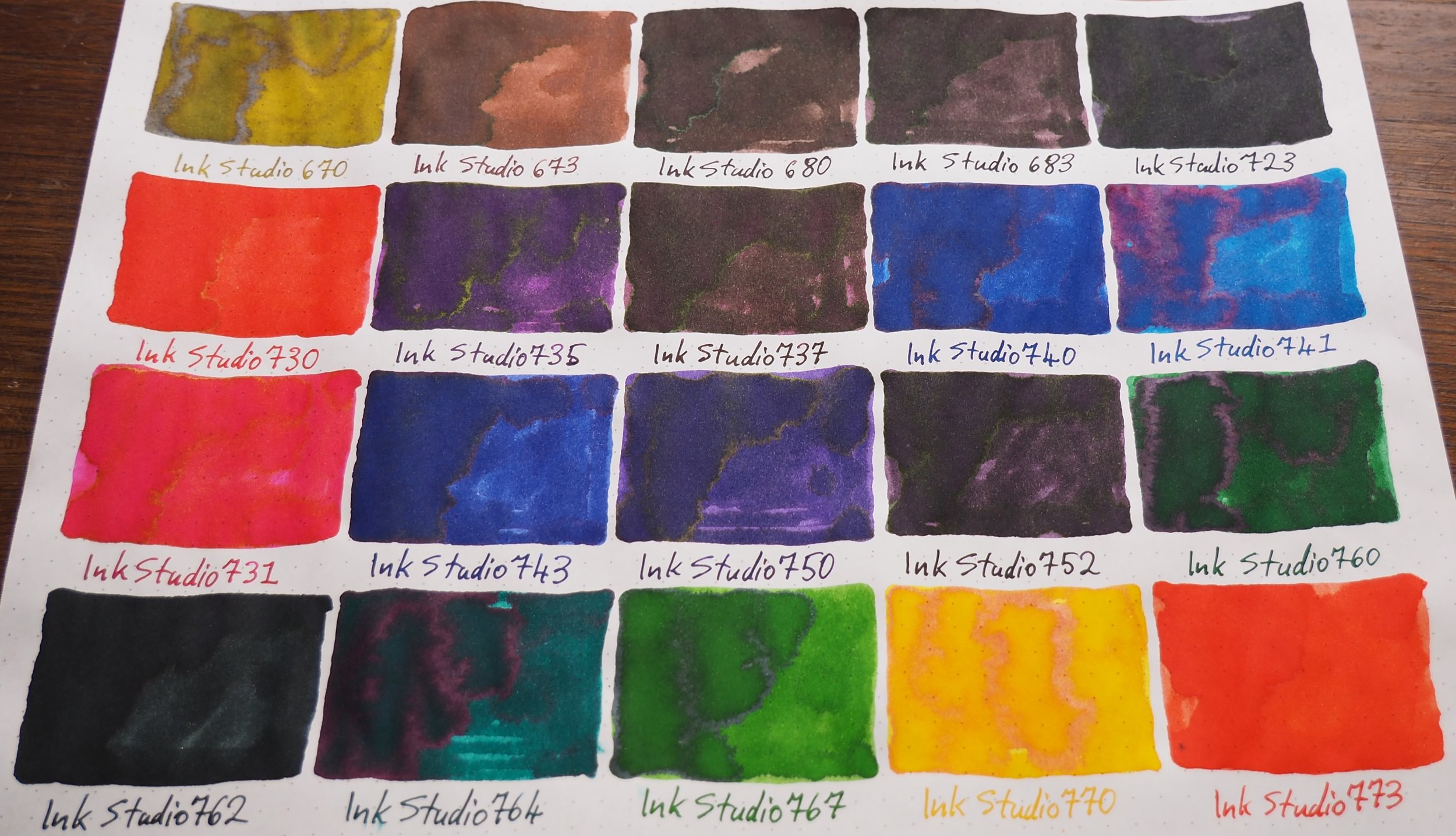
Tomoe River Ivory(white) 52gsm 670-773
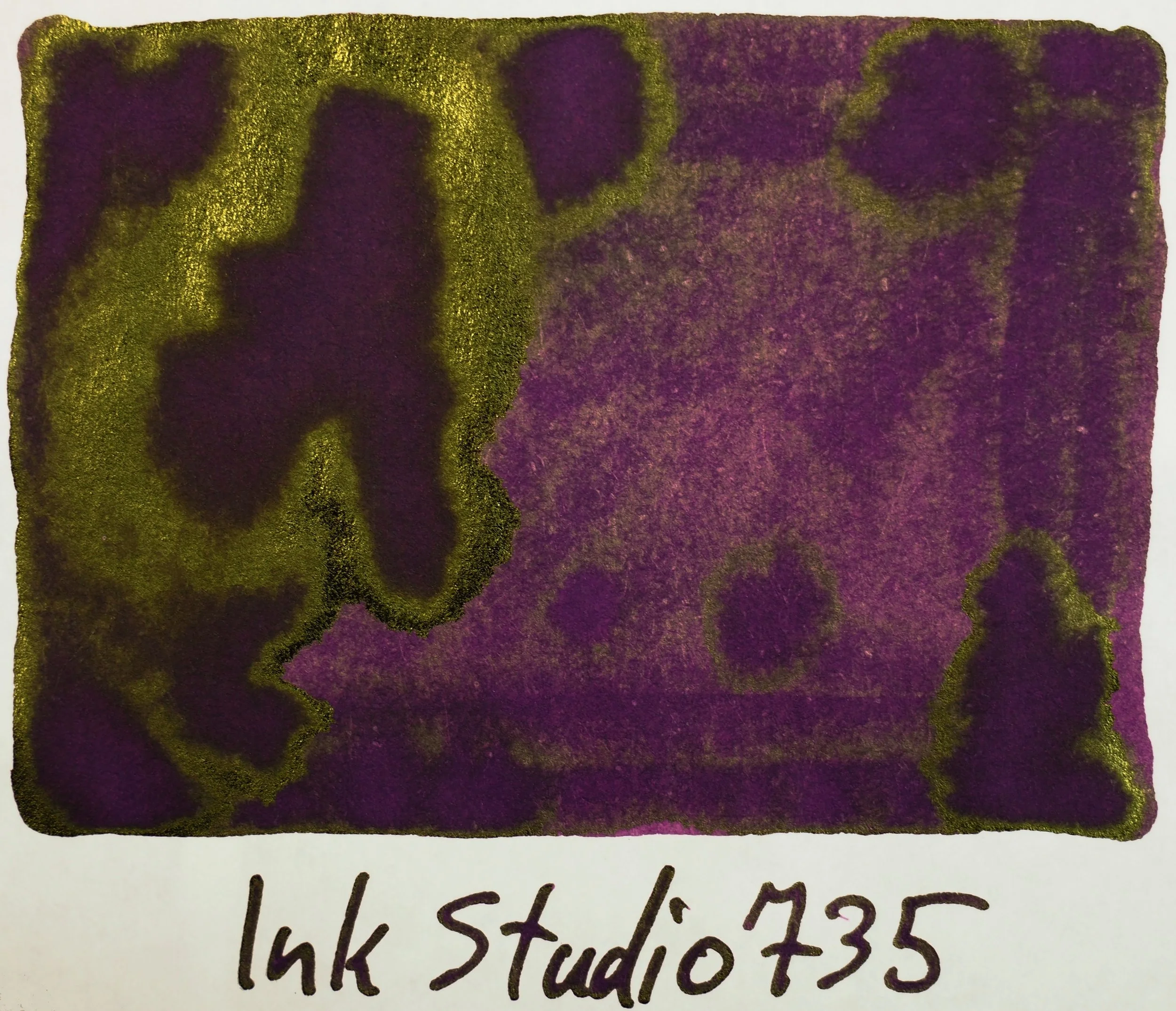
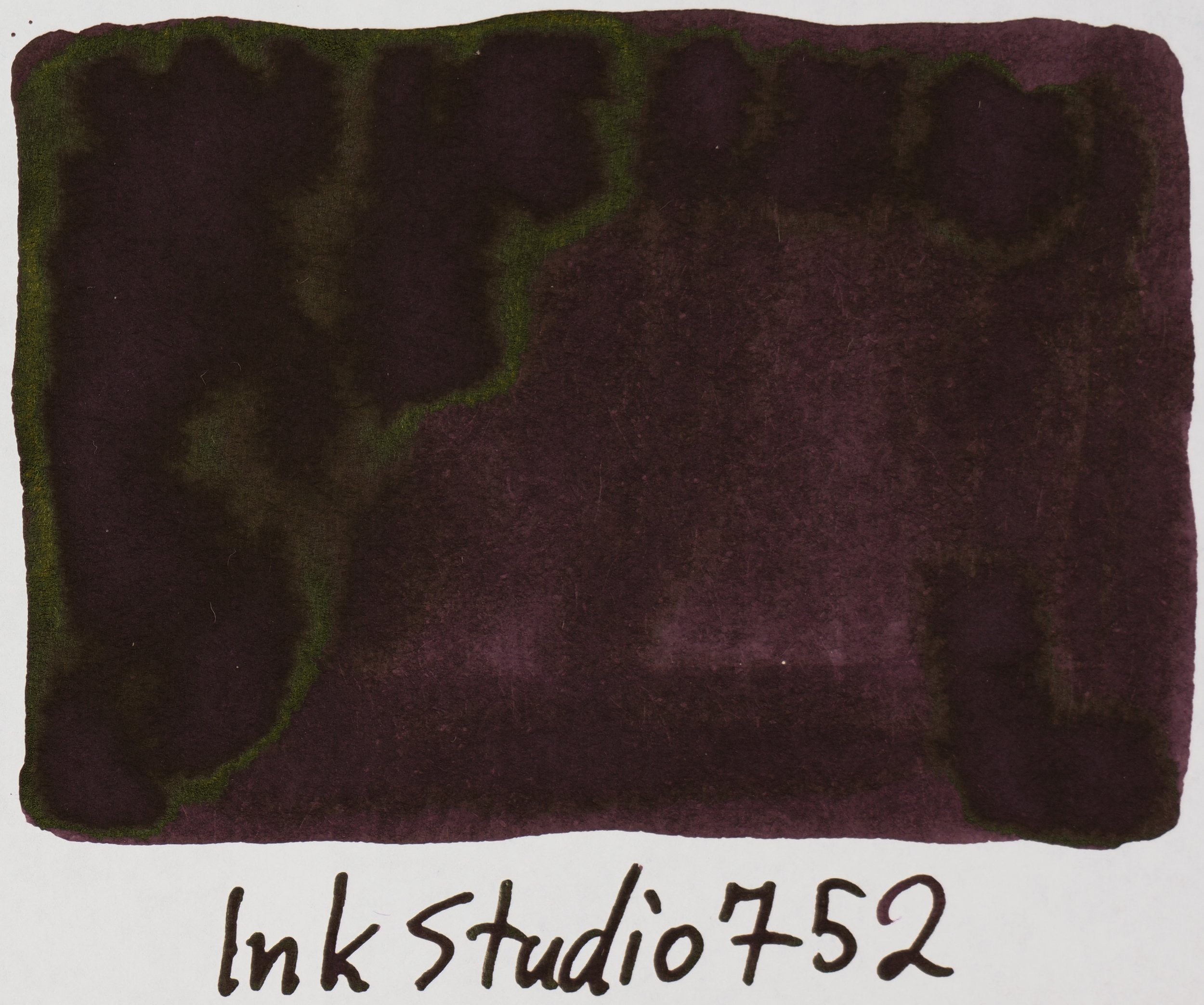
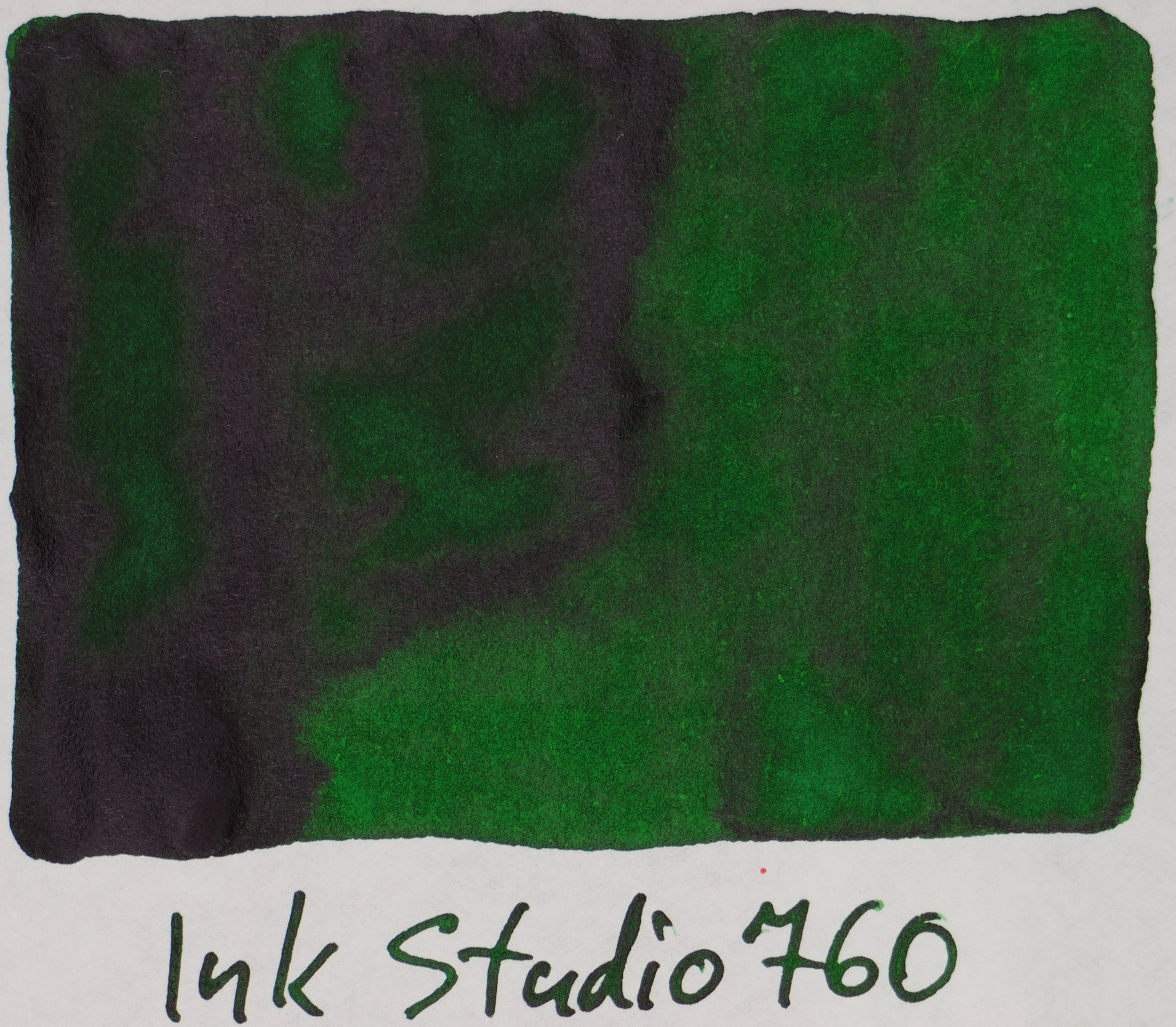
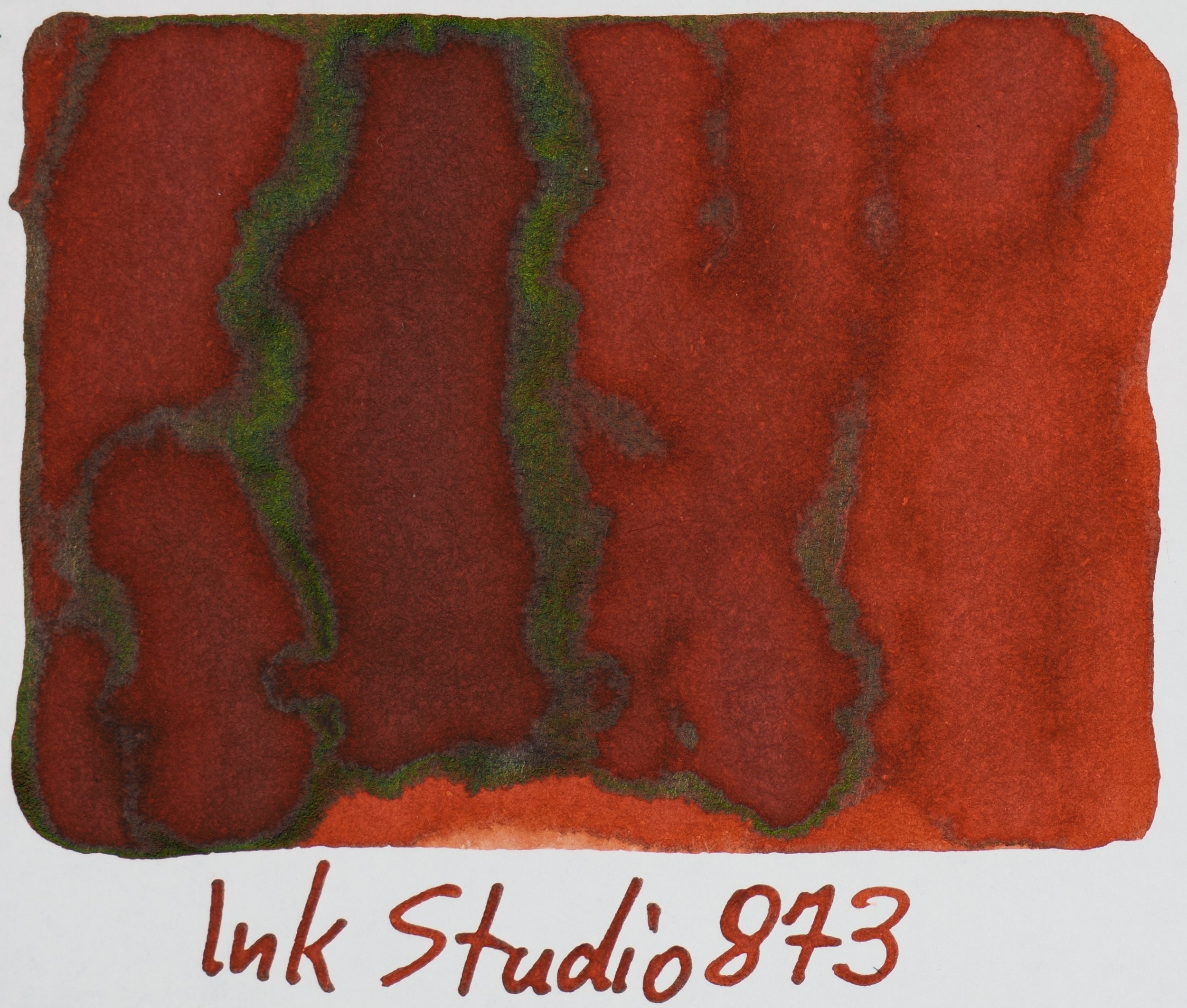
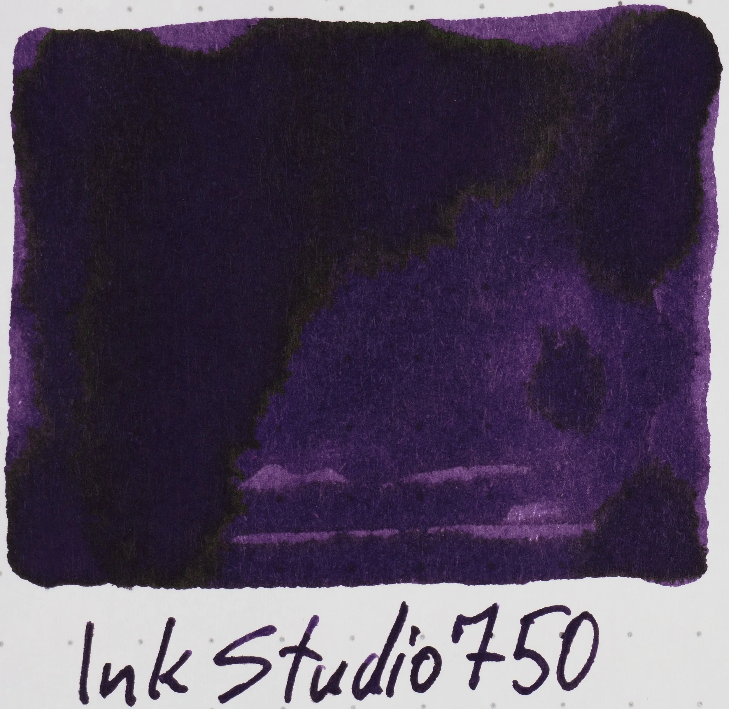
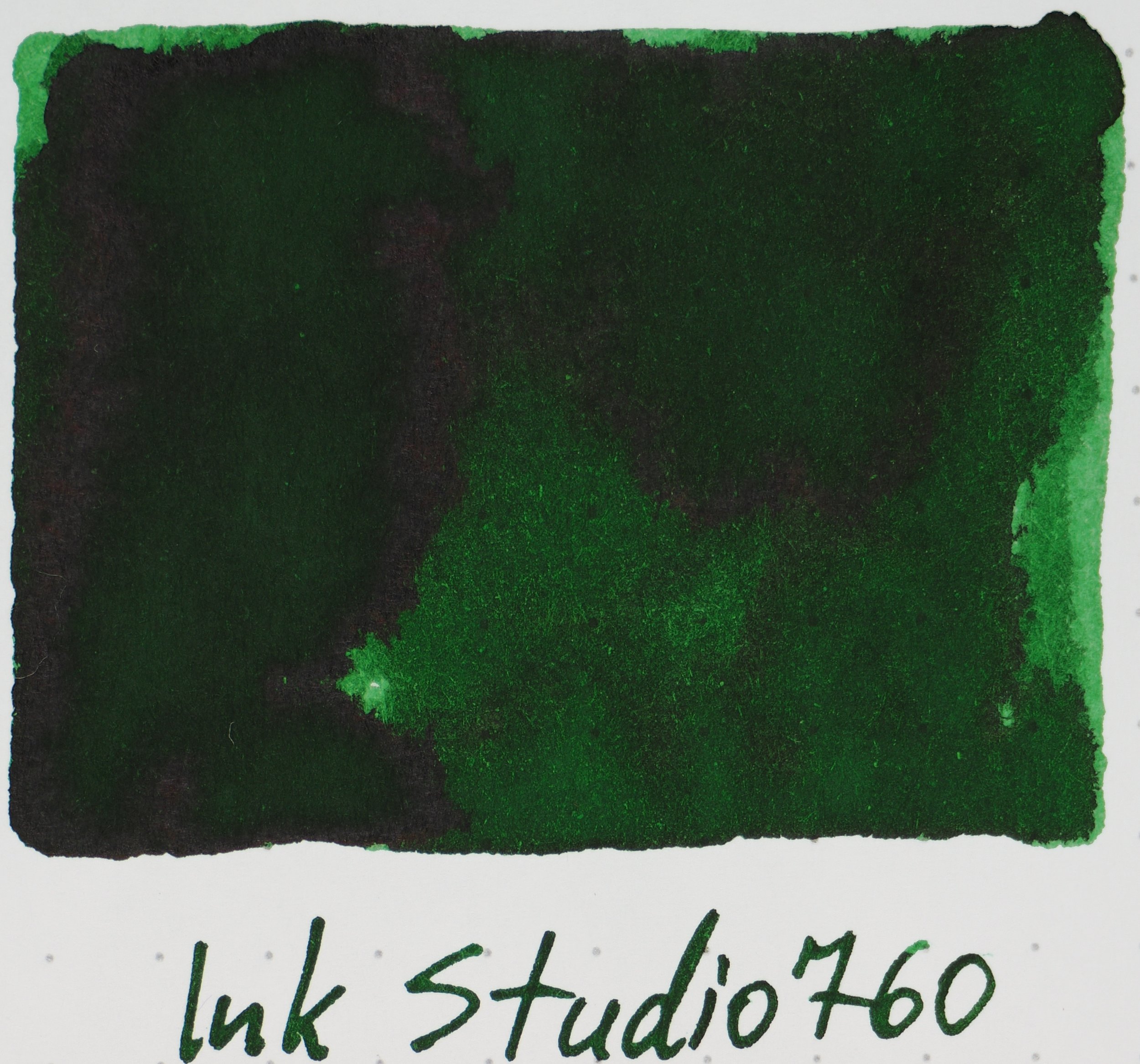
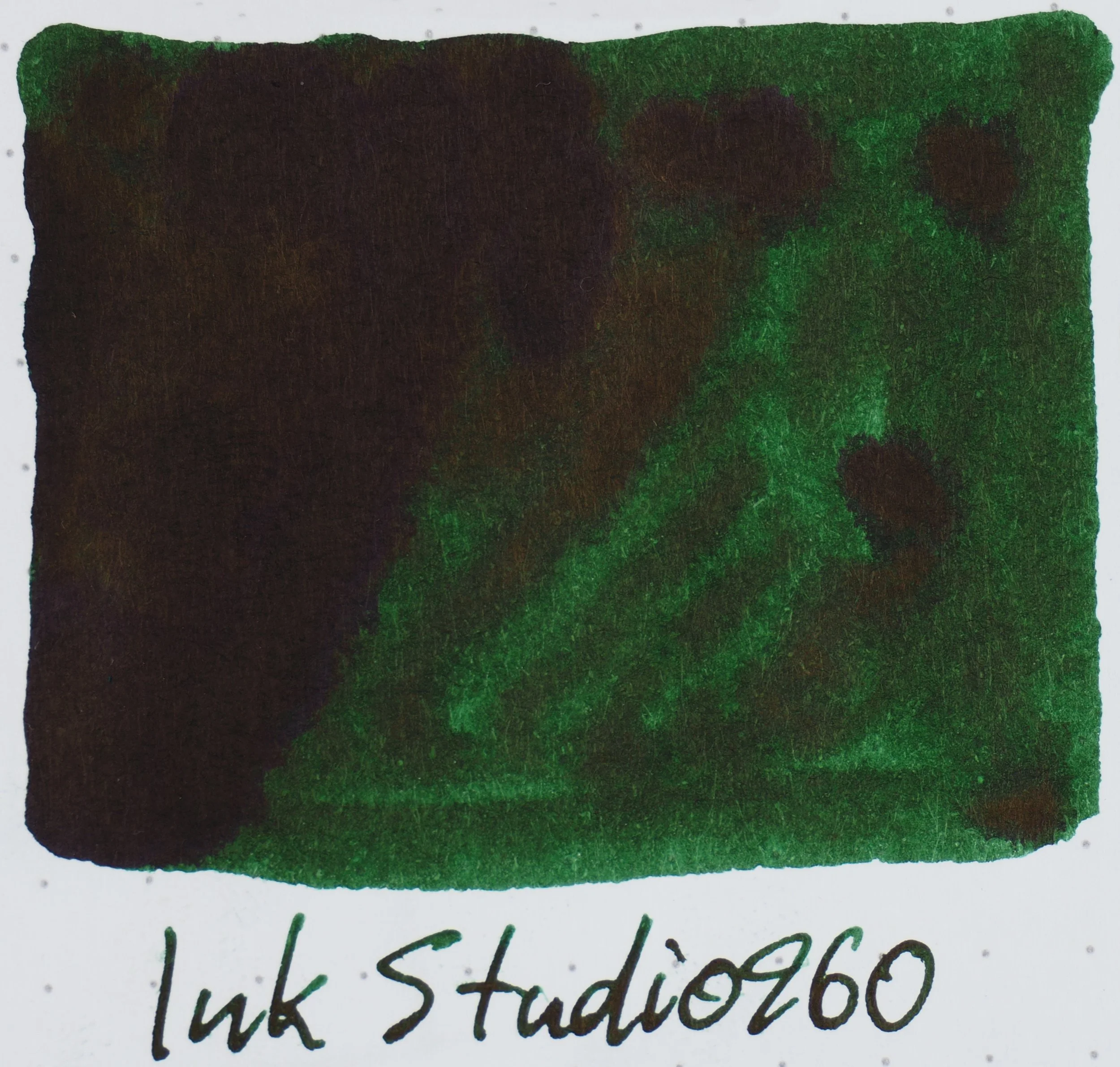
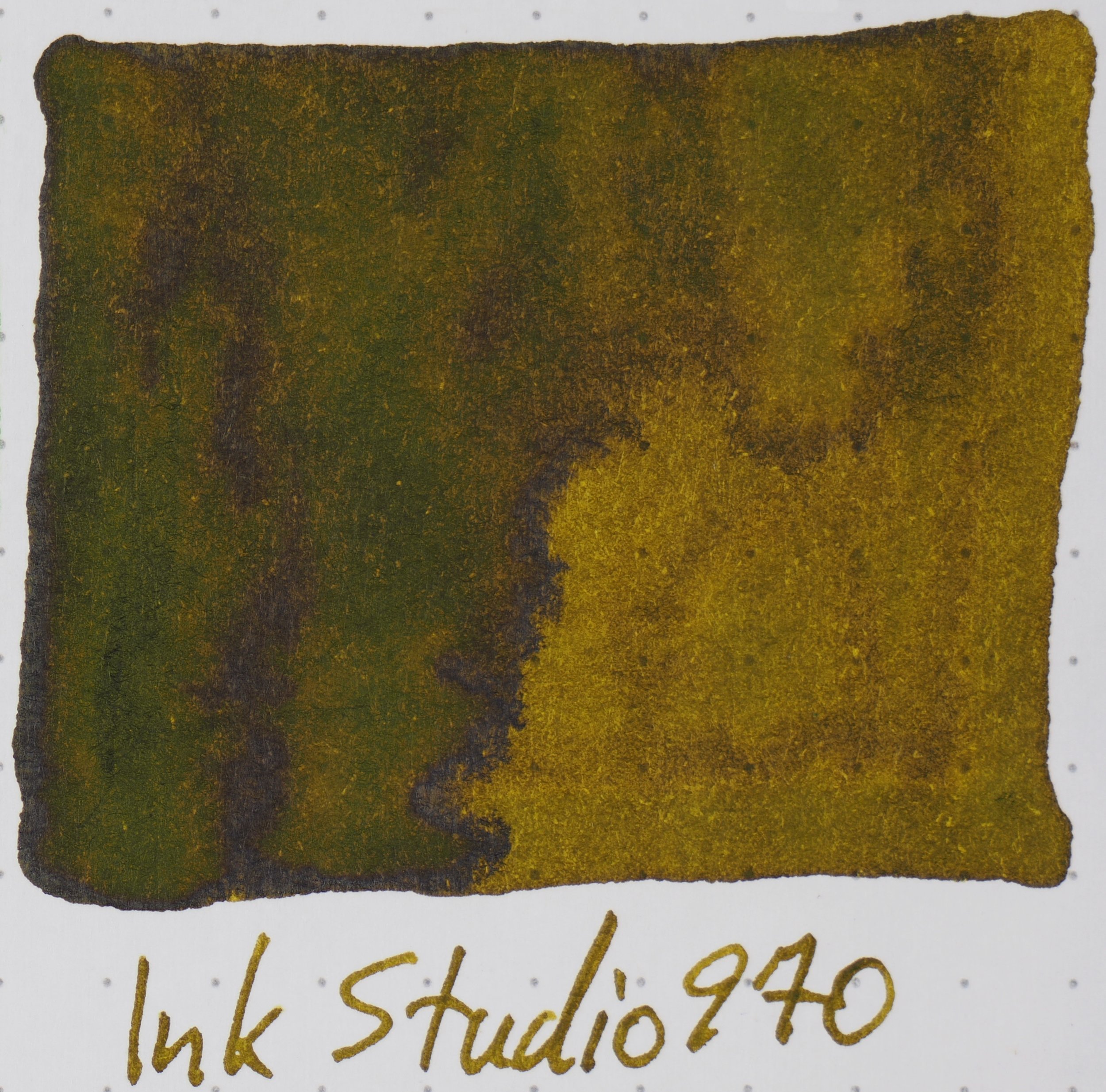
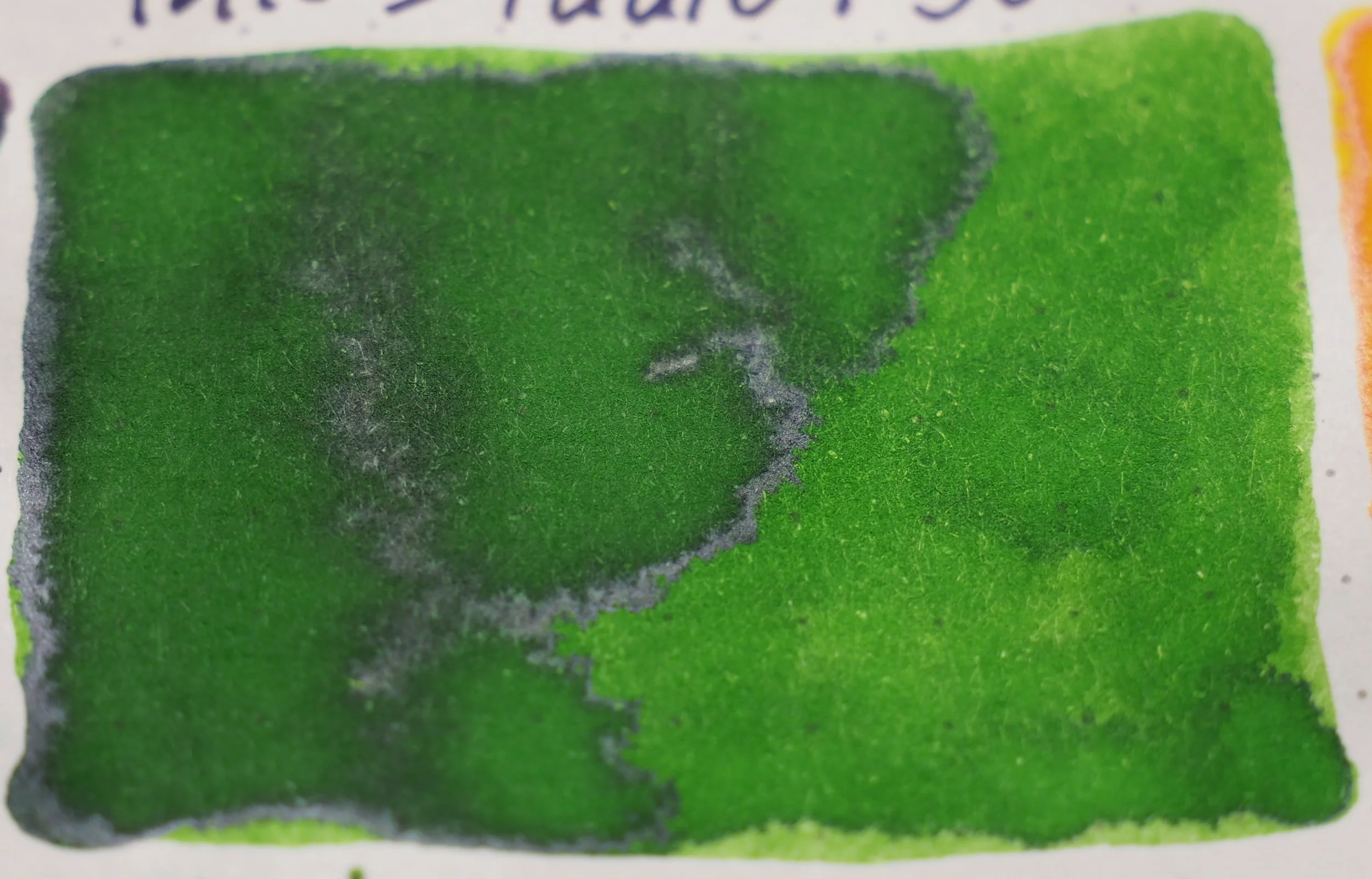
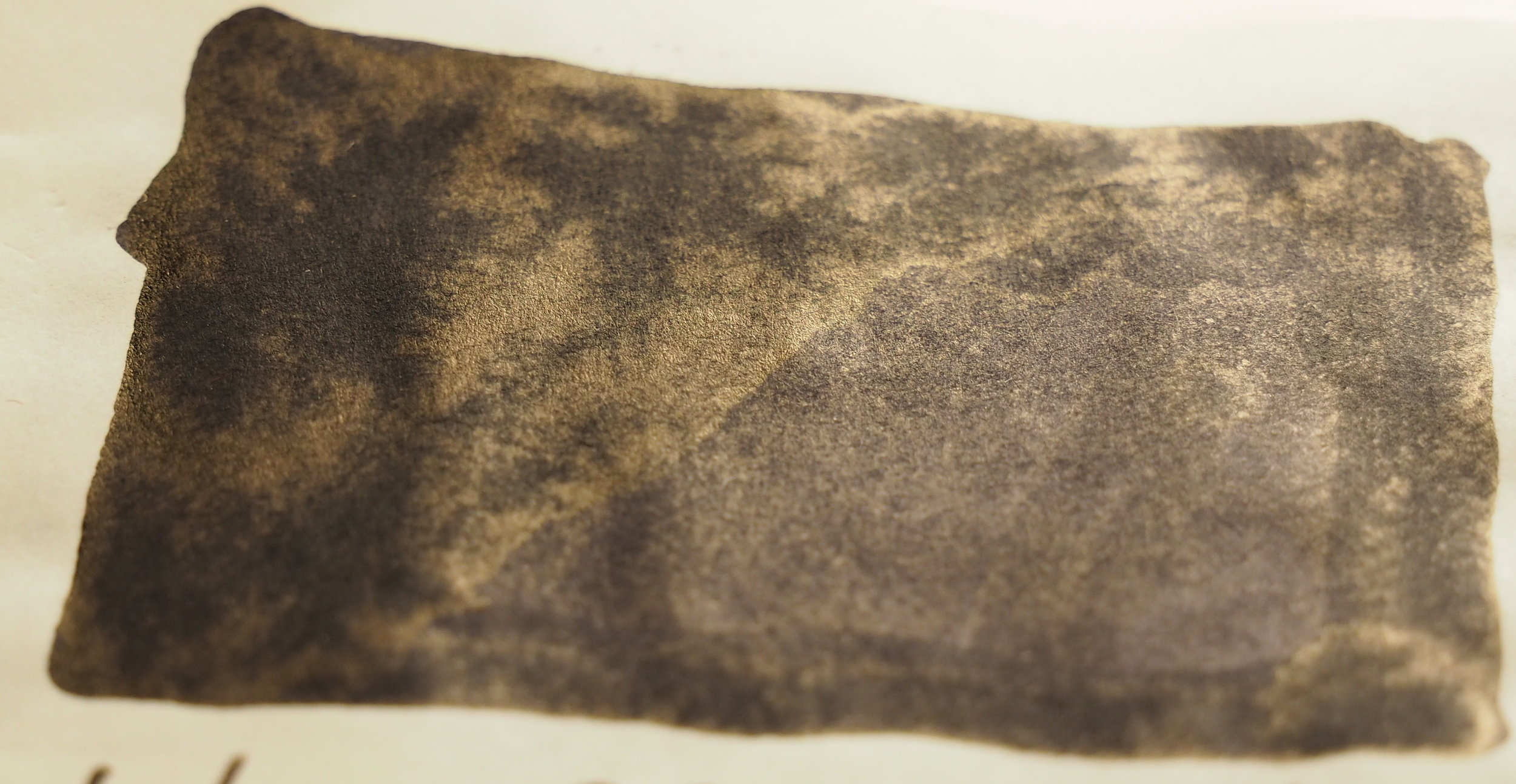
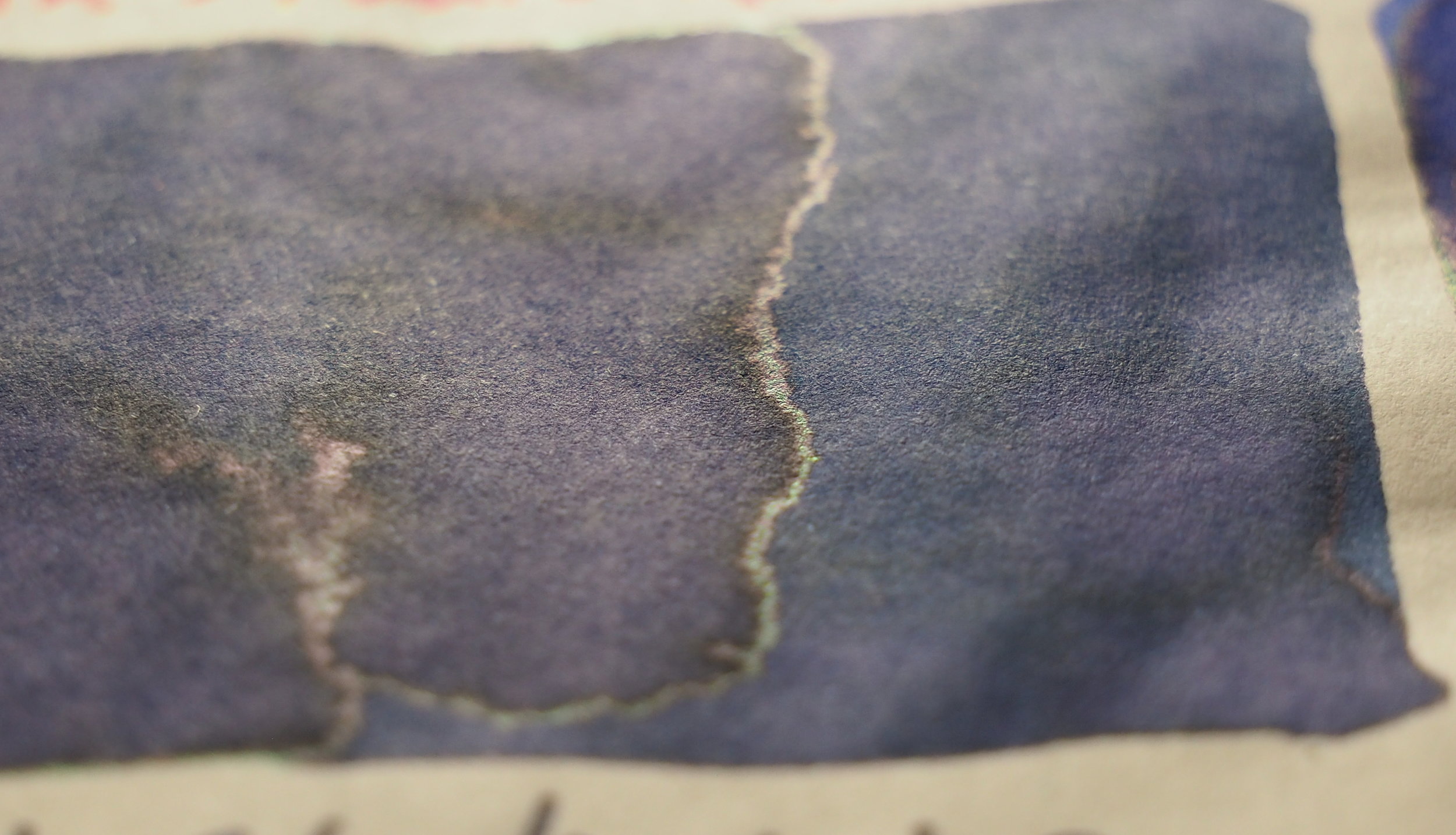
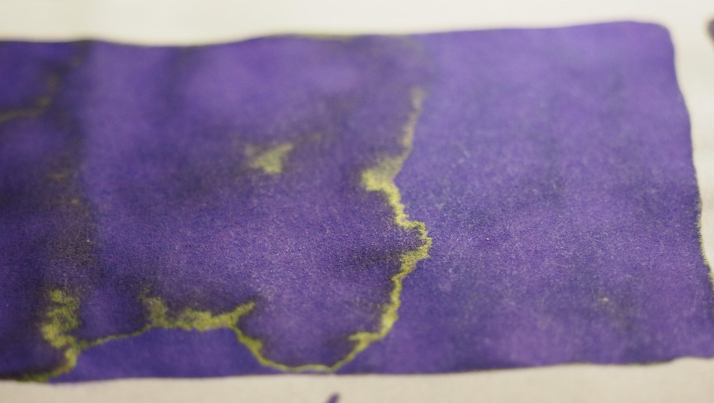
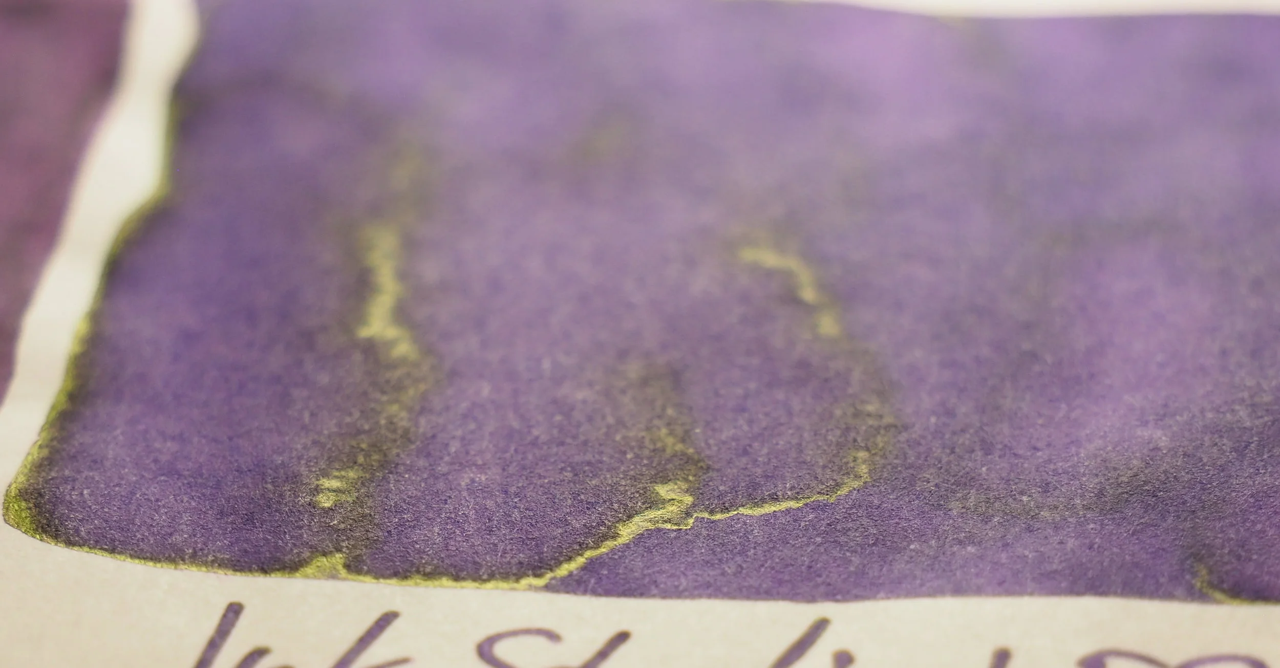
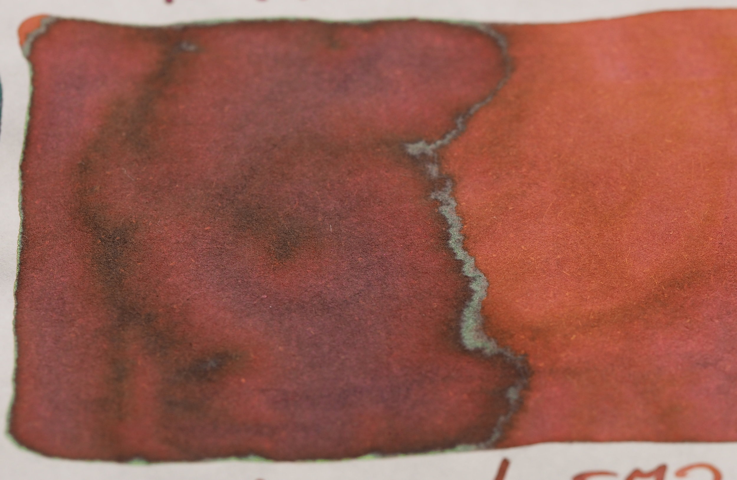
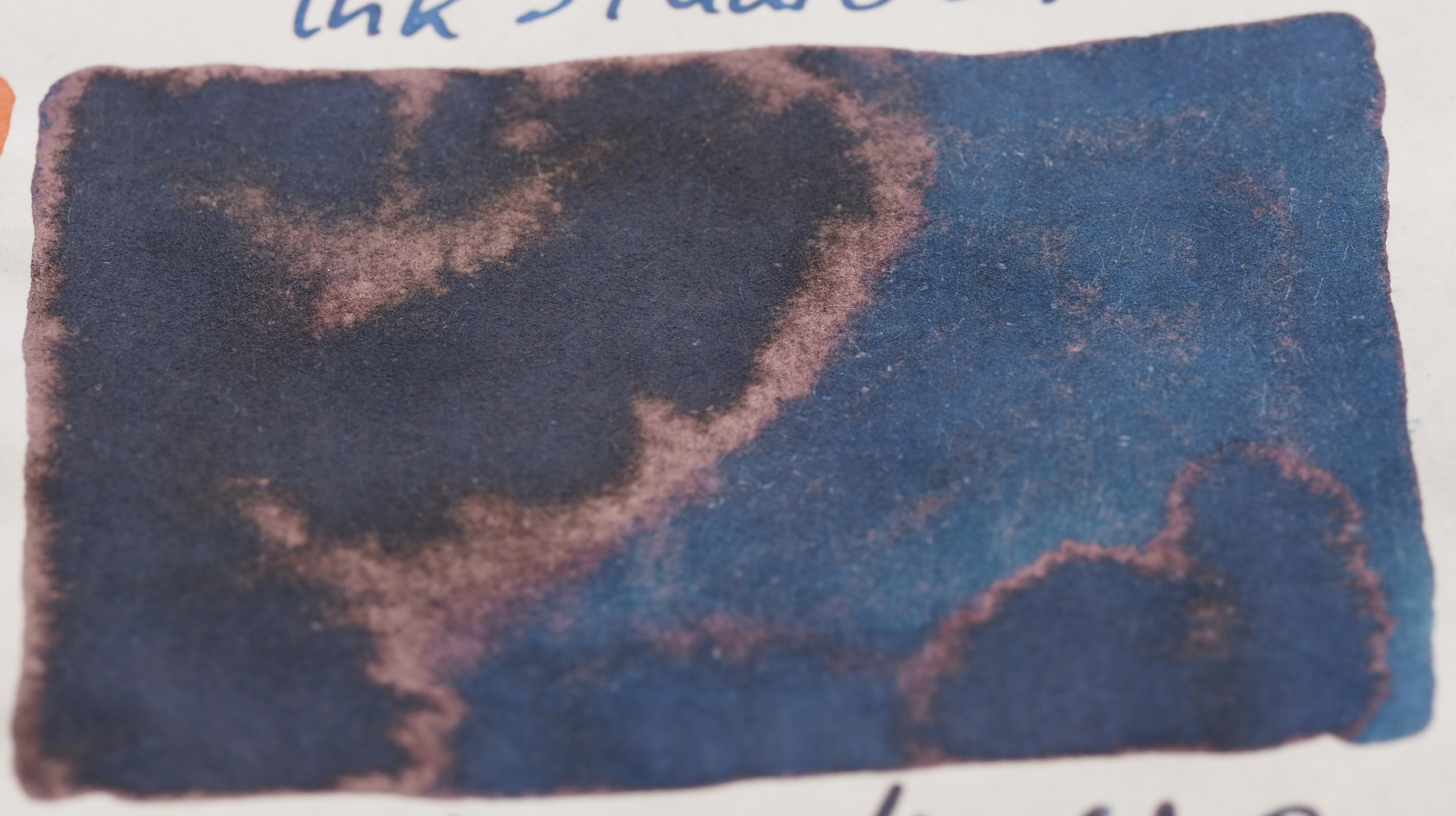
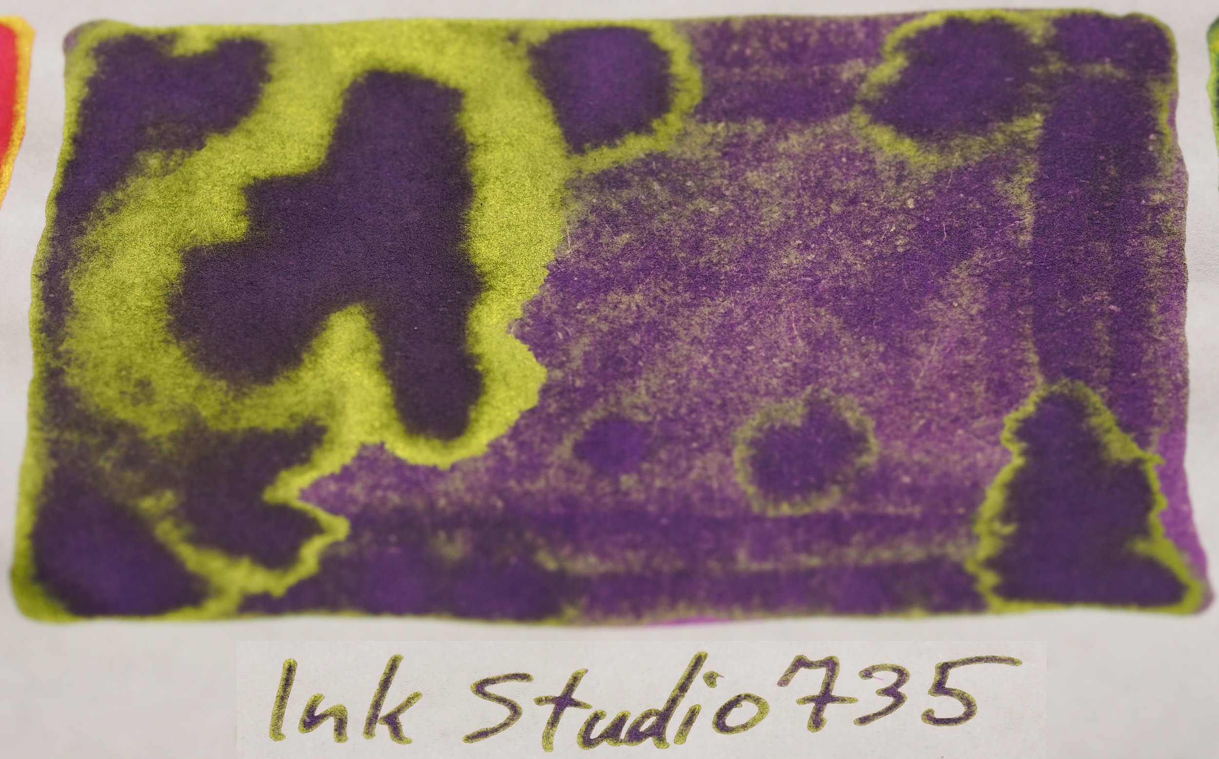
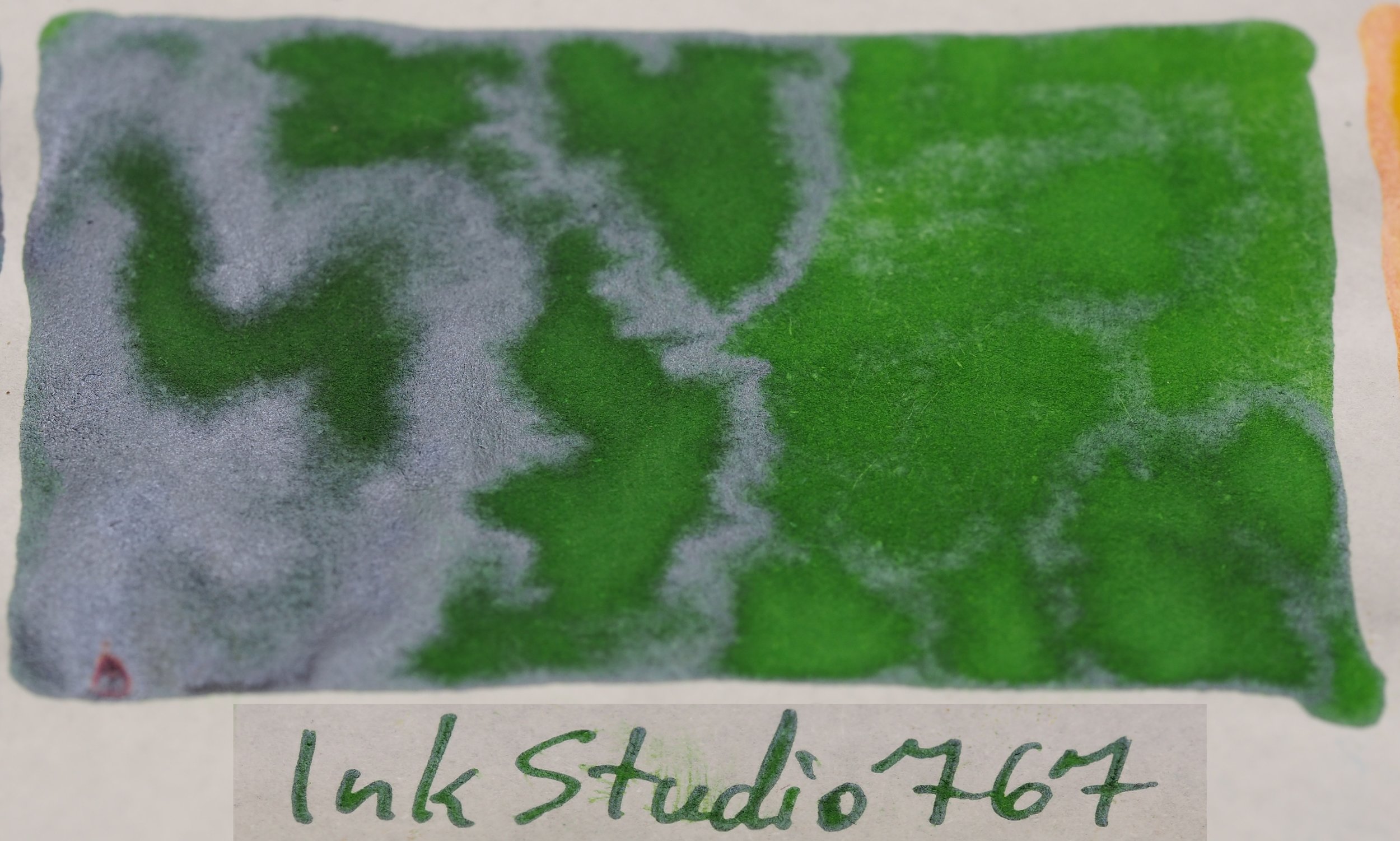
Starting to get a lot of sheen in these inks even visible from above. Lots of warm colours and browns on this page (4). 670 is one of the standout colours for me in this set. I love the rich yellow with just a slight hint of green and some subtle orange-brown highlights and also some silver sheen. 735 is a lovely purple, 737 is a lovely red-brown with green sheen. 740-750 are all vibrant and rich with green sheen. 762 is a strange dark green and 760 and 767 are great greens. Even 770 is a great yellow! I’m a big fan of this page.
Tomoe River Ivory(white) 52gsm 830-973
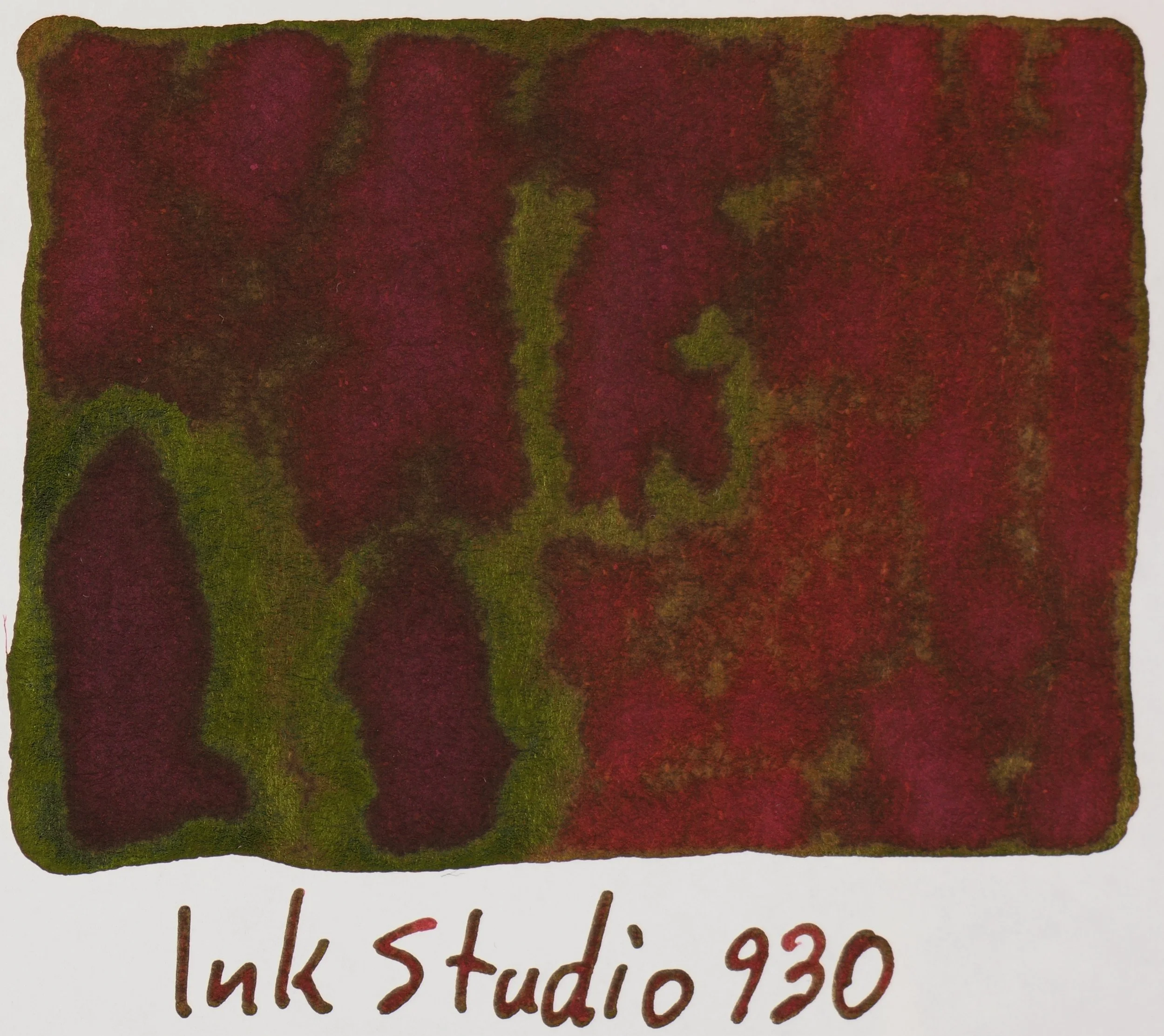
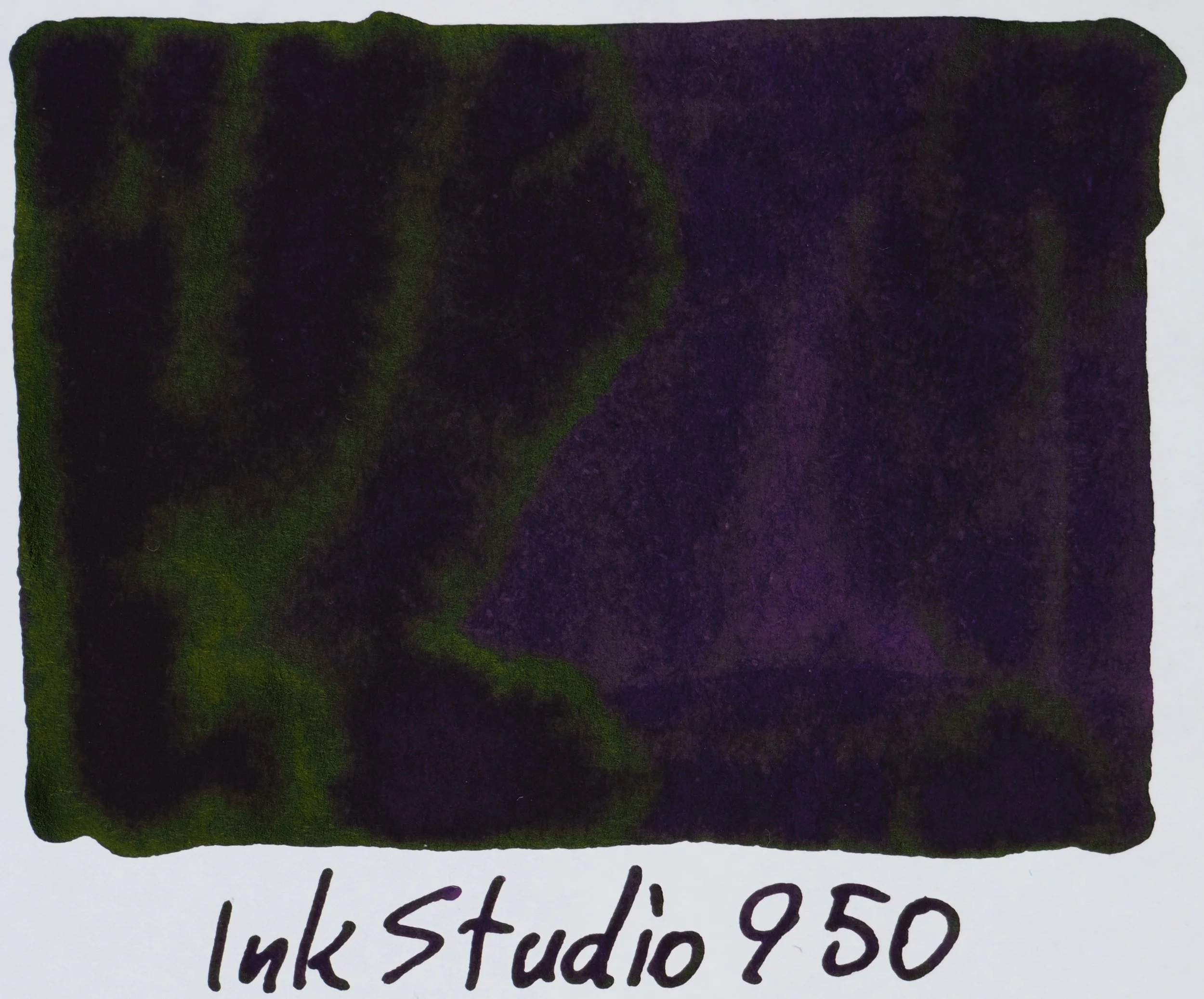
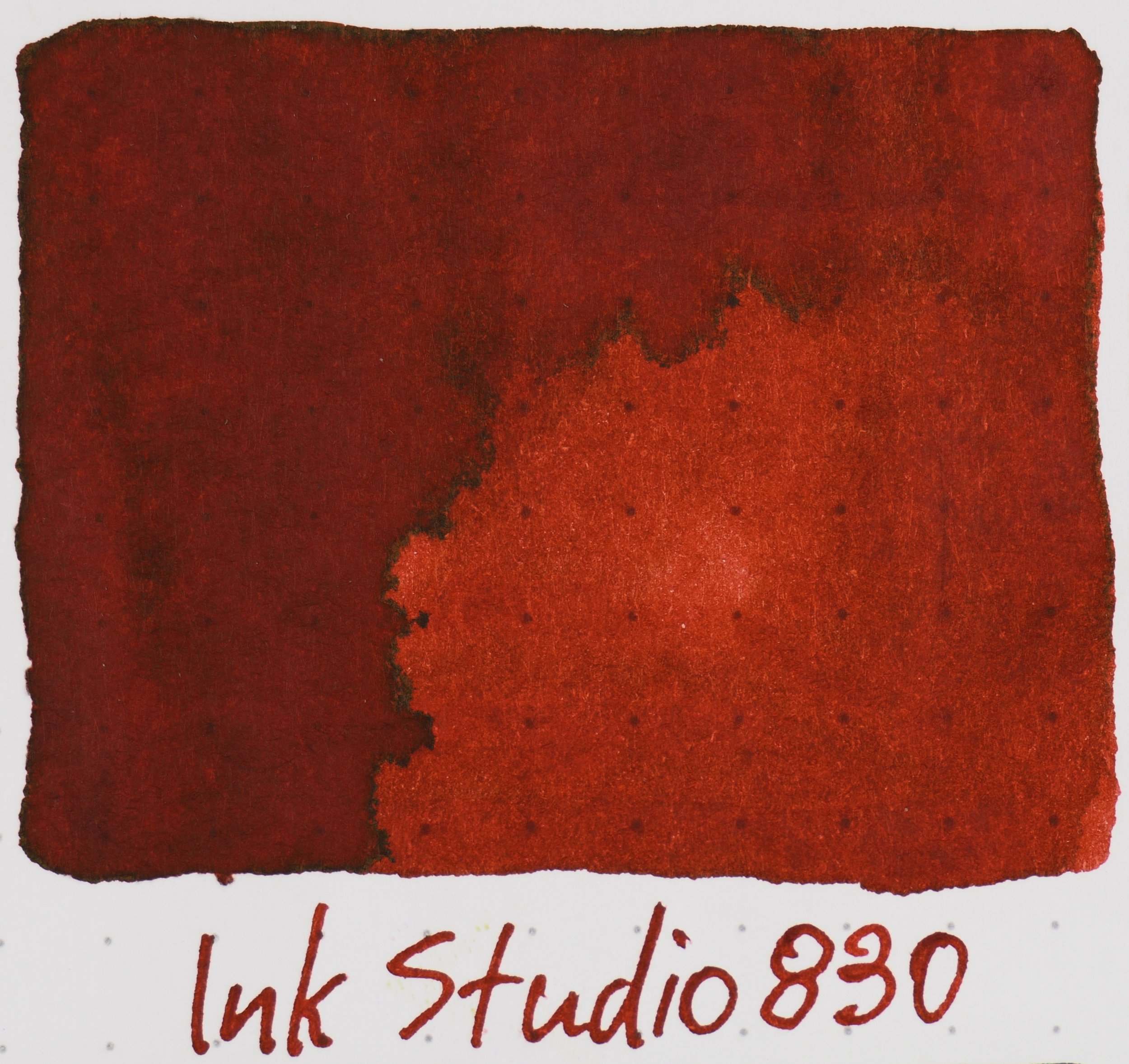
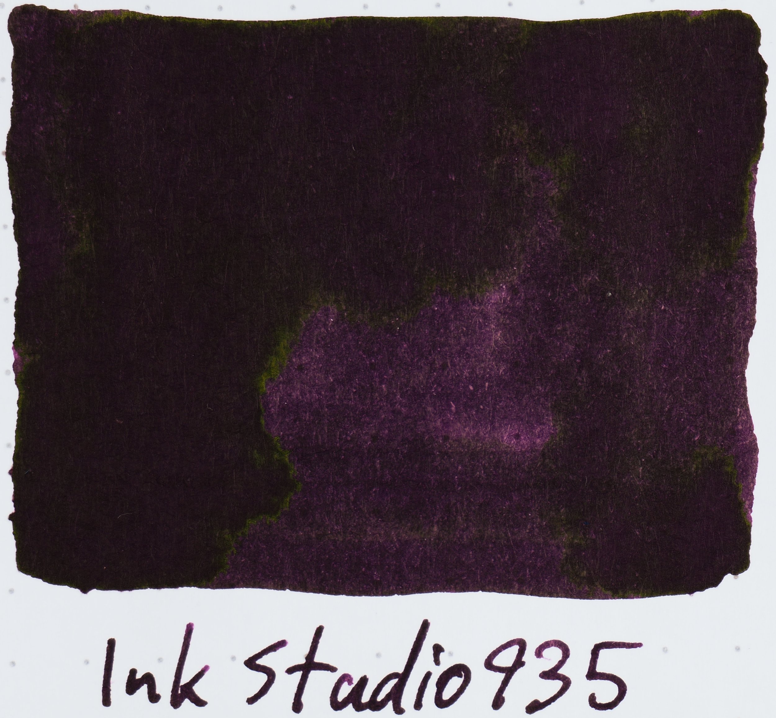
The reds and greens shine on the final page 5. Some much glorious richness of colour! The reds are just velvety and luxurious, and the greens are leafy and luscious. 935 is a decent alternative (but definitely not a dupe) to Lamy Dark Lilac (review coming soon!).
Rhodia 80gsm White paper
Tomoe River tends to make inks look either desaturated and sad or bubbly and fun (in my opinion). Some reds and oranges from Montblanc can lose a lot of their colour on Tomoe River. Shading is often a little understated on Tomoe River as well. I consider Tomoe River (if it’s not making inks dull which fortunately isn’t the case here for any ink!) often highlights the best parts of an ink (sometimes exaggerating them) but Rhodia represents a more neutral representation of the ink.
Rhodia 80gsm White 023-237
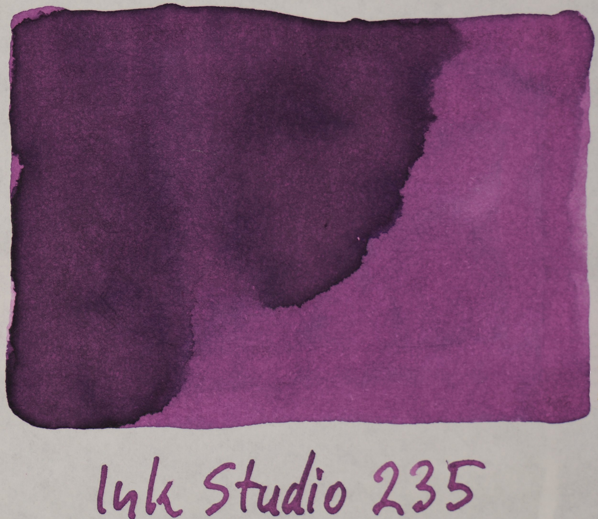
As unexpected the colour trajectory from page one to page five is pretty much the same as when on Tomoe River. It starts with pastels on page one. However, the dual-colour inks are more subtle now. 123 and 162 barely offer any pink and the green is far more prominent on both. Similarly with 130, 173 and especially 237 there is still dual-colours but it is less present than on Tomoe River. Oddly the dual-colour of 150 is slightly more prominent! 231 and 235 are noticeably more vibrant here.
The 2020 additions
UPDATED: On Rhodia 224 is similar but more muted. 252 is pinker but more orange leaning. 280 is noticeably yellower and saturated. There is no sheen on Rhodia.
Rhodia 80gsm White 240-443
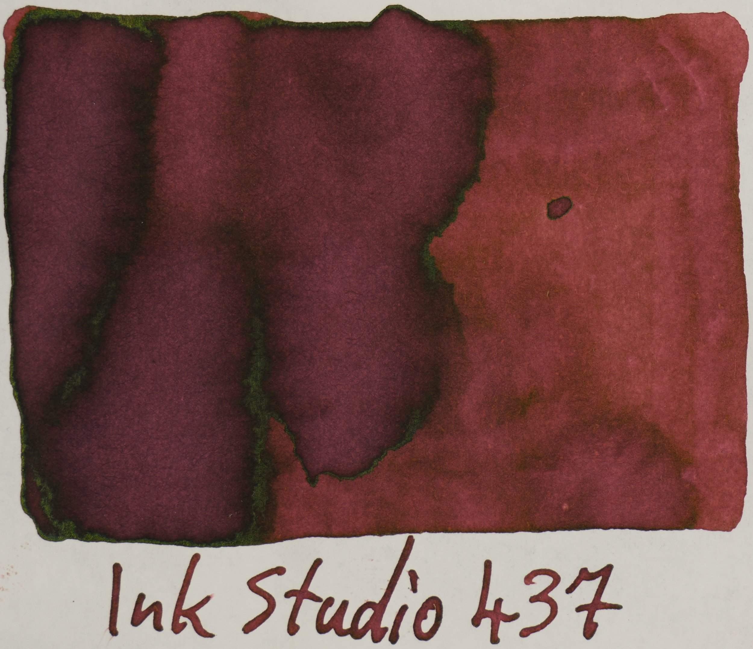
While still dull I find that these are not as dull as on Tomoe River. 437 is an interesting pink-brown-red colour on Rhodia but 237 and 373 I find a little less interesting. 370 is quite camouflage-y!
Rhodia 80gsm White 450-664
653 looks rich and dark here and 530 and 573 still remind me of the Montblanc inks. I feel the inks on this page on Rhodia feel a little more generic than the other pages.
Rhodia 80gsm White 670-773
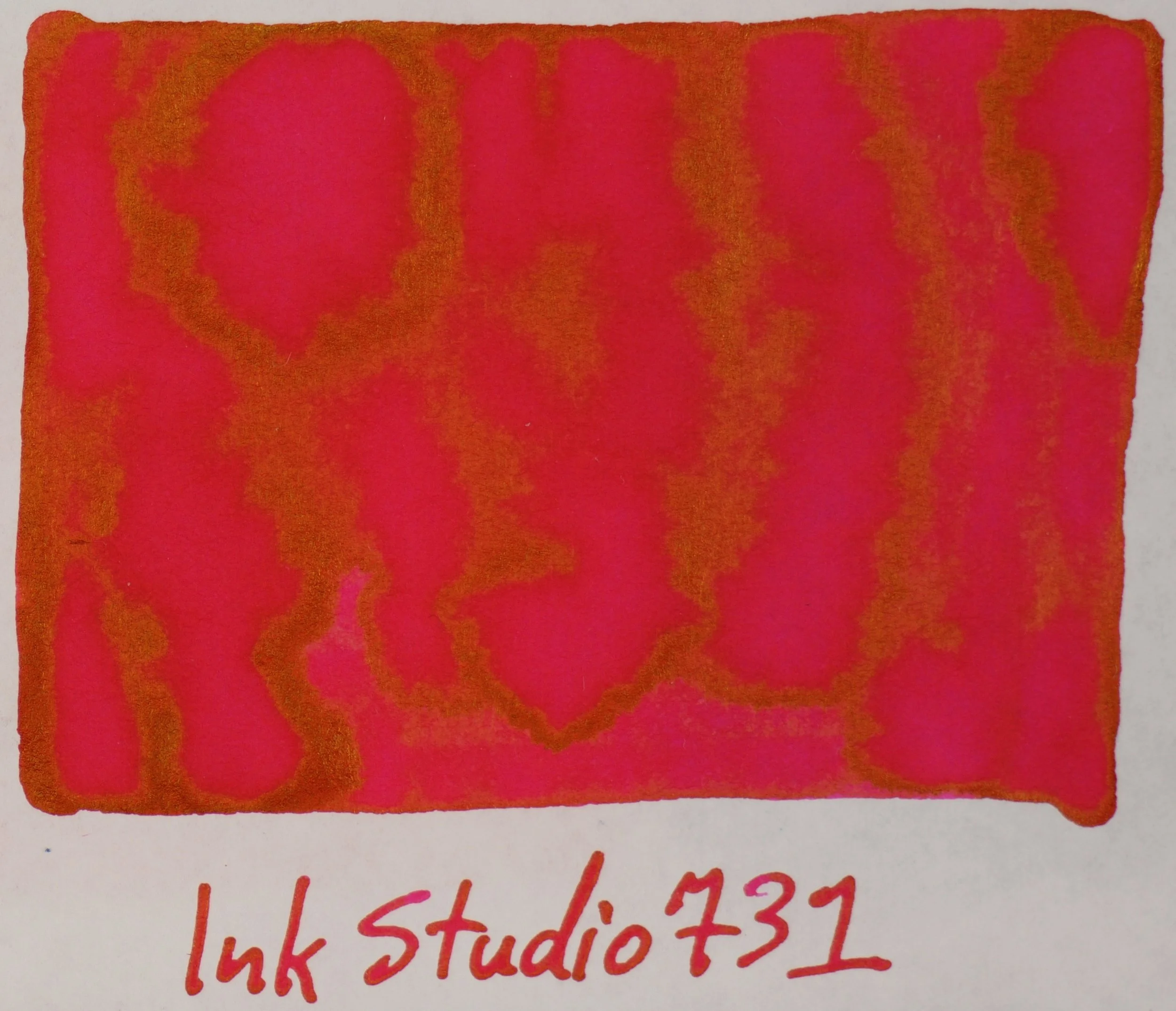
Starting to get some sheen and some real vibrancy to the inks on Rhodia here. 741 and 764 have noticeable amounts of sheen and the silver from 670 and 770 is quite nice. 760, 735, 750 are also starting to sheen. 731 is a nice super vibrant but still a slightly soft pink.
Rhodia 80gsm White 830-973
The darker blues of the final page five really leap out for me. With Tomoe River it was the Reds and Greens (which are still great here) but the complicated blues look great on Rhoda and also have some sheen. 941 is lovely rich dark blue. 967 is still great here with the darker areas almost picking up a warm sheen of some sort.
Sheen
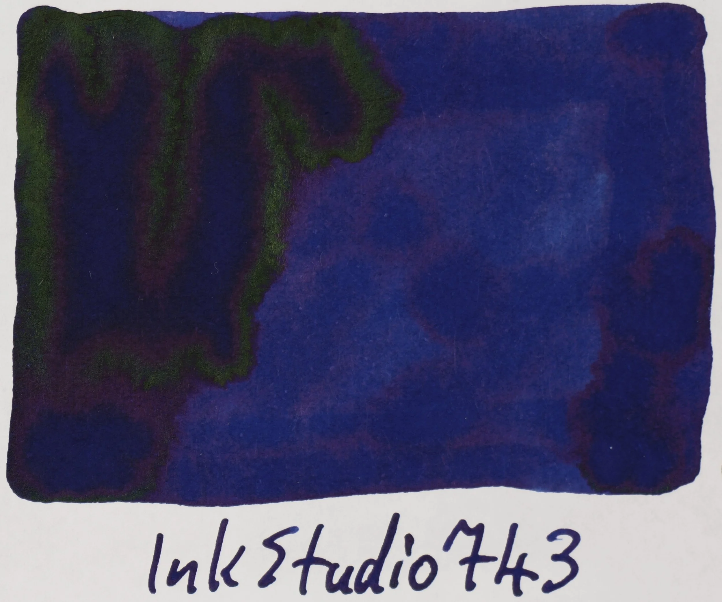
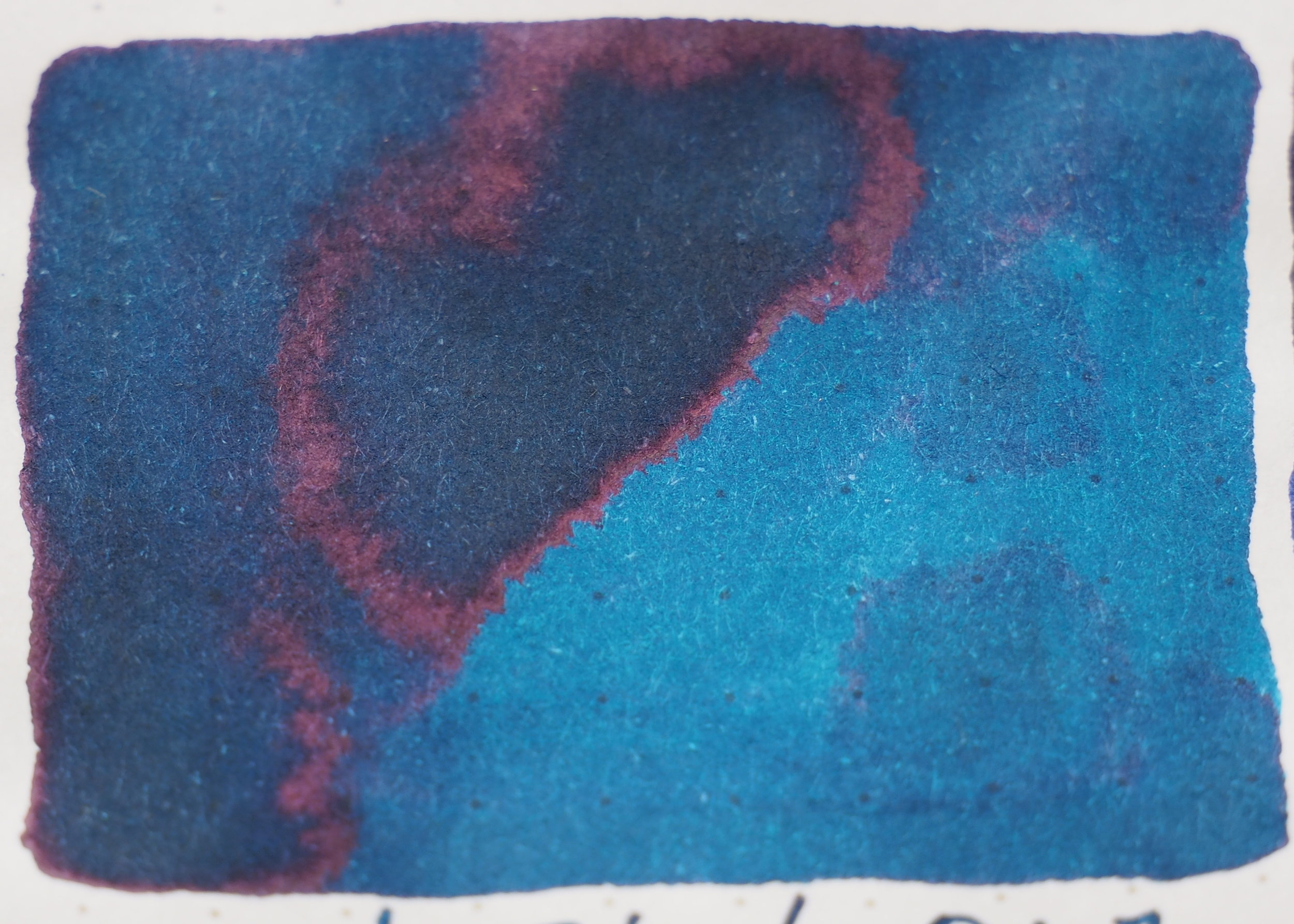
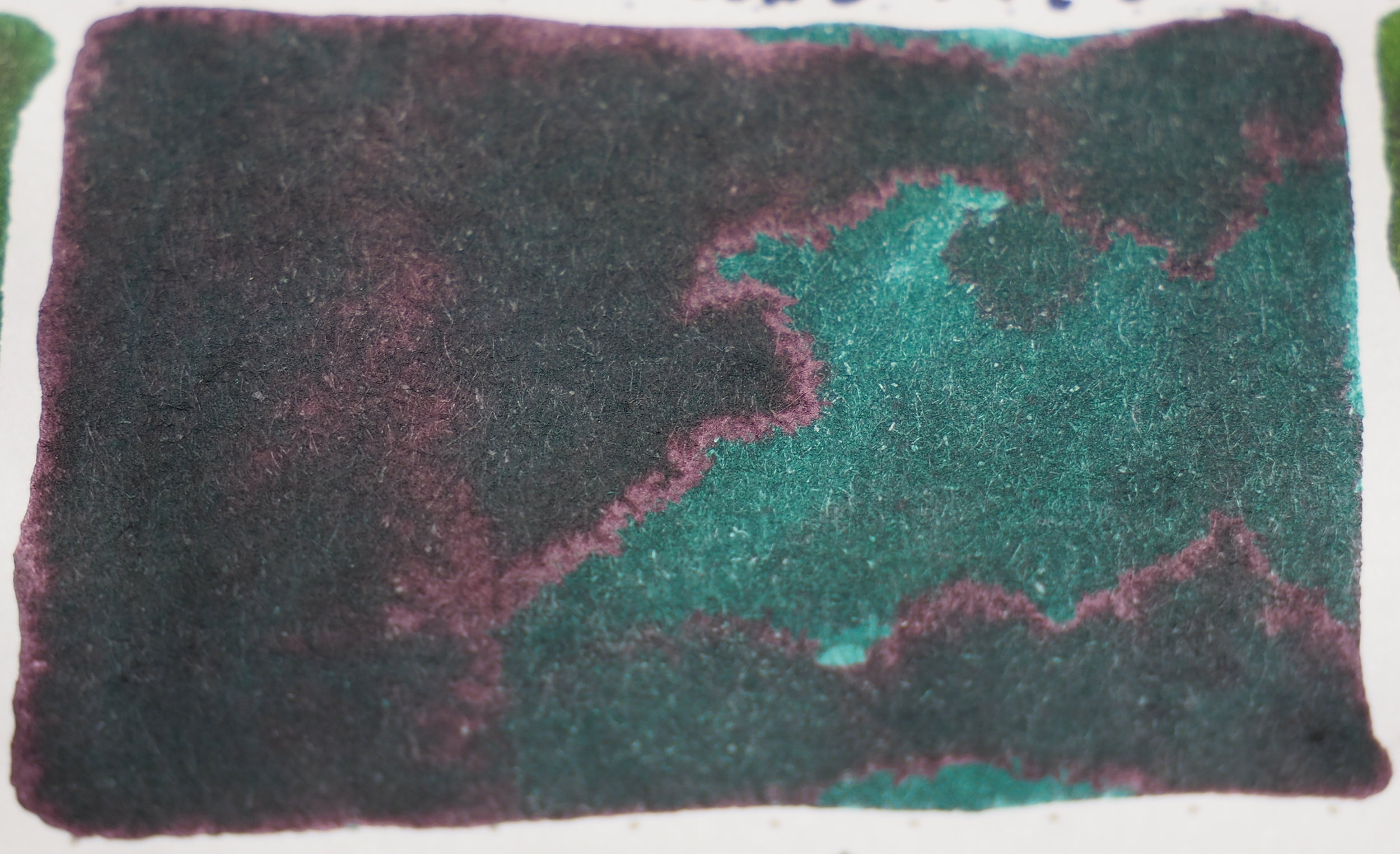
The sheen from the last two pages of Tomoe River is insane! So much colour on each page. 940 is showing reddish sheen green sheen and the blue base as is 743. Even the browns have a strong silvery-green sheen. They are impressive pages of colour. It’s not unexpected that Rhodia doesn’t produce the same sheen nor does it produce anything close to the same amount of sheen.
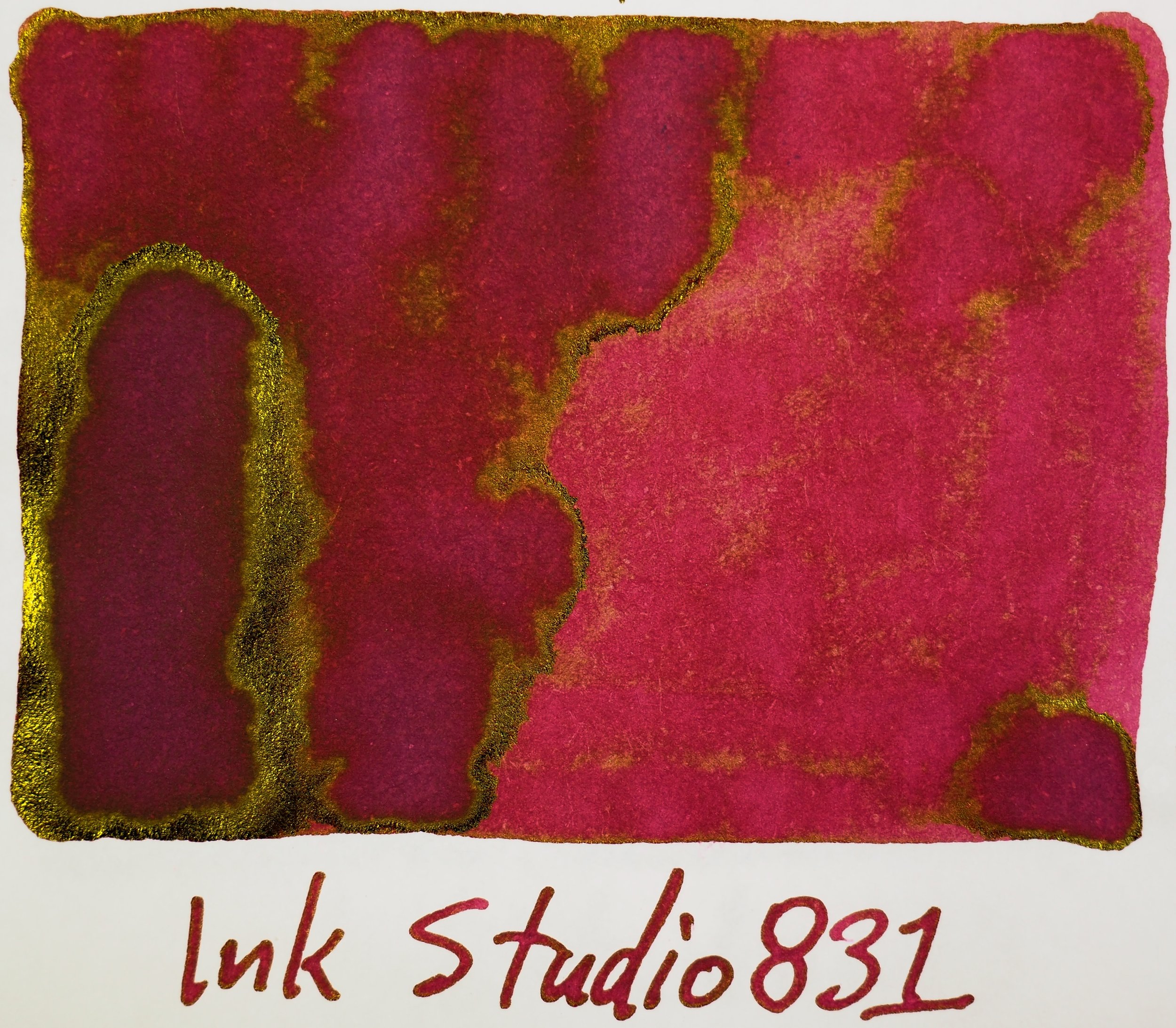
On Rhodia the standout inks (for me) with regards to sheen are: 741 for its amount of sheen; 670 and 770 for the glossy silver sheen and 930 for the subtle green-gold sheen over the red base colour.
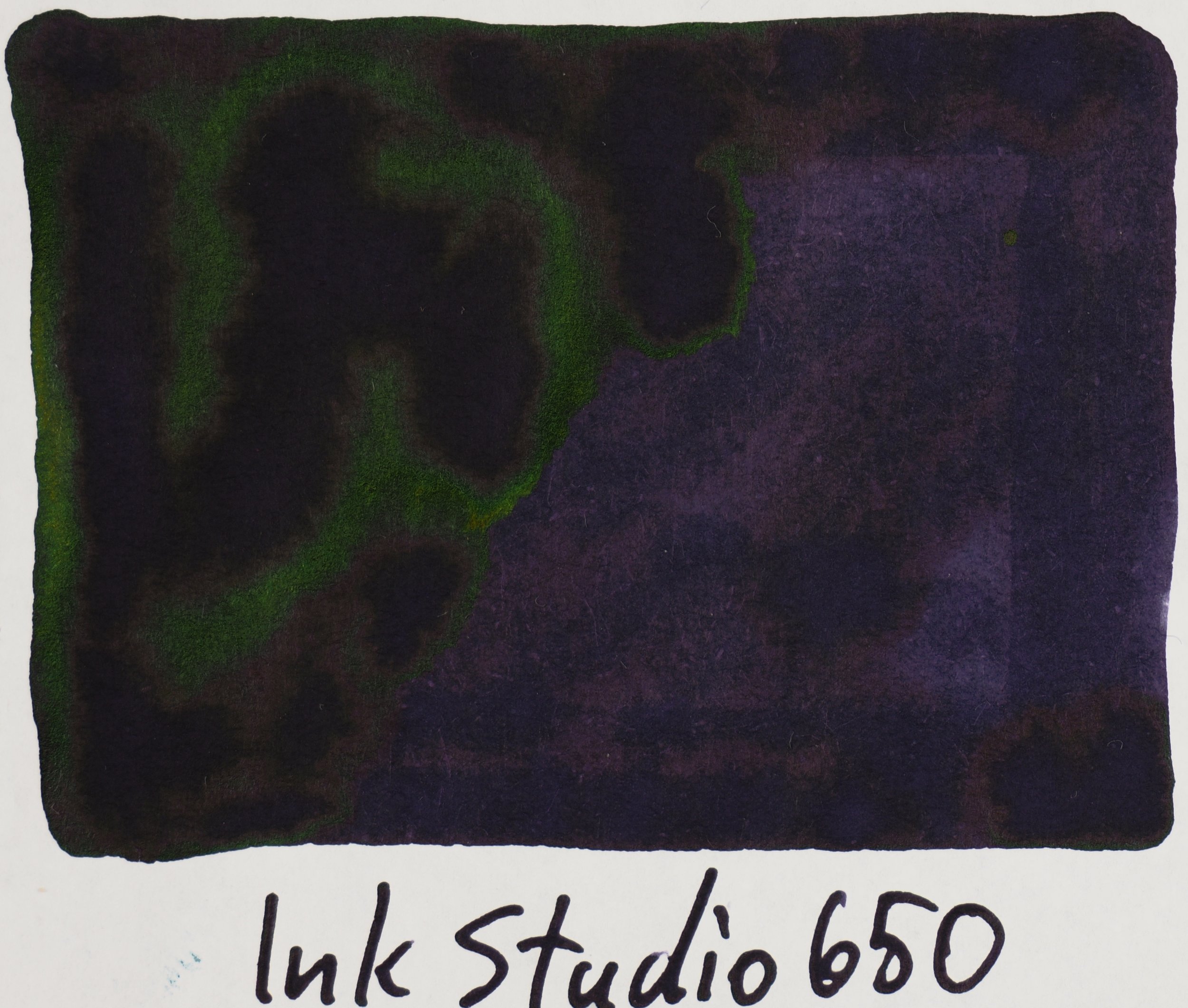
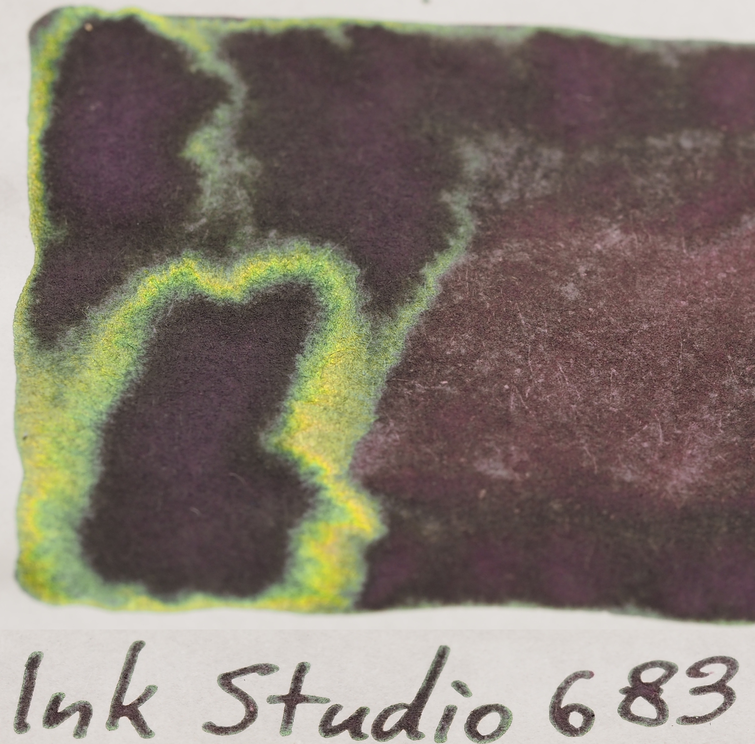
On Tomoe River there is obviously a lot more to choose from! First a shoutout to the double shiners (a pink sheen with a green sheen): 642, 650, 740, 743, 840, 843, 940 and 943. The silver gloss of 670, 770 and 970 are still great and I love the browns and reds with strong sheen (683, 830, 930, 973). Finally the silver sheen on the greens of 767, 867 and 967 really remind me of rain on leaves.
This isn’t all the shining ink for Rhodia 80gsm but it is the most sheening ones and the others are unlikely to show much of the already subtle sheen in writing.
There are 69 sheening inks on Tomoe River 52gsm which means more than two thirds of the inks from the set sheen (to various degrees) on Tomoe River. That’s a lot of sheen! Meanwhile very few of inks sheen on Rhodia (especially in any meaningful way).
Conclusion
So should you get the whole set? Probably not. It’s a very sizeable ink investment. The inks are NZ$34.99 (which is around US$24 as of late January 2019) at Pen Classics. But I have seen prices ranging from US$17-US$19. This is the higher end of the ballpark normal price for Sailor these days (unfortunately). They are definitely cheaper from Japan (At US$12/¥1,296) but Japan can be expensive to ship from and also they are getting strict with shipping their (requiring an MSDS). If you are traveling to Japan and want some of these I recommend taking advantage of your proximity! There’s a lot of variation in hues, saturation, vibrancy, and brightness. I’d wager for most people not every ink would be an ink they would normally choose. It isn’t for me. 160 is a colour I very much dislike, for example, and I don’t really have a need for 023, 024, and 027. My recommendation for everyone is to, very simply, pick and choose a few but if you have a favourite type of ink you can also buy a batch of inks based on the first digit; If you like Pastels 100s and 200s are great for that; 300s are good for greyer inks and if you want rich and sheeny Thant 800s and 900s are your go. I do recommend getting one of the unique dual-colour inks though.
There are a lot of blues here. Almost 25% are some sort of blue. Too many? Possible. I think there could be more variety with the greens and browns as well as more oranges and there are no greys.
In my State of the Union I generally bemoaned Sailor’s hidden price increase but I was more critical of dropping the volume to 20ml which I think is just too small. Given that this is a specific set with 100 bottles, however, I think it’s OK. This is not a normal standard line ink (though it isn’t limited); it’s a whole set of 100 related inks. 30ml would be ideal but 20ml is fine for this.
I am glad I have the whole set. There are lot of colours here that I really like or at least find interesting. The point of this was not really to review the inks and as I’ve inked very few of them that wouldn’t really be possible. The purpose was to provide an overview to help with selecting an ink (or a few) to purchase as approaching 100 inks can be a little overwhelming. Hopefully it helps with that!
As mentioned I bought these inks from Pen Classics in New Zealand. They are one of the first few non-Japanese stores to sell these inks.
✒︎ ✑ ✒︎ ✑
I’ve listed all my inks and all my pens in their respective pages. Please let me know which inks you’d like to review next via the comments, Twitter, Instagram, or contact me directly.
For blog updated you can follow @macchiato_man on Twitter, subscribe via email, or like my Facebook page.
I was not compensated for this review and everything here is my own honest opinion. There are no affiliate links in this review but Desk Bandit is a sponsor of the blog.
I purchased these ink with my own money but it was at a discounted price the purpose of giving an honest overview. I was not otherwise compensated and everything here is my own honest opinion. There are no affiliate links.























































































Leave a Reply